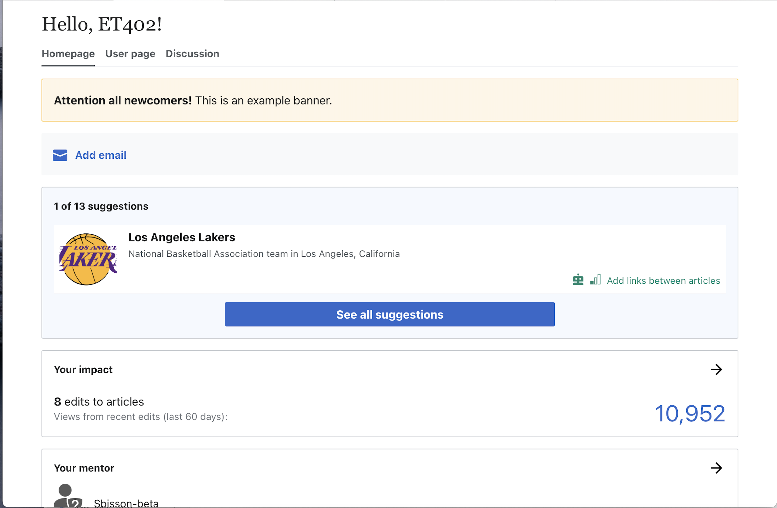
Problem
There is a conflict in user expectations as the current paradigm for mobile module previews is that each entire preview is one tap-target to open the corresponding module; but the new task preview card provides contains elements that leads users to expect two separate destinations – one on the inset article preview card to open the article for editing, and the other to open the the task module.
Note that this was the expectation of some participants in a recent Add links usability study.
Proposed solution
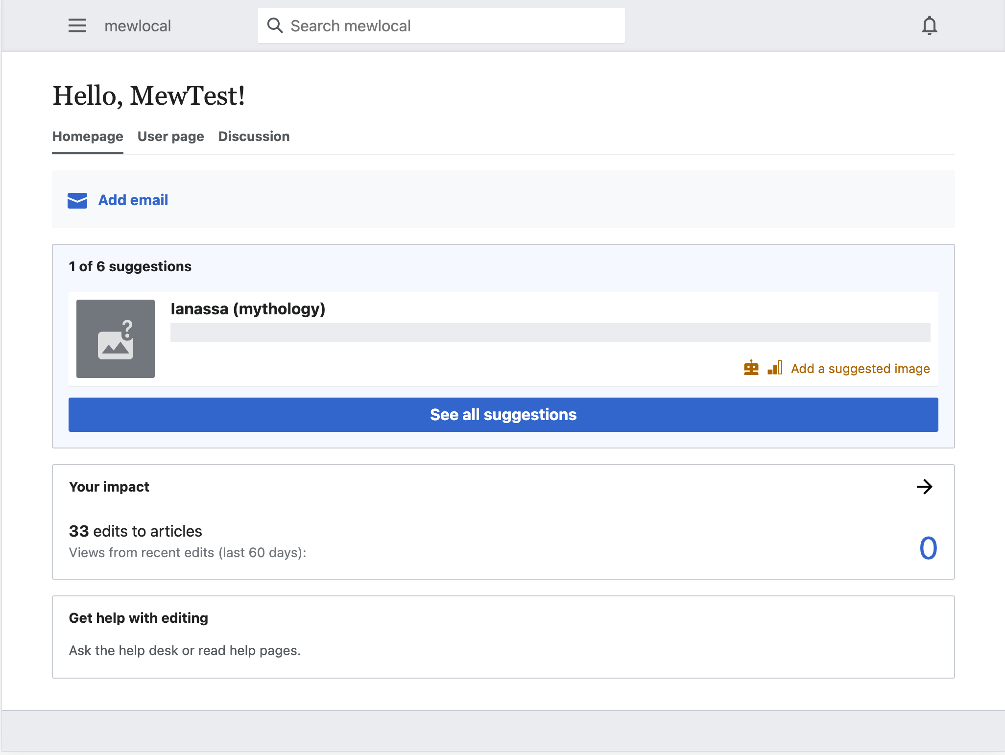
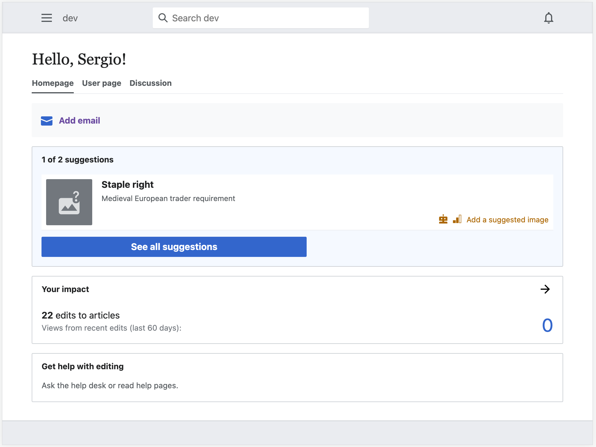
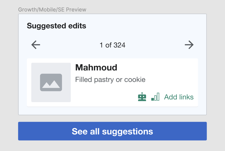
Split the task preview module into two cards with separate targets when there are non-zero Suggested edit articles.
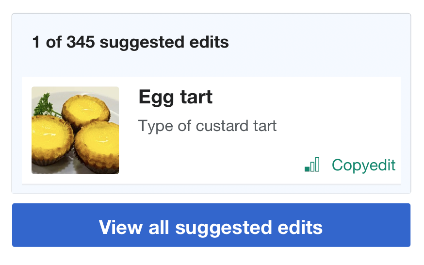
Notable changes from existing design:
a. Header changes from Suggested edits to the count of tasks text 1 of {total number} suggested edits
b. Remove the icon from the module preview header
c. Move the CTA button to view all suggested edits below and outside of the card, and make it full width. It links to the task module
d. The top card links to the article suggested.