Page MenuHomePhabricator

Variant C/D: mobile preview for suggested edits module with first suggested edit
Closed, ResolvedPublic

Description

T250440: Variant tests: C-mobile calls for the mobile preview of the suggested edits module to display the first suggested edit:

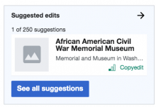
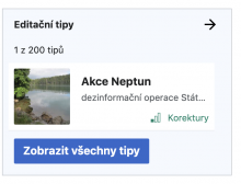
  • On the homepage, this variant employs an entirely new suggested edits preview, which shows an actual suggestion in miniature.
  • This is present even when the newcomer arrives for the first time, when the welcome drawer is open.
  • Header: "Suggested edits"
  • Miniature suggestion:
    • This is a mini-version of a suggested edit card from the actual module.
      • It should contains: the article title, title description, image, and task type.
      • It should not contain: a preview of the article content or a pageview count.
    • This should be the actual first suggestion that the user would be seeing in the suggested edits module if they were to navigate there at the time. That means...
      • ...any of the user's existing topic or difficulty filter settings should be applied in choosing the article shown.
      • ...when the user does navigate to the full module, they should see that same article as the first option.
  • Above the miniature suggestion should show the task counter and position in the queue, just as it would in the full suggested edits module, e.g. "1 of 135".
  • Button: "See all suggestions"
  • When the user taps anywhere on the module preview, whether the header, the miniature suggestion, or the call to action button, they should go to the full suggested edits module.

This also applies in variant D, once the suggested edits module has been initiated (pre-initiation it looks different, see T258022: Variant D: mobile preview for suggested edits module with call to action)

Mockup

Related Objects

Event Timeline

There are a very large number of changes, so older changes are hidden. Show Older Changes

Change 617834 merged by jenkins-bot:
[mediawiki/extensions/GrowthExperiments@master] Add data for the top suggested edit card to the homepage

https://gerrit.wikimedia.org/r/617834

I've played around with two approaches and I'm on the fence about which one to use. The context is that the server will insert task data for a single task into the homepage HTML. On the mobile homepage that will be used as the task preview, and then the full task list on the module view will be manipulated to start with that task, for consistency. (If someone uses the non-JS detail view, that will be inconsistent, but that's a fringe case.) On the desktop, the full task list will also be manipulated to start with the preloaded task - there is nothing to be consistent with in that case, but it should improve the performance significantly.

The question is, how to get the extra data? On the server, we only load the page title for the task, plus task-specific data like difficulty. The description (which comes from a different source on mobile and desktop), image and pageviews are all loaded on the client side as separate API requests. One option is to keep doing that - that will mean adding a skeleton phase to the task preview, much like the one we already have for the desktop card. It also means more promise juggling (the data for the preview card might be loading in parallel with the data for the other 199 cards).

The other option is to do all the lookups on the server side. That's a fair amount of code duplication (for the other 199 tasks the data is loaded just in time so it would still have to happen on the client, unless we create a new API), and unclear performance impact - it would replace some client requests with intra-datacenter requests, OTOH PHP is not good at parallelizing things. UX-wise, it would mean there is no loading / skeleton animation and the task is visible immediately when the rest of the homepage is, but the homepage takes a bit longer to appear.

I'm leaning towards the client-side approach; @RHo @Catrope if you have a preference otherwise, I'd like to hear about it.

Client-side sounds preferable to me as well. If I understand you correctly, does that mean the mobile preview card will require a loading state for the image thumbnail and description only? I think we can use the same loading animation (pulsing grey boxes) as the desktop card skeleton for those elements, as per T238231.

If I understand you correctly, does that mean the mobile preview card will require a loading state for the image thumbnail and description only?

Those and the pageview count.

I've played around with two approaches and I'm on the fence about which one to use. The context is that the server will insert task data for a single task into the homepage HTML. On the mobile homepage that will be used as the task preview, and then the full task list on the module view will be manipulated to start with that task, for consistency. (If someone uses the non-JS detail view, that will be inconsistent, but that's a fringe case.) On the desktop, the full task list will also be manipulated to start with the preloaded task - there is nothing to be consistent with in that case, but it should improve the performance significantly.

The question is, how to get the extra data? On the server, we only load the page title for the task, plus task-specific data like difficulty. The description (which comes from a different source on mobile and desktop), image and pageviews are all loaded on the client side as separate API requests. One option is to keep doing that - that will mean adding a skeleton phase to the task preview, much like the one we already have for the desktop card. It also means more promise juggling (the data for the preview card might be loading in parallel with the data for the other 199 cards).

The other option is to do all the lookups on the server side. That's a fair amount of code duplication (for the other 199 tasks the data is loaded just in time so it would still have to happen on the client, unless we create a new API), and unclear performance impact - it would replace some client requests with intra-datacenter requests, OTOH PHP is not good at parallelizing things. UX-wise, it would mean there is no loading / skeleton animation and the task is visible immediately when the rest of the homepage is, but the homepage takes a bit longer to appear.

I'm leaning towards the client-side approach; @RHo @Catrope if you have a preference otherwise, I'd like to hear about it.

Just wanted to note that the per-user cache option described in the performance document could be used to render this on the server-side. If we pursue the server-side lookups as described above, then I think we should combine it with a caching strategy otherwise we will likely see some degradation in homepage loading times.

Change 620902 had a related patch set uploaded (by Kosta Harlan; owner: Kosta Harlan):
[mediawiki/extensions/GrowthExperiments@master] Only fetch task card data for users in variant C and D

https://gerrit.wikimedia.org/r/620902

The impact of loading one card on the server-side rendering speed:

image.png (343×770 px, 78 KB)

Snapshot in Grafana: http://grafana.wikimedia.org:3000/dashboard/snapshot/kLcqjLUd6sKUHQszYvJ047WAdyEIy6mn

Link to XHGui profile: https://performance.wikimedia.org/xhgui/run/symbol?id=5f3ba54caace69c58b785e9e&symbol=GrowthExperiments%5CNewcomerTasks%5CTaskSuggester%5CUserSettingsDecorator%3A%3Asuggest

I've pushed a patch to load the card data only for users in variant C/D, but that's a bandaid since soon everyone will be in one of those variants.

Rendering the first task card on the server side will, fundamentally, slow down the overall server-side rendering speed. I agree that the current impact is excessive and we should try to reduce it, but it was never going to be zero.

Rendering the first task card on the server side will, fundamentally, slow down the overall server-side rendering speed. I agree that the current impact is excessive and we should try to reduce it, but it was never going to be zero.

I agree, but it could be done as part of the per-user cache T258021#6382457 at which point we'd only see something like a 50ms-100ms hit.

Of course said cache doesn't exist and we need to build it, but maybe this is a good reason to prioritize that proposed work.

Change 620902 merged by jenkins-bot:
[mediawiki/extensions/GrowthExperiments@master] Only fetch task card data for users in variant C and D

https://gerrit.wikimedia.org/r/620902

Change 620967 had a related patch set uploaded (by Catrope; owner: Kosta Harlan):
[mediawiki/extensions/GrowthExperiments@wmf/1.36.0-wmf.4] Only fetch task card data for users in variant C and D

https://gerrit.wikimedia.org/r/620967

Change 620968 had a related patch set uploaded (by Catrope; owner: Kosta Harlan):
[mediawiki/extensions/GrowthExperiments@wmf/1.36.0-wmf.5] Only fetch task card data for users in variant C and D

https://gerrit.wikimedia.org/r/620968

I'm sorry; enabling the server half but not the frontend half before going on vacation was certainly sloppy. But once the code is finished, I don't think there's any difference between A and C/D (desktop C/D does not have task previews anyway). The server-side fetched task will be used to display the first card; rendering of the homepage will slow down but rendering the task card will speed up. (*) With our increasing focus on suggested edits as the central component of the home page, I think that's an acceptable tradeoff, regardless of caching.

(*) Actually that's not quite true if the user selects many task types / topics: SearchTaskSuggester iterates through all the queries even if it has enough results already. That made sense for the task list, since we wanted to interleave different types of tasks so we needed all queries, but it does not make sense when we are fetching a single task (or, currently, a couple ones, to deal with page protection). I'll fix that.

Change 620968 merged by jenkins-bot:
[mediawiki/extensions/GrowthExperiments@wmf/1.36.0-wmf.5] Only fetch task card data for users in variant C and D

https://gerrit.wikimedia.org/r/620968

Change 620967 merged by jenkins-bot:
[mediawiki/extensions/GrowthExperiments@wmf/1.36.0-wmf.4] Only fetch task card data for users in variant C and D

https://gerrit.wikimedia.org/r/620967

Mentioned in SAL (#wikimedia-operations) [2020-08-18T23:44:00Z] <catrope@deploy1001> Synchronized php-1.36.0-wmf.4/extensions/GrowthExperiments: Only fetch task card data for users in variant C/D (T258021) (duration: 01m 06s)

Mentioned in SAL (#wikimedia-operations) [2020-08-18T23:45:05Z] <catrope@deploy1001> Synchronized php-1.36.0-wmf.5/extensions/GrowthExperiments: Only fetch task card data for users in variant C/D (T258021) (duration: 01m 05s)

I'm sorry; enabling the server half but not the frontend half before going on vacation was certainly sloppy. But once the code is finished, I don't think there's any difference between A and C/D (desktop C/D does not have task previews anyway). The server-side fetched task will be used to display the first card; rendering of the homepage will slow down but rendering the task card will speed up. (*) With our increasing focus on suggested edits as the central component of the home page, I think that's an acceptable tradeoff, regardless of caching.

(*) Actually that's not quite true if the user selects many task types / topics: SearchTaskSuggester iterates through all the queries even if it has enough results already. That made sense for the task list, since we wanted to interleave different types of tasks so we needed all queries, but it does not make sense when we are fetching a single task (or, currently, a couple ones, to deal with page protection). I'll fix that.

Per T260758, could we think about implementing a cache here, at least for the initial visit to Special:Homepage? We could do just the part of T260758 which proposes to fetch tasks on user creation and caches them, then use that in the Suggested Edits module code which selects a single card to display.

The task needs to match the user's filters, so either we'd need to cache hundreds of tasks to make sure we have every combination ready, or invalidate the cache on option API requests. I'd leave caching as a last resort.

The task needs to match the user's filters, so either we'd need to cache hundreds of tasks to make sure we have every combination ready, or invalidate the cache on option API requests. I'd leave caching as a last resort.

I might be misunderstanding the flow / mockups, but I don't think we'd need to cache hundreds of tasks, invalidating the cache as the user updates their filters doesn't seem hard and would handle the problem:

  • user is added in the experiment during account creation, we cache some tasks with the default filters and no topics so that we can show one non-protected one on the first time they visit the homepage
  • as the user interacts with the topic/task filters (as you noted) we invalidate and rebuild the cache
  • in addition to checking protected status, we also want to do a DB query to validate that the task we serve to the user from the cache still has the maintenance template

Going from 200ms to 700ms or higher (some users saw 1.8 seconds) on server-side rendering is a pretty high jump, it would be nice to avoid this.

I agree with Kosta: having to invalidate the cache when the user changes their settings isn't an issue IMO, because in the current situation the user already has to wait for a search request to be made when they do that, and it's understandable to the user why they would have to wait. Writing this new result to the cache wouldn't take any additional time. We wouldn't have to cache hundreds of tasks: we would only have to cache results for the user's current settings, and if needed we could get away with caching only a small number of results (like 5-10) and lazy-loading the rest.

I agree with Kosta: having to invalidate the cache when the user changes their settings isn't an issue IMO, because in the current situation the user already has to wait for a search request to be made when they do that, and it's understandable to the user why they would have to wait. Writing this new result to the cache wouldn't take any additional time. We wouldn't have to cache hundreds of tasks: we would only have to cache results for the user's current settings, and if needed we could get away with caching only a small number of results (like 5-10) and lazy-loading the rest.

I wrote https://gerrit.wikimedia.org/r/c/mediawiki/extensions/GrowthExperiments/+/623768 (and a child patch for variant C) to help clarify what the proposal is.

Change 626243 had a related patch set uploaded (by Gergő Tisza; owner: Gergő Tisza):
[mediawiki/extensions/GrowthExperiments@master] Disable suggested edits navigation and result count until fully loaded

https://gerrit.wikimedia.org/r/626243

Change 626244 had a related patch set uploaded (by Gergő Tisza; owner: Gergő Tisza):
[mediawiki/extensions/GrowthExperiments@master] Always load the first task on the server side

https://gerrit.wikimedia.org/r/626244

Change 626243 merged by jenkins-bot:
[mediawiki/extensions/GrowthExperiments@master] Disable suggested edits navigation and result count until fully loaded

https://gerrit.wikimedia.org/r/626243

Change 627424 had a related patch set uploaded (by Gergő Tisza; owner: Gergő Tisza):
[mediawiki/extensions/GrowthExperiments@master] Make wrapping SmallTaskCard in an <a> optional

https://gerrit.wikimedia.org/r/627424

Change 627426 had a related patch set uploaded (by Gergő Tisza; owner: Gergő Tisza):
[mediawiki/extensions/GrowthExperiments@master] [WIP] Show task preview in variant C/D mobile summary

https://gerrit.wikimedia.org/r/627426

Change 627424 merged by jenkins-bot:
[mediawiki/extensions/GrowthExperiments@master] Make wrapping SmallTaskCard in an <a> optional

https://gerrit.wikimedia.org/r/627424

Change 626244 merged by jenkins-bot:
[mediawiki/extensions/GrowthExperiments@master] Always load the first task on the server side

https://gerrit.wikimedia.org/r/626244

There might be some more work with this for variant D (not sure the process by which the preview card is displayed will be usable right after initiation), but that's blocked on variant D onboarding.

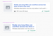
@RHo: Kosta pointed out that the task preview card gets resized during the skeleton->final transition when the title or Wikidata description is long and takes multiple lines. Should we do something about that?
(If we do, preferably it should also be applied to the post-edit notice as the implementation is the same, they only differ now in some font formatting.)

taskcard-multiline.png (234×370 px, 25 KB)

Ah thanks for picking this up @Tgr - My expectation that I failed to put down explicitly was that these cards are fixed height, which allows for the title to overflow to two lines and one line only for the wikidata description:

image.png (1×1 px, 124 KB)

Change 627426 merged by jenkins-bot:
[mediawiki/extensions/GrowthExperiments@master] Show task preview in variant C/D mobile summary

https://gerrit.wikimedia.org/r/627426

Change 628982 had a related patch set uploaded (by Gergő Tisza; owner: Gergő Tisza):
[mediawiki/extensions/GrowthExperiments@master] Fix small task card CSS

https://gerrit.wikimedia.org/r/628982

Change 629009 had a related patch set uploaded (by Gergő Tisza; owner: Gergő Tisza):
[mediawiki/extensions/GrowthExperiments@master] Small task card CSS fixes

https://gerrit.wikimedia.org/r/629009

@RHo Done, sort of, but I have a hard time reproducing the sample visuals. With the sizes in Zeplin (image height: 72px, title font: 16px, title line height: 1, title padding: 4px, description / tasktype font: 13px) the text is still slightly taller than the image. Even if I remove the padding, there is a few pixels of difference.

@RHo Done, sort of, but I have a hard time reproducing the sample visuals. With the sizes in Zeplin (image height: 72px, title font: 16px, title line height: 1, title padding: 4px, description / tasktype font: 13px) the text is still slightly taller than the image. Even if I remove the padding, there is a few pixels of difference.

@RHo this will be on betalabs in a few minutes if you want to review there. Please move back to Needs Work if there are still changes to make per @Tgr's comment above.

Change 628982 merged by jenkins-bot:
[mediawiki/extensions/GrowthExperiments@master] Fix small task card CSS

https://gerrit.wikimedia.org/r/628982

Change 629009 merged by jenkins-bot:
[mediawiki/extensions/GrowthExperiments@master] Small task card CSS fixes

https://gerrit.wikimedia.org/r/629009

Etonkovidova subscribed.

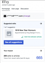
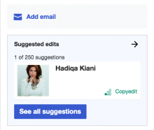
For Design review - looks and works according to the specs:

Screen Shot 2020-09-22 at 2.06.33 PM.png (559×405 px, 54 KB)

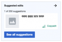
Also checked the case when there is 0 results - the present default picture will be displayed:

Screen Shot 2020-09-22 at 2.11.30 PM.png (224×414 px, 24 KB)

Note: When a user selects new topics/filters on SE screen and then clicks back button - users' selection is not reflected on the Homepage screen.

  • Homepage screens presents SE card based on selection 'Easy' and 'Oceania' filters
  • a user clicks on the presented SE card, then on SE screen selects different topic - 'Mathematics' and 'Hard'
  • a user clicks on '<--' arrow to return to the Homepage screen - and still sees a card for 'Easy' and 'Oceania'

Hi @Tgr - moving back for more work as I have noted a few minor tweaks below to get the spacing looking even closer to the Zeplin mock; and @Etonkovidova's note about the preview not showing the first task should be fixed as well.

For Design review - looks and works according to the specs:

Screen Shot 2020-09-22 at 2.06.33 PM.png (559×405 px, 54 KB)

Actual (CS Beta 1-Oct-2020)
image.png (500×622 px, 91 KB)
Expected: eg. 1
image.png (508×612 px, 95 KB)
Expected eg. 2
image.png (232×562 px, 80 KB)
Expected eg. 3
image.png (230×564 px, 75 KB)
Expected eg. 4
image.png (222×570 px, 79 KB)

Some design tweaks:
a. Add another 8px space between the mini article card and the number of tasks preview pager (.suggested-edits-preview-pager)
b. The mini article card should actually be 8px wider on left and right so that it is the image thumbnail that is aligned with the Suggested edits module header and blue CTA button. How I achieved this in the "expected" mock was by making the following changes to the .mw-ge-small-task-card class:

width:calc(100% + 16px);  // changed from width:100%;
margin-left: -8px; // added to shift the card left

c. Image thumbnail (class .growthexperiments-homepage-module-suggested-edits.growthexperiments-homepage-module-mobile-summary .suggested-edits-main-with-preview .mw-ge-small-task-card-image) should have width:80px and height:80px (currently it is 77x77px)
d. Image thumbnail should additionally have a border-radius:2px
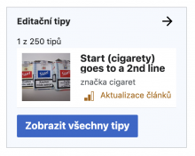
e. Article title - change line-height from line-height:1 to line-height:1.2 (this is to prevent the letters from being cut-off like the "g" in "goes"
f. Article description - add a line-height:1.5
g. Task difficulty level icon should be smaller and vertically centred with the difficulty text - achieved by adding min-width:16px and margin-bottom:4px to the .mw-ge-small-task-card-tasktype .oo-ui-iconWidget span element
h. Task difficulty container should be smaller - set a height:20px on .mw-ge-small-task-card-metadata-container
i. Space title and descriptions to vertically centered on the card area - this may be done by adding another <div class="mw-ge-small-task-card-glue"></div> (see expected example screenshots when there is a single line title with and without a description)

Also checked the case when there is 0 results - the present default picture will be displayed:

Screen Shot 2020-09-22 at 2.11.30 PM.png (224×414 px, 24 KB)

Note: When a user selects new topics/filters on SE screen and then clicks back button - users' selection is not reflected on the Homepage screen.

  • Homepage screens presents SE card based on selection 'Easy' and 'Oceania' filters
  • a user clicks on the presented SE card, then on SE screen selects different topic - 'Mathematics' and 'Hard'
  • a user clicks on '<--' arrow to return to the Homepage screen - and still sees a card for 'Easy' and 'Oceania'

This is unexpected too. The user should see the first suggestion for their selected filters of 'Mathematics' and 'Hard' tasks

Change 632218 had a related patch set uploaded (by Kosta Harlan; owner: Kosta Harlan):
[mediawiki/extensions/GrowthExperiments@master] Update mobile summary small task card when filters change

https://gerrit.wikimedia.org/r/632218

This is unexpected too. The user should see the first suggestion for their selected filters of 'Mathematics' and 'Hard' tasks

I have a patch up for this: https://gerrit.wikimedia.org/r/c/mediawiki/extensions/GrowthExperiments/+/632218

Change 632218 merged by jenkins-bot:
[mediawiki/extensions/GrowthExperiments@master] Update mobile summary small task card when filters change

https://gerrit.wikimedia.org/r/632218

While @kostajh did the part about updating the task on the summary card, there are still a pile of design tweaks to do. @Tgr, this is for you.

Change 633964 had a related patch set uploaded (by Gergő Tisza; owner: Gergő Tisza):
[mediawiki/extensions/GrowthExperiments@master] Small fixes for mobile task preview card

https://gerrit.wikimedia.org/r/633964

g. Task difficulty level icon should be smaller and vertically centred with the difficulty text - achieved by adding min-width:16px and margin-bottom:4px to the .mw-ge-small-task-card-tasktype .oo-ui-iconWidget span element

FWIW the icon ends up 18px-ish this way, due to a width rule elsewhere. Looks about the same size as on the image, though.

Change 634011 had a related patch set uploaded (by Kosta Harlan; owner: Kosta Harlan):
[mediawiki/extensions/GrowthExperiments@master] Mobile summary: Update HTML when previous/next are clicked

https://gerrit.wikimedia.org/r/634011

I've +2'ed @Tgr's patch. Leaving in code review for https://gerrit.wikimedia.org/r/634011, which is a follow-up to

Note: When a user selects new topics/filters on SE screen and then clicks back button - users' selection is not reflected on the Homepage screen.

  • Homepage screens presents SE card based on selection 'Easy' and 'Oceania' filters
  • a user clicks on the presented SE card, then on SE screen selects different topic - 'Mathematics' and 'Hard'
  • a user clicks on '<--' arrow to return to the Homepage screen - and still sees a card for 'Easy' and 'Oceania'

This is unexpected too. The user should see the first suggestion for their selected filters of 'Mathematics' and 'Hard' tasks

The patch I pushed updates the mobile summary card when previous/next are pressed on the suggested edits module (@RHo I assume that is desired, but it wasn't specified so double-checking)

Change 633964 merged by jenkins-bot:
[mediawiki/extensions/GrowthExperiments@master] Small fixes for mobile task preview card

https://gerrit.wikimedia.org/r/633964

Change 634011 merged by jenkins-bot:
[mediawiki/extensions/GrowthExperiments@master] Suggested Edits mobile summary: Update card when previous/next are clicked

https://gerrit.wikimedia.org/r/634011

a. Add another 8px space between the mini article card and the number of tasks preview pager (.suggested-edits-preview-pager)

Done.

production (no padding-bottom: 8px;)betalabs with padding-bottom: 8px;
Screen Shot 2020-10-19 at 3.54.36 PM.png (400×471 px, 47 KB)
Screen Shot 2020-10-19 at 3.54.52 PM.png (418×467 px, 58 KB)

b. The mini article card should actually be 8px wider on left and right so that it is the image thumbnail that is aligned with the Suggested edits module header and blue CTA button. How I achieved this in the "expected" mock was by making the following changes to the .mw-ge-small-task-card class

width:calc(100% + 16px);  // changed from width:100%;
margin-left: -8px; // added to shift the card left

Done - it was added:

.growthexperiments-homepage-module-suggested-edits.growthexperiments-homepage-module-mobile-summary .suggested-edits-main-with-preview .mw-ge-small-task-card {
    margin-left: -8px;
    margin-right: -8px;
production (no fix)betalabs with the fix
Screen Shot 2020-10-19 at 4.07.21 PM.png (322×457 px, 44 KB)
Screen Shot 2020-10-19 at 4.07.07 PM.png (320×460 px, 54 KB)

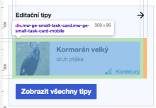
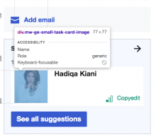
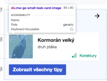
c. Image thumbnail (class .growthexperiments-homepage-module-suggested-edits.growthexperiments-homepage-module-mobile-summary .suggested-edits-main-with-preview .mw-ge-small-task-card-image) should have width:80px and height:80px (currently it is 77x77px)

d. Image thumbnail should additionally have a border-radius:2px

Done.

.growthexperiments-homepage-module-suggested-edits.growthexperiments-homepage-module-mobile-summary .suggested-edits-main-with-preview .mw-ge-small-task-card-image {
    height: 80px;
    width: 80px;
    border-radius: 2px;
production (no fix)betalabs with the fix
Screen Shot 2020-10-19 at 4.01.20 PM.png (403×455 px, 50 KB)
Screen Shot 2020-10-19 at 4.01.33 PM.png (341×447 px, 57 KB)

e. Article title - change line-height from line-height:1 to line-height:1.2 (this is to prevent the letters from being cut-off like the "g" in "goes"

Done.

.growthexperiments-homepage-module-suggested-edits.growthexperiments-homepage-module-mobile-summary .suggested-edits-main-with-preview .mw-ge-small-task-card-title {
    line-height: 1.2;
    color: #202122;
production (no fix)betalabs with the fix
Screen Shot 2020-10-19 at 4.47.55 PM.png (300×447 px, 24 KB)
Screen Shot 2020-10-19 at 4.47.46 PM.png (328×449 px, 23 KB)

f. Article description - add a line-height:1.5

Done.

.growthexperiments-homepage-module-suggested-edits.growthexperiments-homepage-module-mobile-summary .suggested-edits-main-with-preview .mw-ge-small-task-card-description {
    line-height: 1.5;
}
production (no fix)betalabs with the fix
Screen Shot 2020-10-19 at 5.43.04 PM.png (305×444 px, 32 KB)
Screen Shot 2020-10-19 at 5.43.10 PM.png (331×445 px, 46 KB)

g. Task difficulty level icon should be smaller and vertically centred with the difficulty text - achieved by adding min-width:16px and margin-bottom:4px to the .mw-ge-small-task-card-tasktype .oo-ui-iconWidget span element.

The icon is more centered - see the screenshot below and the specs are in place.

h. Task difficulty container should be smaller - set a height:20px on .mw-ge-small-task-card-metadata-container

Done - the height is set to 20px.

production (no fix)betalabs with the fix
Screen Shot 2020-10-19 at 5.51.02 PM.png (123×385 px, 40 KB)
Screen Shot 2020-10-19 at 5.51.48 PM.png (131×397 px, 34 KB)

i. Space title and descriptions to vertically centered on the card area - this may be done by adding another <div class="mw-ge-small-task-card-glue"></div> (see expected example screenshots when there is a single line title with and without a description)

With two-line titles:

production (no fix)betalabs with the fix
Screen Shot 2020-10-19 at 6.01.00 PM.png (289×439 px, 52 KB)
Screen Shot 2020-10-19 at 6.00.33 PM.png (308×435 px, 38 KB)

Checked the following - it's Done. To summarize: a card presented to a user on a SE overlay (as a result of a user filters selection) will be presented on Homepage (as a SE card) when a user navigates there via a browser back button.

I've +2'ed @Tgr's patch. Leaving in code review for https://gerrit.wikimedia.org/r/634011, which is a follow-up to

Note: When a user selects new topics/filters on SE screen and then clicks back button - users' selection is not reflected on the Homepage screen.

  • Homepage screens presents SE card based on selection 'Easy' and 'Oceania' filters
  • a user clicks on the presented SE card, then on SE screen selects different topic - 'Mathematics' and 'Hard'
  • a user clicks on '<--' arrow to return to the Homepage screen - and still sees a card for 'Easy' and 'Oceania'

This is unexpected too. The user should see the first suggestion for their selected filters of 'Mathematics' and 'Hard' tasks

The patch I pushed updates the mobile summary card when previous/next are pressed on the suggested edits module (@RHo I assume that is desired, but it wasn't specified so double-checking)

Great, thanks @Etonkovidova. Double checked the behaviour when changing the filters on the SE module is correctly updating the article on the preview, and style tweaks also look good so over to PM review now.

image.png (526×688 px, 102 KB)
Filters changed
image.png (492×682 px, 99 KB)

Checked the following - it's Done. To summarize: a card presented to a user on a SE overlay (as a result of a user filters selection) will be presented on Homepage (as a SE card) when a user navigates there via a browser back button.

I've +2'ed @Tgr's patch. Leaving in code review for https://gerrit.wikimedia.org/r/634011, which is a follow-up to

Note: When a user selects new topics/filters on SE screen and then clicks back button - users' selection is not reflected on the Homepage screen.

  • Homepage screens presents SE card based on selection 'Easy' and 'Oceania' filters
  • a user clicks on the presented SE card, then on SE screen selects different topic - 'Mathematics' and 'Hard'
  • a user clicks on '<--' arrow to return to the Homepage screen - and still sees a card for 'Easy' and 'Oceania'

This is unexpected too. The user should see the first suggestion for their selected filters of 'Mathematics' and 'Hard' tasks

The patch I pushed updates the mobile summary card when previous/next are pressed on the suggested edits module (@RHo I assume that is desired, but it wasn't specified so double-checking)