This task is about adding a skeleton card to the Suggested edits module while tasks are being loaded. The expected basic behaviour will be:
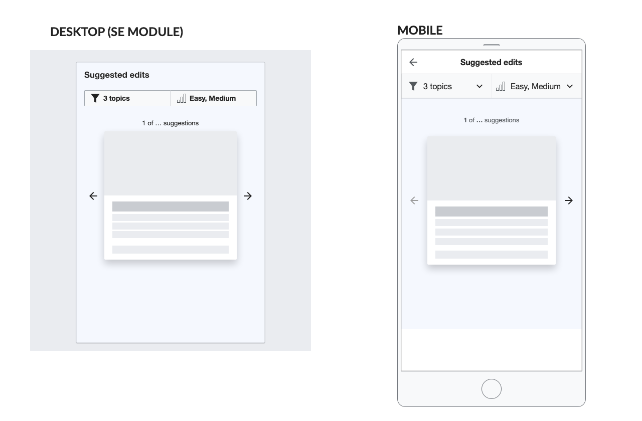
Desktop
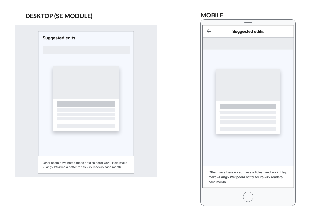
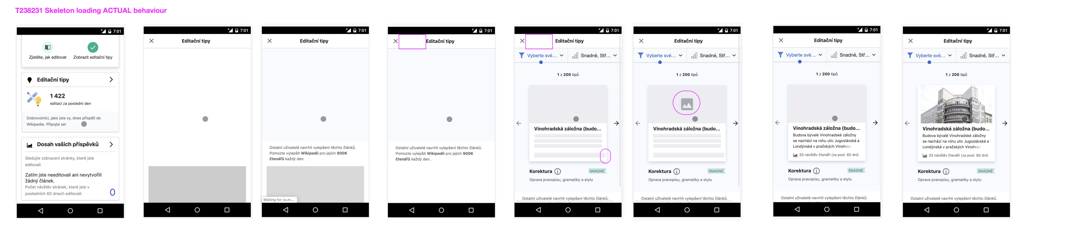
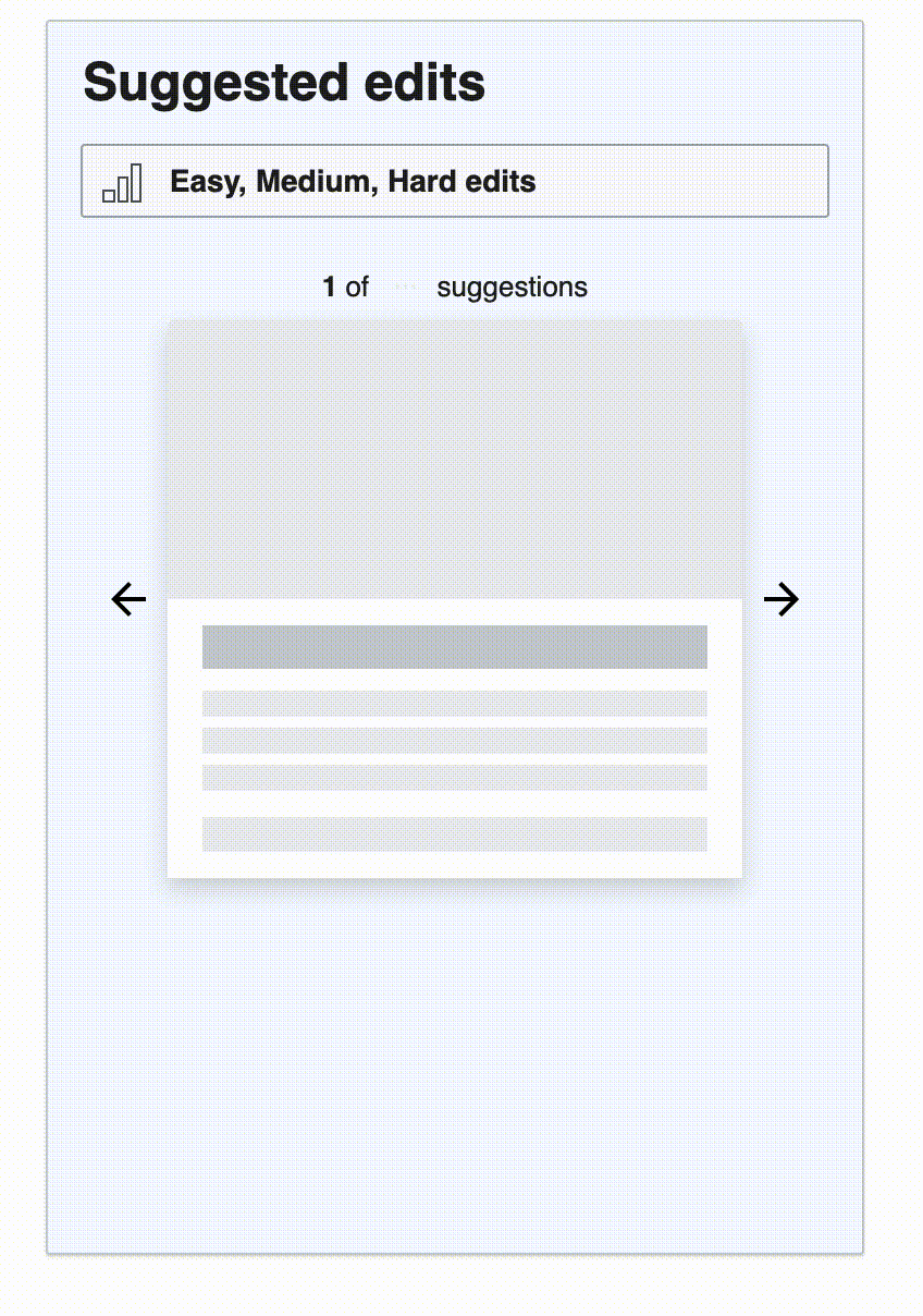
- Suggested edits module loads at the height that it will be when all elements are loaded.
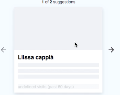
- Pager text will show as 1 of ... suggestions whilst the total number of tasks is being fetched
- The filter bar and skeleton of the article card will load.
- The task type, info icon, difficulty level tag, and task type short description text will be shown after the initial skeleton card is loaded
- The tasks number will be updated with the correct number of tasks
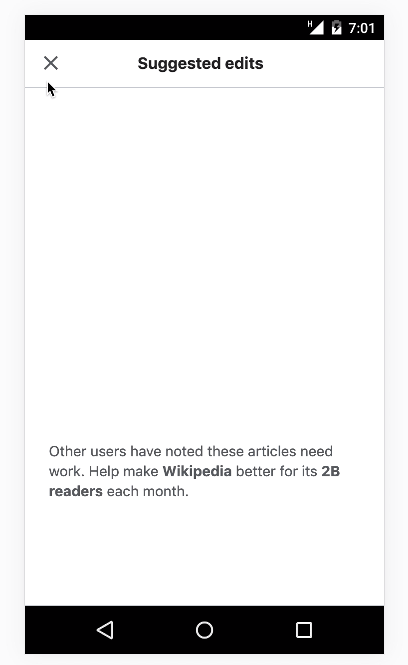
Mobile
- Suggested edits module screen loads with dialog header in place, and the footer in its final position.
- Pager text will show as 1 of ... suggestions whilst the total number of tasks is being fetched
- The filter bar and skeleton of the article card will load in their final position (there should not be any shift in position when the information loads).
- The task type, info icon, difficulty level tag, and task type short description text will be shown after the initial skeleton card is loaded
- The tasks number will be updated with the correct number of tasks
Moved to leftovers task T263040
Our team will work to make the suggested edits module and cards load as quickly as possible. Because there may still be some delay, we should also have a skeleton screen to show during the millisecond of loading.
Proposed design:
https://app.zeplin.io/project/5bd0b069495b5d0a002e7eb6/screen/5dceca39ec737944ea2120d6
zpl://screen?pid=5bd0b069495b5d0a002e7eb6&sid=5dceca39ec737944ea2120d6
... with CSS animation:
https://codepen.io/reets/pen/wvBwGKE
And as animated gif
Notable aspects:
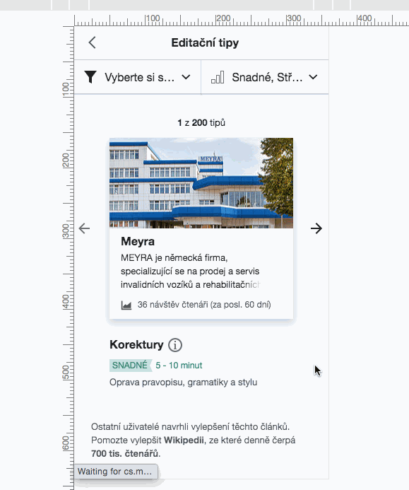
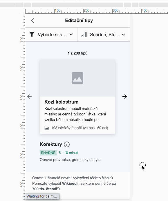
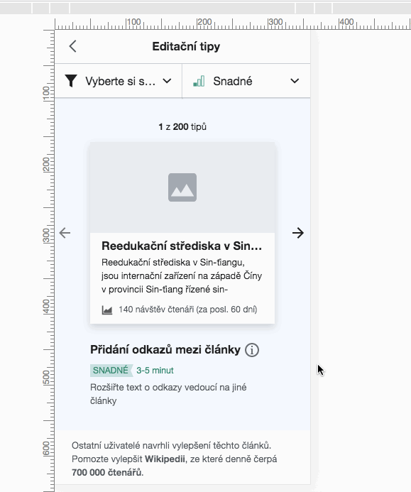
- Pager text will show as 1 of ... suggestions whilst the total number of tasks is being fetched
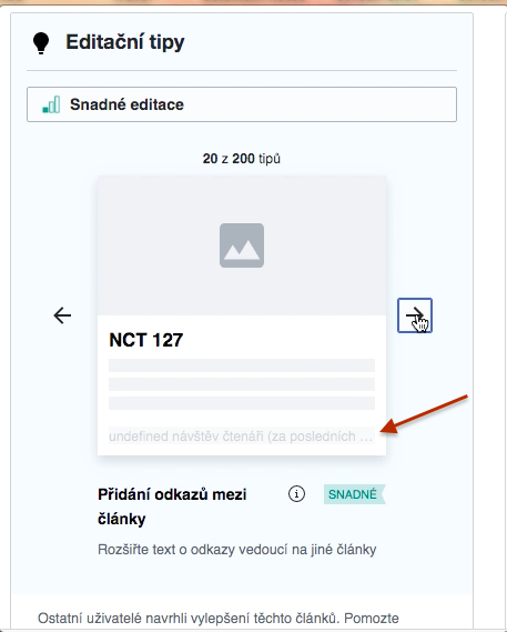
- All elements of the article card will load as a 'skeleton' placeholder grey boxes
- The task type, info icon, difficulty level tag, and task type short description text will be shown (fade in) after the initial skeleton article card is loaded (along with filter bar and pager text)
- The suggested edits white footer section animates in (moving upwards into position) after all other content is loaded - this removes the joltiness with how this section shifts down currently when it is shown first.