Page MenuHomePhabricator

Variant tests: C-mobile
Closed, ResolvedPublic

Assigned To
Authored By
MMiller_WMF
Apr 16 2020, 8:46 PM
Referenced Files
F31921446: image.png
Jul 8 2020, 11:01 PM
F31919148: image.png
Jul 7 2020, 4:05 AM
F31803424: Topics-landscape.svg
May 5 2020, 11:25 AM
F31803425: Topics-landscape@2x.png
May 5 2020, 11:25 AM
F31787098: image.png
Apr 29 2020, 6:22 PM
F31760164: image.png
Apr 16 2020, 8:51 PM

Description

The background for this variant test can be found in T246533: Variant tests: "initiation part 2" test (C vs. D). It contains two versions of the desktop workflow and two versions of the mobile workflow. This task is about Variant C for the mobile.

Mockups

Specifications

  • Start module reduced to only the email submodule. The user does not need to be able to dismiss this.
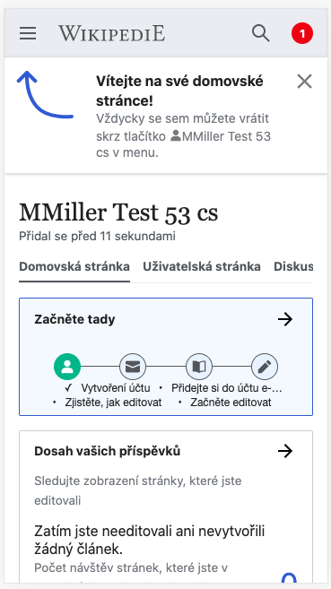
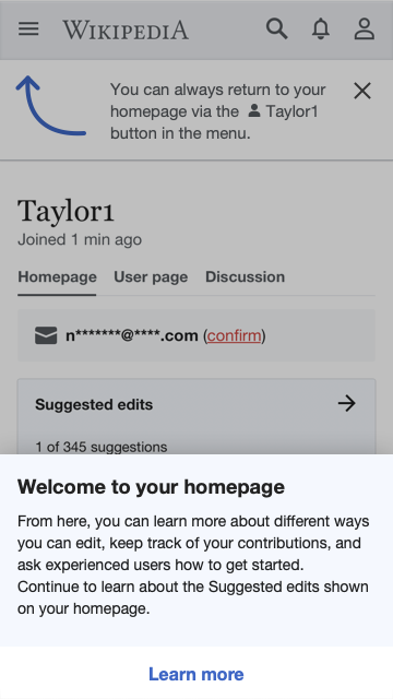
  • When the user first arrives on their homepage, they should get a drawer that comes up from the bottom of the screen. When the drawer is open, the rest of the screen is shaded over.
    • Header: "Welcome to your homepage!"
    • Body: "You can learn to edit, contact your mentor, and see the impact of your work. Continue to learn about the suggested edits on your homepage."
    • The drawer is dismissable by tapping outside of it.
    • The user can tap "Continue" at the bottom to open the onboarding.
    • After the user dismisses the drawer or taps continue, they will never see this drawer again.
    • With the advent of this drawer, we should remove the "Welcome to your homepage!" header on the banner that explains to users how to return, implemented in T224883: Homepage: discovery of homepage after account creation (mobile).
  • Onboarding
SVG PNG@2x
Topics-landscape@2x.png (128×432 px, 9 KB)
    • When the user completes this onboarding, they should be on the full suggested edits module.
    • The module should have an "i" icon in the upper right, which opens up the "Onboarding" sequence again.
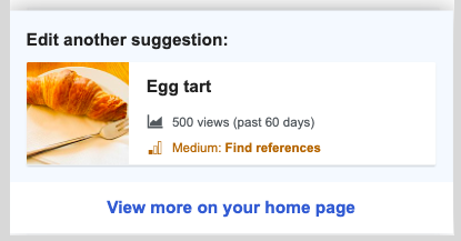
  • Suggested edits preview
    • On the homepage, this variant employs an entirely new suggested edits preview, which shows an actual suggestion in miniature.
    • This is present even when the newcomer arrives for the first time, when the welcome drawer is open.
    • Header: "Suggested edits"
    • Miniature suggestion:
      • This is a mini-version of a suggested edit card from the actual module.
        • It should contains: the article title, title description, image, and task type.
        • It should not contain: a preview of the article content or a pageview count.
      • This should be the actual first suggestion that the user would be seeing in the suggested edits module if they were to navigate there at the time. That means...
        • ...any of the user's existing topic or difficulty filter settings should be applied in choosing the article shown.
        • ...when the user does navigate to the full module, they should see that same article as the first option.
    • Above the miniature suggestion should show the task counter and position in the queue, just as it would in the full suggested edits module, e.g. "1 of 135".
    • Button: "See all suggestions"
    • When the user taps anywhere on the module preview, whether the header, the miniature suggestion, or the call to action button, they should go to the full suggested edits module.
  • Instrumentation
    • This instrumentation happens in addition to the normal homepage instrumentation.
    • We should record an impression event for the welcome drawer.
    • We should record a "close" event for dismissing the drawer.
    • We should record an event for when the user clicks the call-to-action link in the drawer.
    • We should record an event for advancing, going back, and dismissing the onboarding overlays just as we did in Variant A.

Related Objects

Event Timeline

@RHo -- please have a read over this to make sure I got the specifications right and didn't miss anything. I have two open questions:

  • The miniature suggested edit card looks a lot like the miniature card in the post-edit dialog for guidance. Should we make them the same? In guidance, the card has a view count and a colorful difficulty level. In Variant C-mobile, the card does not have those things, but it has a title description. What's the right mixture?
    image.png (217×415 px, 39 KB)
  • In Variant C-desktop, the user can go back through the onboarding overlays by clicking a little "i" at the top of the module. Should there be a similar opportunity for mobile users?

@RHo -- please have a read over this to make sure I got the specifications right and didn't miss anything. I have two open questions:

  • The miniature suggested edit card looks a lot like the miniature card in the post-edit dialog for guidance. Should we make them the same? In guidance, the card has a view count and a colorful difficulty level. In Variant C-mobile, the card does not have those things, but it has a title description. What's the right mixture?
    image.png (217×415 px, 39 KB)

Yes, they will use the same card style as mentioned in T245790 for post-edit dialog in guidance. I've updated to ensure both use the same info.

  • In Variant C-desktop, the user can go back through the onboarding overlays by clicking a little "i" at the top of the module. Should there be a similar opportunity for mobile users?

Also yes! It is on the Suggested edits module on mobile dialog header.

image.png (286×480 px, 50 KB)

@RHo -- similar question as on T250331#6283867. On mobile, when users first visit their homepage from the welcome survey progressive button, they have a banner about how to return there (screenshot below). Would this conflict with the welcome drawer from this mockup?

image.png (657×369 px, 47 KB)

@RHo -- similar question as on T250331#6283867. On mobile, when users first visit their homepage from the welcome survey progressive button, they have a banner about how to return there (screenshot below). Would this conflict with the welcome drawer from this mockup?

image.png (657×369 px, 47 KB)

Similar to my comment on Variant D (T250451#6285213), the existing here's 'how to get back to homepage' banner does conflict a lot more than the desktop version. I propose switching to our tried-and-trusted pulsing blue dot again over the menu icon. This is a pretty well used discovery indicator on mobile menus, with the idea that the first time the user taps on the menu to open the drawer, the same message about returning to the homepage by selecting the username will appear as a pop-up.

OK, so after chatting about this with you @MMiller_WMF a bit more, my new proposal is now to keep the discovery pop-up on var C for both the desktop and this mobile variant as well. The peek will appear *ABOVE* the pop-up and dialog scrim like so:

image.png (640×360 px, 59 KB)

I just updated the task description to simplify the welcome drawer. I will propagate this to the other tasks.