Page MenuHomePhabricator

Variant tests: C-desktop
Closed, ResolvedPublic

Description

The background for this variant test can be found in T246533: Variant tests: "initiation part 2" test (C vs. D). It contains two versions of the desktop workflow and two versions of the mobile workflow. This task is about Variant C for the desktop.

Mockups

Specifications

  • Start module reduced to only the email submodule. The user does not need any option to dismiss it.
  • The initialized suggested edits module will be large-sized, on left side of homepage. It will display the card feed once it is initialized.
  • Suggested edits module
    • The initiated suggested edits module is already present on the page upon arrival, including the pulsing blue dot on the topic filter.
    • The module has an "i" icon in the upper right, which opens up the "Onboarding" sequence described below.
  • Popup
    • This popup (and the one for T250343: Variant tests: D-desktop) obsoletes the popup implemented in T222852: Homepage: discovery of homepage after account creation (desktop) that explains how the user should return to the homepage.
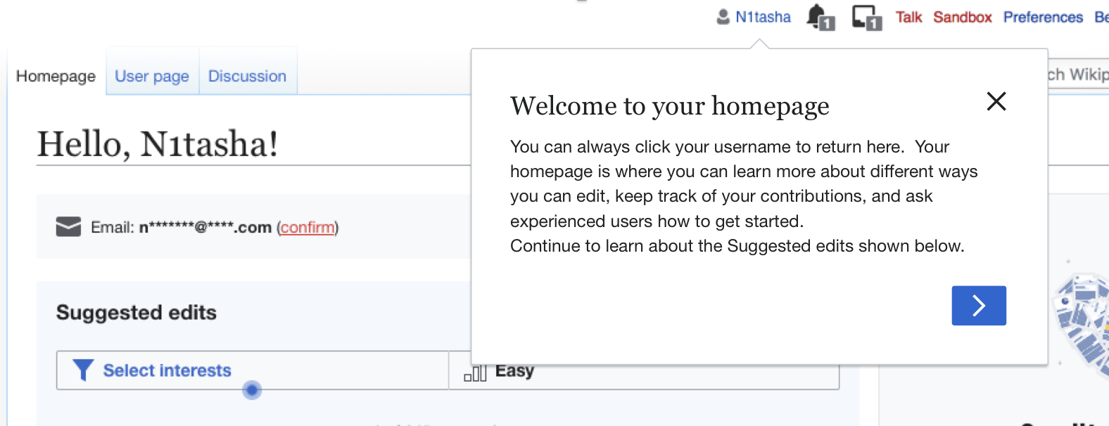
    • When the user first arrives on their homepage, they will see a popup on top of the page that is pointing to their username.
    • Header: "Welcome to your homepage!"
    • Body: "You can always click on your username to return here. Continue to learn about the suggested edits on your homepage."
    • The popup is dismissable with an "X" in the upper right and also by clicking on the screen outside of it.
    • In the lower right, it has a blue arrow button, which initiates the onboarding.
    • After the user dismisses it, they should never see it again.
  • Onboarding
    • When the user clicks the blue arrow button on the popup, they see the first of two onboarding overlays. The first one is an intro overlay that does not have topic selection inside the overlay like in Variant A.
      • Top section: same content as our existing first overlay as implemented in T235723: Newcomer tasks: intro and difficulty overlays ("Suggested edits to get started...Wikipedia is built by people like you...Your edits help improve...")
      • Bottom section
        • Header: "Filter by topic"
        • Body: "Use topics to get suggestions you find interesting. You can choose just one topic or select many."
      • Asset for new intro overlay:
SVG PNG@2x
Topics-landscape@2x.png (128×432 px, 9 KB)
    • They can dismiss the overlay by clicking away.
    • They can click "Continue" to go to the next overlay.
    • The second overlay is the exact same difficulty overlay as implemented in T235723 for Variant A. Its back button returns to the previous overlay.
    • When the user clicks "Done", the overlays and popup are gone, and the user is just on their homepage.
  • Instrumentation
    • This instrumentation happens in addition to the normal homepage instrumentation.
    • We should record an impression event for the popup.
    • We should record a "close" event for dismissing the popups either by the "X" or by clicking away. Along with this event, we want to record whether the user dismissed with the "X" or clicked away.
    • We should record an event for when the user clicks the blue progressive button in the popup.
    • We should record an event for advancing, going back, and dismissing the onboarding overlays just as we did in Variant A.
    • We should record an event if the user clicks the "i" icon to restart the onboarding overlays.

Related Objects

Event Timeline

@RHo -- please have a read over this to make sure I got the specifications right and didn't miss anything. I have two open questions:

  • On the first onboarding overlay in your mockups, there are two sections. The top one has our classic "welcome", and the bottom has new content about topics. That sounds fine, but I want to point out that this leaves no place for personalization related to the welcome survey. Should we leave that out? The alternative is we could revert back to the original intro overlay, which had the "welcome" section up top and the personalized content at the bottom. Like this.
  • After the user confirms their email, should the email mini-module disappear? Or should go into the state where you can "change" your email? Screenshot below from mockup on T219391.

image.png (52×241 px, 3 KB)

@RHo -- please have a read over this to make sure I got the specifications right and didn't miss anything. I have two open questions:

  • On the first onboarding overlay in your mockups, there are two sections. The top one has our classic "welcome", and the bottom has new content about topics. That sounds fine, but I want to point out that this leaves no place for personalization related to the welcome survey. Should we leave that out? The alternative is we could revert back to the original intro overlay, which had the "welcome" section up top and the personalized content at the bottom. Like this.
  • This is intentional for variant C, where we want to re-use the welcome overlays to be accessible always under the "i" icon. I want to avoid personalization referencing a welcome survey that a user may have completed weeks or months ago.
  • After the user confirms their email, should the email mini-module disappear? Or should go into the state where you can "change" your email? Screenshot below from mockup on T219391.

image.png (52×241 px, 3 KB)

  • I think we should make it removable by the user (via an "x" to close the module) it after the user has completed their email, ideally with a toast message letting them know they can change it under their Preferences in future.
  • BTW this reminds me, can we also complete this anonymize email address task T237312 as part of the work?

@RHo -- I made the change to the task description to specify the copy on the first onboarding overlay.

For the email address, could you add the "x" for dismissal to all the mockups? I think it exists on both versions, mobile and desktop, right?

For the email address, could you add the "x" for dismissal to all the mockups? I think it exists on both versions, mobile and desktop, right?

So in T219391, there is no option to dismiss the module entirely, we merely want to we show an icon to toggle expanding/collapsing the Start module, and remove the expand option once the email is confirmed.
I think we should only add this new requirement to enable users who have a confirmed email to dismiss the dialog if we also showed a message telling them where to go once this start/email module is gone from the homepage. Do you think it's important enough at this point to add these dismiss business rules?

@RHo -- in thinking back through these specifications, I realized that the the "welcoming" popup in this variant will conflict with one of the discovery popups, which welcomes the user to the homepage and tells them to click their username to return there. This happens if the user first arrives on their homepage after submitting the welcome survey and then clicking the button on the confirmation screen to go to their homepage. This is actually the majority way that users arrive at the homepage (see this slide).

image.png (834×1 px, 179 KB)

What should we do about this?

Since the idea for Variant C is to use the same guided tour style pop-up that this welcome pop-up is using, I propose updating the existing welcome pop-up to incorporate the new message to learn about suggested edits.

@MMiller_WMF - this would be my revised welcome banner message for var C which incorporates the discovery pop-up message:

image.png (606×1 px, 198 KB)

You can always click your username to return here.  Your homepage is where you can learn more about different ways you can edit, keep track of your contributions, and ask experienced users how to get started. 
Continue to learn about the Suggested edits shown below.

I just updated the task description to simplify the popup. I will migrate these changes to the subtasks.

I will resolve this parent task when the children are resolved.