Page MenuHomePhabricator

Variant C/D: homepage Suggested edits module changes - Mobile
Closed, ResolvedPublic

Description

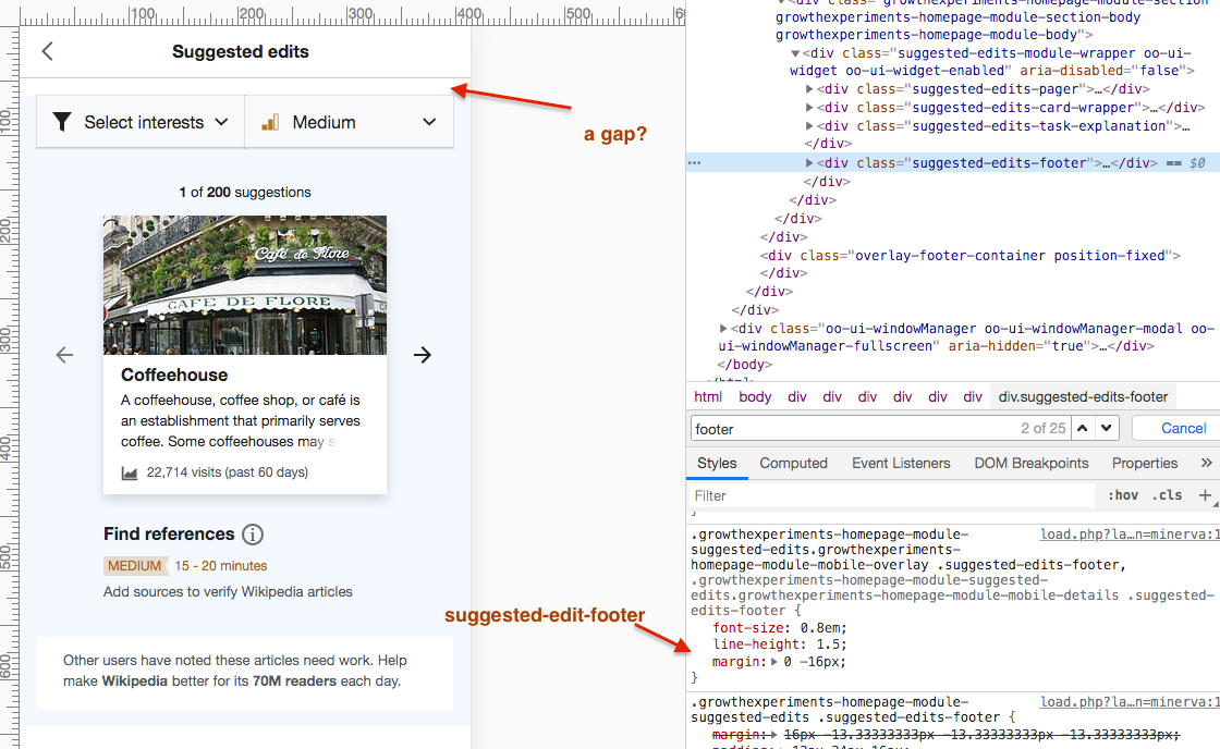
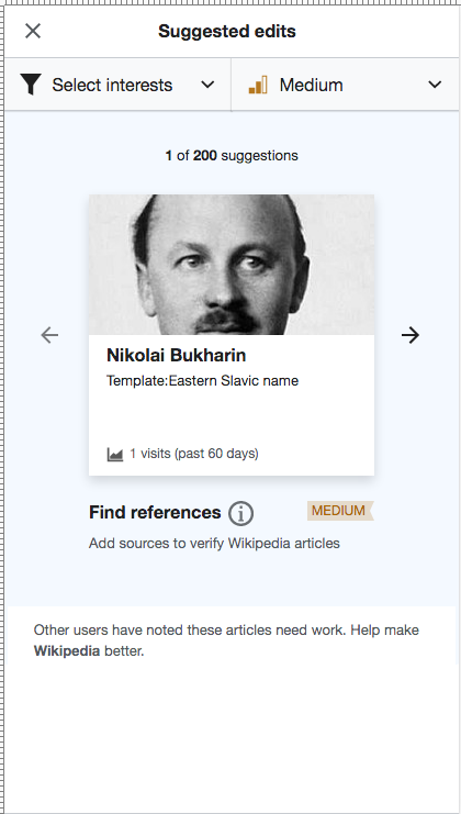
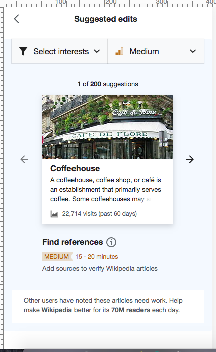
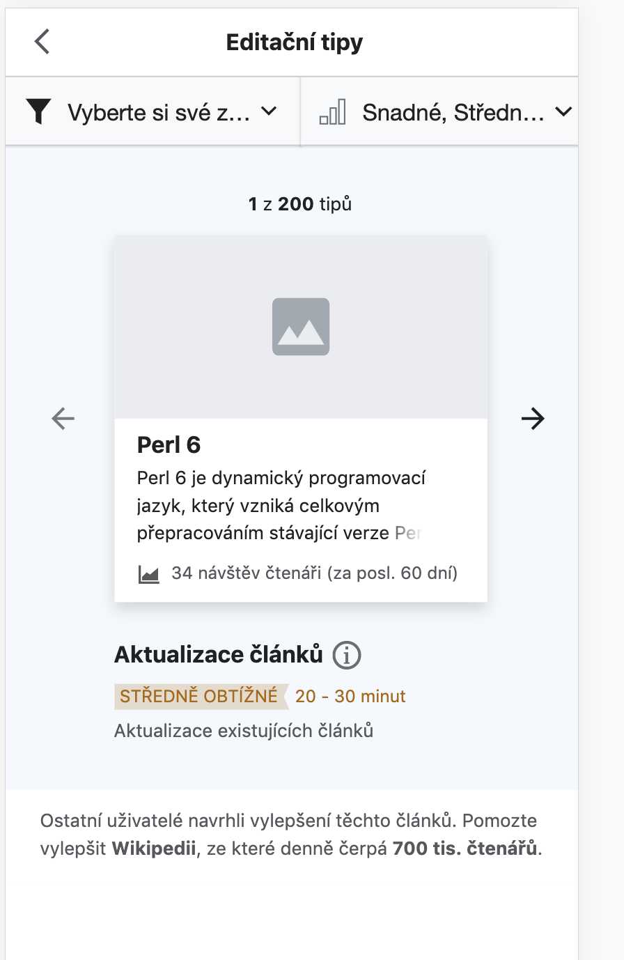
For the variant tests in T246533: Variant tests: "initiation part 2" test (C vs. D), there are changes to the Suggested edits module on mobile that variant C and D have in common.

These are as follows:
A. Add an "i" info icon on the top RHS of the module (vertically centered with the module header) which on click re-opens the onboarding overlay (see T258020)
B. Decrease space between suggested-edits-pager (number of total suggestions) and the card to be 16px;

Currently
image.png (302×596 px, 59 KB)
With 16px
image.png (284×594 px, 60 KB)

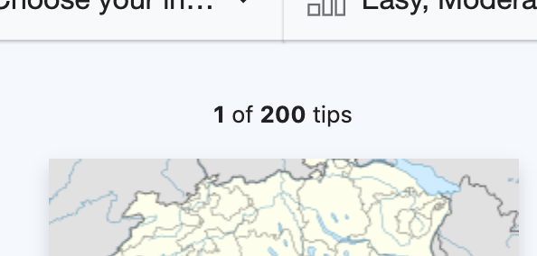
C. Move difficulty indicator 'ribbon' below the task heading (as per guidance panel)
D. Show the estimated time required next to the indicator ribbon (as per the guidance panel)
E. Suggested edits footer should fill flush to the bottom of the module, achievable on mobile by making the suggested-edit-footer margin: 0px -16px;.

Event Timeline

Change 625889 had a related patch set uploaded (by Kosta Harlan; owner: Kosta Harlan):
[mediawiki/extensions/GrowthExperiments@master] [WIP] Suggested Edits: Variant C, add info icon

https://gerrit.wikimedia.org/r/625889

Change 625923 had a related patch set uploaded (by Kosta Harlan; owner: Kosta Harlan):
[mediawiki/extensions/GrowthExperiments@master] Suggested Edits: Footer fills flush to bottom

https://gerrit.wikimedia.org/r/625923

Change 625924 had a related patch set uploaded (by Kosta Harlan; owner: Kosta Harlan):
[mediawiki/extensions/GrowthExperiments@master] Suggested edits: Decrease space between pager and card

https://gerrit.wikimedia.org/r/625924

Change 625923 merged by jenkins-bot:
[mediawiki/extensions/GrowthExperiments@master] Suggested Edits: Footer fills flush to bottom

https://gerrit.wikimedia.org/r/625923

Change 625924 merged by jenkins-bot:
[mediawiki/extensions/GrowthExperiments@master] Suggested edits: Decrease space between pager and card

https://gerrit.wikimedia.org/r/625924

Change 625889 merged by jenkins-bot:
[mediawiki/extensions/GrowthExperiments@master] Suggested Edits: Variant C, add info icon

https://gerrit.wikimedia.org/r/625889

Etonkovidova subscribed.

For Design review - A, B, C, D are done (marked with check marks). Please review E - the blue background is displayed with a gap after overlay-header header :

Screen Shot 2020-09-15 at 3.41.07 PM.png (688×1 px, 325 KB)

The screenshots below just for comparison:

testwikibetalabs
Screen Shot 2020-09-15 at 3.47.55 PM.png (741×420 px, 79 KB)
Screen Shot 2020-09-15 at 3.19.22 PM.png (699×429 px, 161 KB)

Hi @Etonkovidova - I'm not getting the gap in the filters area nor the footer spacing in the screenshots you posted for betalabs today. All items from A to E look good to me on CS betalabs:

image.png (1×896 px, 116 KB)

Would you mind rechecking - maybe something to do with the Vector bugs filed yesterday that seem to have resolved?

Thanks, @RHo - I re-checked - the issue is not present anymore.

Since you said that all items - A-E -are good I've removed and moved to PM review.

This looks good to me in beta. To be resolved when it's in production.