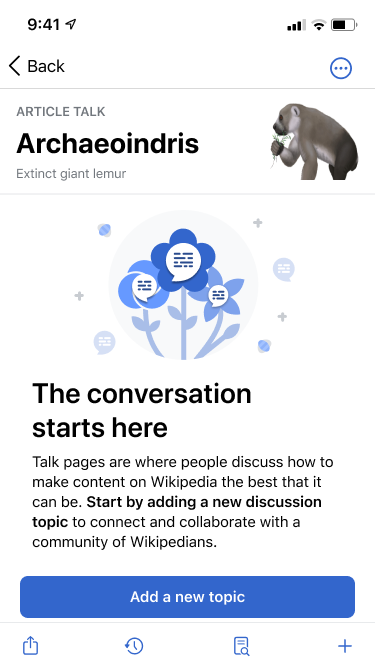
This task represents displaying an empty state on the talk page. Please see parent task for requirements.
Description
Description
| Status | Subtype | Assigned | Task | ||
|---|---|---|---|---|---|
| Resolved | None | T301824 As a reader and editor I need useable and platform appropriate ways to use Talk pages | |||
| Resolved | • JMinor | T310275 Topics: As a contributor/reader, I want to be able to have a brief overview of the main topics on each article talk page. | |||
| Resolved | • JMinor | T311638 Topics: Empty State |
Event Timeline
Comment Actions
Hi!
Doing design review for the empty states.
- For the empty state for an empty talk page:
- Currently, the CTA button is below the fold in smaller screen sizes. In the new design, I decreased the padding around the text and the image size (updated in the Figma file too) to ensure that the button is visible without scrolling.
| in app | new design |
 |  |
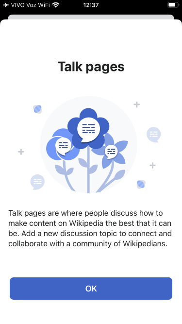
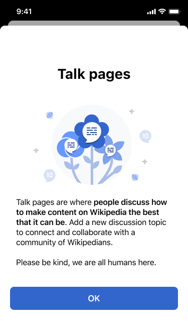
- For the onboarding screen when tapping on the '+' for the first time:
- After tapping on the '+' the topic screen appears first and then a short while after the onboarding screen appears. I was wondering if we could have the onboarding pop-up first?
- Similarly, on smaller screen sizes the last line that states 'Please be kind, we are all humans here', appears below the fold. In the original designs, the image was much smaller to prevent that (I decreased it, even more, to keep it consistent with the size in the empty state.)
- In the designs, some of the text is bolded, but it is not bolded in the app. It would be great to bold the appropriate words shown below.
- The padding around the left/right side of the text is less than it should be, it should be 32pts.
| in app | design |
 |  |
Thanks!
Comment Actions
@OTichonova Thanks for reviewing this work! I'm happy to make these design changes. Just wanted to point something out though - while these updates might make this content appear in a more ideal presentation for this particular device size, there is still possible presentational imperfection inherent in the variety of devices the user may be using or settings they may have enabled.
If the user's using a language that is dramatically more terse or verbose, a dynamic text size that is not at default, a device size that isn't this one in the screenshots, viewing an article with a longer title in the header, or any combination of these, we're back in a situation where the actual presentation is not the desired as designed presentation and may require scrolling (or present excessive whitespace) to view the call to action or interesting text.
I don't immediately have sales figures to reach for, but my previous understanding was that these smaller screen devices are no longer as popular/the norm amongst iPhone users. My recommendation for our future work is to base our ideal presentations on the by majority most popular screen device size.
Comment Actions
Hi @Dmantena,
I hear you, there are many reasons why the CTA might fall below the fold. I would still appreciate it if the changes were made as the 375x667 is a well-known size and designing for smaller screens helps to ensure that the designs are visible on all the following screen sizes.
Going back to things being hidden below the fold - I was speaking with Carolyn and she mentioned that in the past they have added a blur & a flash of a scroller when there was information hidden below the fold. Examples are shown below.
I was wondering if it would be possible to adjust the size of the text/illustration as mentioned in the above comment and add the UI from the examples to help indicate to people (eg. using dynamic type) that there is information below the fold?
| Eg. of fading text & flash of scroller |
 |
Comment Actions
On Wikidata and Commons, the scroll view doesn't scroll properly to hide the header and allow the user to tap the button. It doesn't seem to occur in Wikipedia projects.