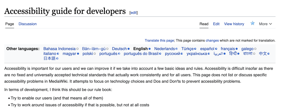
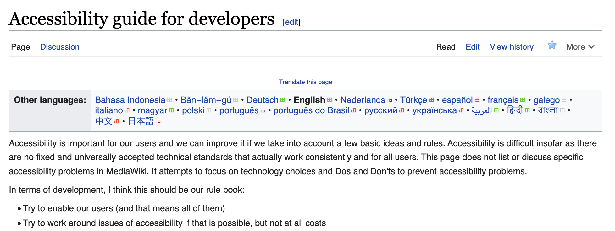
Background
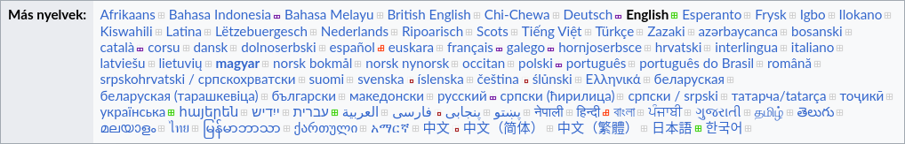
As of now, the translate languages list feels very heavy design-wise, as in it features a lot of emphasized design details.
- A strong border,
- two different background colors, although the two content parts, language headline (boldened) and languages list are dense in itself already
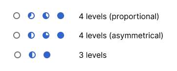
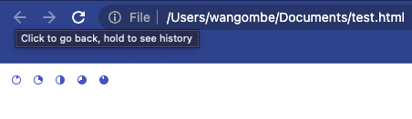
- the information squares about translation progress and the mid dots separating the languages over-emphasizing the area between the languages over themselves
- the translate message atop is set to x-small equaling 10px, which is below our own typographic recommendations
Current
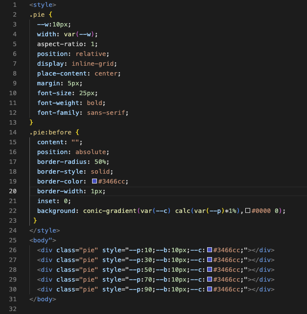
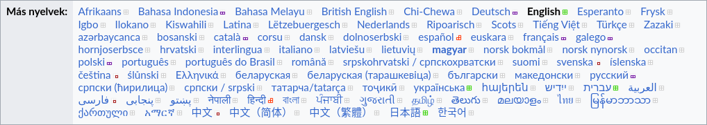
Quick proposal mockup
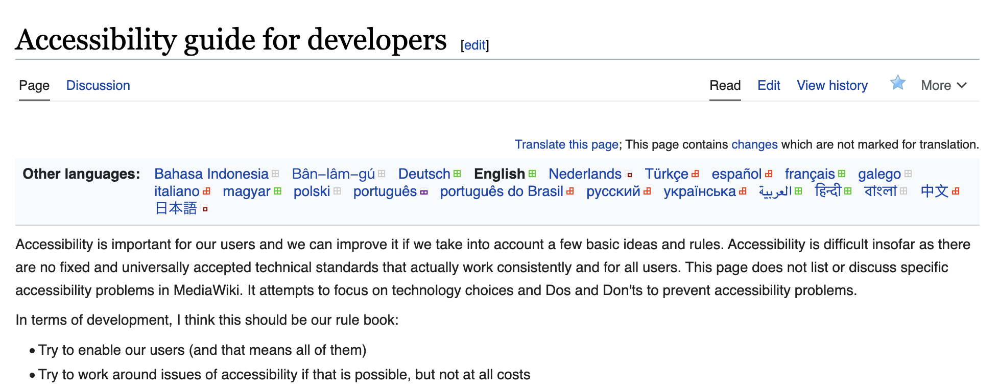
Goal
Better fit the languages list to our current user-interface (Vector 2022) and underlying Wikimedia Design guidelines.