Page MenuHomePhabricator

Improve page translation progress indicators
Closed, ResolvedPublic8 Estimated Story Points

Assigned To
Authored By
Nikerabbit
Feb 7 2023, 12:50 PM
Referenced Files
F41548359: image.png
Nov 30 2023, 10:05 AM
F41548326: image.png
Nov 30 2023, 9:46 AM
F41533603: translatewiki.net_wiki_Help_us(Wiki Tablet).png
Nov 24 2023, 9:50 AM
F41533545: en.wikipedia.org_wiki_Moon(Wiki Tablet).png
Nov 24 2023, 9:50 AM
F41533650: Language_Selector_Designs.pdf.jpg
Nov 24 2023, 9:50 AM
F41533570: Screenshot 2023-11-24 at 10.18.34.png
Nov 24 2023, 9:50 AM
F41531028: image.png
Nov 23 2023, 2:50 PM
F41531019: image.png
Nov 23 2023, 2:50 PM
Tokens
"Love" token, awarded by Remagoxer."Like" token, awarded by Soda."Like" token, awarded by stjn."Like" token, awarded by Quiddity.

Description

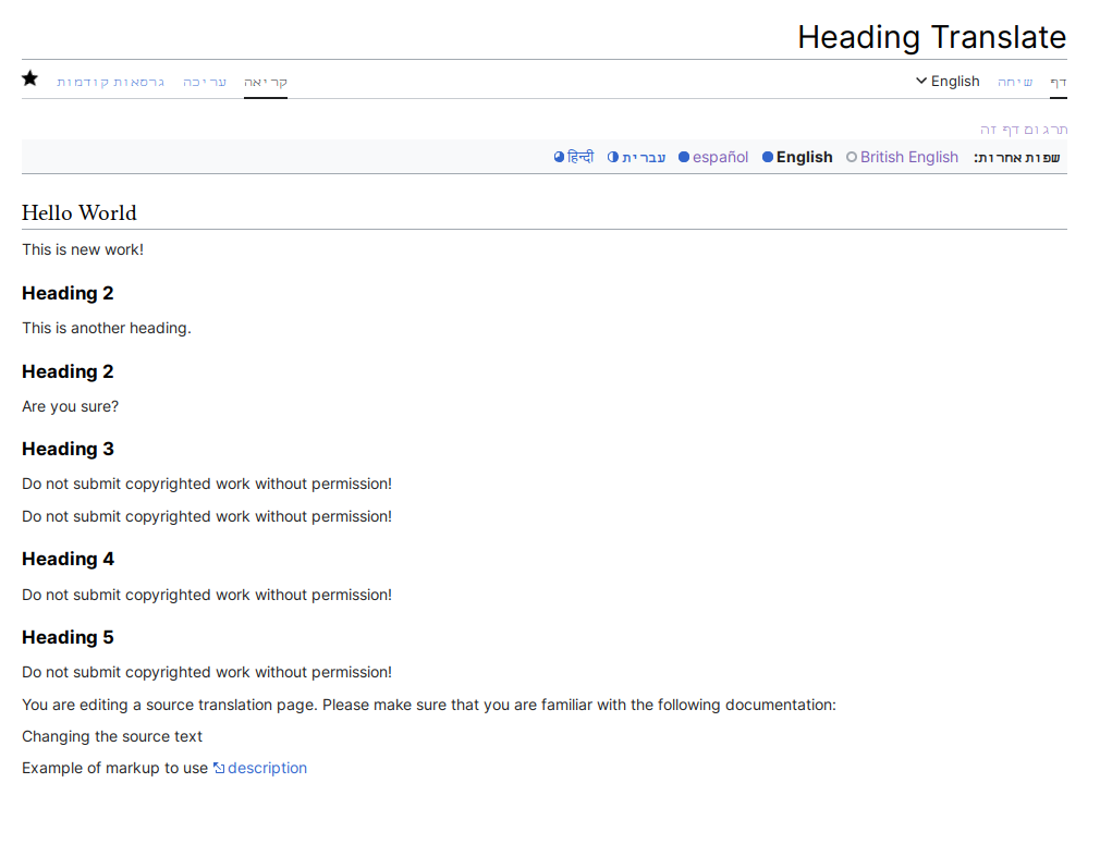
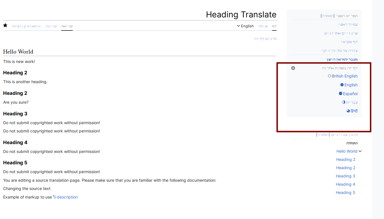
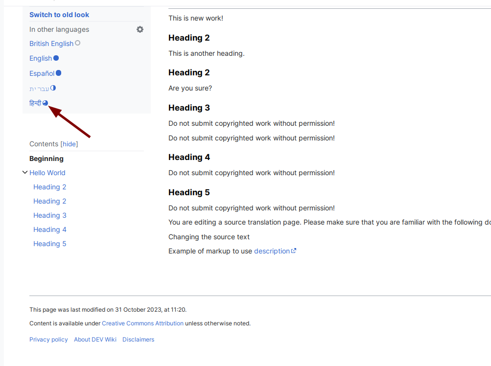
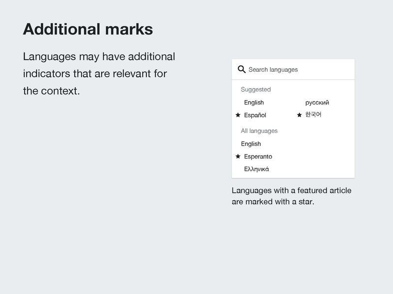
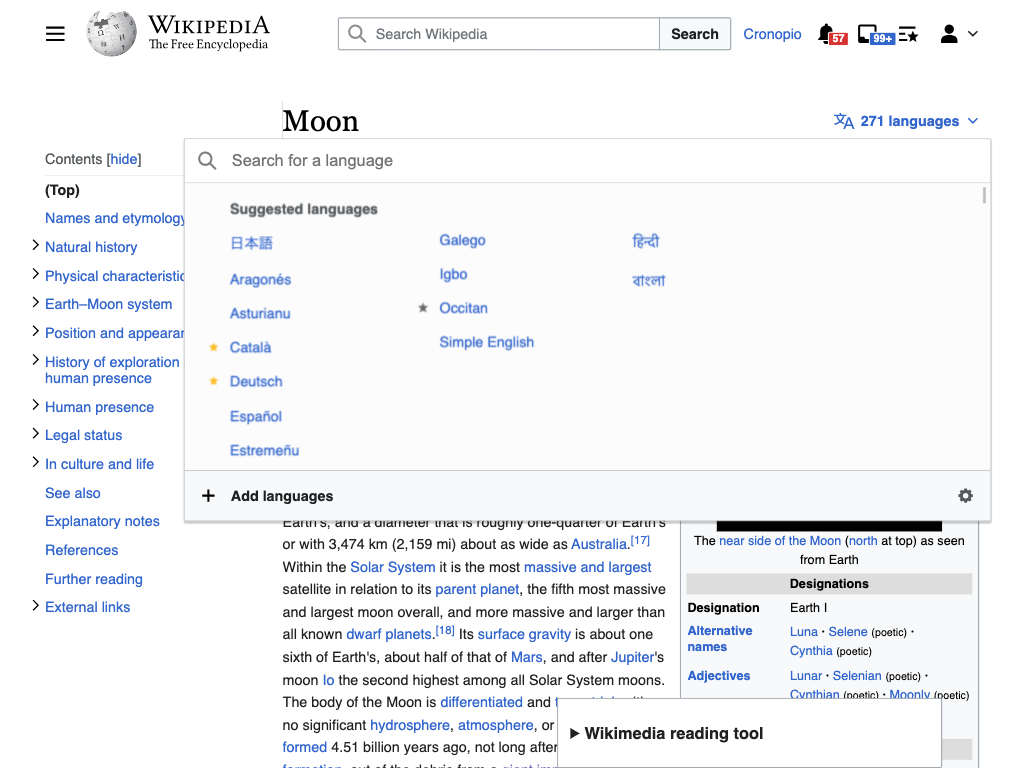
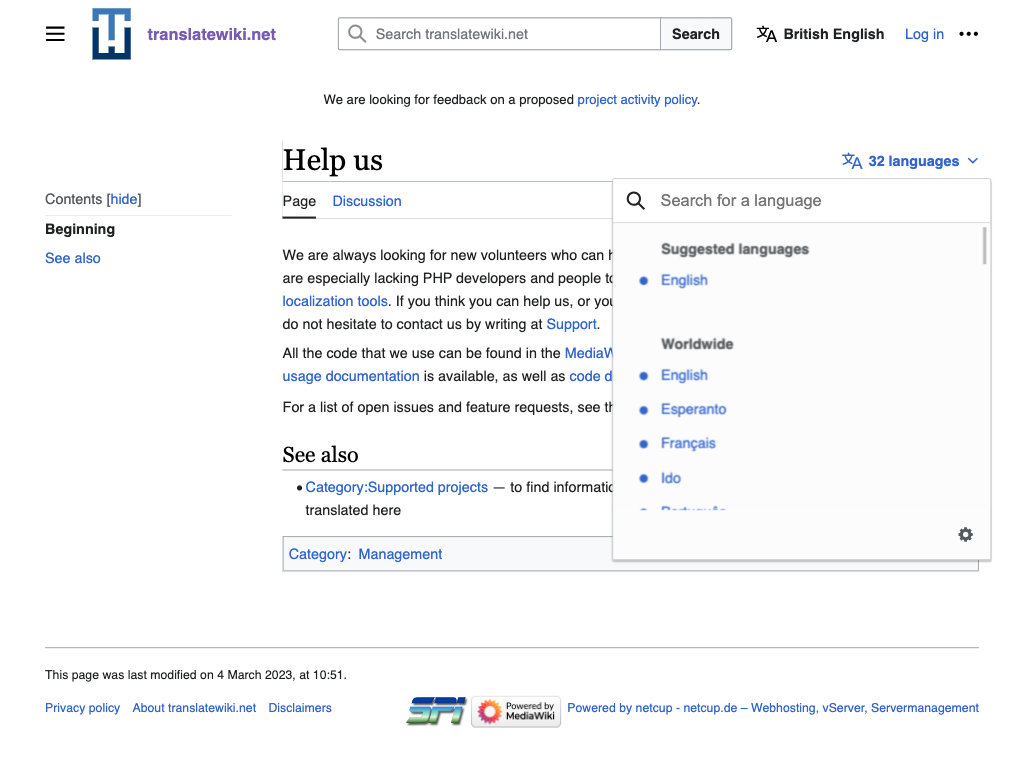
Split of from another task: T313126: Adapt Translate Language header list design

Suggestions in T313126#8427760

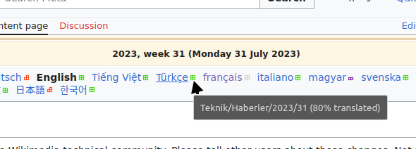
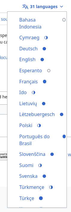
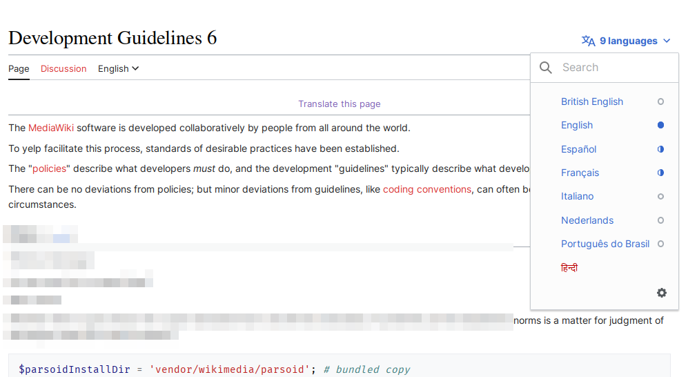
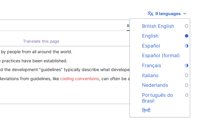
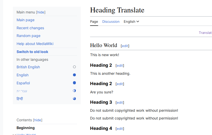
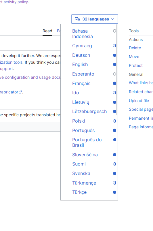
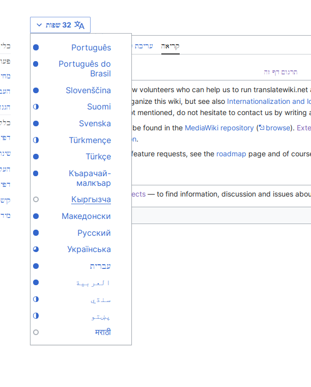
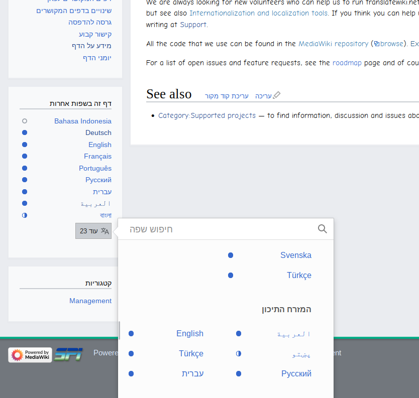
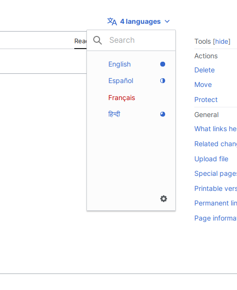
Given that the indicator of completion can be repeated many times, I think it makes sense to simplify it to avoid the list to feel too crowded. Also the current one relies on highlighting the border of small squares so identifying smaller parts is required (which is not ideal).

If we simplify the shape, we may want to consider reducing the number of levels of completion we communicate.
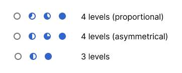
Currently there are five levels (0 colored squares to 4 colored squares). One of the first questions would be to think on how many levels are needed and try to provide a clear meaning (and intention/expectations ) to each of those.

We can think of 4 levels:

  • (Almost or) Not translated. Nothing to consume. Please start translating.
  • Lightly translated. Hard to consume. Contributions very welcome.
  • Mostly translated. Can be consumed. Contributions still welcomed to complete it.
  • (Almost or) fully translated. Ready to consume.

A more radical approach could be based on 3 levels:

  • (Almost or) Not translated. Nothing to consume. Please start translating.
  • Incomplete translation. Consumption incomplete. Contributions welcome.
  • (Almost or) fully translated. Ready to consume.

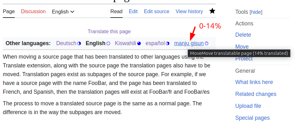
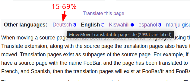
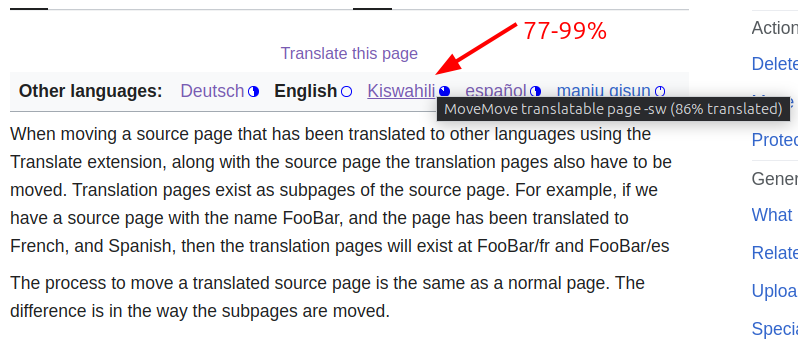
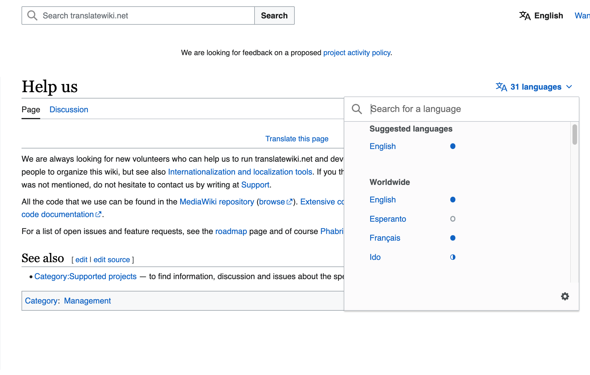
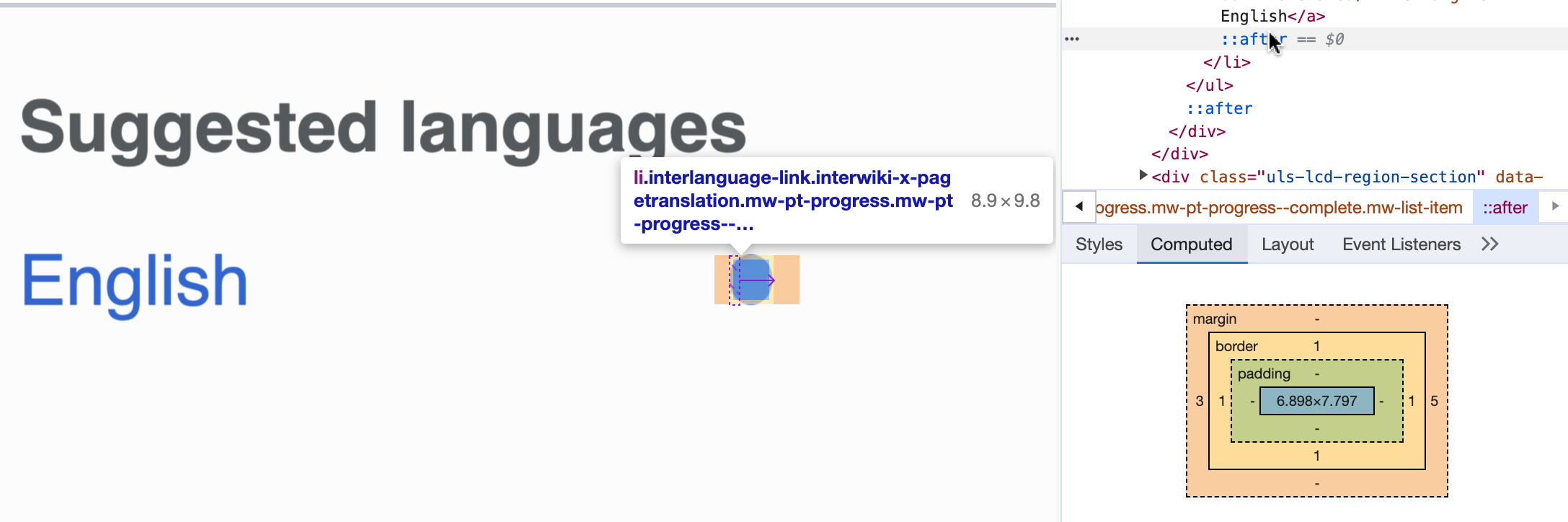
With those levels, using circles partially filled can work well to be recognized. Representations of the different steps can use proportional increments or be more asymmetrical to make them more visually distinct. I tried three approaches illustrated below with some quick examples. There is still room to adjust sizes and pixel-align to improve visibility a bit, but I wanted to share early different directions to answer more fundamental questions first (can we do with three levels or do we need four?) .

Frame 427318204.png (145×362 px, 6 KB)

a) 4 levels (proportional)

4levels-proportional.png (381×978 px, 95 KB)

b) 4 levels (asymmetrical)

4levels-asym.png (381×978 px, 95 KB)

c) 3 levels

3levels.png (381×978 px, 95 KB)

Other people expressed wish to not use buckets at all. This is likely more complicated to implement, given these current approach of using a class name per bucket.

Event Timeline

There are a very large number of changes, so older changes are hidden. Show Older Changes

Copying/Updating my merged task Description:

  • As a reader (& potential translator),
    • Or, as someone who is sending a translatable MassMessage,
  • I want to be able to glance at the <languages> bar and determine if a language is fully translated or only partially translated. This is currently impossible, and I have to mouseover each one, as 75-100% are all the same.

image.png (212×590 px, 23 KB)

Thanks for the input. In the proposals different levels were considered:

  • (Almost or) Not translated. Nothing to consume. Please start translating.
  • Lightly translated. Hard to consume. Contributions very welcome.
  • Mostly translated. Can be consumed. Contributions still welcomed to complete it.
  • (Almost or) fully translated. Ready to consume.

Your input would suggest to make the most complete level to be more strict ("fully translated", that is, 100% complete) as opposed to being bore flexible ("almost/fully completed", which could be 90-100% complete). Does that make sense to you or were you thinking on different ranges to be more useful?

@Pginer-WMF Yup, exactly. I think a distinct "100%" indicator would make it clearest to potential translators if there is anything missing, and thus give impetus to complete a partially-done page. Otherwise, a page with 10 sections but a single missing translation for a newly added "== Updates ==" section might be overlooked, because the translator glanced at the header-bar and saw the 'almost complete' indicator but interpreted the fully-filled-circle as indicating 'complete'.

Wangombe changed the task status from Open to In Progress.Sep 12 2023, 7:32 AM
Wangombe claimed this task.

@Wangombe, based on the above feedback we could go initially with the "4 levels (asymmetrical)" approach with the following ranges (assuming the percentages don' have decimals, or rounding is used if they internally do):

  • 0-14%
  • 15-69%
  • 70-99%
  • 100%

Frame 427318204.png (91×724 px, 8 KB)

For the 3rd level I adjusted the representation to increase a bit the white portion to be more distinguishable at smaller sizes (using a white portion of 100° instead of 90°.
An example in a more realistic scenario:

4levels-asym.png (381×978 px, 95 KB)

`

I wonder if the color of the circles might be considered/tested a bit, or details shared about the reasons behind the change to blue?
I.e. I'd be curious to see the new designs but using green instead of blue.
Context: I find the current green icons are helpfully distinct from the blue text, and this makes it easy to skim the icons -- this is useful for someone like me where that (completion-status) is usually my main interest, versus trying to find a specific language.
It might also be helpful for folks who are trying to find a specific language, as the green might provide clearer separation of words. Especially in a page with many dozens of translations, such as Meta-wiki's Main Page or Meta:Babylon.

Change 957285 had a related patch set uploaded (by Wangombe; author: Wangombe):

[mediawiki/extensions/Translate@master] Improve page translation progress indicators

https://gerrit.wikimedia.org/r/957285

Nikerabbit set the point value for this task to 8.Oct 10 2023, 11:27 AM

Here are some results of the implementation.

0-14%15-69%77-99%100%
image.png (402×941 px, 92 KB)
image.png (269×630 px, 51 KB)
image.png (345×798 px, 79 KB)
image.png (331×896 px, 70 KB)

Here are some results of the implementation.

0-14%15-69%77-99%100%
image.png (402×941 px, 92 KB)
image.png (269×630 px, 51 KB)
image.png (345×798 px, 79 KB)
image.png (331×896 px, 70 KB)

Good progress! Some quick comments about minor aspects to adjust:

The symbol for the 0-14% range:

  • The Base30 (#72777D) from the color palette should be used instead of blue to better communicate the notion of incompleteness.
  • The current implementation shows a small segment filled. The proposal for this range is to show only the border of the circle without any completed segment. This simplifies the shapes for quick visual scanning.

The rest of the symbols:

  • The Accent50 (#3366CC) from the color palette should be used for the blue color elements.

For the 15-69% range:

  • The circle should be 50% filled. Currently it seems it is a bit less (maybe that's a pixel alignment issue)

For the 77-99% range:

  • The circle should be 70% filled. Currently the filled area is larger getting visually too close to the completed state.

For the 15-69% range:

  • The circle should be 50% filled. Currently it seems it is a bit less (maybe that's a pixel alignment issue)

Depending on the screen resolution of the user, the fill might appear with a jagged edge. I tested this by increasing and decreasing the zoom percentage of the test page.

image.png (175×699 px, 27 KB)

I wonder if the color of the circles might be considered/tested a bit, or details shared about the reasons behind the change to blue?
I.e. I'd be curious to see the new designs but using green instead of blue.
Context: I find the current green icons are helpfully distinct from the blue text, and this makes it easy to skim the icons -- this is useful for someone like me where that (completion-status) is usually my main interest, versus trying to find a specific language.
It might also be helpful for folks who are trying to find a specific language, as the green might provide clearer separation of words. Especially in a page with many dozens of translations, such as Meta-wiki's Main Page or Meta:Babylon.

The idea was to start simple by using a simple progress indicator to avoid additional noise. A list of languages in this context can result in significant repetition, and we may need to be careful about how many signals we use and how prominent those are.

Trying som examples based on real data will be helpful to understand whether we need to increase the prominence of this indicator.

For the 15-69% range:

  • The circle should be 50% filled. Currently it seems it is a bit less (maybe that's a pixel alignment issue)

Depending on the screen resolution of the user, the fill might appear with a jagged edge. I tested this by increasing and decreasing the zoom percentage of the test page.

image.png (175×699 px, 27 KB)

Thanks for the clarification.
I also noticed that the image incorporates most of the provided feedback. One aspect I noticed is that the the symbol for the 0-14% range seems to be using a filled grey circle. The intention was to have a border-only circle in grey.

Context: I find the current green icons are helpfully distinct from the blue text, and this makes it easy to skim the icons -- this is useful for someone like me where that (completion-status) is usually my main interest, versus trying to find a specific language.

Since the new version is CSS-only, you can always override the colors in your common.css/global.css file.

LTRRTL
image.png (226×670 px, 30 KB)
image.png (206×670 px, 26 KB)

Here are the results. I believe all the cases have been captured with the current implementation.

I believe you, but I’d like to note that no RTL translation pages are visible on the screenshot, so only two out of four cases (LTR-on-LTR and LTR-on-RTL) are tested.

Few more screenshots from Firefox (118.0.2 (64-bit)) on Arch Linux:

Case 1: RTL with an RTL language translation:

image.png (775×1 px, 62 KB)

Case 2: Language bar in the sideabar with RTL:

image.png (769×1 px, 80 KB)

Case 3: Language bar in the sidebar with LTR:

image.png (748×1 px, 79 KB)

Minor issue: I'm noticing a minor glitch with the "high" translation representation at 100% zoom level when the language bar is displayed in the sidebar. Similar issue can be noticed at various zool levels on Firefox. Not able to reproduce this on Chromium.

There are also known issues with anti-aliasing for gradients on Chromium based and Firefox browser.

I also noticed that the unfilled part is on the left both using Hebrew and English UI. It should probably be on opposite sides.

I also noticed that the unfilled part is on the left both using Hebrew and English UI. It should probably be on opposite sides.

I got an opinion from a native speaker that it's okay to keep it as it is. It's just N=1 but I'd go with the current implementation for now.

Okay, let’s go with this then (unless someone raises concerns before the patch is merged). It can always be reconsidered later, should concerns arise.

Change 957285 merged by jenkins-bot:

[mediawiki/extensions/Translate@master] Improve page translation progress indicators

https://gerrit.wikimedia.org/r/957285

Change 972932 had a related patch set uploaded (by Wangombe; author: Wangombe):

[mediawiki/extensions/Translate@master] Remove unused resource, update .mw-pt-progress--low

https://gerrit.wikimedia.org/r/972932

Change 972932 merged by jenkins-bot:

[mediawiki/extensions/Translate@master] Remove unused resource, update .mw-pt-progress--low

https://gerrit.wikimedia.org/r/972932

After TranslateWiki deployment, the icons appear as below. This link showcases the changes implemented from this ticket

Screen Shot 2023-11-09 at 16.20.18 PM.png (1×2 px, 283 KB)

I happened to open the page in a browser with NoScript, and it doesn’t look great. ☹️ The indicators of languages whose names don’t fit in one line are on the far right (actually in the overlay scrollbar area, so I don’t see the icons while scrolling). While I didn’t try using the language selector on a translatable page using Vector 2022 and disabled JavaScript before, so I don’t know how it looked like, I do remember that on Timeless, all icons were on the far right, and now aren’t, so probably the Vector 2022 inconsistency is also a regression caused by this redesign.

Screenshot 2023-11-09 at 15-10-12 Help us - translatewiki.net.png (707×238 px, 36 KB)

Adding

.mw-pt-progress > a {
	flex-grow: 1;
}

fixes Timeless and makes no-JS Timeless more consistent (all indicators below the scrollbar – adding some padding/margin could fix this), but I didn’t test it on other skins or the output of <languages/>.

There's some feedback at https://www.mediawiki.org/wiki/Topic:Xtiir7e6iubumeqq asking for the CSS needed to replace the new styling with something less prominent.

There's some feedback at https://www.mediawiki.org/wiki/Topic:Xtiir7e6iubumeqq asking for the CSS needed to replace the new styling with something less prominent.

Replied there.

Change 975804 had a related patch set uploaded (by Abijeet Patro; author: Abijeet Patro):

[mediawiki/extensions/Translate@master] Tweak CSS for page translation progress indicator

https://gerrit.wikimedia.org/r/975804

Some test with the latest patch:

Normal on Vector:

image.png (546×1 px, 62 KB)

Vector 2022 with JS disabled:

image.png (443×664 px, 35 KB)

Vector 2022 with VectorLanguageInHeader as false and PageTranslationLanguageList = 'sidebar-only'.

image.png (522×819 px, 57 KB)

With the language bar

image.png (339×991 px, 54 KB)

Timeless: language bar

image.png (259×1 px, 38 KB)

Timeless: sidebar

image.png (621×1 px, 62 KB)

Change 975804 merged by jenkins-bot:

[mediawiki/extensions/Translate@master] Tweak CSS for page translation progress indicator

https://gerrit.wikimedia.org/r/975804

Here's a screenshot from https://translatewiki.net/wiki/Help_us with the latest changes deployed:

Vector 2022 with JS enabled:

image.png (642×1 px, 64 KB)

Vector 2022 with JS disabled:

image.png (801×532 px, 62 KB)

Vector 2022 with JS disabled and an rtl interface language:

image.png (760×611 px, 62 KB)

Timeless with an rtl language:

image.png (793×834 px, 71 KB)

Leaving the task open for any additional feedback from users.

Thanks for the fix! The margin of the non-ULS language switcher is still odd, but it’s probably okay for a fallback solution. (And even if it isn’t, it looks like something to fix in Vector, not in Translate.)

Here's a screenshot from https://translatewiki.net/wiki/Help_us with the latest changes deployed...

Thanks for sharing the examples. I noticed some aspects that we may consider adjusting:

Shape and size of the circles

Looking at the circles, they are not always perfectly round. I inspected the size and found that the height and the width are not of the same value when computed in pixels:

Screenshot 2023-11-24 at 10.18.34.png (724×2 px, 171 KB)

The issue seems to be related with the use of "em" units. When I replaced them with "rem" instead, the circle appears with a more round shape.

In addition, the circles appear a bit large with respect to the text. Using 0.5rem as the size makes their size more harmonious with the text.

Placement in the language selector

Currently the indicators are placed after the language labels in the language selector. The language selector has space reserved for this kind of indicators before the labels. This is used on Wikipedia for signals such as featured/good article.

Spec showing the placement of indicatorsExample from Wikipedia
Language_Selector_Designs.pdf.jpg (599×799 px, 32 KB)
en.wikipedia.org_wiki_Moon(Wiki Tablet).png (768×1 px, 205 KB)

Conclusion

With the above changes the the language selector would look like this:

translatewiki.net_wiki_Help_us(Wiki Tablet).png (768×1 px, 147 KB)

If the adjustments are not trivial, we can move the proposal into a separate ticket.

The issue seems to be related with the use of "em" units. When I replaced them with "rem" instead, the circle appears with a more round shape.

In addition, the circles appear a bit large with respect to the text. Using 0.5rem as the size makes their size more harmonious with the text.

Using rems would worsen the circle-to-text-ratio situation: the em specifies the size in terms of font size of the current element, while rem specifies it in terms of the font size of the HTML element. The ratio between the two varies across skins (em calculated on the <a> elements of the interlanguage links):

  • Vector 2010: 1em = 0.75rem
  • Monobook: 1em ≈ 0.86rem (75%×127%×95%×95%)
  • Vector 2022 (ULS or fallback language selector): 1em = 0.875rem
  • Timeless: 1em = 0.9025rem (95%×95%)

The rem value that looks good on Vector 2010, is way too small on Timeless, and conversely, a value appropriate for Timeless is huge on Vector 2010.

Currently the indicators are placed after the language labels in the language selector. The language selector has space reserved for this kind of indicators before the labels. This is used on Wikipedia for signals such as featured/good article.

I’ve thought about this, but I thought that they would be too prominent if placed before the links (only a small portion of languages have featured/good articles on a given subject, while all translations have progress levels, which results in much more indicators). However, looking at your mockup, it isn’t that bad, so it may be worth implementing it and evaluating it on other skins as well.

Thanks for the feedback, @Tacsipacsi.

Using rems would worsen the circle-to-text-ratio situation...

Good points. Maybe the change of unit is not the way to go. I was surprised to see that an element with the same width and height expressed in Ems was rendered with different sizes. Given that Ems can be problematic in some contexts, I tried the "similar" Rem unit. But I'd be ok with any technical solution that make the circles a bit rounder.

I’ve thought about this, but I thought that they would be too prominent if placed before the links (only a small portion of languages have featured/good articles on a given subject, while all translations have progress levels, which results in much more indicators). However, looking at your mockup, it isn’t that bad, so it may be worth implementing it and evaluating it on other skins as well.

Having the circles closer to the labels helps to perceive them more sa a unit, making the perception of being a lower number of elements (i.e., looking simpler). For cases where the language selector has many languages, andl multiple columns are used, placing the indicators after the label in the first column would make them closer to the labels of the second column, creating potential confusion too.

Change 979028 had a related patch set uploaded (by Abijeet Patro; author: Abijeet Patro):

[mediawiki/extensions/Translate@master] Translation progress indicators: Do not shrink the circles

https://gerrit.wikimedia.org/r/979028

I've figured out the reason why the circles were not perfectly round, and submitted a patch to fix it. Screenshot from my local:

image.png (597×488 px, 27 KB)

See: https://stackoverflow.com/a/37818560 for more details.

Other issue I noticed is that the space between red links and blue links is inconsistent:

image.png (96×1 px, 19 KB)

This seems to be caused by the margin-inline-end that has no equivalent for the red languages.

Change 979028 merged by jenkins-bot:

[mediawiki/extensions/Translate@master] Translation progress indicators: Do not shrink the circles

https://gerrit.wikimedia.org/r/979028

Marking this as done. We've created other tasks to handle follow-ups.