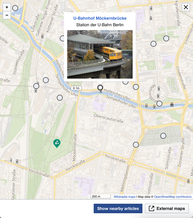
Background
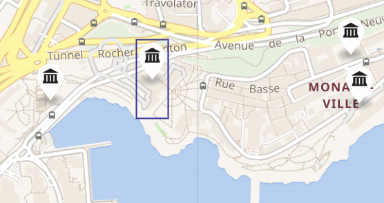
Markers added by the show nearby feature will overlay any annotations in Kartographer maps created by users. They need to be styled in a way that there is no chance that will look the same as a user-created marker, but they should also look different to signal that they are a different category of markers. Following the pattern set by the iOS places tab, the markers will be circular instead of teardrop shaped. Styling general follows the neutral normal button patterns, see figma for details.
Requirements
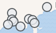
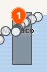
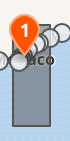
- All show nearby markers representing articles should be styled differently than default Kartographer markers
- Marker have different states for:
- default, hover
- focus, active/selected
- clustered implemented in T308227: Visually grouping/un-grouping markers on zoom in nearby feature
- Markers have an increased click/touch area
Specifications
~ Specs are located in the figma file