Page MenuHomePhabricator

Display event time on event details modal on event page
Closed, ResolvedPublic1 Estimated Story Points

Description

As a campaign participant, I want the time zone to be clearly displayed in the registration modal, so that I know when the event is taking place and I can make a decision about whether or not I can potentially attend.

Acceptance Criteria:

  • Display event time zone on event page (registration modal when user clicks on 'more details') in the following way:
    • In person events: timezone specified by organizer when configuring registration form
    • Online and hybrid events:
      • If user logged in: time zone set in preferences
    • If user logged out: default time zone of wiki
  • Time zone options include geographic time zone and UTC offset
  • Time zone should be on a separate line from date/time of event

Visual examples:

Timezone design (View Design Specs)
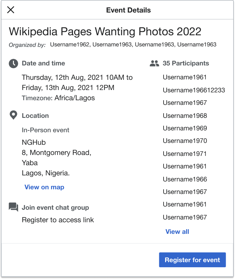
More details - In-person only.png (902×760 px, 94 KB)

Event Timeline

Change 853296 had a related patch set uploaded (by Daimona Eaytoy; author: Daimona Eaytoy):

[mediawiki/extensions/CampaignEvents@master] Choose appropriate timezone in EventTimeFormatter

https://gerrit.wikimedia.org/r/853296

Change 853310 had a related patch set uploaded (by Daimona Eaytoy; author: Daimona Eaytoy):

[mediawiki/extensions/CampaignEvents@master] Display timezone in "more details" modal on event pages

https://gerrit.wikimedia.org/r/853310

Daimona changed the point value for this task from 2 to 1.Nov 4 2022, 3:51 PM

Turned out to be easier than I thought.

Change 853296 merged by jenkins-bot:

[mediawiki/extensions/CampaignEvents@master] Choose appropriate timezone in EventTimeFormatter

https://gerrit.wikimedia.org/r/853296

Change 853310 merged by jenkins-bot:

[mediawiki/extensions/CampaignEvents@master] Display timezone in "more details" modal on event pages

https://gerrit.wikimedia.org/r/853310

Display event time zone on event page (registration modal when user clicks on 'more details') in the following way:

✅ In person events: timezone specified by organizer when configuring registration form
Testing with this event
Timezone set as America/Chicago by organizer:
Logged in user with timezone set as different than event time zone:

Screen Shot 2022-11-15 at 4.33.18 PM.png (974×1 px, 150 KB)

Logged out:

Screen Shot 2022-11-15 at 4.33.38 PM.png (994×1 px, 178 KB)


Online and hybrid events:
screenshots are from this event
✅ If user logged in: time zone set in preferences

Screen Shot 2022-11-15 at 11.44.28 PM.png (1×1 px, 133 KB)

✅ If user logged out: default time zone of wiki
Screen Shot 2022-11-15 at 11.44.38 PM.png (1×1 px, 134 KB)

✅ Time zone options include geographic time zone and UTC offset
✅ Time zone should be on a separate line from date/time of event

@Daimona @vaughnwalters The timezone for 'If user logged out: default time zone of wiki' just shows the offset and not the full timezone, it should be UTC, UTC+01:00, UTC+02:00. Just writing the offset doesn't tell the user what timezone it is.
Also, the Timezone heading font weight is medium, not bold. and should have the same color/opacity of the 'Start date and time' heading

@Daimona @vaughnwalters The timezone for 'If user logged out: default time zone of wiki' just shows the offset and not the full timezone, it should be UTC, UTC+01:00, UTC+02:00. Just writing the offset doesn't tell the user what timezone it is.

This is technically not correct. "+XX:XX" is a standard designation of timezones, see https://en.wikipedia.org/wiki/Time_zone#ISO_8601, as well as the article on ISO 8601 and that on UTC offsets. So I would argue that what is shown is the full timezone, and it should give the user all the information they need. That said, maybe the average user would be more familiar with "UTC+XX" rather than "+XX:XX". The problem is, the former is language-dependent; in particular, different languages can have different words for "UTC". We may look into this, but maybe that should be its own task.

Also, the Timezone heading font weight is medium, not bold. and should have the same color/opacity of the 'Start date and time' heading

It's using a 'strong' tag to denote the importance of the label, which happens to be styled in bold. Maybe it can be worked on as part of T322962?

The problem is, the former is language-dependent; in particular, different languages can have different words for "UTC".

For instance, see the names of the Wikipedia articles for "UTC+1" across all languages.

Boldly closing this, since a follow-up task to address the remaining issues was created: T325300.