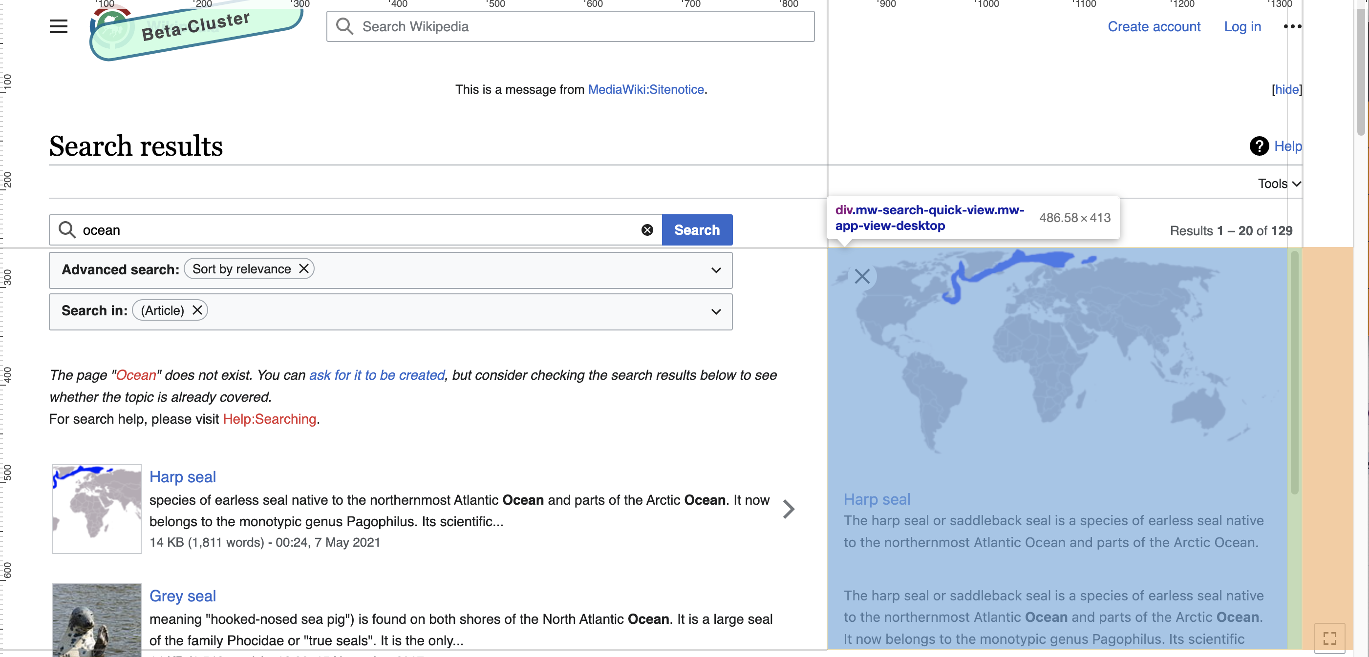
Problem
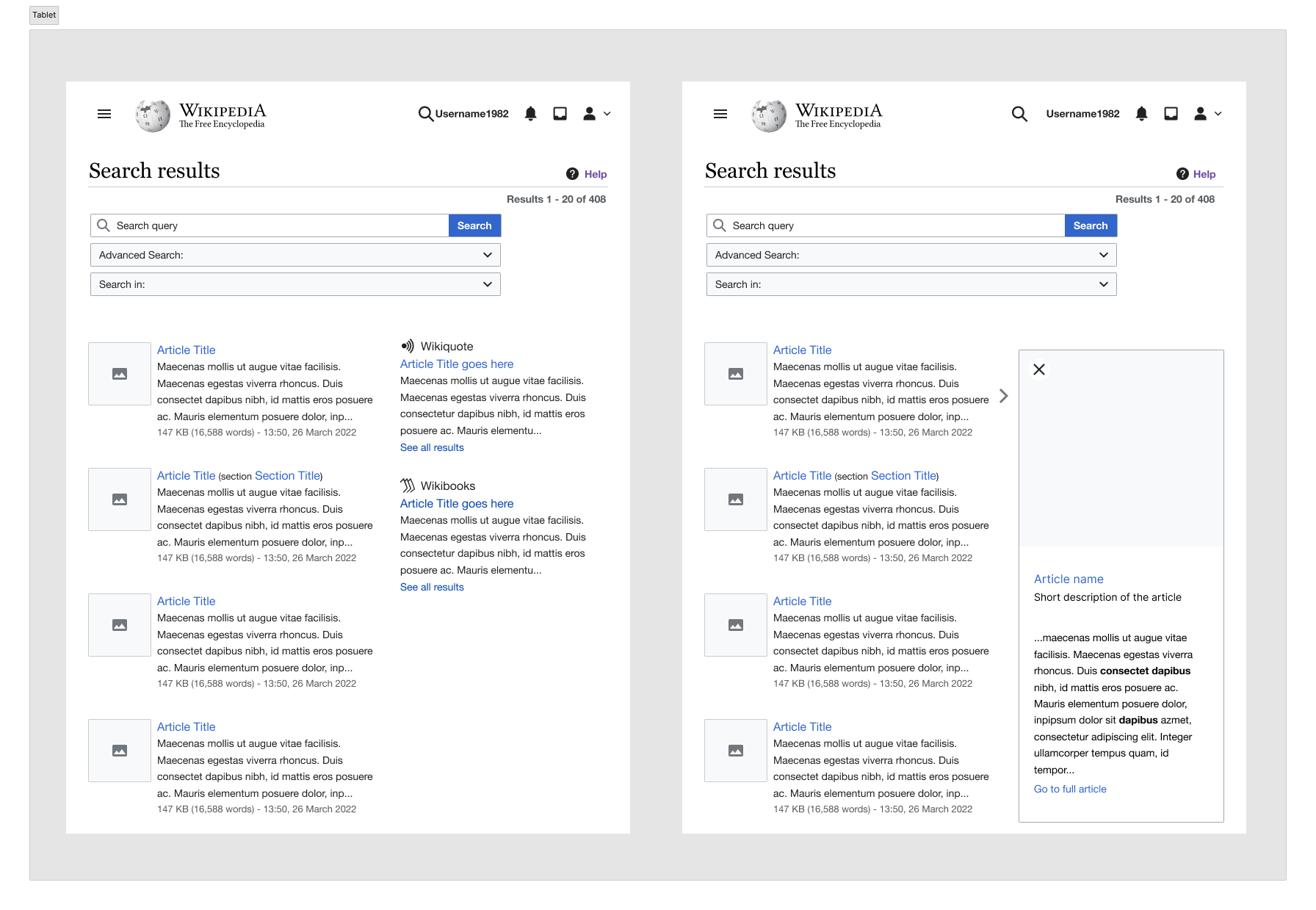
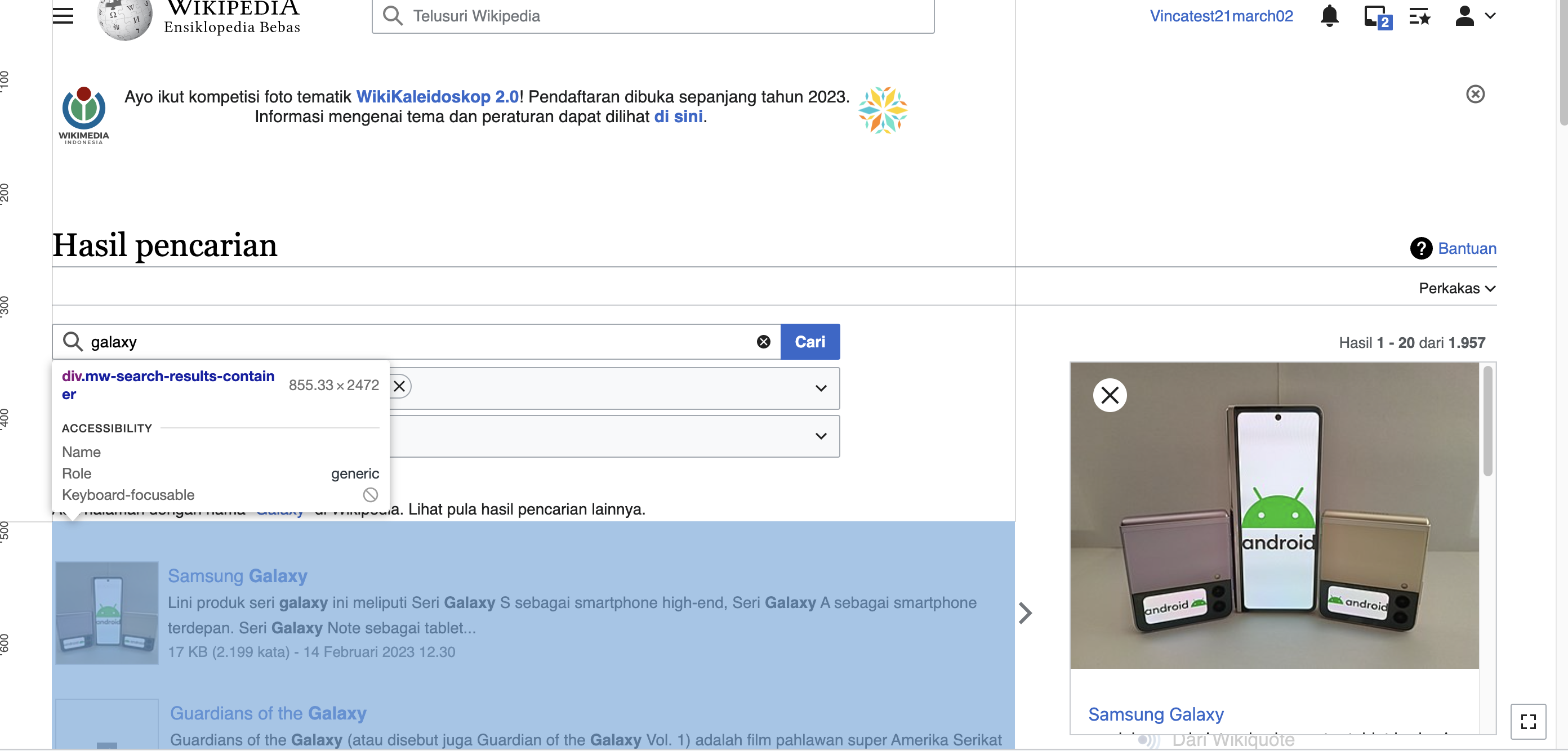
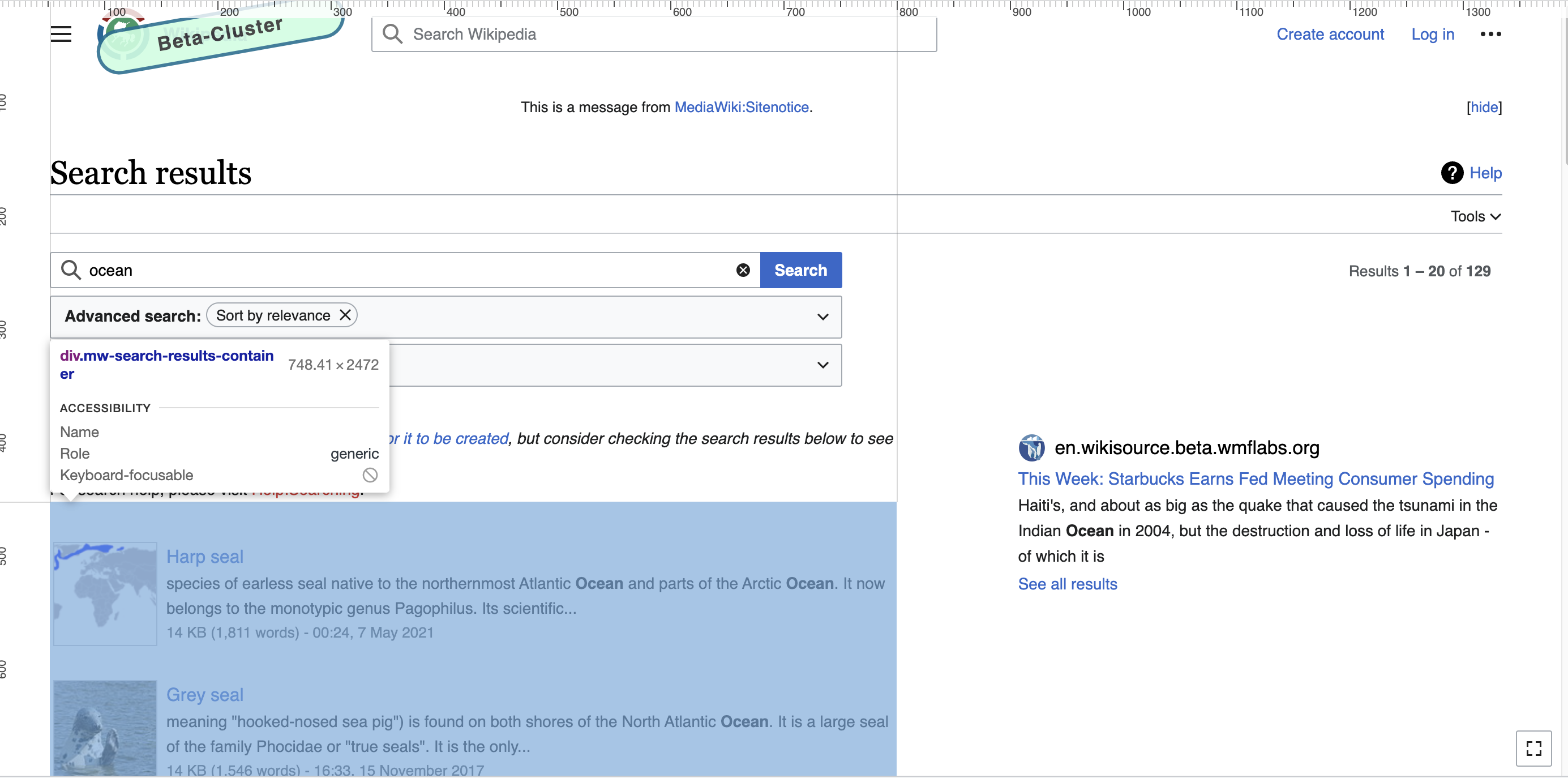
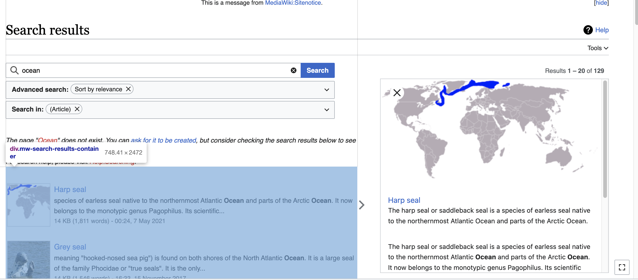
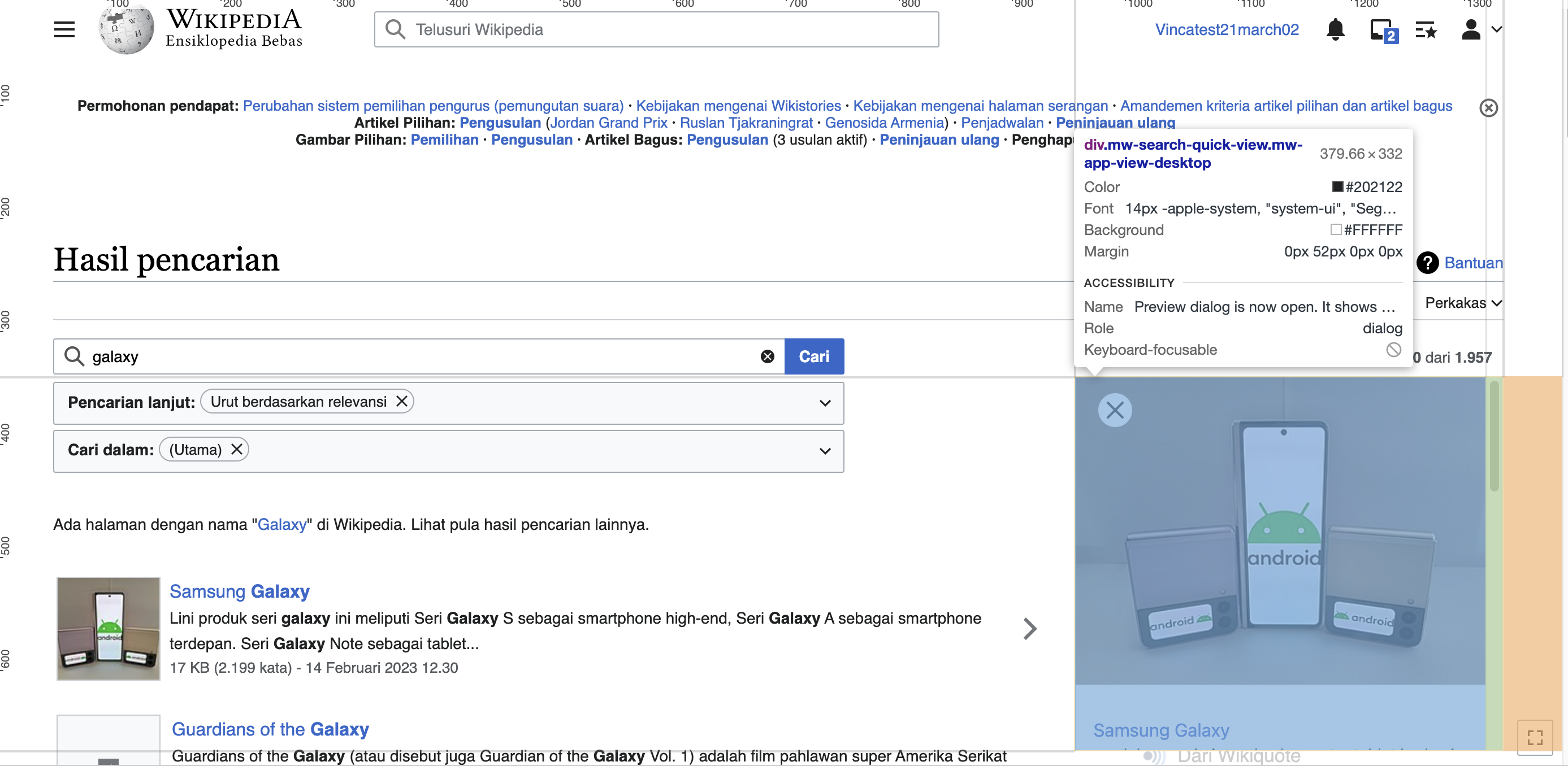
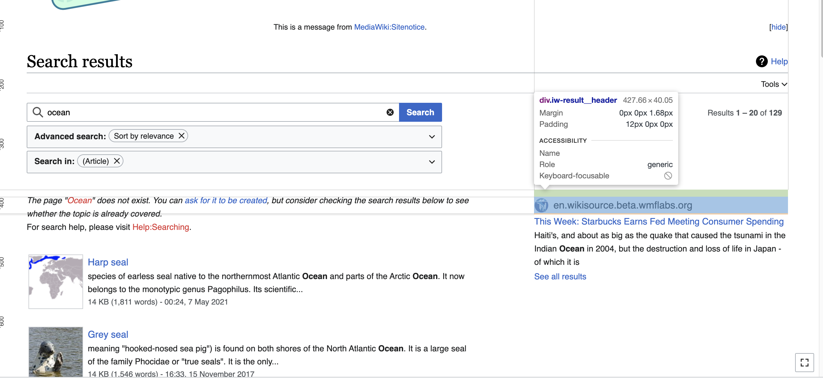
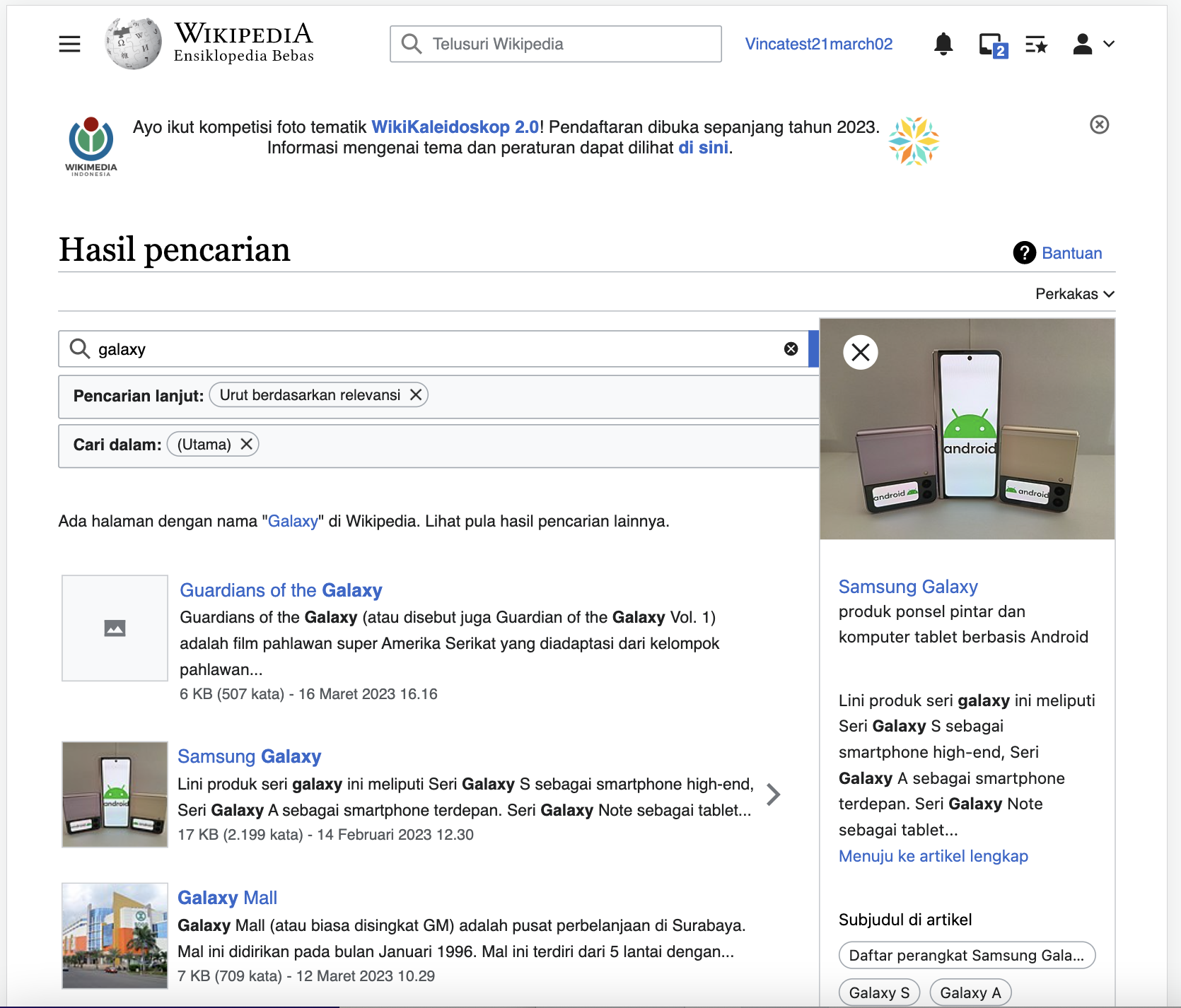
Mobile design is currently applied by default to all tablets except Apple tablets because Apple gives iPad a desktop user agent which overrides our redirects to mobile site on tablets. Also despite having the mobile skin applied to Android tablets and mobile, users can still switch to Desktop version. In both of those use cases, users will have a mediocre search preview experience as with current implementation the previews are rendered very narrow in an attempt to fit on smaller devices.
After several design iterations and discussions on amount of time required and feasibility, the following solution is being proposed.
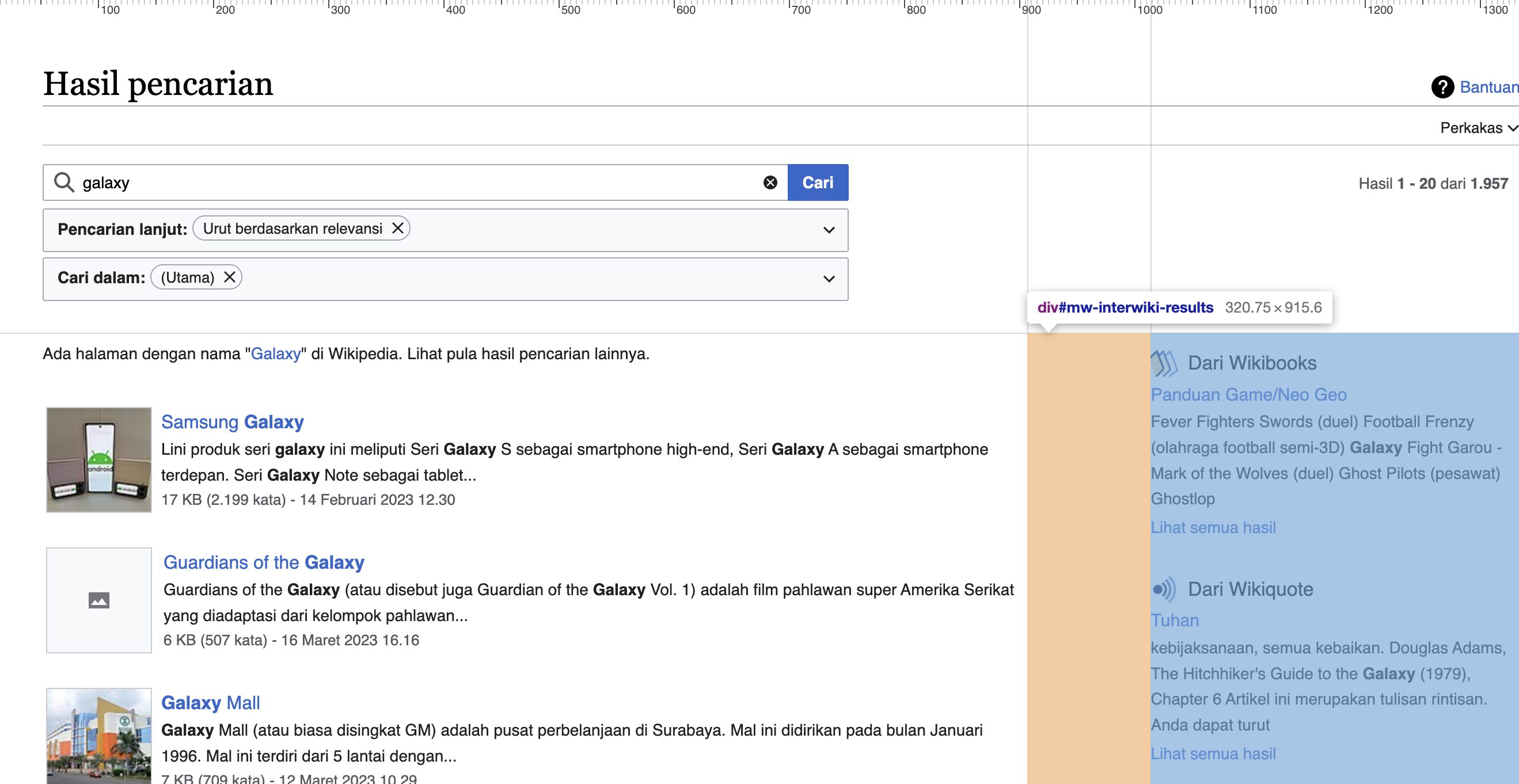
Solution
Layout improvements
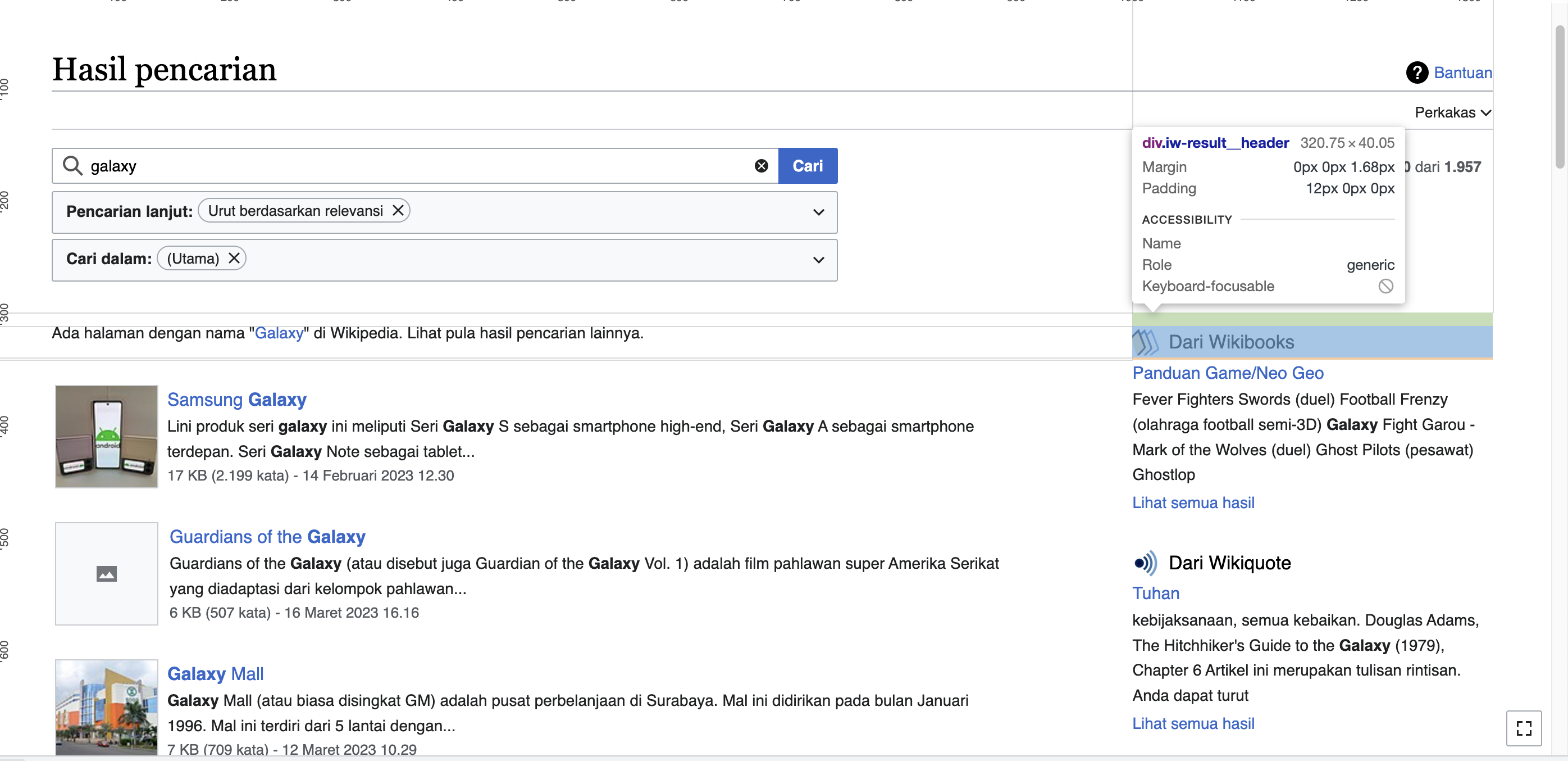
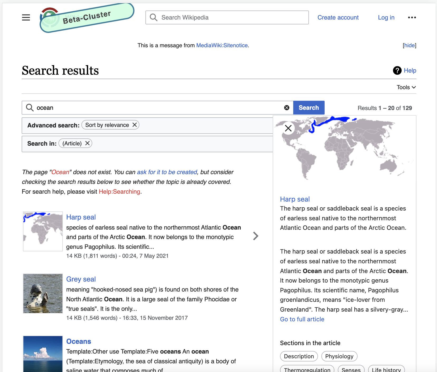
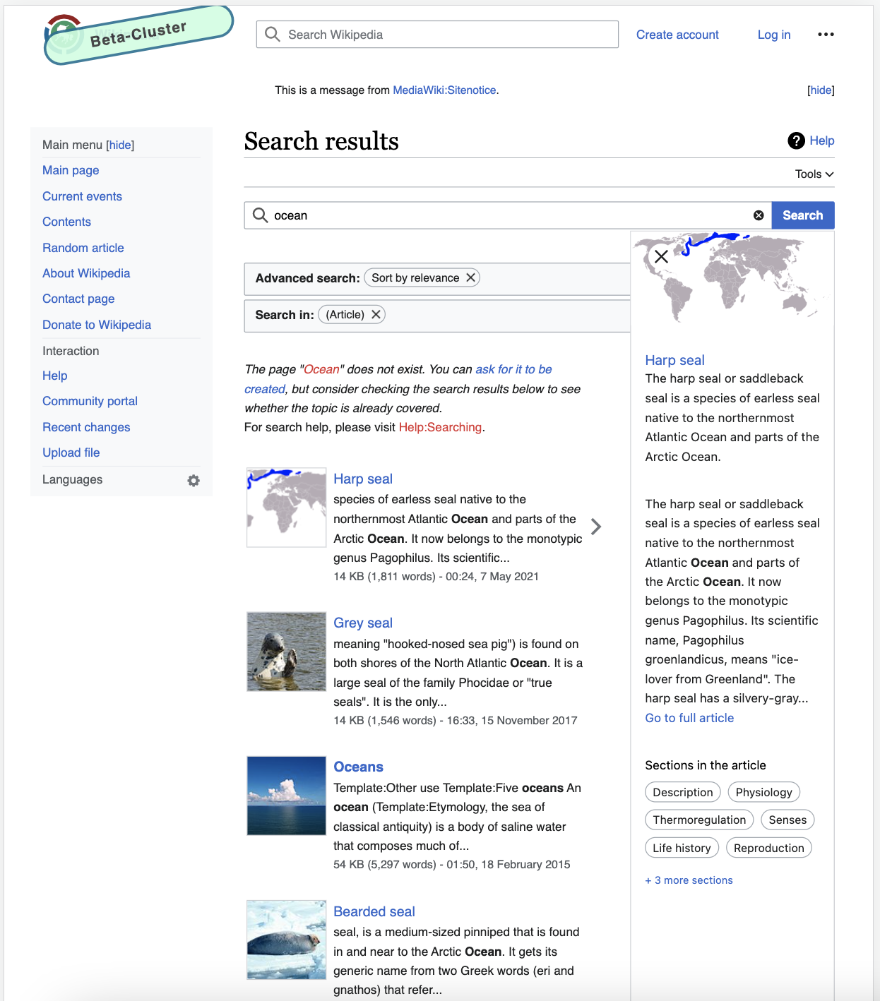
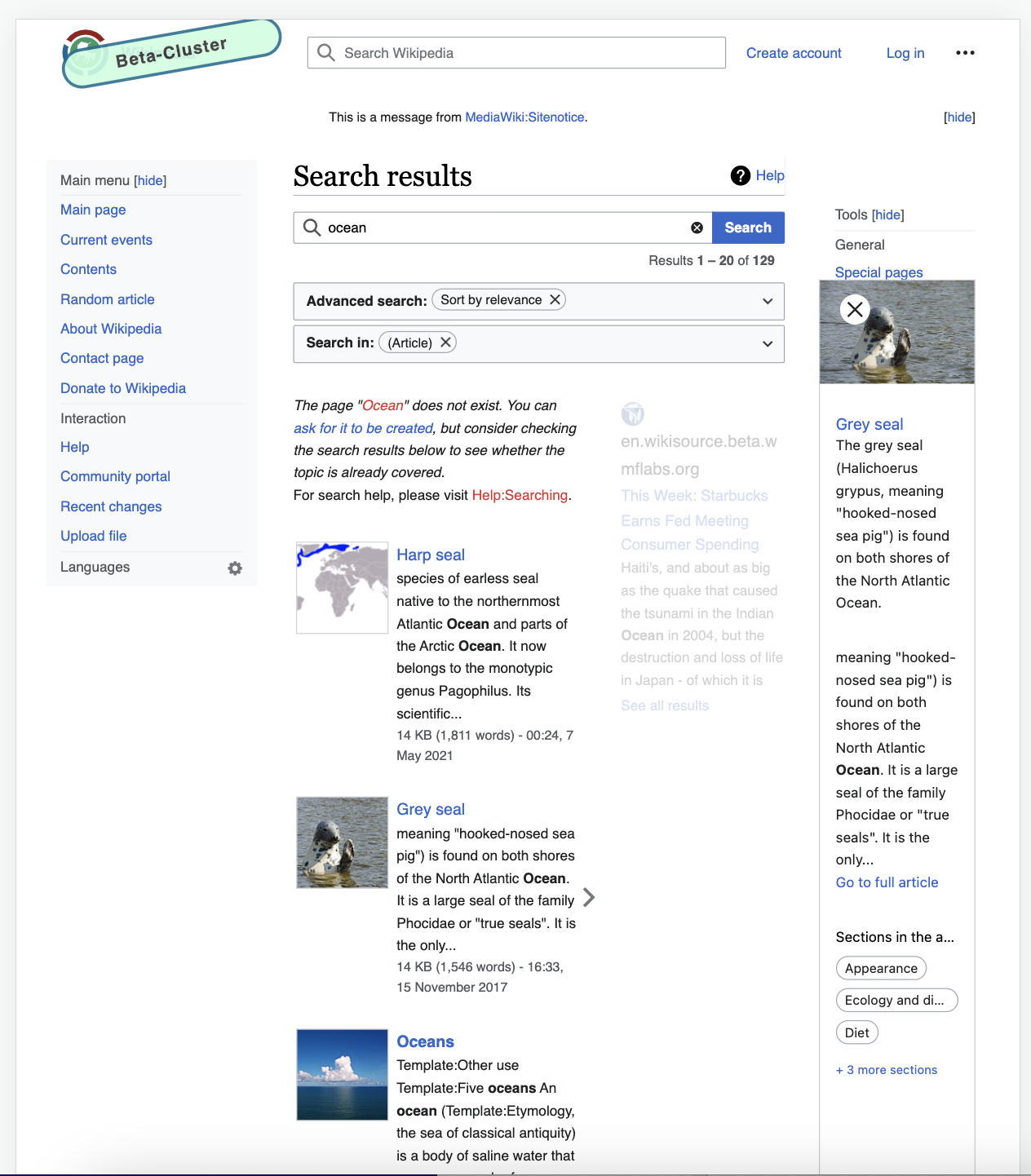
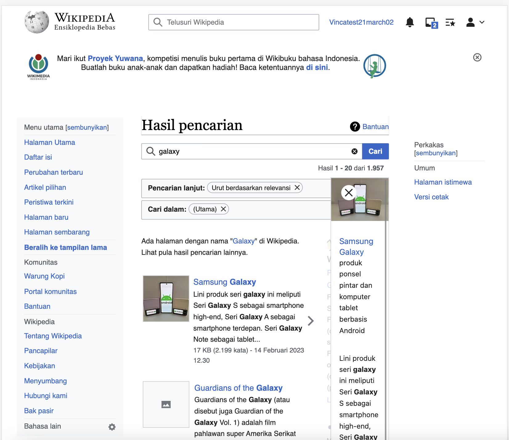
- Make all the screens between 1440px and 720px that are not using mobile skin/view to have a different width distribution of column. For example currently it shows 8/12 of content, 1/12 whitespace, 3/12 interwiki results. This should be adjusted to: 7/12 of content, 1/12 whitespace, 4/12 interwiki results. This would allow more space for search previews and interwiki results.
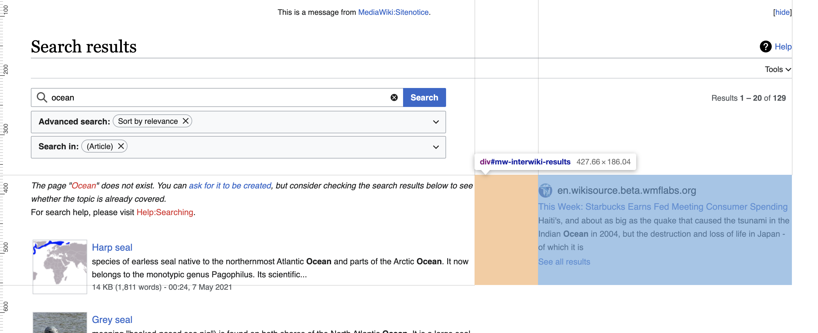
Edited on 04/03
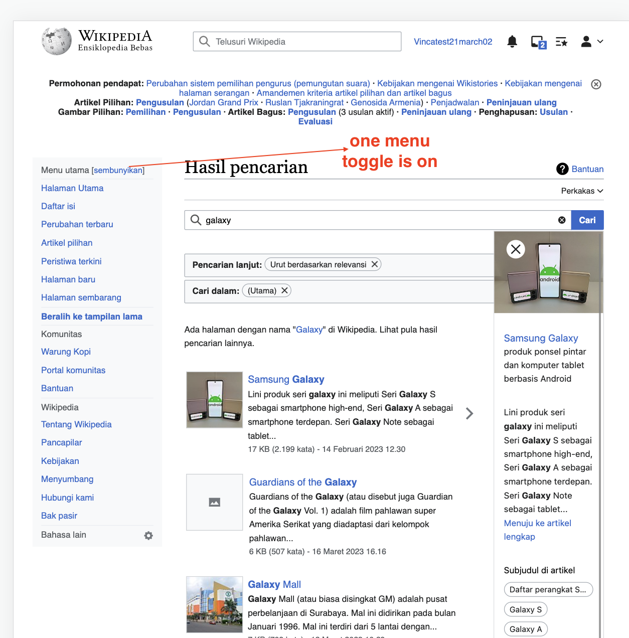
- If the sidebar is closed ratio between 1440px and 1000px) should be 7/12 - 1/12 - 3/12 - 1/12 (same as when the screen is over 1440px)
- If the sidebar is closed ratio between 720px and 1000px) should be 8/12 - 1/12 - 3/12
- When Advanced search is enabled. Clicking it should close the search preview (currently clicking the advanced search does not close the search preview). Filed as T334498: Search Preview should be closed when Advanced search is clicked.
- Previous discussion and current column widths captured in this ticket
[] Do not show the thumbnails for screens size at or below 720px (Currently the layout switches to 1 column below 720 so there is no need to hide the thumbnails)
Link to proposal in Figma