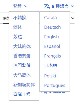
It seems considerable to implement the suggestion from the demo picture in T278372 for language variant menu.
| Winston_Sung | |
| Apr 13 2023, 6:06 PM |
| F36966795: en.wikipedia.org_wiki_Moon(iPad Mini) (6).png | |
| Apr 28 2023, 11:13 AM |
| F36966793: en.wikipedia.org_wiki_Moon(iPad Mini) (7).png | |
| Apr 28 2023, 11:13 AM |
| F36961883: image.png | |
| Apr 24 2023, 3:27 PM |
| F36955600: Screenshot 2023-04-18 at 9.24.43 AM.png | |
| Apr 18 2023, 4:24 PM |
| F36955350: Overview Copy 7.png | |
| Apr 18 2023, 12:42 PM |
| F36955340: Variants Overview.png | |
| Apr 18 2023, 12:42 PM |
| F36954981: image.png | |
| Apr 18 2023, 1:29 AM |
| F36954983: image.png | |
| Apr 18 2023, 1:29 AM |
It seems considerable to implement the suggestion from the demo picture in T278372 for language variant menu.
| Status | Subtype | Assigned | Task | ||
|---|---|---|---|---|---|
| Open | None | T123901 Avoid use of the mixed ("main language code") variant, improve selector visibility | |||
| Open | Feature | None | T334688 Vector-2022: Try to improve language variant menu selector visibility |
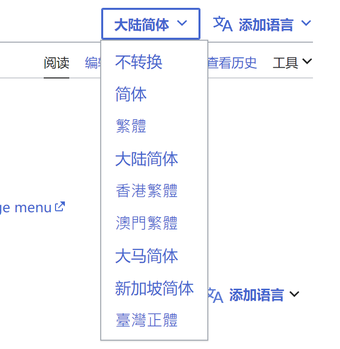
Change 908286 had a related patch set uploaded (by Winston Sung; author: Winston Sung):
[mediawiki/skins/Vector@master] Vector-2022: Move language variant menu to the left/right side of interlanguage menu
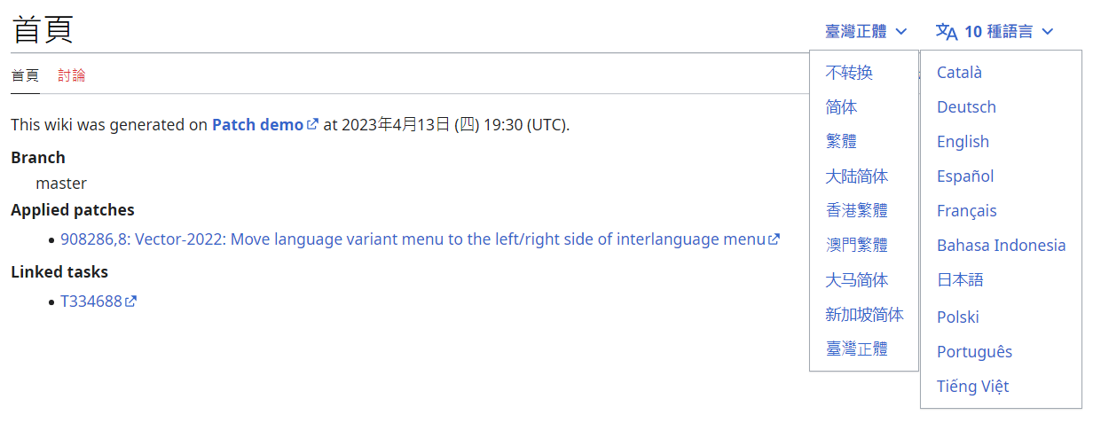
Test wiki created on Patch demo by Jdlrobson using patch(es) linked to this task:
https://patchdemo.wmflabs.org/wikis/b371c53547/w
It's currently the same font size of the non-JavaScript interlanguage menu.
If we want to make it smaller, I think it's also needed for the interlanguage menu, as I only added the variant menu CSS selectors to the original stylesheet for interlanguage dropdown menu.
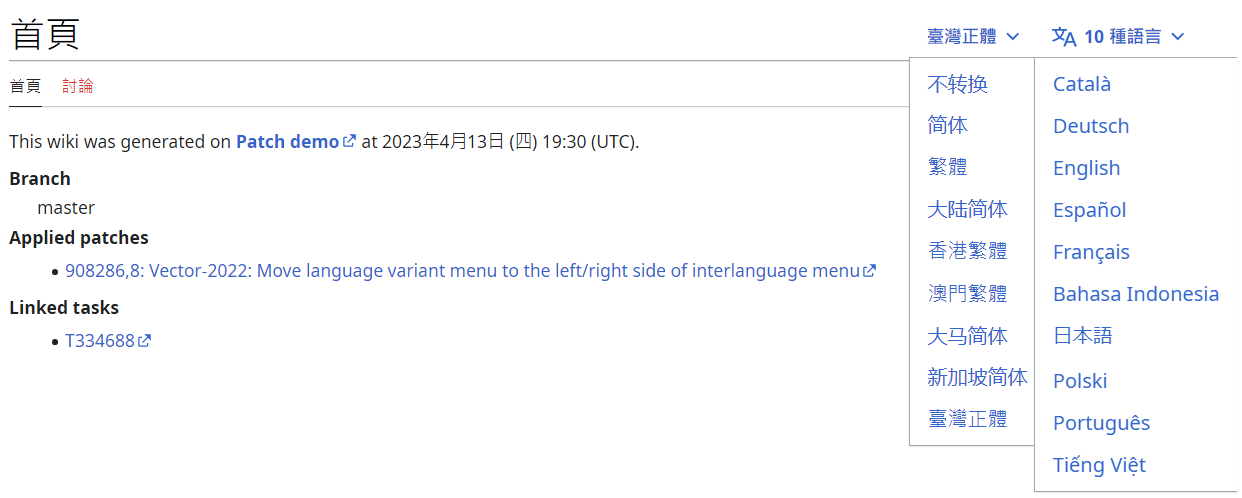
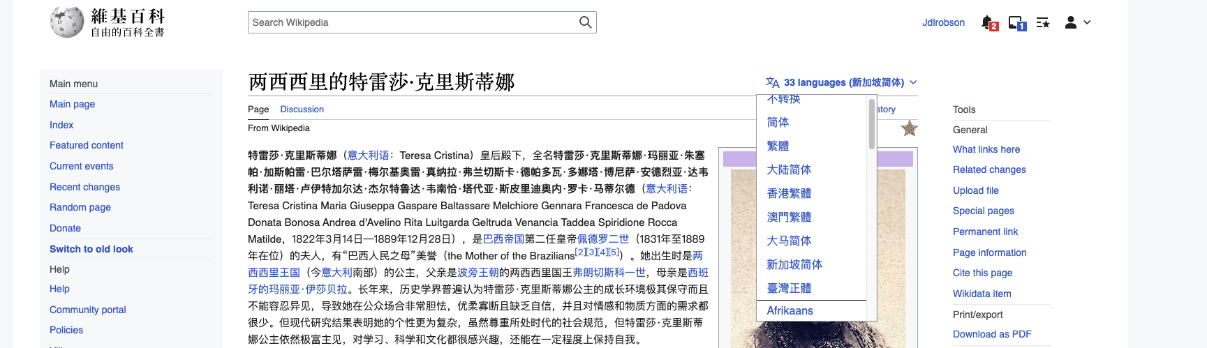
Test wiki created on Patch demo by Winston Sung using patch(es) linked to this task:
https://patchdemo.wmflabs.org/wikis/c08839db19/w
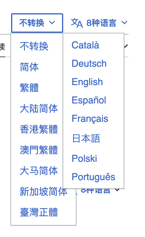
- If there's language variant menu, the language menu would always appear on the top including on main page.
- When there's variant on the main page, should we:
- hide the top language button or the bottom interlanguage button, or
- move variant button to bottom as interlanguage button does, or
- display interlanguage button in both places?
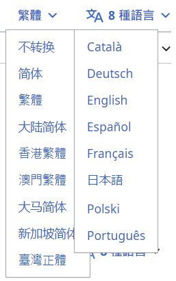
@Winston_Sung currently the two language menus overlap when JavaScript is disabled. Could we better visually separate those?
When there's variant on the main page, should we:
The language button at the bottom of the page is a temporary state that I hope will be removed in future. I think for variants, it would be best to either retain the tab for the main page as it currently is (I think this would probably be best for now) or put them alongside the language menu for consistency.
For the current approach, I don't think there are easy solution except using hover in CSS, but I don't think that's a good idea.
Another solution would be solving T200142: Create a logo for LanguageConverter to add the icon, and this would make it wider.
For the current approach, I don't think there are easy solution except using hover in CSS, but I don't think that's a good idea.
How about something like:
.vector-menu-content { width: 100%; }
 .vector-page-titlebar > div { margin-right: 8px;}
The key thing is to stop them overlapping.
I didn't see anything changed with / without this line.
This is pretty tricky and only work if the label text has more than 3 Han characters, but zh-Hans and zh-Hant labels are only 2 Han characters, and that would increase the margin from 8 px to 28 px.
8 px:
28 px:
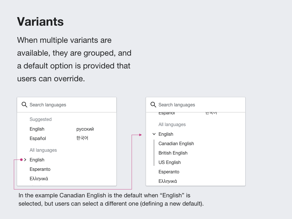
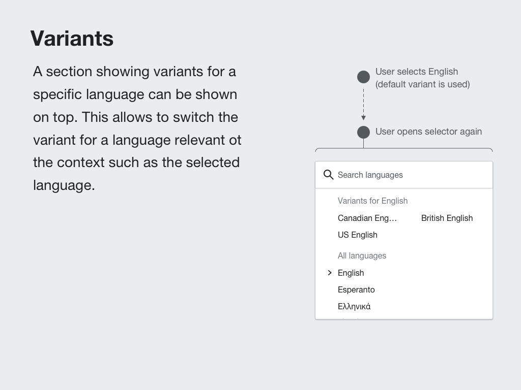
I think it may be better to support the selection of variants integrated as part of a single language selector rather than providing two separate entry points about language selection. Having a single entry point would crowd less the page and will allow for users to switch directly to a specific variant (e.g., a user on English Wikipedia could search for "Traditional Chinese" in the selector to access directly such variant).
This approach was mentioned in T278372#7023626, and there are more detail in the language selector component design documentation. I created a separate ticket focusing on the proposed approach: T334938: Language variants support for the responsive language selector
 |  |
Then another design issue came up:
Another question:
If we use this solution, where should we put p-variants id and .mw-portlet-variants class?
If we use this solution, where should we put p-variants id and .mw-portlet-variants class?
The .mw-portlet-variants class is not really important, only the ID (since it's used for addPortletLink). I'd recommend nesting the list inside an li tag
e.g.
<ul id="p-lang"><li>
<ul id="p-variants"...></ul>
</li>
<li>
<a>lnaguage link one.</a>
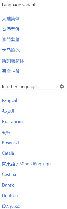
See Minerva skin as a reference :
https://zh.m.wikipedia.org/wiki/%E8%A5%BF%E7%8F%AD%E7%89%99#p-lang
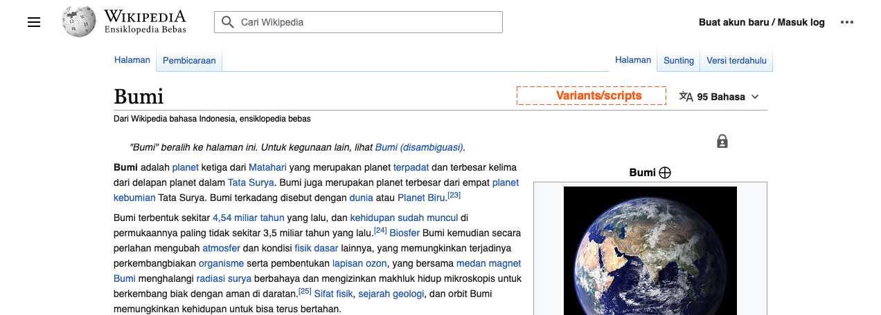
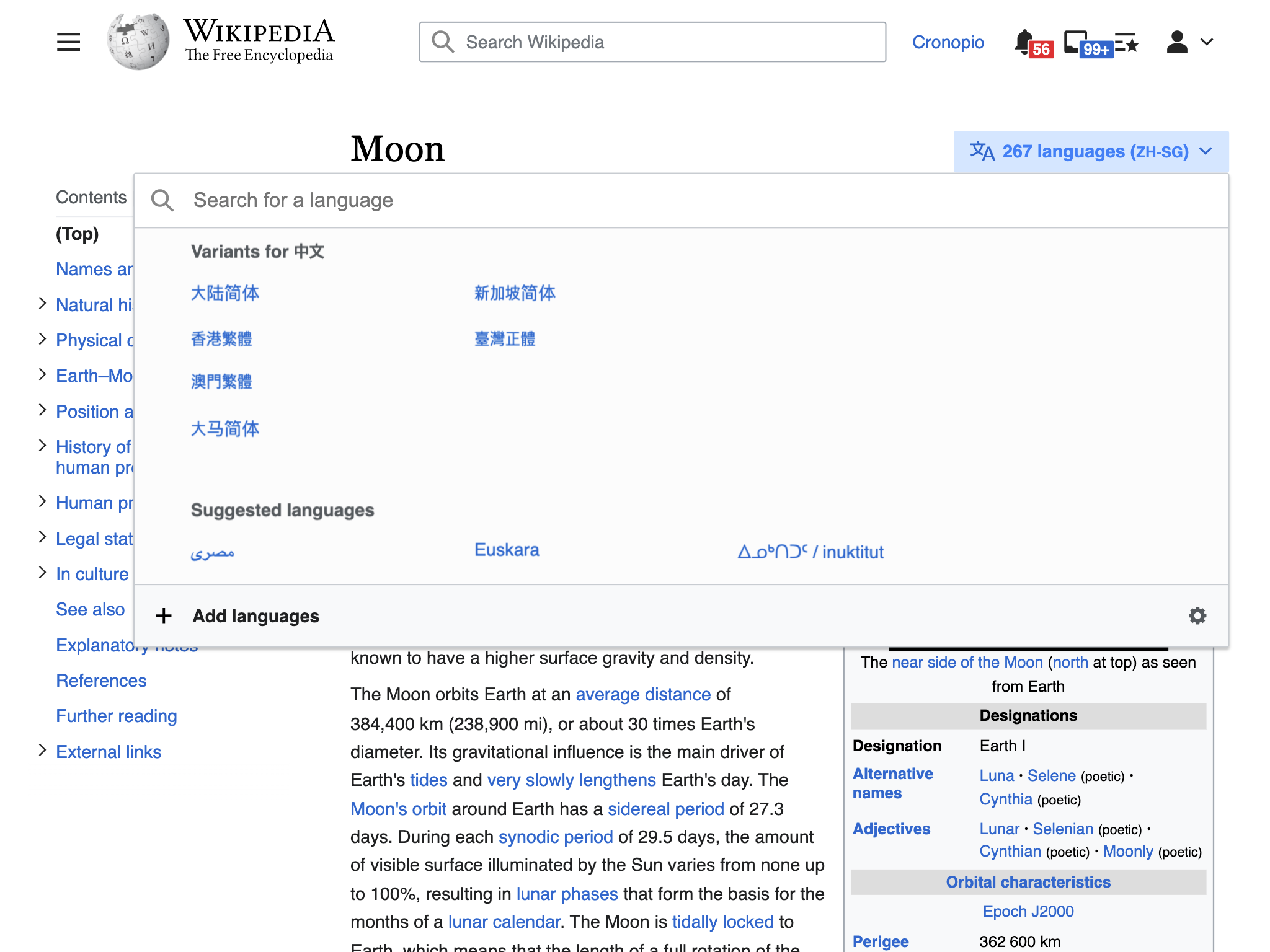
Now it looks strange for "Add languages (Simplified Han, Singapore)".
But if we switch the order to "Simplified Han, Singapore (Add languages)", the place looks like is designated for language name instead of variant name.
This looks good. It goes in the same direction as some of the ideas proposed for the future language selector with variant support. so I think it could be considered an incremental iteration.
Some aspects to consider:
I exemplified the ideas below:
 |  |
Test wiki on Patch demo by Winston Sung using patch(es) linked to this task was deleted:
By the way, I think that the design of the mobile interface should be consistent with the desktop one. Currently all variants belong to the "recommended languages" area in the language selector.
Change #908286 abandoned by Jdlrobson:
[mediawiki/skins/Vector@master] Vector-2022: Move language variant menu to the left/right side of interlanguage menu
Reason:
Hello this is an automated message.
I am abandoning this patch as it over a year old, and is not currently in a mergeable state. This has nothing to do with the quality of the patch.
If you still care about this patch, please feel free to restore it and rebase it, and we can happily continue the conversation to help you get it merged.
Change #908286 restored by Winston Sung:
[mediawiki/skins/Vector@master] Vector-2022: Move language variant menu to the left/right side of interlanguage menu