Page MenuHomePhabricator

Evaluate the use of icons and logos
Open, Needs TriagePublic

Description

Background goal

At the moment we are using our logos in two ways:

  • Icons: a simplified version of the logo created to be used as an icon. The icon color could be customized.
  • Logos: non-simplified project logo with all its colors and details.

We need to define when icons and logos should be used.

Known use cases

Captura de pantalla 2023-06-07 a las 11.41.39.png (1×2 px, 483 KB)
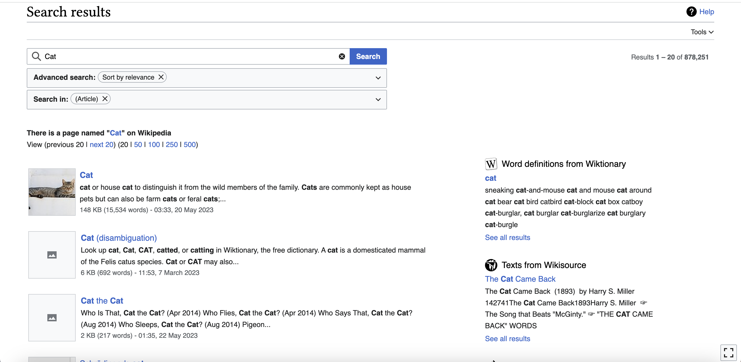
Icons with simplified logos in Search page.
Captura de pantalla 2023-06-07 a las 11.43.35.png (1×2 px, 602 KB)
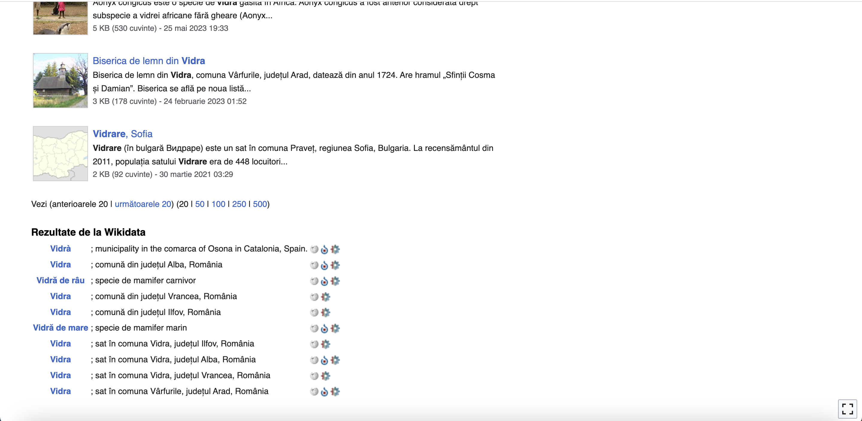
Small logos in onwiki comments (at the bottom of the page).
Captura de pantalla 2023-06-07 a las 11.45.11.png (1×2 px, 543 KB)
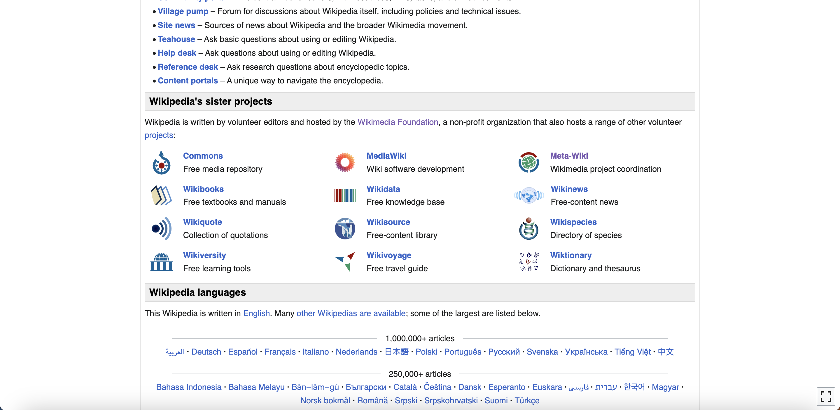
Big logos in Wikipedia's sister projects.
Captura de pantalla 2023-06-07 a las 11.50.34.png (96×602 px, 14 KB)
Favicons using an small size of the logo.

User stories

  • As a designer/developer I need to know when should I use the icon or the logo in my projects.
  • As a Wikimedia user, I need icons and logos use to be unified so I can understand why one or another is being used.

Considerations (Optional)

One technical constraint that we have is that icons are (currently) monochrome, and their color changes depending on the context (to color-base in most cases, but icons in buttons can also be white, or various shades of blue or red). Right now the icon versions of the logos are monochrome for this reason. We could, in theory, have a few icons that are not monochrome and whose color doesn't adapt to the context, but that would be confusing because those icons could not be used with buttons (especially primary and disabled buttons where the icon needs to be white).

Open questions (Optional)

Proposal

Once the approach has been decided, it will be explained in this section.

Design spec (if needed)

Once the approach has ben decided, the Figma spec should be included here if needed.

Acceptance criteria for Done

  • Decide the best approach and document it
  • Update the icons/logos in the code (if needed)
  • Update components (if needed)

Event Timeline

One technical constraint that we have is that icons are (currently) monochrome, and their color changes depending on the context (to color-base in most cases, but icons in buttons can also be white, or various shades of blue or red). Right now the icon versions of the logos are monochrome for this reason. We could, in theory, have a few icons that are not monochrome and whose color doesn't adapt to the context, but that would be confusing because those icons could not be used with buttons (especially primary and disabled buttons where the icon needs to be white).

One technical constraint that we have is that icons are (currently) monochrome, and their color changes depending on the context (to color-base in most cases, but icons in buttons can also be white, or various shades of blue or red). Right now the icon versions of the logos are monochrome for this reason. We could, in theory, have a few icons that are not monochrome and whose color doesn't adapt to the context, but that would be confusing because those icons could not be used with buttons (especially primary and disabled buttons where the icon needs to be white).

Adding this info as "Consideration" in the task description.

For this reason, I think we should not add the logos as icons and we should use instead the icon version in any component or in any place where we are using icons. E.g. lists, menus, buttons, selects, etc. On the other hand, we could use the logos when we place them in a standalone way (e.g. header).

I generally agree, but would suggest specifying whether or not using logos (not icons) includes the two use cases mentioned in the task, favicons and image links at the bottom of the search results page. This can be not so ideal in certain cases where logos lose legibility at small sizes, but in such cases projects can and have gone with a simplified logo option. See example below where there is a mix of simplified vs regular logo used in favicon.

image.png (96×646 px, 21 KB)