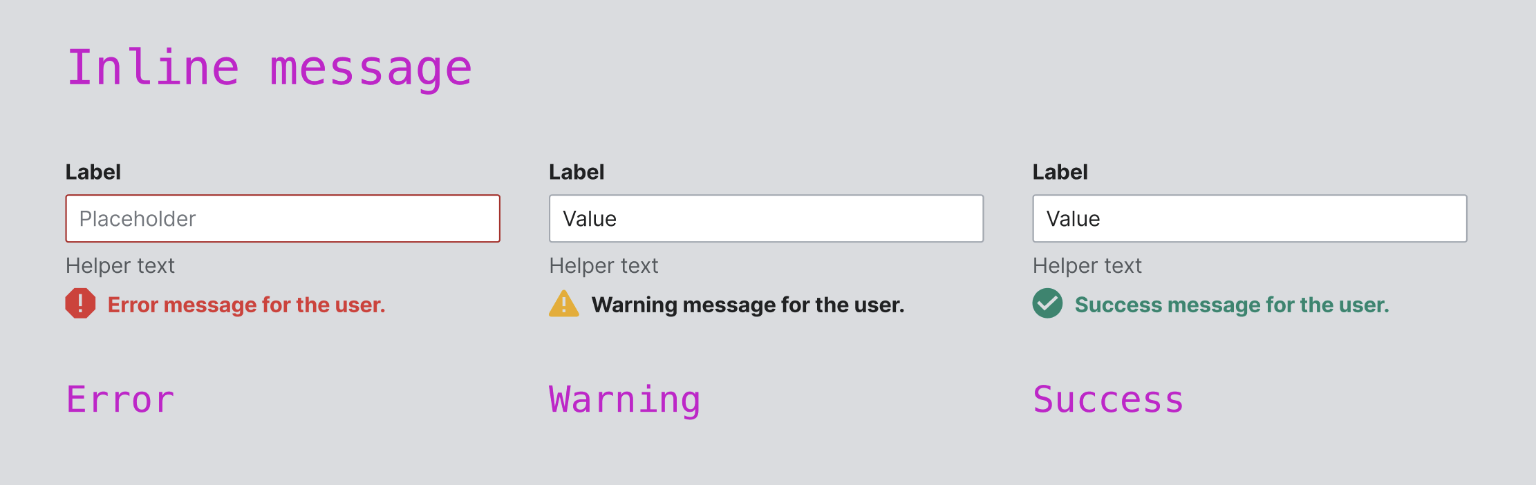
Page MenuHomePhabricator

Field: Support warning and success statuses
Closed, ResolvedPublic2 Estimated Story Points

Description

Background

The Field component takes in a status prop, which is provided to the child components, and can display a validation message with the same type as that status. Currently, this only works for the error status/message type. We should also support warning and success statuses and message types.

Implementation

  • The ValidationStatusType type will need to be updated to include 'warning' and 'success'
  • The @values tag for all status props will need to be updated to include these new values
  • We may also want to add warning and success styles for TextInput and Select (which currently show a red border for the error state)

Design spec

Acceptance criteria

  • The ValidationStatusType is updated to include 'warning' and 'success'
  • All component prop docs have been updated to include these new values
  • The Types and Constants page has been updated to include these new values
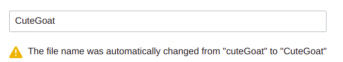
  • The new statuses and validation message types are demoed on the Field page with real-world examples (at least warning; we have no known use cases for success yet)

Event Timeline

Restricted Application added a subscriber: Aklapper. · View Herald Transcript
AnneT added a subscriber: bmartinezcalvo.

@bmartinezcalvo Right now we show error styles for TextInput (and any component that contains TextInput, like Combobox and Lookup) and Select. Do we want to add warning or success styles as well? e.g. a different color border for those statuses.

@bmartinezcalvo Right now we show error styles for TextInput (and any component that contains TextInput, like Combobox and Lookup) and Select. Do we want to add warning or success styles as well? e.g. a different color border for those statuses.

@AnneT at the moment we have some use cases for warning messages (e.g. Create account) where the Warning inline message would be needed. But not sure about the success one. One possible case for success could be a password creation where we could give a positive feedback for the user. But at the moment it's not a real case.

Captura de pantalla 2023-06-13 a las 17.27.02.png (702×2 px, 94 KB)

thanks @bmartinezcalvo! Even though we don't have a known use case for the success message yet, it would be very easy to add both 'warning' and 'success" as options for the validation message. We can add a demo of the warning message since we have a real-world use case. Does that sound ok?

thanks @bmartinezcalvo! Even though we don't have a known use case for the success message yet, it would be very easy to add both 'warning' and 'success" as options for the validation message. We can add a demo of the warning message since we have a real-world use case. Does that sound ok?

It sounds good, let's do it.

Hi there!

As a little follow up here I'll move the use case from T352147: CdxField should support `warning` as status here. The context is that we were starting to experiment with adding a Codex workflow to the FileImporter extension that's part of the Move-Files-To-Commons project. - In there there's a step where the user can change the page title and the tool applies some auto normalization on the user input.

That's where we use a warning to make that step transparent for the user. See

CdxField with validation warning.png (128×708 px, 19 KB)

Thanks for the good work so far!

AnneT changed the task status from Open to In Progress.Jan 8 2024, 9:52 PM
AnneT claimed this task.

Change 989623 had a related patch set uploaded (by Anne Tomasevich; author: Anne Tomasevich):

[design/codex@main] Field: Enable use of warning and success messages

https://gerrit.wikimedia.org/r/989623

Change 989623 merged by jenkins-bot:

[design/codex@main] Field: Enable use of warning and success messages

https://gerrit.wikimedia.org/r/989623

You can read the new validation messages section on the Field page to see the existing error demo and the new warning and success demos.

You can read the new validation messages section on the Field page to see the existing error demo and the new warning and success demos.

@AnneT design sign-off done. I'm listing here some possible improvements:

  1. The padding between the helper text and the inline validation message seems to be missing.
  2. In order to make these demos with validation message more easy to understand for the users, what if we display the inline message directly in the demos instead of making the user enter the info described in each demo's instructions?
CCiufo-WMF triaged this task as Medium priority.Jan 23 2024, 4:57 PM

Change 992533 had a related patch set uploaded (by Eric Gardner; author: Eric Gardner):

[mediawiki/core@master] Update Codex from v1.2.1 to v1.3.0

https://gerrit.wikimedia.org/r/992533

Change 992533 merged by jenkins-bot:

[mediawiki/core@master] Update Codex from v1.2.1 to v1.3.0

https://gerrit.wikimedia.org/r/992533

You can read the new validation messages section on the Field page to see the existing error demo and the new warning and success demos.

@AnneT design sign-off done. I'm listing here some possible improvements:

  1. The padding between the helper text and the inline validation message seems to be missing.
  2. In order to make these demos with validation message more easy to understand for the users, what if we display the inline message directly in the demos instead of making the user enter the info described in each demo's instructions?

Moving the task to In progress so we can review the corrections commented above.

Change 994207 had a related patch set uploaded (by Anne Tomasevich; author: Anne Tomasevich):

[design/codex@main] styles, Field: Fix and simplify spacing of help text

https://gerrit.wikimedia.org/r/994207

@bmartinezcalvo I've pushed a patch to fix the help text/validation message spacing; thanks for pointing that out!

  1. In order to make these demos with validation message more easy to understand for the users, what if we display the inline message directly in the demos instead of making the user enter the info described in each demo's instructions?

This may make it easier to understand from a design standpoint, but I believe it would be more difficult to understand from a developer/UX standpoint. We're using these demos to show how validation actually works behind the scenes, which is critical for our developer users. I also think it's important to have a working field that any user can play with to see how it works from a UX standpoint.

The guidelines section displays all the parts of a field at once, including an error validation message - is this enough to help people understand the validation message from a design standpoint? Perhaps we could add more images to that section of the guidelines including examples of warning and success messages too?

@AnneT ok, since the Error, Warning and Success messages are represented in the Interaction States section in the Guidelines, we can leave these demos as they are for now if they are clear for developers. We will include more Do-Don't examples for designers once we improve the guidelines in this task.

Change 994207 merged by jenkins-bot:

[design/codex@main] styles, Field: Fix and simplify spacing of help text

https://gerrit.wikimedia.org/r/994207

Change 997931 had a related patch set uploaded (by Anne Tomasevich; author: Anne Tomasevich):

[mediawiki/core@master] Update Codex from v1.3.1 to v1.3.2

https://gerrit.wikimedia.org/r/997931

Test wiki created on Patch demo by ATomasevich (WMF) using patch(es) linked to this task:
https://patchdemo.wmflabs.org/wikis/2e8b582c42/w

Change 997931 merged by jenkins-bot:

[mediawiki/core@master] Update Codex from v1.3.1 to v1.3.2

https://gerrit.wikimedia.org/r/997931