Why are we doing this?
On the SE size the fundraising banner is scrollable, but currently there is limited affordance to allow users to know this. As the CTA to donate can be below the fold, it's important that we ensure that scrollability is visible and understandable for users.
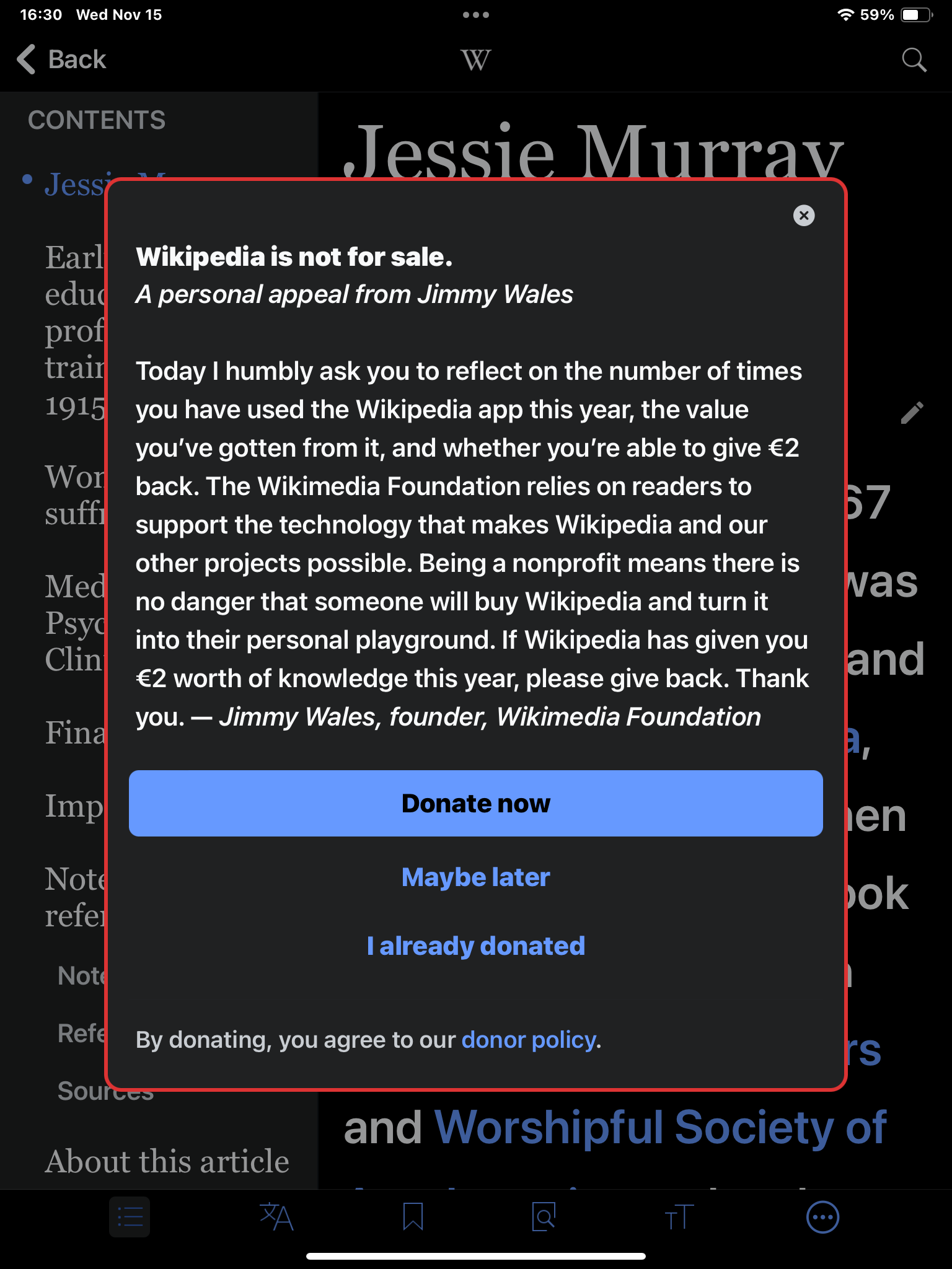
Design suggestion
Add a bottom blur similar to on the iOS onboarding screens.
Testing Notes
Note: This can be tested starting in the main Wikipedia app TestFlight 7.4.5 (2781)
- Fresh install app on device.
- Change device region to Italy or the Netherlands in iOS Settings.
- After first launch, background the app, foreground and pull to refresh on Explore feed. Visit an article on EN, NL or IT wiki. Confirm fundraising modal appears.
- Confirm you can see a bottom blur on iPhone (screenshots here)
- Repeat steps 1-3 on iPad.
- Confirm iPad does not show a blur, but shows a more square modal (before it was tall and skinny like iPhone).