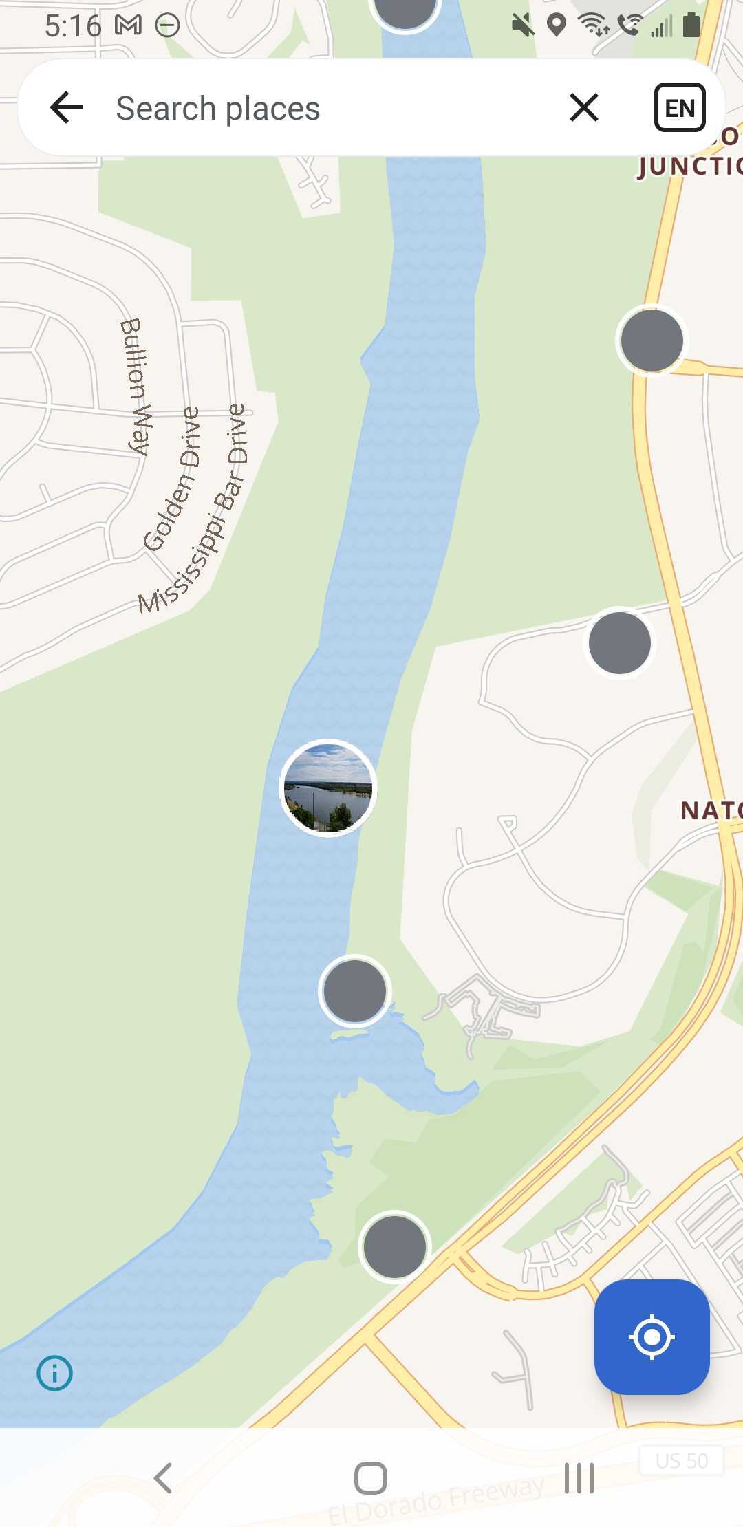
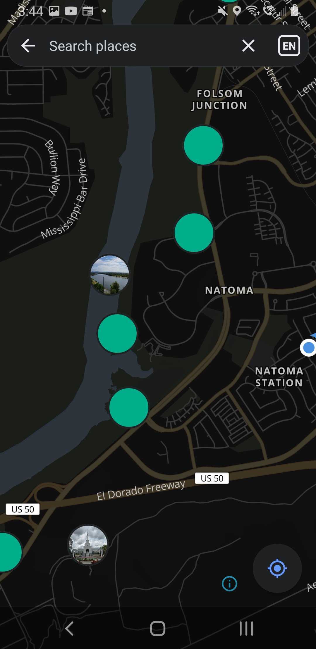
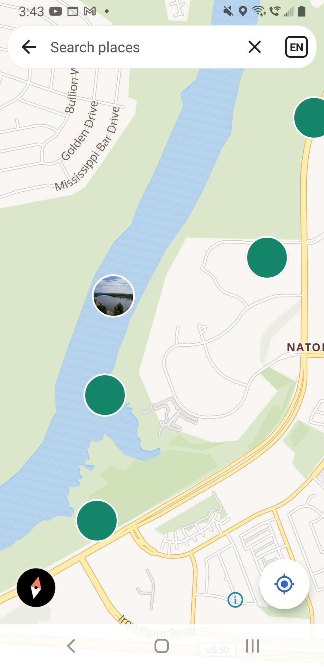
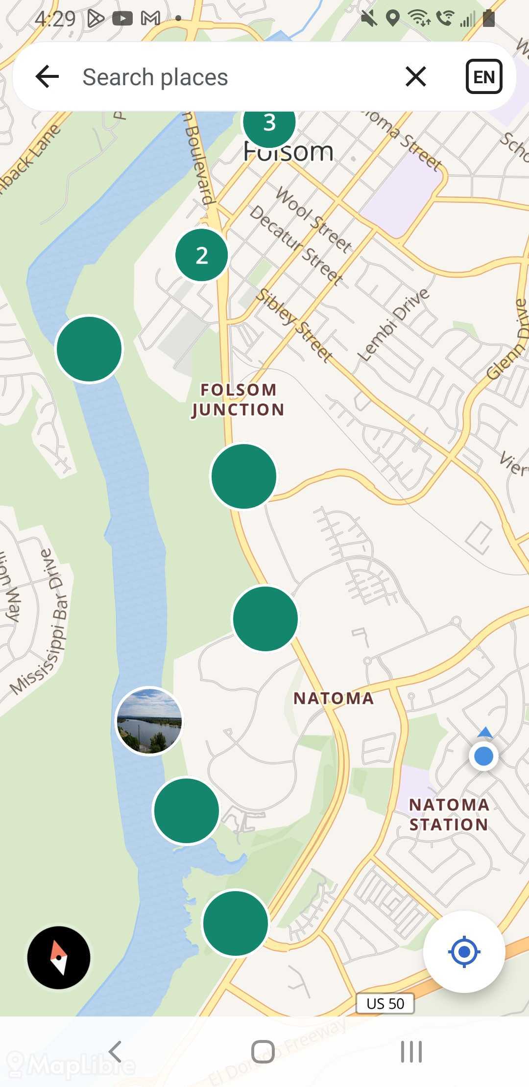
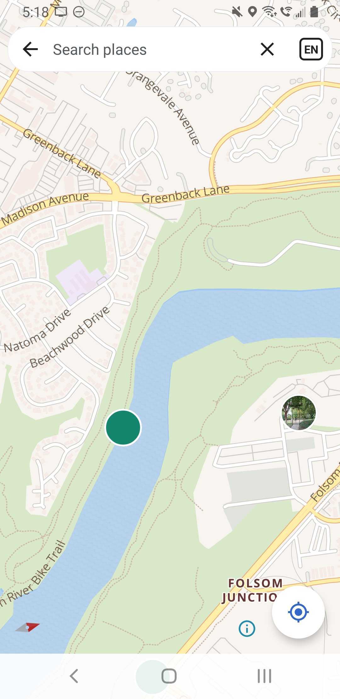
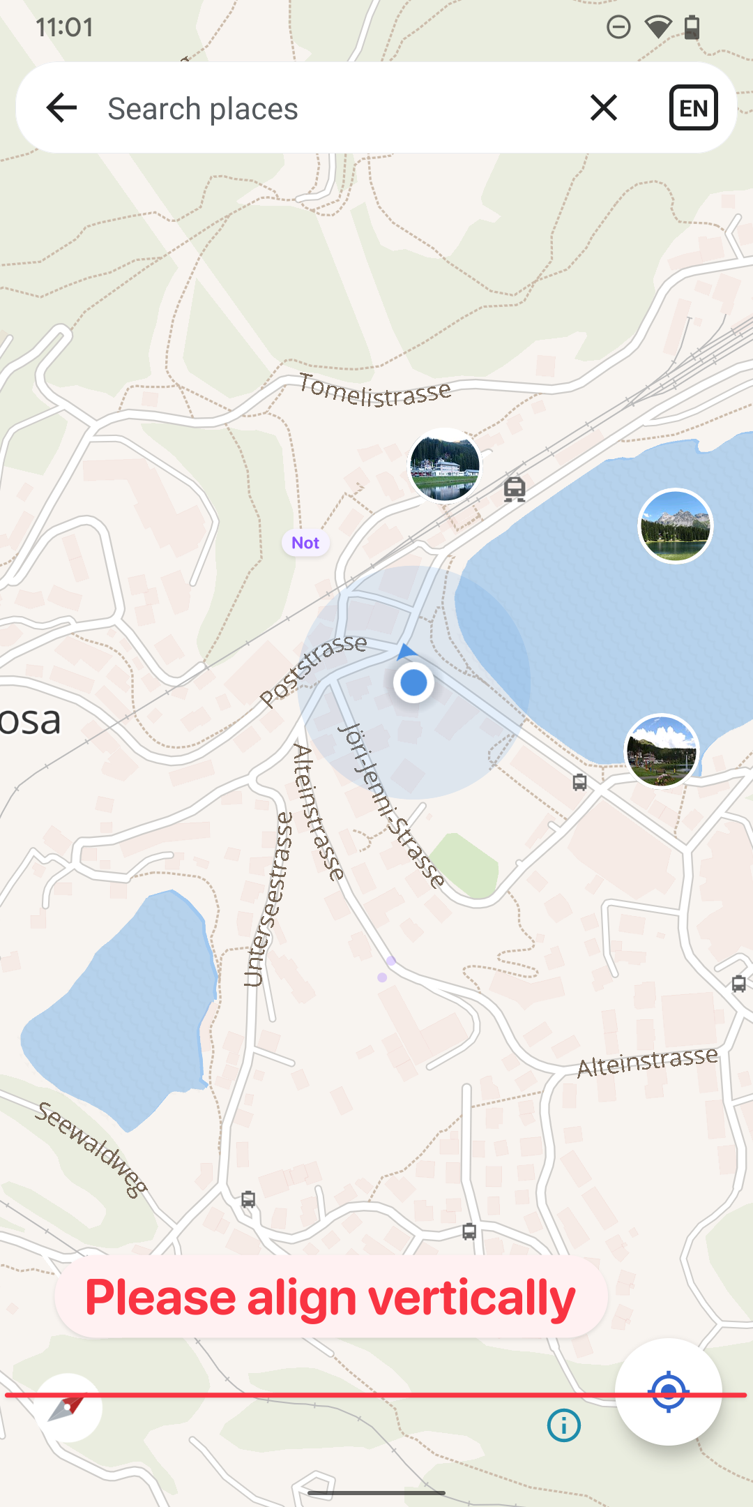
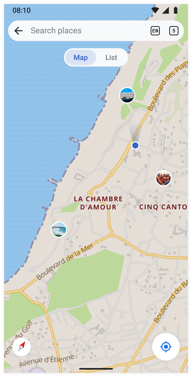
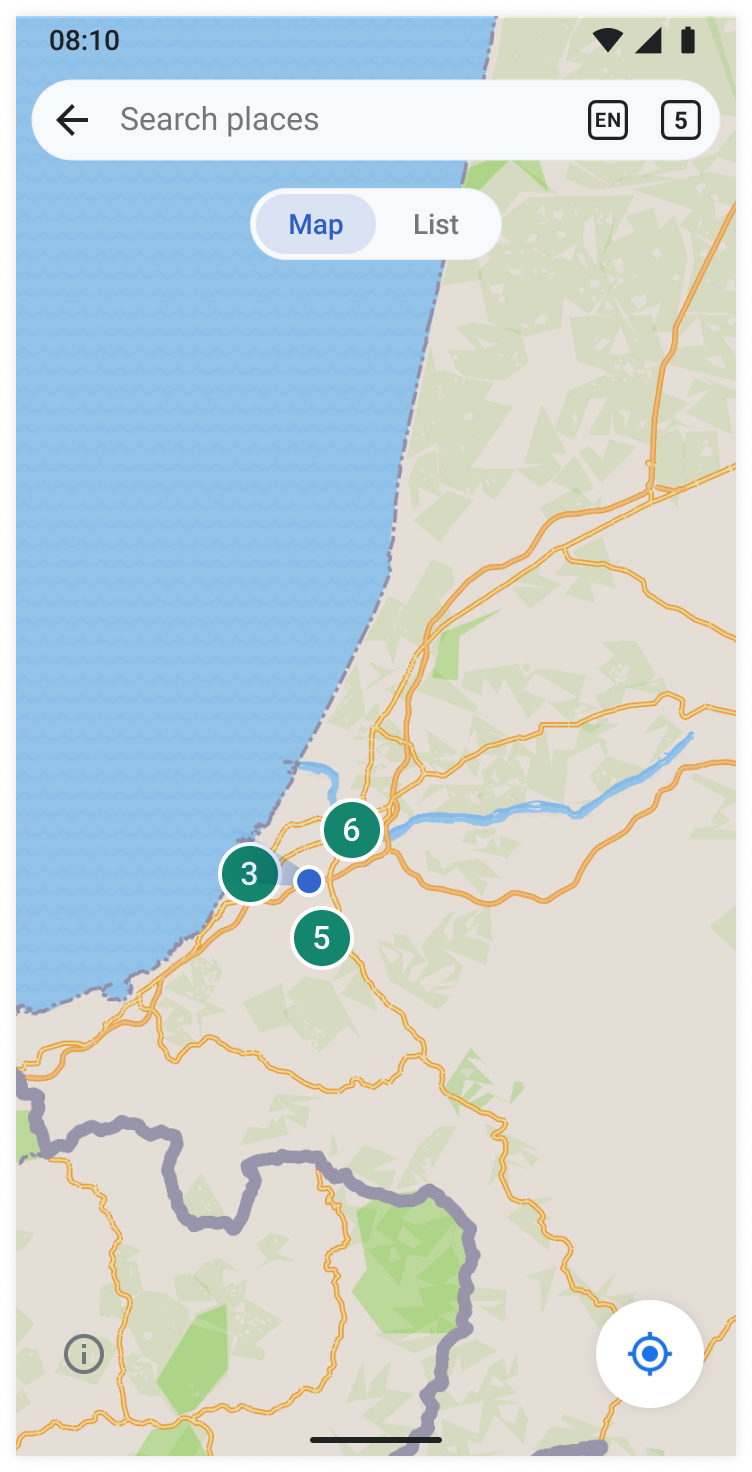
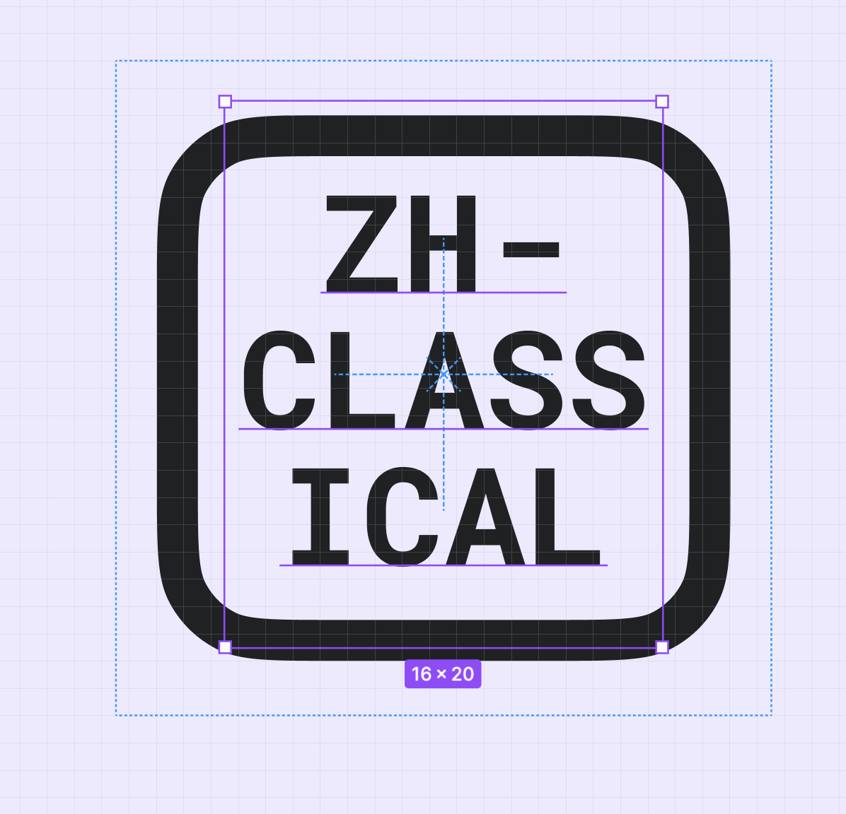
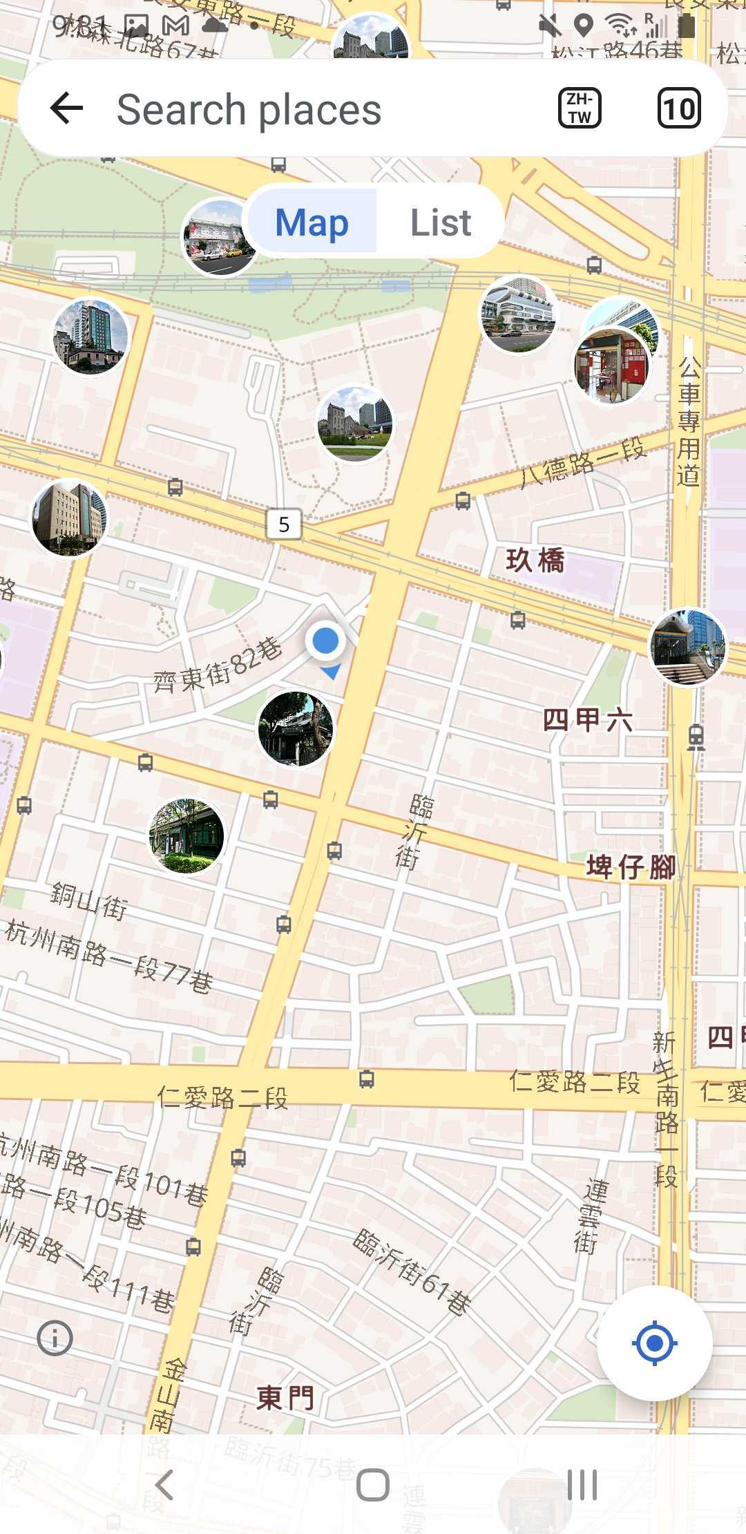
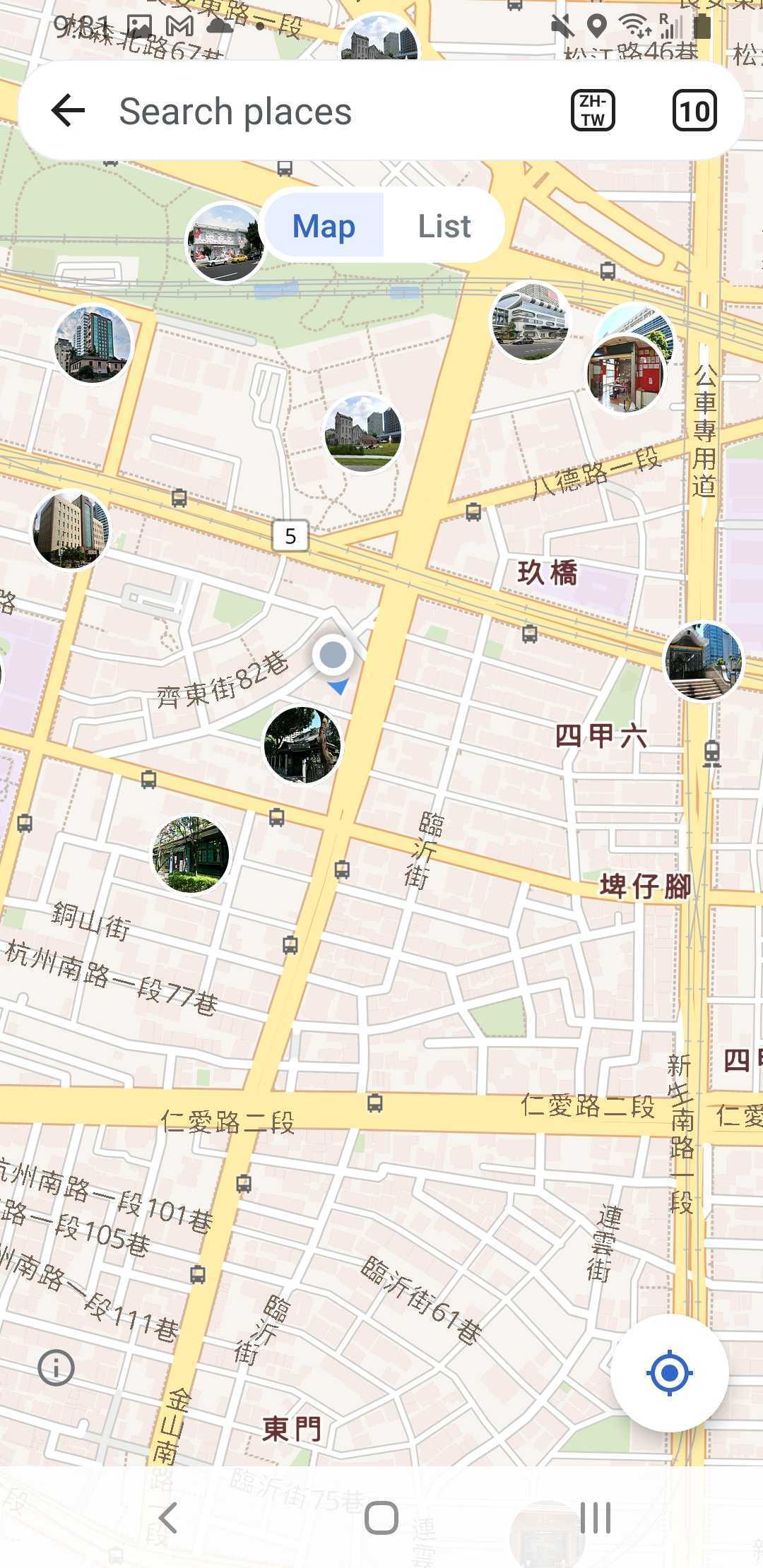
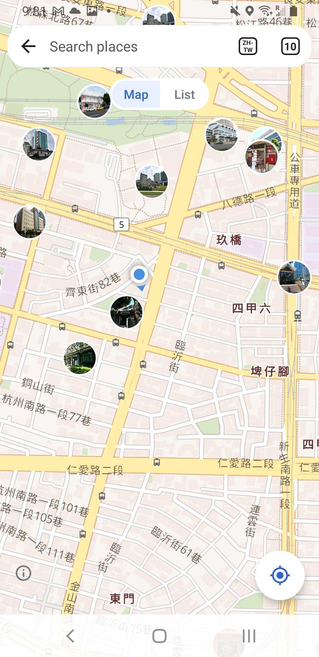
Page MenuHomePhabricator

Places: Update and fine tune UI elements of the map
Closed, ResolvedPublic

Description

Design (Figma)

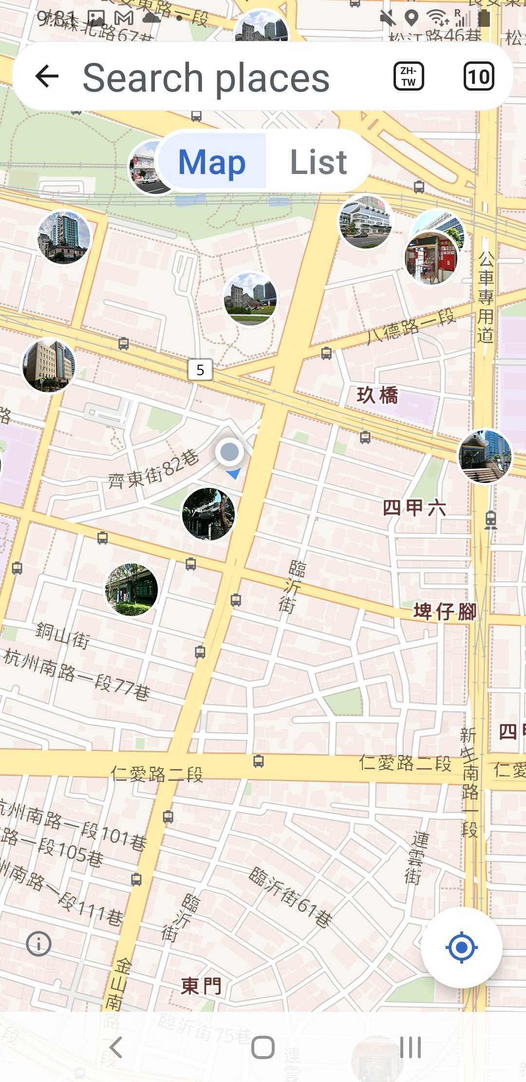
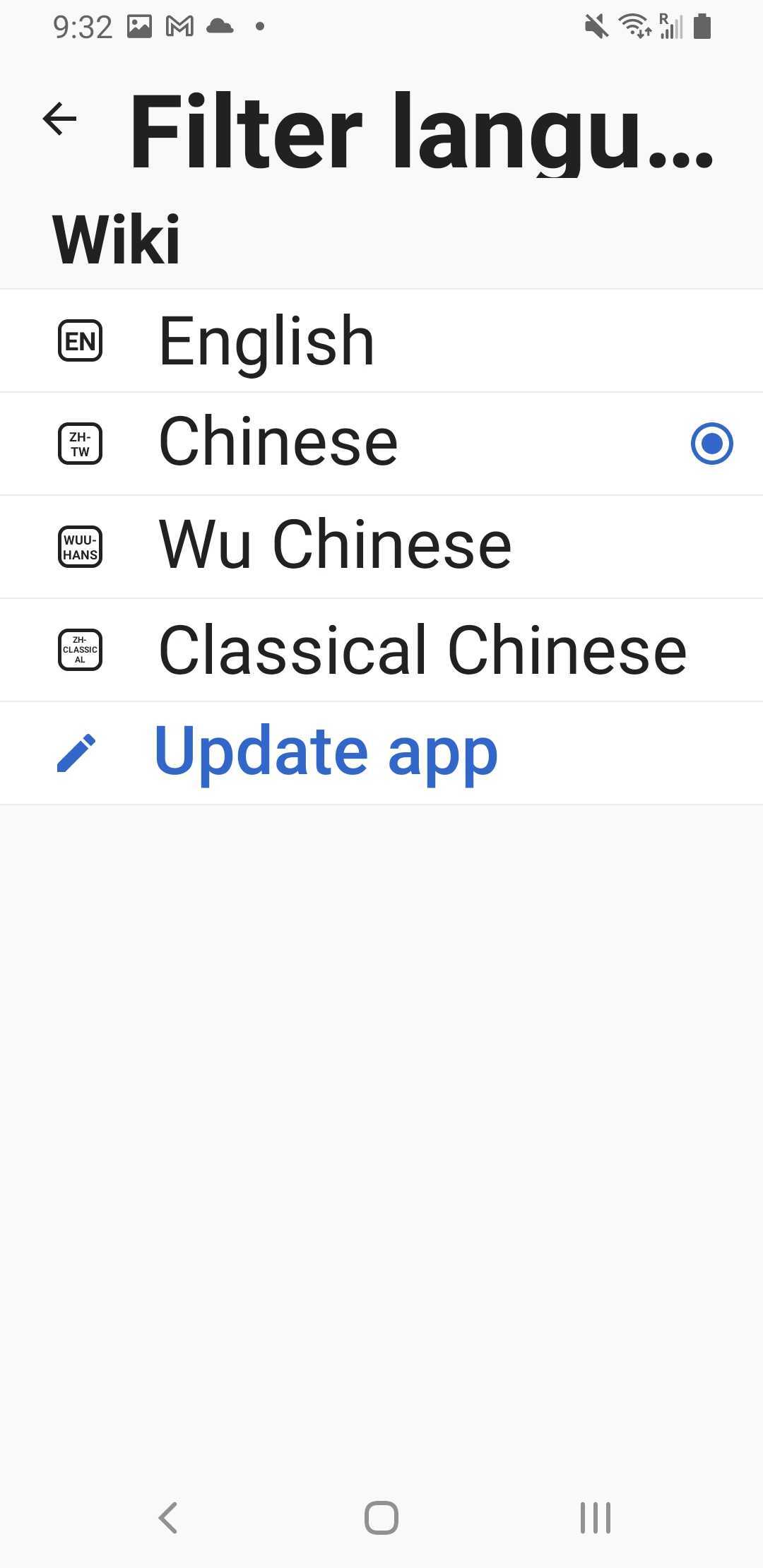
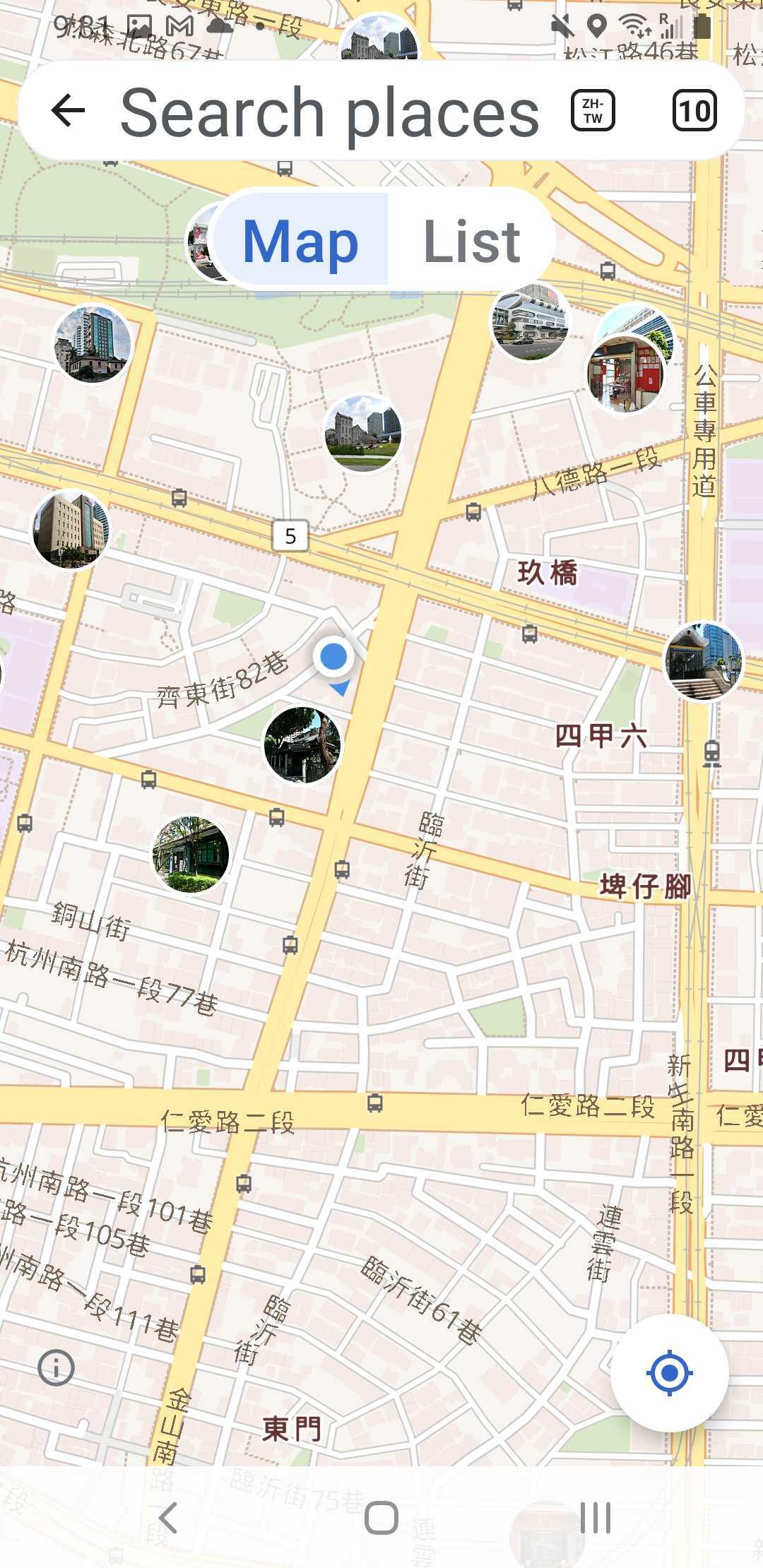
This task is to update the UI elemnts withing the mapview. This will require looking into what is feasible with the library, and building:

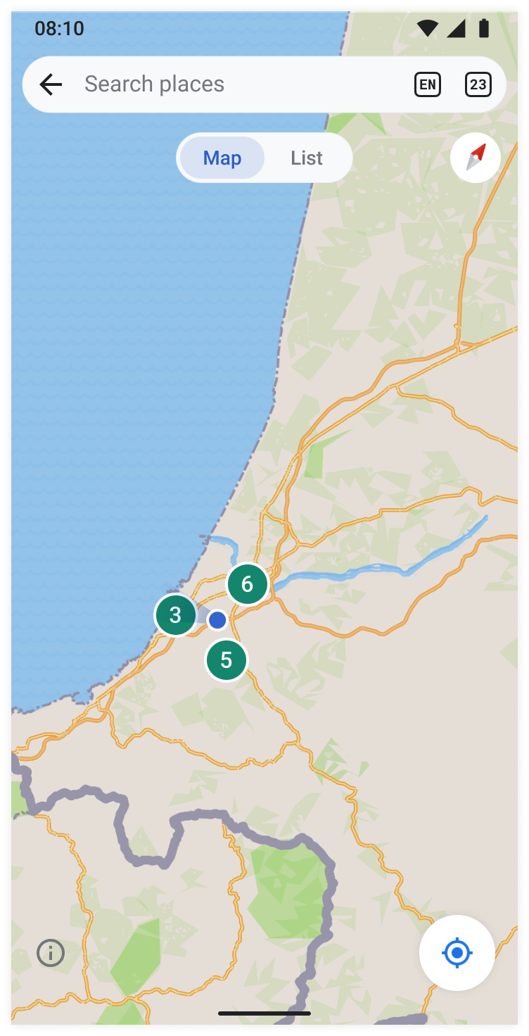
  • Icon for compass as per specs
  • Marker icon per specs
  • Any other transitions/ minor adjustments that need to be made for the map view

APK: https://github.com/wikimedia/apps-android-wikipedia/pull/4182

Event Timeline

Sharvaniharan renamed this task from Places: Update all UI elements of the map to Places: Update and fine tune UI elements of the map.Dec 15 2023, 10:24 PM

Hi @scblr

I do not see the default color for the markers that don't have an image in the Figma, does the placeholder_color look good to you? Also, does the size need to be consistent or smaller?

Screenshot_20231220-171601_Wikipedia Dev.jpg (2×1 px, 90 KB)

@cooltey how about reusing the color from the cluster experience: success_color? (T351159)

Hi @scblr

@cooltey how about reusing the color from the cluster experience: success_color? (T351159)

Yes, here are the screenshots:
border: paper_color, should we change that?
base: success_color

Screenshot_20231221-154435_Wikipedia Dev.jpg (2×1 px, 96 KB)
Screenshot_20231221-154357_Wikipedia Dev.jpg (2×1 px, 94 KB)

Hi @cooltey

Noting this here so you can check/work on them as part of this task.
https://phabricator.wikimedia.org/T351397#9421119
Please lmk if you have questions
thank you :-)

Thanks @Sharvaniharan, that helps!

Hi @scblr,

Three questions:

Screenshot_20240102-162915_Wikipedia Dev.jpg (2×1 px, 140 KB)

  1. Should we align the size of markers with the cluster? (smaller?)
  2. Please provide the SVG file for the compass since the color is not configurable.
  3. Light theme vs. Dark theme: T353562#9422686

Great input/questions @cooltey 👏

Should we align the size of markers with the cluster? (smaller?)

Yes let’s align them to the smaller size!

Please provide the SVG file for the compass since the color is not configurable.

Light theme vs. Dark theme: T353562#9422686

These colors look good to me; thanks for verifying!

Hi @scblr

Great input/questions @cooltey 👏

Yes let’s align them to the smaller size!

Done!

Please provide the SVG file for the compass since the color is not configurable.

The compass is not vertical by default and it also does not have the background. Could you please update the SVG? Thanks!

Screenshot_20240108-171808_Wikipedia Dev.jpg (2×1 px, 127 KB)

Please provide the SVG file for the compass since the color is not configurable.

The compass is not vertical by default and it also does not have the background. Could you please update the SVG? Thanks!

Screenshot_20240108-171808_Wikipedia Dev.jpg (2×1 px, 127 KB)

How about this, @cooltey? 👇

Please apply the shadow from the location button (bottom right) to the compass as well. Thanks!

Hi @scblr

Done! Please check the APK from the ticket description, thanks!

Please apply the shadow from the location button (bottom right) to the compass as well. Thanks!

The compass UI element is built in the library and we cannot access the view to do further updates.

I also tried to apply shadow to the drawable or add another layout to the position but did not work correctly.

Due to the technical limitation, can we show the compass icon without the shadow (which is a default presentation) ?

@cooltey

1)

The compass UI element is built in the library and we cannot access the view to do further updates.

Ok, one last try with the SVG below? I increased the canvas and applied our default shadow.

If it’s not working, let’s keep the previous one.

2) Can you align the compass with the button on the right?

ImplementationvsDesign
Screenshot_20240110-110157.png (2×1 px, 882 KB)
image.png (1×752 px, 760 KB)

3) Related to alignment: if you could look into this from T351397#9441219 as well, that’d be great!

The current positioning of the info icon (next to the location button) feels random. What do you think about this idea? 👇

Map default state: Show info button at the bottom leftMap tilted state: Compass overlaps info button
image.png (1×752 px, 558 KB)

The color of the info icon should be placeholder. Here’s the Figma link with all the details.

Hi @scblr

Please download the latest APK to see the changes.

@cooltey

1)

The compass UI element is built in the library and we cannot access the view to do further updates.

Ok, one last try with the SVG below? I increased the canvas and applied our default shadow.

If it’s not working, let’s keep the previous one.

I updated the icon but it seems pretty much the same. Can you find the difference?

2) Can you align the compass with the button on the right?

ImplementationvsDesign
Screenshot_20240110-110157.png (2×1 px, 882 KB)
image.png (1×752 px, 760 KB)

It looks like the new compass icon moves up a bit and now it looks aligned to the right.

3) Related to alignment: if you could look into this from T351397#9441219 as well, that’d be great!

The current positioning of the info icon (next to the location button) feels random. What do you think about this idea? 👇

Map default state: Show info button at the bottom leftMap tilted state: Compass overlaps info button
image.png (1×752 px, 558 KB)

I did not see this issue, can you provide the steps to reproduce it?

The color of the info icon should be placeholder. Here’s the Figma link with all the details.

Done!

Thx @cooltey

It looks like the new compass icon moves up a bit and now it looks aligned to the right.

  • Since the new compass icon doesn’t do anything, can you use the previous one (T353562#9445086) and vertically align it (F41663037)? It’s better regarding file size and svg optimization.
  • Can you also ensure that the margin-left of the compass is 16dp?

I did not see this issue, can you provide the steps to reproduce it?

  • It’s not an issue; it’s a feature request 🙃 Since we need to show the "info i" icon for licensing reasons, can we show it at the bottom left? When the map is tilted, it should overlap the "info i" icon
  • Also, ensure that the "info i" icon uses the default icon size (24*24dp).

Hi @scblr
Please download the APK to see the changes, thanks.

Thx @cooltey

It looks like the new compass icon moves up a bit and now it looks aligned to the right.

  • Since the new compass icon doesn’t do anything, can you use the previous one (T353562#9445086) and vertically align it (F41663037)? It’s better regarding file size and svg optimization.
  • Can you also ensure that the margin-left of the compass is 16dp?

Updated with the previous compass icon, and now it aligns with the location icon.

I did not see this issue, can you provide the steps to reproduce it?

  • It’s not an issue; it’s a feature request 🙃 Since we need to show the "info i" icon for licensing reasons, can we show it at the bottom left? When the map is tilted, it should overlap the "info i" icon
  • Also, ensure that the "info i" icon uses the default icon size (24*24dp).

From the discussion with engineers, hiding/overlapping the info icon will go against the terms of use.

Also, if we move the info icon to the bottom left, the info icon will sit on an upper level and will overlap the compass icon.

Screenshot_20240111-122500_Wikipedia Dev.jpg (2×1 px, 143 KB)

My question now: where would you like to put the info icon?

Thanks @cooltey – here’s the design suggestion: the info icon stays at the bottom left, but the compass is displayed at the top right when the map is tilted:

Default
image.png (1×752 px, 559 KB)
Tilted map
image.png (1×752 px, 560 KB)

Designs on Figma are updated accordingly.

Hi @scblr, done and please download the latest APK to see the change, thanks!

Looks good, @cooltey – can you apply a 12dp margin-right to the compass instead of 8dp? It’s a visual trick to make the top more harmonic.

There is no need for another design review round, though: please move it to the next column after applying it.

Thanks!

Thanks @cooltey. I appreciate your excellent work on this! 😍

cooltey added a subscriber: Dbrant.

Hi @scblr

I have received feedback from @Dbrant that the different devices or system font-size settings will affect how it looks.
https://github.com/wikimedia/apps-android-wikipedia/pull/4429#pullrequestreview-1856726035

To solve that, I found that we can use an Android library ( TextViewCompat.setAutoSizeTextTypeUniformWithConfiguration) that handles the text size automatically:

For language code:

autoSizeMinTextSize: 1
autoSizeMaxTextSize: 12
autoSizeStepGranularity: 1
unit: sp

For tab count:

autoSizeMinTextSize: 7
autoSizeMaxTextSize: 12
autoSizeStepGranularity: 1
unit: sp

and here are the screenshots:

Screenshot_20240202-132710_Wikipedia Dev.jpg (2×1 px, 86 KB)
Screenshot_20240202-132719_Wikipedia Dev.jpg (2×1 px, 71 KB)
Screenshot_20240202-132729_Wikipedia Dev.jpg (2×1 px, 61 KB)
Screenshot_20240202-132659_Wikipedia Dev.jpg (2×1 px, 96 KB)

I tried to make the text inside the textview to increase/decrease the size of the view, but not work as expected.

You can download the APK to see and test the changes and please let me know if it works for you, thanks!

1)

To solve that, I found that we can use an Android library ( TextViewCompat.setAutoSizeTextTypeUniformWithConfiguration) that handles the text size automatically:

This is pretty clever @cooltey. Can you define the width of the text field inside the border? I’m asking because the letters/numbers are often touching the borders now, like here:

CleanShot 2024-02-02 at 12.43.29@2x.png (576×1 px, 237 KB)

The way I avoided this in the designs is that the text field does not span from edge to edge inside the border:

CleanShot 2024-02-02 at 12.48.51@2x.png (1×1 px, 99 KB)

Check out the Figma for details.

2) Since the autoSizeMinTextSize values differ for tab count and language code, will they resize the same way (synchronously)? I’m asking because in Places, they’re right next to each other. The same resize behavior is appreciated, e.g., when the tab count contains 2 numbers and language code 2 letters. Can you post a screenshot from Places? Thx

Hi @scblr

Updated to 2dp horizontally now. You can also check the APK as well.

However, I cannot guarantee that this setting can fit all different devices with various font settings, so touching the edges might be expected.

Here are the screenshots from Places:

Screenshot_20240202-213143_Wikipedia Dev.jpg (2×1 px, 214 KB)
Screenshot_20240202-213205_Wikipedia Dev.jpg (2×1 px, 65 KB)
Screenshot_20240202-213156_Wikipedia Dev.jpg (2×1 px, 215 KB)
Screenshot_20240202-213133_Wikipedia Dev.jpg (2×1 px, 213 KB)
Screenshot_20240202-213215_Wikipedia Dev.jpg (2×1 px, 69 KB)
Screenshot_20240202-213122_Wikipedia Dev.jpg (2×1 px, 212 KB)
Screenshot_20240202-213111_Wikipedia Dev.jpg (2×1 px, 212 KB)
Screenshot_20240202-213224_Wikipedia Dev.jpg (2×1 px, 62 KB)

Hi @scblr @cooltey

Can this be moved to Merged and waiting?

Yes @Sharvaniharan – I moved it to Code review now 👍