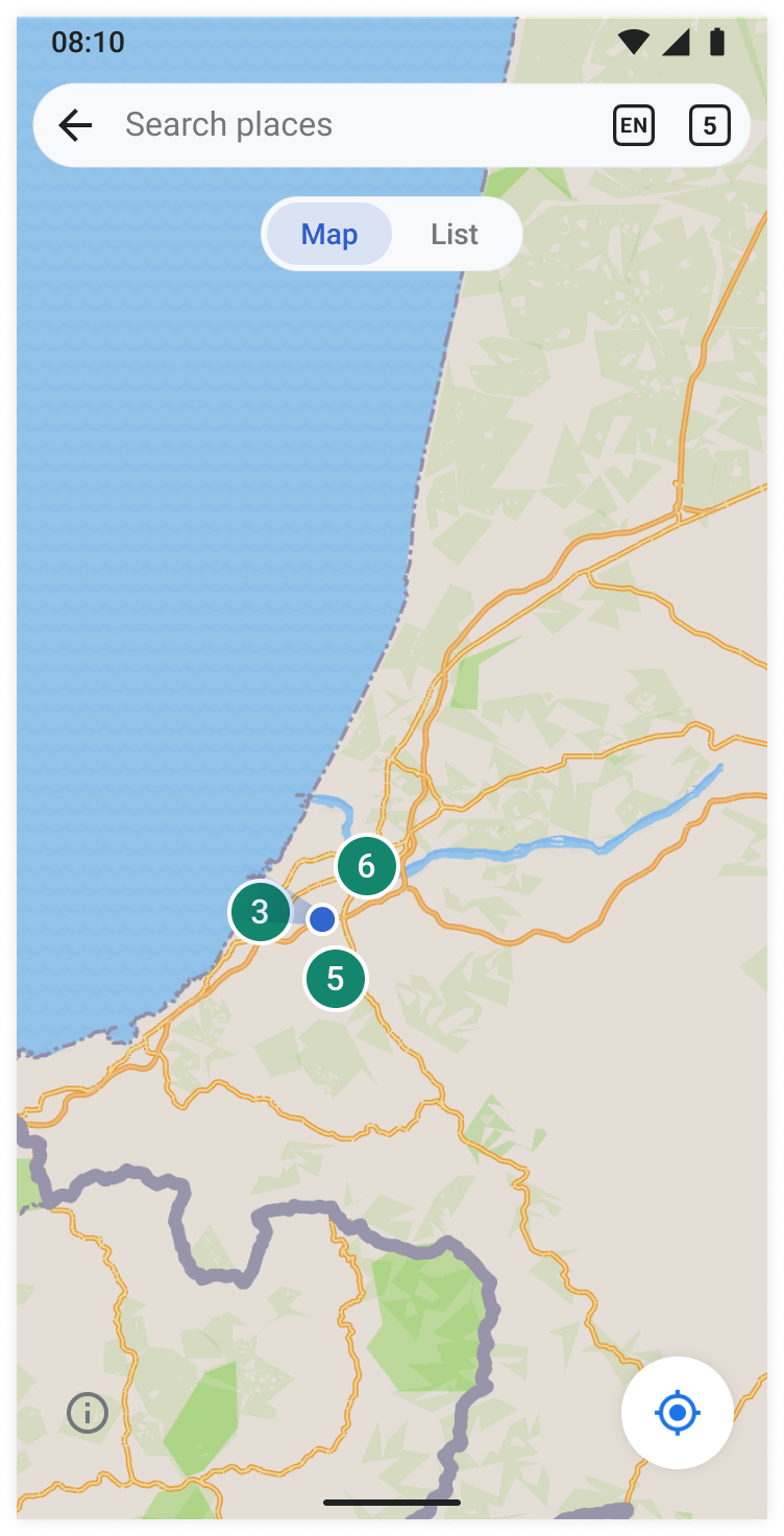
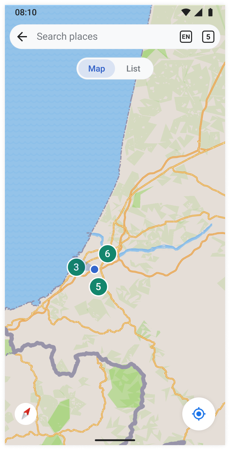
Page MenuHomePhabricator

Places: Build search tab functionalities and Filter screen on map view
Closed, ResolvedPublic

Assigned To
Authored By
scblr
Nov 16 2023, 12:59 PM
Referenced Files
F41697308: Screenshot_20240118-133140.png
Jan 18 2024, 12:33 PM
F41695199: Screenshot_20240117-100559.png
Jan 17 2024, 9:11 AM
F41658630: image.png
Jan 8 2024, 11:53 AM
F41658636: Screenshot_20240108-125212.png
Jan 8 2024, 11:53 AM
F41658617: CleanShot 2024-01-08 at 12.41.57@2x.png
Jan 8 2024, 11:53 AM
F41658603: image.png
Jan 8 2024, 11:53 AM
F41658599: image.png
Jan 8 2024, 11:53 AM
F41649128: Screenshot 2024-01-02 at 2.55.34 PM.png
Jan 2 2024, 10:57 PM

Description

Design (Figma)
1. Zoomed in
image.png (1×752 px, 760 KB)
2. Zoomed out
image.png (1×752 px, 558 KB)
3. Filter
image.png (1×720 px, 40 KB)
  • Tapping 'Back' at the top left takes users to where they came from (either to T351393 or T351394)
  • Tapping the 'Tabs' icon at the top right takes users to the tab overview page
  • Tapping the language button (EN) leads to the Filter view (view reused from contributions)
  • Tapping an item on the map leads to doubling the icon’s size and leads to the view described in T351395
  • Zooming out leads to a clustered view of the map (details to be defined with @Sharvaniharan during implementation)
  • Tapping the compass icon at the bottom right changes the map’s orientation to default (existing functionality). The compass icon is shown only when the map has been tilted/manipulated by the user.
  • Tapping the location icon at the bottom right takes the user to its current location, which is also the map’s default state

APK: https://github.com/wikimedia/apps-android-wikipedia/pull/4319/checks

Event Timeline

Sharvaniharan renamed this task from Build map view to Nearby: Build map view.Nov 20 2023, 6:48 PM
Sharvaniharan triaged this task as Medium priority.

@Sharvaniharan do you know if this functionality is feasible for the compass icon in Mapbox? 👇

https://www.dropbox.com/scl/fi/vbccj1vp8zv64ce5ctgjj/RPReplay_Final1700743529-2.mov?rlkey=mqvtw5rxeg7745agy9xg566i4&dl=0

It tilts the map based on the direction you are facing. If we get it out of the (map) box, let’s use it, as it’s great for navigation.

Thanks!

Sharvaniharan renamed this task from Nearby: Build map view to Places: Build map view.Dec 7 2023, 2:28 AM

@scblr
I have moved the map|list switch to the List view task.
Have also created another task for all UI element updates on the map:

Sharvaniharan renamed this task from Places: Build map view to Places: Build search tab functionalities and Filter screen on map view.Dec 16 2023, 12:17 AM

Hi @scblr
This is ready for Design review: https://github.com/wikimedia/apps-android-wikipedia/pull/4319/checks

The change of marker icons and compass icon will happen in the ui element update task.

@scblr A couple of comments and requests:

image.png (152×473 px, 20 KB)

  • The "tabs" button in the design looks slightly larger than our Tabs button in other places, such as the article screen or main screen. Can we make it consistent, or do we want to change the design for the tabs button everywhere?
  • Same for the language button: it looks slightly different from other places where we have it (thicker border?).
  • Regarding the Language selection screen: can we please reuse the language selection that we have in other places, such as Talk pages. That way we can leverage an existing screen without needing to build anything new:

image.png (537×455 px, 32 KB)
This would make even more sense because the language selection is not a "filter", but simply setting the wiki language for your map.

1)

The "tabs" button in the design looks slightly larger than our Tabs button in other places, such as the article screen or main screen. Can we make it consistent, or do we want to change the design for the tabs button everywhere?

Same for the language button: it looks slightly different from other places where we have it (thicker border?).

Good eye @Dbrant. I adapted the tabs and language icons to look consistent alongside each other. But yeah, let’s use the ones we have in the app already and see how they look together. Then make some tweaks, possibly. It wouldn’t make sense to, e.g., use a different type of border thickness for each of these since they use the same square shape.

2)

Regarding the Language selection screen: can we please reuse the language selection that we have in other places, such as Talk pages. That way we can leverage an existing screen without needing to build anything new:

Yes, it looks like the screenshot you posted does not match the designs on Figma (which re-use the contributions filter design).

3)

I noticed that this view uses incorrect type definitions:

Screenshot_20231221-132449.png (2×1 px, 97 KB)

a) Please change it to use the p type definition for the language list:

font-family: Roboto
font-weight: Regular
font-size: 16sp
line-height: 24sp/1.5em

b) And h3-button for the 'Add language' label:

font-family: Roboto
font-weight: Medium
font-size: 16sp
line-height: 24sp/1.5em

@Dbrant not sure if this belongs in this ticket:

1) Can this button be removed?

Screenshot_20231221-135334 copy.png (2×1 px, 845 KB)

2) Location button design needs to be updated:

ImplementationvsDesign
Screenshot_20231221-135334 copy 2.png (2×1 px, 850 KB)
image.png (1×752 px, 760 KB)

3) Update compass design button:

ImplementationvsDesign
Screenshot_20231221-135645.png (2×1 px, 878 KB)
image.png (1×752 px, 760 KB)

Thx!

Hi @scblr

Picking things back after the changes on this task.. 😅

  1. The tabs view and langCode view now look off sized. Should we match their sizes, or is this ok?

Screenshot 2024-01-02 at 2.22.44 PM.png (242×896 px, 128 KB)

  1. Regarding the language selection, I feel the current Figma looks like the best choice. The app language is not always the map language, so opening the Languages screen directly might not be the best way. The current Filters-like selection feels better here Cc @Dbrant
  1. I have updated the language list items. I also saw that the language scrollview on top had localized name, so have changed that as well. Please check the changes here: https://github.com/wikimedia/apps-android-wikipedia/pull/4351/checks and confirm.
Screenshot 2024-01-02 at 2.56.22 PM.png (260×824 px, 33 KB)
Screenshot 2024-01-02 at 2.55.34 PM.png (318×834 px, 41 KB)

1) Can this button be removed?

Screenshot_20231221-135334 copy.png (2×1 px, 845 KB)

Attribution for maps is required, per the terms of use.

Thanks for the great work on this so far! ✨


1)

Attribution for maps is required, per the terms of use.

Gotcha @Dbrant. The current positioning (next to the location button) feels random. What do you think about this idea? 👇

Map default state: Show info button at the bottom leftMap tilted state: Compass overlaps info button
image.png (1×752 px, 558 KB)

The color of the info icon should be placeholder. Here’s the Figma link with all the details.

2) This hasn’t been updated yet:

Update compass design button:

ImplementationvsDesign
Screenshot_20231221-135645.png (2×1 px, 878 KB)
image.png (1×752 px, 760 KB)

3)

The tabs view and langCode view now look off sized. Should we match their sizes, or is this ok?

Agreed @Sharvaniharan. Since this is a global change, I created a new task: T354522.

4)

Regarding the language selection, I feel the current Figma looks like the best choice. The app language is not always the map language, so opening the Languages screen directly might not be the best way. The current Filters-like selection feels better here Cc @Dbrant

Agreed @Sharvaniharan. I had a few conversations about this with @Dbrant on Slack and explored consistent language screens that works in different scenarios across the app:

However, aligning all language screens is a bigger undertake: so we should consider creating a separate task for it and go with the current design suggestion for now.

5) Related to 4): Please make sure to use the exact design specs from Figma for that language screen:

ImplementationvsDesign
Screenshot_20240108-125212.png (2×1 px, 47 KB)
image.png (1×720 px, 40 KB)

Some things to optimize:

  • p font definition for the list
  • border between list items
  • background color for the entire screen and paper for the list items
  • list items "jump" (are moving by 1px) when selecting an item
  • margin between items is too large

Hi @scblr

Sorry it took long 😅
Here is the new apk. We merged most of the stable updates so we could give you consolidated apks. So the new link is here: https://github.com/wikimedia/apps-android-wikipedia/pull/4383/checks
Thank you!

Thanks @Sharvaniharan.

Minor thing: Please apply the h3-button font style to this:

Screenshot_20240117-100559.png (2×1 px, 92 KB)

h3-button {
  font-family: Roboto;
  font-weight: Medium;
  font-size: 16sp;
  line-height: 24sp/1.5em;
}

And I guess 1) and 2) are handled in T353562.

Hi @scblr

This is done.
And yes, the first two things were addressed on this T353562, but since we merged all our work, you should be able to see the updated changes on the apk.
APK: https://github.com/wikimedia/apps-android-wikipedia/pull/4383/checks
Thank you :)

@Sharvaniharan "Update app languages" using bold or faux bold now 🤔 (cc @cooltey) 👇

Screenshot_20240118-133140.png (2×1 px, 88 KB)

Can you check if it’s using

h3-button {
  font-family: Roboto;
  font-weight: Medium;
  font-size: 16sp;
  line-height: 24sp/1.5em;
}