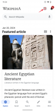
Page MenuHomePhabricator

Harmonize dynamic tab and language icon in the app
Closed, ResolvedPublic

Assigned To
Authored By
scblr
Jan 8 2024, 11:38 AM
Referenced Files
F41734166: CleanShot 2024-01-31 at 10.13.17@2x.png
Jan 31 2024, 9:14 AM
F41731120: CleanShot 2024-01-30 at 11.34.13@2x.png
Jan 30 2024, 10:35 AM
F41731115: Screenshot_20240130-112434 1 copy.png
Jan 30 2024, 10:35 AM
F41731093: Screenshot_20240130-112638.png
Jan 30 2024, 10:35 AM
F41722246: Screenshot_20240126-155500_Wikipedia_Dev.jpg
Jan 27 2024, 9:54 AM
F41722244: Screenshot_20240126-155554_Wikipedia_Dev.jpg
Jan 27 2024, 9:54 AM
Restricted File
Jan 27 2024, 12:39 AM
Restricted File
Jan 27 2024, 12:39 AM

Description

This task is derived from T351397#9431331.

Problem:

Screenshot 2024-01-02 at 2.22.44 PM.png (242×896 px, 128 KB)

Tabs and language icons don’t work side by side due to different border widths and font sizes.

Solution:

image.png (1×752 px, 558 KB)

Please harmonize both the tabs and language icon to use the specs defined on Figma:

Examples in various contexts:

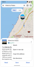
Places
image.png (1×752 px, 578 KB)
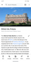
Article
image.png (1×720 px, 609 KB)
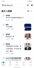
Explore
image.png (1×720 px, 245 KB)
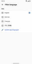
Languages
image.png (1×720 px, 45 KB)

Notes

  • Icon canvas: 24dp*24dp(Material default)
  • Canvas within the borders: 19dp*18dp (it always has the same width)
  • Text field: 15dp*14dp* (vertically and horizontally centered on the icon canvas)
  • Border thickness:1.5dp
  • The font size adapts:
    • One and two characters: Roboto Mono, Bold, 10sp (e.g. tab numbers and language codes with two letters)
    • More than two characters: Roboto Mono, Bold, 5sp (e.g. language codes with more than two letters)

APK: https://github.com/wikimedia/apps-android-wikipedia/pull/4182

Event Timeline

JTannerWMF subscribed.

@scblr will show examples of before and after for existing cases

Added examples to the task’s description and put it back to Needs triage so we can discuss it in the next planning meeting @JTannerWMF.

Hi @scblr

The original spec you provided for zh-hant language code will make the text touch to the border, so I made other comparisons for your reference.

Please see the screenshots below and let me know which one I should proceed with.

Screenshot_20240123-173032_Wikipedia Dev.jpg (2×1 px, 152 KB)
Screenshot_20240123-172945_Wikipedia Dev.jpg (2×1 px, 153 KB)
Screenshot_20240123-172832_Wikipedia Dev.jpg (2×1 px, 154 KB)
19dp x 18dp + 5sp20dp x 19dp + 6sp19dp x 18dp + 6sp

Please note the Tab icon is 19dp x 18dp + 6sp

@cooltey, let’s go with 19dp x 18dp + 5sp then.

I updated the task’s description. I'm just making sure: did you see the definitions? 🤔👇

  • The font size adapts:
    • One and two characters: Roboto Mono, Bold, 10sp (e.g. tab numbers and language codes with two letters)
    • More than two characters: Roboto Mono, Bold, 5sp (e.g. language codes with more than two letters)

Thanks!

Hi @scblr

The PR is working in progress, but you may check it here: https://github.com/wikimedia/apps-android-wikipedia/pull/4415
(the color might be off)

I have not checked if it applied all over the place, but here are the results:

Screenshot_20240125-174516_Wikipedia Dev.jpg (2×1 px, 54 KB)
Screenshot_20240125-171556_Wikipedia Dev.jpg (2×1 px, 82 KB)

It looks like using 5sp for zh-classical is acceptable, I do not think it would be necessary to limit the text length.

Hi @scblr

The design changes have been updated to the main branch, which does not apply to the Places yet.

Please download the APK from the ticket description to see the changes, thanks!

Here are the screenshots for your reference in case you cannot find them all 😉

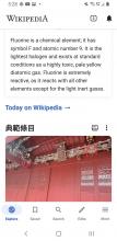
Screenshot_20240126-155407_Wikipedia Dev.jpg (2×1 px, 118 KB)
Screenshot_20240126-155532_Wikipedia Dev.jpg (2×1 px, 106 KB)
Screenshot_20240126-155524_Wikipedia Dev.jpg (2×1 px, 60 KB)
Screenshot_20240126-155442_Wikipedia Dev.jpg (2×1 px, 83 KB)
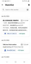
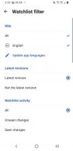
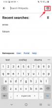
Screenshot_20240126-155500_Wikipedia Dev.jpg (2×1 px, 76 KB)
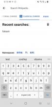
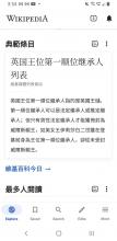
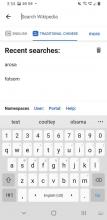
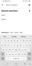
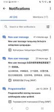
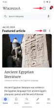
FeedWatchlistWatchlist filterSearch (multiple languages)Search (single language)
Screenshot_20240126-155412_Wikipedia Dev.jpg (2×1 px, 127 KB)
Screenshot_20240126-155416_Wikipedia Dev.jpg (2×1 px, 62 KB)
Screenshot_20240126-155510_Wikipedia Dev.jpg (2×1 px, 59 KB)
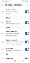
Screenshot_20240126-155554_Wikipedia Dev.jpg (2×1 px, 90 KB)
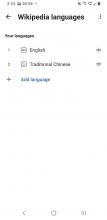
Screenshot_20240126-155447_Wikipedia Dev.jpg (2×1 px, 41 KB)
NotificationNotification filterCustomize feedContribution filterWiki languages

Here are the screenshots for Places (not in this APK yet)

{F41721116}{F41721115}

Looks great! Except maybe for the ZH-CLASSICAL, which is a bit cramped → I still think we should limit the characters to 8, as the WP code for ZH-CLASS (for example) is distinguishable from other Chinese language codes like ZH-YUE. Thoughts @cooltey?

1) Can you remind me of the difference between the filled and outlined icons in this view? 🤔

Screenshot_20240126-155554_Wikipedia_Dev.jpg (2×1 px, 196 KB)

2) For consistency with Places, let’s change this icon to be outlined (not filled)

Screenshot_20240126-155500_Wikipedia_Dev.jpg (2×1 px, 155 KB)

Hi @scblr

Please download the APK to see the changes, thanks.

Looks great! Except maybe for the ZH-CLASSICAL, which is a bit cramped → I still think we should limit the characters to 8, as the WP code for ZH-CLASS (for example) is distinguishable from other Chinese language codes like ZH-YUE. Thoughts @cooltey?

Cutting the language code is not a good idea and I prefer to keep the minimum 5sp for the longer language code in this case, to respect every language code, even if it touching the edge of the view 😓

1) Can you remind me of the difference between the filled and outlined icons in this view? 🤔

Screenshot_20240126-155554_Wikipedia_Dev.jpg (2×1 px, 196 KB)

Filled -> selected language
Outlined -> not selected language

Maybe we can simplify it to show the language code view only if it is selected.

2) For consistency with Places, let’s change this icon to be outlined (not filled)

Screenshot_20240126-155500_Wikipedia_Dev.jpg (2×1 px, 155 KB)

Done!

@cooltey just looked at it (except for Places which isn’t visible yet).

1) The font resizing logic in the tab is incorrect yet. Compare the number 10 with the letters EN. It should also use 10sp:

Screenshot_20240130-112638.png (2×1 px, 1 MB)

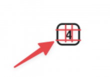
2) Nitpick: when there’s a one-digit number in the new tabs icon, it is not visually not horizontally centered:

Screenshot_20240130-112434 1 copy.png (1×720 px, 779 KB)
CleanShot 2024-01-30 at 11.34.13@2x.png (434×616 px, 48 KB)

Can we move it a tad to the left? Thanks


Hi @scblr

Please download the APK to see the changes, thanks.

Looks great! Except maybe for the ZH-CLASSICAL, which is a bit cramped → I still think we should limit the characters to 8, as the WP code for ZH-CLASS (for example) is distinguishable from other Chinese language codes like ZH-YUE. Thoughts @cooltey?

Cutting the language code is not a good idea and I prefer to keep the minimum 5sp for the longer language code in this case, to respect every language code, even if it touching the edge of the view 😓

Ok, agreed!

1) Can you remind me of the difference between the filled and outlined icons in this view? 🤔

Screenshot_20240126-155554_Wikipedia_Dev.jpg (2×1 px, 196 KB)

Filled -> selected language
Outlined -> not selected language

Maybe we can simplify it to show the language code view only if it is selected.

Ok! 👍

2) For consistency with Places, let’s change this icon to be outlined (not filled)

Screenshot_20240126-155500_Wikipedia_Dev.jpg (2×1 px, 155 KB)

Done!

Thanks!

Hi @scblr

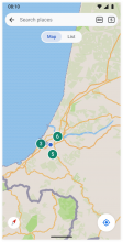
The new icons have been applied to the feature branch. Please download the APK to see the changes on Places, thanks!

https://github.com/wikimedia/apps-android-wikipedia/pull/4182
Hey @cooltey – you’re going to hate me for this 🤗👇

I experimented a bit with bigger sizes to accommodate zh-classical better:

  • Border: 21dp * 20dp
  • Border-width: 1.5dp
  • Up to 2 characters: Roboto Mono, Bold, 12sp
  • Up to 8 characters: Roboto Mono, Bold, 7sp
  • Up to 12 characters: Roboto Mono, Bold, 5sp

In theory, the result should look like this:

CleanShot 2024-01-31 at 10.13.17@2x.png (484×1 px, 58 KB)

Any chance we could try out these settings? I owe you a bubble tea!🧋👼

Hi @scblr

Done!
https://github.com/wikimedia/apps-android-wikipedia/pull/4429

Please check the APK to see the changes 😄

Looks good to me @cooltey – we made it! Thanks for the great work!