Page MenuHomePhabricator

Add hard drop shadow to echo badge label text to increase readability
Closed, DeclinedPublic

Description

echo badge changes

to increase readability of the text for echo notification, a subtle hard drop shadow should be added to the text label for number of notifications.

The echo badge itself should have a minimum width so that it is square at its smallest size irrespective of the notification count 1 vs 0, and a consistent padding so as the count increases the badge resizes in a clean way.

see attached image.


Version: unspecified
Severity: normal
Whiteboard: gci2014

Attached:
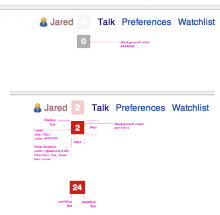
echo_badge.png (574×586 px, 44 KB)

Details

Reference
bz55523

Event Timeline

bzimport raised the priority of this task from to Medium.Nov 22 2014, 2:20 AM
bzimport set Reference to bz55523.
bzimport added a subscriber: Unknown Object (MLST).

It seems that the original design included some shadows, but the implementation was broken (didn't cause a shadow to be shown) and so the code was removed per bug 53490.

Interesting, value should be text-shadow: 0px 1px 0px rgba(0,0,0,0.20);

But personally, as outlined on the patch on the bug (https://gerrit.wikimedia.org/r/#/c/81502/), I am against adding a text shadow here, as we're not using those anywhere (and because IMO it looks bad in this particular case).

@Bartosz did you look at the image provided? What exactly do you think looks bad about it? its very subtle.

As far as it looking out of place, it is in line with the Agora style controls that we're working on rolling out and will be initially used in flow.

(In reply to comment #4)

As far as it looking out of place, it is in line with the Agora style
controls that we're working on rolling out and will be initially used in flow.

The problem is, the entirety of Agora tends to look out of place in Vector. This is because Agora and Vector each technically very different skins (in the sense of being sets of visual styles applied to the interface), with different aims. Attempting to meld them together in this fashion simply does not work.

More to point on the bug at hand, though, I'm not sure adding a drop shadow like that is going to help much anyway. There comes a point where subtle things become too subtle, and considering the variation we can expect in monitor contrast, chances are it won't even show up at all for most people if they're not using high end screens.

@Isarra due to the size and complexity of the project, its nearly impossible to flip a switch and have everything have an identical look and feel instantly. So you'll naturally see some inconsistencies while things grow and change. To clarify I'm referring to Agora Control Library, not Agora the skin.

When we design new features we certainly want them to degrade in a pleasant and known way for all the platforms we support. However we do not design specifically for those platforms as our benchmark of desired look and feel.

I wasn't aware there were multiple Agoras. Interesting.

My point was that the potential usefulness of the shadow is sufficiently limited that it's probably not worth worrying about, at least as a bug. That doesn't make it necessarily bad to do, however - just that the priority would probably be quite low here.

That said, if you know a bit of css and would like to add the line back yourself, without the breaking space so that it actually works this time, you should be able to go through github and do it pretty easily from there. Apparently yuvipanda enjoys being tortured by pull requests into gerrit.

(This was never turned into a GCI task, removing misleading information.)

We still welcome GCI tasks! Especially UX related, since we are running out of them. Jorm, you can you create a task for this bug if you wish.

Jared: Could you and/or other members of Design imagine being a mentor for this task in Google Code-in 2014?
See https://lists.wikimedia.org/pipermail/wikitech-l/2014-October/079264.html and https://www.mediawiki.org/wiki/Google_Code-in_2014 for more information.

I'm happy to help getting this task into Google Code-in - just need to know if somebody (plural) would mentor this!

sure, its a pretty small task. Happy to help.

I'm currently working on fixing this