Page MenuHomePhabricator

A8. Polish the entry fields after VE integration
Closed, ResolvedPublic2 Estimated Story Points

Description

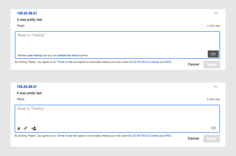
Here are some visual issues I have identified that can help to make the UI look more clear. I included a mockup of the current status, a list of the issues, and a mockup on how the resulting UI would look after the changes.

flow-edit-box-original.png (637×960 px, 75 KB)

  1. The reply box for wikitext:
    1. The highlighting of the reply box should go around the whole reply area (including the "wikitext info" label and the "switch to VE" button).
    2. The top padding needs to be increased. Make the padding be 8px on all the sides (currently it has different values and making it depend on font size, by using em units, helps to misalign stuff). I'll be using the 8px unit to keep space consistent in different elements.
    3. When the focus is on the text, I can see both the highlighted blue and a bit of the grey border behind. Only the highlighted should be visible. (T95512)
  2. The "wikitext info" text:
    1. It should be aligned with the text above. For that, an 8px padding could help.
    2. Since it is a kind of footnote, we want it aligned to the bottom of the text area (with an 8px distance to the bottom border of it).
    3. Links should open in a new window to avoid the user to lose the context. (T97434)
  3. Switch to wikitext mode.
    1. It should be a regular pressed button. That is, look dark grey, not green. (T94877)
    2. It should use the same icon used on the rich text version and it should be in the same location when you interact with it. For that purpose, I reduced the button height to 28px and adjusted the position of the VE version accordingly. (T97451)
  4. Terms of use text. Move it down keeping a distance of 8px.
  1. For VE text area. The total height for the text element (what gets surrounded by the blue highlight) needs to be consistent in both versions. I made it 110px.
  2. The placeholder text is not appearing in the VE version. It should be added to keep it consistent.(T97457)
  3. The VE actions should be moved down to be 8px to the bottom and have an 8px separation to each other.
  4. Terms of use text. Move it down keeping a distance of 8px.
  5. When summarizing a topic, VE box should not be gray.

flow-edit-box-changes.png (637×960 px, 67 KB)

Event Timeline

Pginer-WMF raised the priority of this task from to High.
Pginer-WMF updated the task description. (Show Details)
Pginer-WMF set Security to None.
DannyH renamed this task from Polish the entry fields after VE integration to A8. Polish the entry fields after VE integration.Apr 22 2015, 8:04 PM
DannyH moved this task from Current workboard to Untriaged on the Collaboration-Team-Triage board.

Change 206771 had a related patch set uploaded (by Pginer):
Polish the entry fields after VE integration Adjustments to the input element for Flow: - Size of VE and wikitext versions are the same (before a jump was noticed when switching). - The switch to VE looks pressed in wikitext. - Wikitext info text is align

https://gerrit.wikimedia.org/r/206771

I created an initial patchset to adjust some of the alignment issues described. It requires a "focused" class to be added to the flow-editor element once the textarea becomes focused (and removed when it is not). Can anyone help with that?

Awesome, it's cool to see that you're creating patches! :) I'll put this in the In Development column, and we'll talk about it in the daily meeting.

I also note you have a '</>' icon for switching to source, however than suggests the source is HTML. The icon for switching to wikitext source should probably be '[ ]' or '[ [ ] ]' (spaces for emphasis only). Both exist in ooui.

Oh, Ed makes a good point. Pau, what do you think about that?

Oh, Ed makes a good point. Pau, what do you think about that?

The main goal of the icon is to communicate that you can access the underlying code for the content. It is true that the underlying code is wikitext, but being that especific requires you to know that to understand the message. With the current approach:

  • If you are aware that the underlying code is wikitext, you will still be able to access it.
  • If you are just familiar with the idea of source code or advanced editing in general (e.g., the HTML editing of a blog publishing system, or the Markdown version of some apps or forums), you will still be able to access the source mode (and through the link to wikitext info, learn how to use it). A more specific "[[ ]]" icon I guess would be harder to decipher in this case.

For example, in Github (which is its core audience we can assume is familiar with coding concepts) they use a similar generic source icon ("<>") to edit their wiki syntax (markdown in this case):

github-edit-source.png (363×1 px, 49 KB)

Having said that, I think it is a valid point, and it would be a good aspect to observe in upcoming usability testing sessions in order to identify potential issues.

Change 206771 merged by jenkins-bot:
Polish the entry fields after VE integration

https://gerrit.wikimedia.org/r/206771

Pau, does your patch fix all of the issues outlined in the description of this task? I ask because there were like 10 of them.

Pau, does your patch fix all of the issues outlined in the description of this task?

No. I focused mostly on the layout. Some notes:

  • I have not covered the aspects that require changes in the logic (e.g., links opening in new window or placeholder text in VE mode).
  • The grey and blue border issue seems to be a general issue of the highlight of input fields, I'd like to check with UI-Standardization instead of overriding it in Flow.
  • I was planning to make both editing areas to be 110px but since I found no way to adjust the default textarea size, I adjusted the VE element to have the same size initially.

I'll split the unsupported elements in the list into separate tasks and update the description to make it more clear.

Pau makes a good point about the recognisability of the <> vs [[]]. One could counter argue that someone who doesn't know about '[[]]' markup probably shouldn't be looking to switch to source mode, however my main concern is that we are consistent across products. Current VE has a [] icon hidden away under a settings menu. In the next quarter hopefully this will become more prominent with our work on source switching.

Either way I think we should also consider showing a label for the button?

I'll split the unsupported elements in the list into separate tasks and update the description to make it more clear.

I updated the description and extracted the issues not covered in the patchset to separate tickets.

Either way I think we should also consider showing a label for the button?

I created a ticket about the icon consistency at T97451: Make source/wikitext icon consistent in order to discuss how to detect the potential issues and find solutions for them.

This looks great on Beta, nice improvement!