Page MenuHomePhabricator

Change the action buttons in context menus to be separate buttons, not a button group
Open, LowPublic

Description

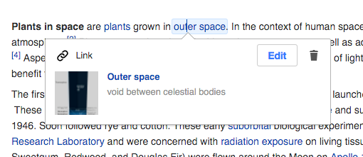
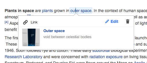
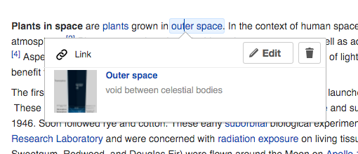
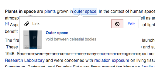
Recently, the delete action is presented in the link inspector as part of a button group, and using a "forbidden" icon:

delete-link.png (220×510 px, 47 KB)

I'd recommend to:

  • Have the actions as separate buttons and not a button group. A button group brings expectations of freedom of navigation. It works well for switching modes ( it is the case of editing) but the delete action destroys the whole thing breaking the possibility of the user to switch. Presenting them as separate buttons (even if they are close to each other) seems a better approach. also, having both buttons being of the same height would reduce visual noise (that part is T113495).
  • Use the trash icon instead. The trash icon communicates better the action of removing the link and it is consistent with other areas of the UI (e.g., deleting template fields).
  • Consider adding a tooltip Ideally with the above the deletion action should be clear, but considering the destructive nature of the action and the lack of a label, if someone is waiting with the cursor on top of it for a while they may appreciate a "Remove link" tooltip to appear.

Related:

Event Timeline

Pginer-WMF raised the priority of this task from to Needs Triage.
Pginer-WMF updated the task description. (Show Details)
Pginer-WMF added a project: VisualEditor.
Pginer-WMF subscribed.

having a different height

I wanted to report this problem, and found this task, which already mentions it. But one thought: The task itself seems to report (and tries to address) multiple problems/suggestions for the link inspector, while the different height seems to be the "most visible" one. So, wouldn't it make sense, to open a new, own task for it to fix it? :)

I decided to create a more general task with the connected issues since solving one may have effects on others. For example, using separate buttons may solve the heigh issue if that is a specific problem of the button group widget. Thus, letting others to decide how to divide the work.

In any case, having tickets or atomic units of work is a good practice. Thus, creating a specific sub-task seems a good option.

Makes sense :)

I know found the same problem for the MultimediaViewer button on a file description page:

Unbenannt.PNG (71×378 px, 3 KB)

(source: e.g. https://commons.wikimedia.org/wiki/File:Google_2015_logo.svg)

Seems to be a general problem?

Jhernandez subscribed.
Jdforrester-WMF lowered the priority of this task from Medium to Low.Dec 1 2015, 8:16 PM

The button has a tooltip. The height is consistent now for most users most of the time (don't ask how we fixed it). The icon was chosen to be consistent with the existing controls that do the same step; longer-term, we're planning to have an 'unlink' icon for this one, but that requires time to test which icon versions are most readily understood.

So the only thing left from here is "Have the actions as separate buttons and not a button group", which looks terrible to me and takes up too much space (we originally did this and merged them into a group).

Re-titling.

Jdforrester-WMF renamed this task from Delete link action seems inconsistent to Change the action buttons in context menus to be separate buttons, not a button group.Dec 1 2015, 8:20 PM
Jdforrester-WMF moved this task from To Triage to Freezer on the VisualEditor board.

Thanks for the update @Jdforrester-WMF

The icon was chosen to be consistent with the existing controls that do the same step;

Exploring the UI I found the trash can icon, but not other instances of this one. Where else is this one used?

longer-term, we're planning to have an 'unlink' icon for this one, but that requires time to test which icon versions are most readily understood.

A specific "unlink" icon makes sense. For general actions such as edit or delete I see two valid approaches: (a) trying to keep the actions generic so that they are consistent across the different inspectors, and (b) present specific icons.
The problem with the second approach is that specific icons may be hard to communicate clearly. For example, I think that a specific "edit link" (e.g., a link with a small pencil) will not work better than a generic "edit" which is already qualified by being inside the link card.

So the only thing left from here is "Have the actions as separate buttons and not a button group", which looks terrible to me and takes up too much space (we originally did this and merged them into a group).

I would be great to explore visually if those issues can be solved, if we identify there is confusion when using this.
If there were a screenshot about the design that was tried, that would be very helpful as a reference.

I added three quick mockups to illustrate immediate variants combining the use of silent buttons, icons and color to get different levels of prominence:

link-button-and-silent.png (220×510 px, 47 KB)

link-silent.png (220×510 px, 47 KB)

link-separate-buttons.png (220×510 px, 48 KB)