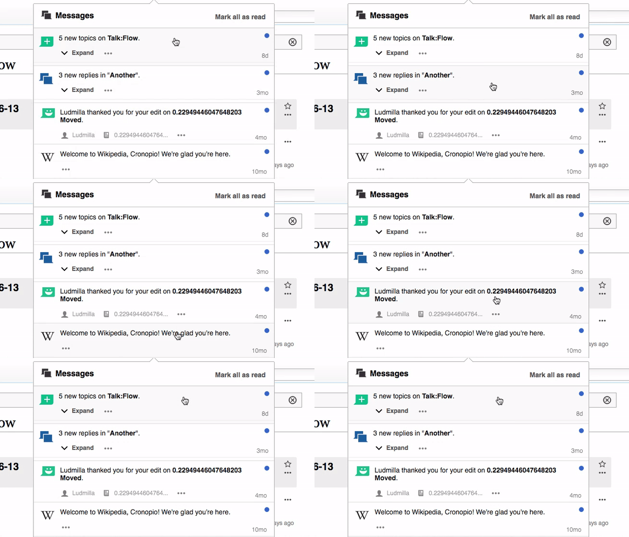
When moving the cursor through the notification list, highlighting the active item could help to communicate which item the user will be acting on. Currently the notification items don't change on hover.
In order to avoid confusion between rea and unread states, a subtle highlighting is proposed:
- For unread items, hover should set the background color to #FAFAFA
- For read items, hover should set the background color to #ECECEC
This should be applied to both the notification items in (a) the notification panel and (b) the notification items in the notifications page.
The resulting effect is shown below:
