Page MenuHomePhabricator

Better organisation of the Notification Page
Closed, ResolvedPublic

Assigned To
None
Authored By
Pginer-WMF
Oct 13 2015, 10:49 AM
Referenced Files
F3578973: notif-page-simplified.png
Mar 9 2016, 4:19 PM
F3578018: notif-page-simplified.png
Mar 9 2016, 3:32 PM
F3268886: notif-page-simplified.png
Jan 22 2016, 1:39 PM
F2716044: inbox.png
Oct 13 2015, 10:49 AM
F2716100: inbox overview.png
Oct 13 2015, 10:49 AM
F2716046: inbox filtered.png
Oct 13 2015, 10:49 AM
F2716048: inbox menu.png
Oct 13 2015, 10:49 AM
Tokens
"Like" token, awarded by MGChecker.

Description

The Notifications page provides access to the full list of your notifications. Currently, all notifications for the local wiki are shown grouped by day, which simplifies going to a specific time period. However, it does not provide much flexibility when looking for the relevant notifications for different activities.

Some example scenarios (more will appear as we dig into the problem):

  • Cronopio wants to check the recent notifications about discussions on his user talk page from all different projects. Cronopio is able to triage what to reply to and can keep some for later if he had no time to reply (e.g., by marking some notification as unread again ).
  • Fama wants to find all the mention notifications she got on a very active topic from a user she is trying to help. She recalls a specific question she wants to look for first.

Goals

The end goal is to make it easy for users to find relevant notifications.
We want the Notification page to become a regularly used entry point for frequent contributors to organise the activities that require their participation.

It will be helpful to measure the access to the Notification Page (and the notifications through it) as well as any sign of improvement of notification processing performance (number of missed notifications to decrease, etc.)

Initial exploration

Some design ideas have been put together in a prototype and documented. More research is needed to identify the needs users have when using notifications to complete different daily on-wiki activities (T124416).

Based on an initial analysis, some design principles to consider are:

  • Flexibility. Notifications are the entry point to many different on-wiki activities, allowing users to get the information they need for their task is key.
  • Efficiency. Users are interested on the information behind notifications, the quickly they can pass through notifications the better. Reducing navigation steps (e.g., surfacing relevant information and actions) as well as making elements easy to process will be helpful.

Based on the above, some initial ideas have been represented:

inbox overview.png (483×644 px, 17 KB)

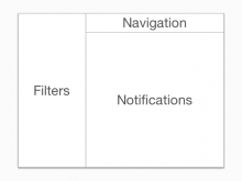
  • An inbox-model based on three areas: filters (to quickly select what you are interested in), navigation (to move around) and the content (notifications).

notif-page-simplified.png (1×1 px, 202 KB)

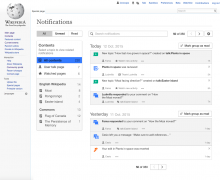
  • The main filters allow users to focus on pending/completed work depending on their activity.
  • Users can check at a glance the content with new notification activity, and focus on those topics.
  • Quick access is provided to check usual locations.
  • The navigation bar allows users to search for specific notifications as well as to change how the list is displayed.

Plan

To support these improvements in several iterations, some smaller tickets have been defined. The order below is just a reference to illustrate how some features may be built on top of the previous ones:

More

Crosswatch is a related project which supports displaying and filtering all your notifications, and we can learn about some of their usecases (more details in crosswatch).
Related Objects

StatusSubtypeAssignedTask
ResolvedNone
ResolvedNone
ResolvedNone
ResolvedMooeypoo
Resolved Mattflaschen-WMF
ResolvedMooeypoo
Resolved Capt_Swing
Resolved SBecker
DeclinedNone
ResolvedMooeypoo
ResolvedSBisson
ResolvedMooeypoo
Resolved jmatazzoni
ResolvedMooeypoo
ResolvedMooeypoo
ResolvedCatrope
ResolvedMooeypoo
Resolved jmatazzoni
ResolvedMooeypoo
ResolvedMooeypoo
ResolvedNone
ResolvedMooeypoo
ResolvedMooeypoo
Resolved jmatazzoni
ResolvedMooeypoo
ResolvedNone
InvalidNone
ResolvedNone
ResolvedMooeypoo
ResolvedMooeypoo
ResolvedMooeypoo
ResolvedMooeypoo
Resolved jmatazzoni
ResolvedMooeypoo
ResolvedCatrope
ResolvedVolker_E
ResolvedMooeypoo
ResolvedSBisson
ResolvedVolker_E
ResolvedSBisson

Event Timeline

Pginer-WMF raised the priority of this task from to Needs Triage.
Pginer-WMF updated the task description. (Show Details)
Pginer-WMF added subscribers: Catrope, Aklapper, Pginer-WMF.

Is it possible you have done some little mistakes at the pictures?

  • Why you can see entries from "2 days ago" in the "Today" section?
  • Why you can see Notifications which are about actions not done by Fama a filter is active that should hide them?

It would be nice if you can clarify this points.

Is it possible you have done some little mistakes at the pictures?

Definitely. Thanks for catching them.

At this point the main intention was to represent the overall idea for the design direction.
An early version was included in this prototype to get some initial feedback. We'll be iterating those designs in order to polish the interaction patterns, add more details, and also reducing inconsistencies to avoid misunderstandings.

On 2/3/16, product managers and others from the Editing Team considered the prototype of the Notifications Page below during the regular Product Pitch Meeting. Below are notes from that meeting.

2016-02-03 Meeting
Collaboration: Prototype of new Notifications Page
Pitching: Pau
Task: T115316
Link: http://pauginer.github.io/prototypes/notifications/notification-page/index.html
––––––
Ed:

  • Looks beautiful (+1 +1 +11)
  • X and check icons are used interchangeably for mark as read, might be better to unify them
  • May benefit from animation/transition e.g. when removing items from a list
  • Amir:
  • It’s not very complicated, but it must be remembered that the content will come from different languages with different directions, different fonts, font-sizes and line-heights, etc.
  • It may be a challenge to handle [[Village pump]], [[Wikipedia:Village pump]] and [[WIkipedia talk:Village pump]]. It’s an issue in the rest of Notifications, too: T56433.

Trevor:

  • Looks amazing
  • +1 about unifying icons - ideally we can get the user comfortable with a metaphor and use it consistently throughout not only this product, but as many of our products as possible
  • Do the unread counts need to be there? Maybe something simpler like a dot? That level of precision makes the interface look heavy, and might not add anything valuable beyond signaling there’s something unread there
  • James: The fact that you’ve got things there is implicit, right?
  • Consider ways to improve support for undoing an action, such as making the X control in the top right persistent, reusing it for marking as unread (a toggle instead of a click and disappear button)

James:

  • Maybe use the Person icon against “user talk page” on all instances to make it stand out?

X and check icons are used interchangeably for mark as read, might be better to unify them

The use of "X" for marking as read has been discussed in the past and we decided to keep it as it was initially and explore alternatives. I did an initial explorations of approaches at T126214.

matmarex subscribed.

This task was a part of a project that seems to have been completed in 2016. I think we can close it now.

I'll remove subtasks that haven't been finished, but which can stand alone.