Page MenuHomePhabricator

Provide a single entry point for notification that anticipates the urgency of the notifications received
Open, Needs TriagePublic

Assigned To
None
Authored By
Pginer-WMF
Aug 15 2016, 12:01 PM
Referenced Files
F35283283: image.png
Jun 28 2022, 9:59 AM
F35124744: Screenshot 2022-05-10 at 10.34.23.png
May 10 2022, 8:36 AM
F34620783: Screen Shot 2021-08-26 at 11.45.09 AM.png
Aug 26 2021, 3:46 PM
F4374796: Screen Shot 2016-08-18 at 2.58.57 PM.png
Aug 18 2016, 10:12 PM
F4364304: simple-anim.gif
Aug 15 2016, 12:01 PM
F4364341: Single-badge-explained.png
Aug 15 2016, 12:01 PM
Tokens
"Love" token, awarded by Iniquity."Like" token, awarded by Lens0021."Love" token, awarded by Prtksxna."Like" token, awarded by Jdlrobson."Love" token, awarded by kostajh."Love" token, awarded by iamjessklein."Like" token, awarded by RHo."Like" token, awarded by Moebeus."Like" token, awarded by alexhollender_WMF."Love" token, awarded by Volker_E.

Description

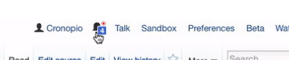
The separation of notifications in two different buckets ("alerts vs. messages" first, "alerts vs. notices" later) was aimed to anticipate to users what kind of notifications the received before opening the panel. This is important to avoid distractions. It allows users to decide whether to rush to check these notifications immediately ("my edit was reverted", "I was directly mentioned in a conversation"), or check them later at their own pace ("a page I created has been linked" or "someone replied to a topic in a discussion I'm interested").

While the distinction is useful, it is not clear that separating both concepts completely as different entry points is the best possible solution:

  • All items are notifications and splitting them requires an effort to understand the purpose of the separation. If I recall an important conversation I got a notification about, I need to know whether I was mentioned or it was a regular reply in order to know which bucket to look at.
  • The distinction results confusing to communicate. Distinctions based on familiar concepts such as content vs communication presented a mismatch in terms of urgency. Buckets based on urgency seem to make it hard to anticipate which kind of notifications they'll find there. Concepts picked for the groups and the general concept tend to be so close that lead to translation issues in several languages.
  • Splitting has not been consistent in all places notifications are provided. Mobile notifications provide a single entry point, and the notifications page shows all of them together.

In addition, when the separation was done, it aimed to solve too many issues related to volume and urgency for which other mechanisms have been considered since then:

  • Volume control (T115264) will help to avoid getting distracted by notifications you are not interested in. Users are not required to process information every time a new notification is received. For example, a user getting too many pages linked to the one she created, can just mute that event and not get distracted by a blinking badge in the future (making it less relevant in which bucket those were appearing).
  • The improvements on the notification page (T115316) provide more filtering capabilities to focus on a given set of notifications. Users interested on a more focused work can use that tool (keeping the panel for quick notification checks as simple as possible).

Proposed solution

Provide a single entry point for notifications.
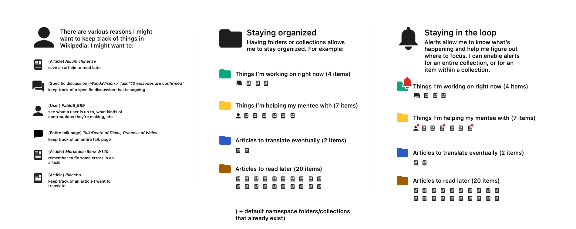
Use the badge color (and the read indicator) will be used to indicate urgency:

  • If there are no urgent notifications, the badge will be blue.
  • If there is any urgent notification, the badge will be red.
  • For unread items, the read indicator of each item will be blue (for non-urgent) or red (for urgent) depending on their urgency.

Single-badge-explained.png (583×999 px, 76 KB)

This prototype (part of the notification schemes prototype) illustrates the idea with an example, also captured by the animation below:

simple-anim.gif (659×640 px, 4 MB)

Benefits:

  • One single place for notifications. All notifications are there, which simplifies the process of where to go in order to check notifications. This also saves space in the already crowded personal toolbar and keeps it aligned with the mobile approach.
  • Helps deciding whether to check them now or later. Urgency is both surfaced when making the decision on whether to check notifications, and indicated on individual items to explain why the badge turned red.

Limitations:

  • No separate counters. The user is indicated that she has 100 pending notifications, and some are urgent. We are not telling how many urgent there are. I don't think this is very limiting since the read status will make it visible once the panel is open.

See also:

Related Objects

Event Timeline

There are a very large number of changes, so older changes are hidden. Show Older Changes

If there are no urgent notifications, the badge will be blue.
If there is any urgent notification, the badge will be red.

I like the idea of unifying the badges and thus simplifying the system. However I think this is still a little complicated. The idea that I'd see a red "7", but that only two of the 7 might qualify for urgent (red) status seems potentially confusing, especially given the way we've trained users to understand the counter ("where are the other 5?"). I think the underlying issue with all the schemes so far has been that each in its own ways has featured concepts and behavior that are not spelled out explicitly to the users. Some users figure these implicit concepts out and others don't (at least at first), which leads some users to be confused. In addition to the issue mentioned above, some users will never pick up the clues as to why the same badge is sometimes one color and sometimes another.

If we are going to change this system (and I'm not saying we need to yet), then let's not do it unless we can hit on a system that is crystal clear. I think the interface proposed can be unpacked further still. I like that you've separated the idea of "urgency" from navigation. It seems to me that continuing in that direction by removing urgency completely from the badge/counter and making it an independent factor signaled independently is worth considering.

After all, we believe it's important for someone to know they have an urgent message. OK. But knowing how many urgent messages one has is not really required, IMHO—as long as the urgent items are discoverable once you open the panel. So why not addd an urgency indicator that's separate from the counter—a little red dot or "!" or whatever, next to the badge that would light up when required? By repeating the same dot or ! or whatever in the panel next to the messages that merit it, we'd help the users to (wait for it) connect the dots, understanding instantly that the icon relates to these items. By making the dot a separate element, we can add a tooltip to it that explains its purpose ("Urgent message").

(Now, having said all that, I still don't think at this time we need to jump on changing the notifications panel now, and that this can wait until we see a clearer trend in user reception.)

Here are my 2 cents (as both a notifications power user and the tech lead of the original Echo team)...

There are only 2 types of notifications that might require an immediate response: talk page posts and mentions. These both also happen to be "message" type notifications (as you can tell by the fact that they both use talk bubble icons). We can easily solve several of the problems identified in this task by implementing a "notices vs. messages" split, which also happens to be the best practice of pretty much every site on the internet (Facebook, Twitter, Google, LinkedIn, iOS, etc.)

The reason people complained about the "alerts vs. messages" implementation is that we didn't include mentions in the messages drop-down, even though this is the most common way that people message each other on Wikipedia. Having messages (i.e. posts and mentions) split into 2 different feeds was annoying and confusing.

The new paradigm of "alerts vs. notices" is equally confusing as:

  1. There is no clear distinction as to what constitutes a notice vs an alert (at least from an end user POV).
  2. The icons are confusing. People assume that an inbox icon (or talk bubble icon as was used previously) is going to have their messages in it. But in our case, it has everything but the messages.

Personally, I don't see any down side to us following the standard practice of having a notices vs. messages split, so long as we actually put all the messages in the messages feed (which we weren't doing before). This simultaneously solves the urgency/volume issues and makes our UI less confusing (since it is conforming to the same UI as other sites).

In summary, I think the best implementation would be:

  • A "Notices" feed (not "Alerts", as these are typically not urgent) with a bell, flag, or globe icon
  • A "Messages" feed with a talk bubble, inbox, or envelope icon (which includes both talk page posts and mentions)
  • Red used to consistently indicate "unread" (not blue or a mix). Overloading colors with multiple meanings (unread + urgency) is confusing.

We're actually very close to getting this right. I don't think inventing a completely new system with confusing urgency indicators (that also double as dismiss buttons) is the right way to go. Let's keep it simple and in line with what other sites are doing, but also correctly respond to the valid issues brought up by the community.

  • Red used to consistently indicate "unread" (not blue or a mix). Overloading colors with multiple meanings (unread + urgency) is confusing.

Red is in most UI (and real-world information-design) contexts used as urgent/error/strong warning color, not “just” as notice indicating color. I strongly oppose that part of your proposal.

Red is in most UI (and real-world information-design) contexts used as urgent/error/strong warning color, not “just” as notice indicating color. I strongly oppose that part of your proposal.

But what about in the context of notifications? The only website I've been able to find that doesn't use red for unread notifications is Twitter (which uses blue). iOS also uses red badges consistently for notification purposes. Another reason that we chose red (initially), is that a lot of community members expressed concern that the small badge was too easy to overlook otherwise. Twitter uses huge icons with large badges, while ours are quite small.

Although I personally think that red is the best choice, this is my least strong opinion in the suggestions above. I would personally be OK with any color or combination of colors so long as it's prominent enough to attract attention.

The idea that I'd see a red "7", but that only two of the 7 might qualify for urgent (red) status seems potentially confusing, especially given the way we've trained users to understand the counter ("where are the other 5?").

This aspect is not very different now. Currently you may have 5 notifications in a grey badge (you opened the panel but decided to act on them later). When you get 2 more, the badge indicates 7 and turns blue. This is not interpreted as having 7 new notifications, but having 7 total unread notifications some of which are new.

Although it can be made the case that seeing a blue highlighted badge with the number 7 could always communicate you got 7 new messages (and it does if you had 0 pending messages before, but not many other times), we have not observed any confusion around this in practice. So keeping the badge number to represent the total number of notifications it contains and the badge color to surface a special condition of a part of those notifications may not necessarily be perceived as an inconsistency.

The same principle is applied to communicate urgency in the proposal, and we need to evaluate if there are specific issues there, but we are not using a completely different pattern here.

If we are going to change this system (and I'm not saying we need to yet), then let's not do it unless we can hit on a system that is crystal clear.

Some research may help us determine what makes the proposal unclear. One challenge when evaluating the notification system is that is hard to reproduce context (you are familiar with the notifications you checked in the past, you are familiar with the actions you did that lead to notifications to appear, and you get only notifications about the kind of activities you get involved). All that affects the understanding of a model and is hard to experience by looking at a picture of random notifications.

It seems to me that continuing in that direction by removing urgency completely from the badge/counter and making it an independent factor signaled independently is worth considering.

The issue we identified is about a user that gets notifications thinking they are urgent and gets frustrated when checking them because the distraction was not worth it. In that scenario there decision point is before the panel is opened. If we want to provide information to the user to make the right decision, it needs to be available at that point, not later.

We can consider that the scenario we are considering is not worth the complexity of solving it, but signalling urgency inside the panel is supporting a different scenario. It helps with prioritisation (identifying which are urgent) which is something which to my knowledge we have not identified as a problem for our users.

So why not addd an urgency indicator that's separate from the counter—a little red dot or "!" or whatever, next to the badge that would light up when required?

I decided to reuse the status indicator to avoid another piece of information that could get in the way of scanning the notifications (which keeping them quick to process is a key goal in this context). Also, as I mentioned before, the purpose of the indicators inside the panel was just to explain why the badge turned red this time (similar to the blue highlight for new notifications). So I didn't see that as a key information element but complementing the badge.

(Now, having said all that, I still don't think at this time we need to jump on changing the notifications panel now, and that this can wait until we see a clearer trend in user reception.)

Totally agree. I think we should not rush. We should give time to the current model and collect the feedback about the problems identifying at which level they happen. I jus think that having an alternative model such as the one proposed could be a good tool to learn more in the process. As we understand better which problem the model is causing to a user we can expose the alternative model and identify if it seems to solve the issue and/or generate new ones.

Here are my 2 cents (as both a notifications power user and the tech lead of the original Echo team)...

Thanks for the input. Your feedback, as well as any background context in this area is always appreciated.

There are only 2 types of notifications that might require an immediate response: talk page posts and mentions. These both also happen to be "message" type notifications (as you can tell by the fact that they both use talk bubble icons). We can easily solve several of the problems identified in this task by implementing a "notices vs. messages" split, which also happens to be the best practice of pretty much every site on the internet (Facebook, Twitter, Google, LinkedIn, iOS, etc.)

The "notices vs. messages" separation is something that easily fits the user mental models. I don't dispute that.

However, we are considering two separate issues. One was about the inconsistency of the classification (as you described well, we were telling people "messages" were in one bucket but we provided some messages in another too). The other problem, is about mixing items that require your immediate attention with others that do not.

Feedback from users around this second issue triggered our explorations for notification schema reorganisation. Quoting one of the users surfacing this issue in T115845#1741759:

Every time I receive a THX there is red alert. And I am close to a heart attack: Did someone revert my recent edit? Another boring talk inviting me, or am I requested to fill a RTFM gap? Oh, no, it was a thanks. I would prefer to see a green heart rather than a red alert bell.

(Although the specific discussion was in the context of icons, the underlying issue seems related to the inability to tell in advance how urgent the received notifications are.)

Having all "messages" in the same bucket like in your proposal, implies having the notifications that require immediate attention (talk page posts and mentions in your example) mixed with many other less relevant messages (talk page discussion updates about a variety of different pages you may engaged in the past and prefer checking at your own pace). This leads to the uncertainty of not knowing how to react (and how much to worry) about new notifications in terms of interrupting your current activity to react immediately or checking them later.

We're actually very close to getting this right. I don't think inventing a completely new system with confusing urgency indicators (that also double as dismiss buttons) is the right way to go. Let's keep it simple and in line with what other sites are doing, but also correctly respond to the valid issues brought up by the community.

Given the above description of the issue, I'm not sure if in your opinion it does not qualify as a "valid issue brought up by the community", or if you consider that it is solved by the "notices vs. messages" or by some other mechanism.

There are only 2 types of notifications that might require an immediate response: talk page posts and mentions.

I don't think of the split as being "things I need to respond to urgently" and "other stuff". I also disagree that these are the only two items that require a prompt response (e.g., an Undo notification may need a very prompt response to deal with an edit war).

But I'm really thinking about this from a completely different place: When they were merged, I didn't enjoy clicking on them. I had no way of knowing whether I was going to find something happy or not. The odds were less than half, but still fairly high that the result would be unpleasant. What you really need to do is to put Thanks into whatever bucket you want me to be quick to click on (and not in the same bucket as the dozens of notifications from Flow pages).

@Pginer-WMF wrote:

their decision point is before the panel is opened. If we want to provide information to the user to make the right decision, it needs to be available at that point, not later.

Sorry I was unclear. I did mean for users to be able to tell before opening the panel. When I spoke about separating out the idea of "important message" from the counter, I meant adding a new urgent-message indicator to the badge, outside of the counter per se.

See my VERY CRUDE concept sketch below. (*Ideally, whatever was used as the urgent indicator in personal tools would be repeated in the panel on the relevant messages, to establish the connection.)

Screen Shot 2016-08-18 at 2.58.57 PM.png (88×420 px, 42 KB)

Thanks for the clarification @jmatazzoni.
That seems an approach worth considering. I was trying to convey the information without adding new elements, but if we need to be more explicit we can consider either modifying the existing ones or adding new ones.

on a related note, a few months ago @iamjessklein and @ppelberg started exploring the idea of giving people more fine-grained control of how they watch/subscribe to different updates within the platform. I tried to visualize some of their thinking in this graphic, which I'm adding here since at the moment I'm not sure where a better place to put it is.

Screen Shot 2021-08-26 at 11.45.09 AM.png (756×1 px, 196 KB)

I hope that making a comment like this is welcome here: As a longtime Wikipedian (and being a big fan of both Echo and the recent Vector developments), I never understood the difference between 'notifications' and 'messages'. It has always been the same to me. Therefore, I am in favour of merging the two buttons, thus also creating space for T288638 (making the Watchlist and Contributions pages more accessible).

A website which has a somewhat similar problem with conflicting prios etc and also struggled with this for a long time (and still does honestly) is Github, with all the notifications of all the projects that you follow, mentions, replies on issues etc.. Might be worth looking into what they do.
One thing I noticed is that they do not have a fly-out. They always take you to the Notification Center.

https://github.com/notifications

Screenshot 2022-05-10 at 10.34.23.png (699×904 px, 166 KB)

Hello, I recently gave feedback on a new vector and was shown this task.

For new vector given that we removed the text from all menus, there are now a lot of icons at the top that do not understand what they do. Different blocks of notifications do not help this at all. I think we can separate the alerts/notifications inside the menu? Filters, tabs, whatever :) But at least you won't get confused in the icons.

I personally still (6 years!) do not know what their fundamental difference is. I asked my friends and they don't know either.

image.png (144×305 px, 3 KB)

Also, after reading this discussion, I thought, why not let the user set the urgency and category of the alerts himself?

For what it's worth, after working with this system for years, I still have no clue which alerts go under which icon. If I see an icon is activated, I go look at it. I really don't make any kind of prioritization about, "Oh, that's only the XXX icon, I'll look at it later".

Worse, I'll often want to go back to a recent alert that's already been dismissed. For example, I might remember that I was notified about some topic not long ago and want to revisit it, but don't remember the details. So I'll go look at my alerts to remind myself. And since I don't remember either:

  • exactly what kind of alert it was nor
  • under which of the two icons that kind of alert shows up

I end up having to search both lists. Have two distinct lists just takes up screen real-estate, adds no value, and creates more work for me.