Notifications are surfaced to the user attention through the notification badges. There are some aspects that can be improved:
- Space efficiency. Surfacing both badges requires to take more room from an already crowded personal bar. While taking some extra space was unavoidable when providing two entry points instead of just one, the use of space can be optimised in some situations. For example, when there are no unread notifications we are still showing an icon and a "0" counter just to keep an entry point for the user to check read messages.
- Accessibility. The inactive state for the badges (when there are no unread messages) uses a grey which is to light for the white text to be readable on top of it according to the basic accessibility considerations. In order to fix this, increasing the contrast may not be the best option since the badge can become too prominent for an "inactive" state (calling the user attention as if there were new notifications when there are not). More details in T98526.
Proposed solution
In recent research sessions with users, a different approach was included as part of the tests (T114086). The new approach was designed to be more efficient with space (there are no counters when all notifications are read), and it makes it easy to comply with the accessibility guidelines without generating confusion between active and inactive states.
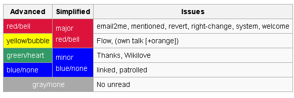
The basic approach is to use persistent icons with smaller badges for the counters (but counters will be only shown when there are unread messages). Note that the examples use the new "tray" icon for notices (a separate change described in T135114). Different colors and levels of grey will be used to communicate the different states as shown below:
New notifications

- Badges are placed partially overlapped with the icons (half horizontally, and one third vertically). they may expand their width to accommodate the counter, but they won't cover more of the icon behind them.
- When there are unread notifications, icons and badges are prominent: icons are dark grey (#2F3133), and badges use color: red (#C33) or blue (#36C) depending on the urgency of notification types.
- The badges have a 2px border radius and a 1px white border to separate them from the icons behind them.
Pending notifications

- After opening the panels, unread notifications are no longer considered "new" (or "unseen"). Thus, badges become less prominent, using a grey background (#71777D) and they show the number of unread items.
Read notifications
- Finally, when all notifications are read for a given category, only lighter grey icons (#71777D) are shown (with no badges) in order to avoid demanding too much user attention but still providing an entry point to check the different kinds of notifications.
Further considerations
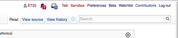
The model worked well when used as entry point for accessing the notification panel without a single issue. A simplified prototype was used (only showing one badge), in order to check whether the metaphor worked. The testing of the badges was not the main goal of those testing sessions, but accessing the panel was done repeatedly.
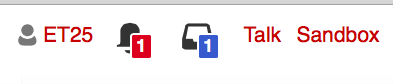
Another initial concern, was about readability. Using smaller badges limits the room for the counter text. As shown in this prototype, we were able to use a 13px font size which is even bigger than the regular font size used in the personal toolbar (12px). Users were able to quickly identify how many unread notifications there were.