Page MenuHomePhabricator

Change bubble speech icon to tray icon
Closed, ResolvedPublic

Description

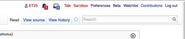
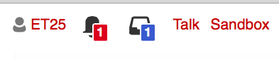
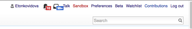
Per that comment T135114#2476359 and the following, it is now time to change the bubble speech icon by the tray icon to remove the idea of "messages" when you click on the "notices" badge.

I've set priority as high, because CLs receive feedback about that inconstancy.

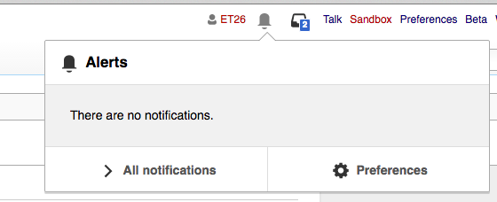
The tray icon is still on discussion for polishing: T135114: Review "tray" icon - that discussion is stalled at the moment because of vacations. When the polishing is done, the icon will be changed again.

As a reminder, the new icon:

Event Timeline

Change 298030 had a related patch set uploaded (by Jforrester):
icons: Provide a 'tray' icon in alerts pack

https://gerrit.wikimedia.org/r/298030

Change 298030 merged by jenkins-bot:
icons: Provide a 'tray' icon in alerts pack

https://gerrit.wikimedia.org/r/298030

Change 299910 had a related patch set uploaded (by Mooeypoo):
Redo the notification badges

https://gerrit.wikimedia.org/r/299910

Change 299910 merged by jenkins-bot:
Redo the notification badges

https://gerrit.wikimedia.org/r/299910

Checked in betalabs 1.28.0-alpha (4c7cd24).
@Pginer-WMF - need your feedback on the following:

Some screenshots

Screen Shot 2016-07-29 at 5.42.46 PM.png (130×607 px, 26 KB)

Closer look:
Screen Shot 2016-07-29 at 5.42.57 PM.png (84×393 px, 13 KB)

Double digits for number of notifications:
Screen Shot 2016-07-29 at 5.28.34 PM.png (55×380 px, 13 KB)

Only Notices are present:

Screen Shot 2016-07-29 at 5.46.56 PM.png (228×560 px, 24 KB)

Only read Notices and Alerts:

Screen Shot 2016-07-29 at 5.24.26 PM.png (95×544 px, 21 KB)

I see an alignment problem for the "99+ notices" scenario:

echo icon overlap.png (258×321 px, 8 KB)

@Etonkovidova, I heard some talk today about Nick's comment re. 99+ above. Before I close this, was that turned into a separate ticket?

@jmatazzoni - I filed it as a separate issue T142454: Notices tray icon with 99+ needs more space since it's a specific bug.
'99+' case (since it occupies three spaces) looks a little bit tight:

Some examples (the browser display scale is 110%):

Screen Shot 2016-08-08 at 7.33.48 PM.png (100×650 px, 21 KB)

Screen Shot 2016-08-08 at 7.29.33 PM.png (120×829 px, 28 KB)

Monobook skin:

Screen Shot 2016-08-08 at 7.33.29 PM.png (56×698 px, 28 KB)

There is comments about the tray icon. Most of time people don't understand the meaning of that icon.

  • on en.wp ("bikini top")
  • on fr.wp ("rear of my car")
  • on de.wp ("subway face")

OK, I'm closing this but have opened a separate ticket to evaluate icon design, T142511.