Page MenuHomePhabricator

Notifications Panel: Support cross-wiki notifications
Closed, ResolvedPublic

Assigned To
Authored By
Pginer-WMF
Oct 1 2015, 10:54 AM
Referenced Files
F3463124: Panel - Cross-wiki.png
Mar 1 2016, 9:57 AM
F3463106: Panel - Cross-wiki.png
Mar 1 2016, 9:40 AM
F3302231: Panel - Multi-project.png
Feb 2 2016, 9:51 AM
F3302226: Panel - Cross-wiki.png
Feb 2 2016, 9:49 AM
F3300628: pasted_file
Feb 1 2016, 8:57 PM
F3070622: cross-wiki-notifs-no-ellipsis.png
Dec 12 2015, 3:23 AM
F3070612: cross-wiki-notifs-ellipsis.png
Dec 12 2015, 3:23 AM
F3007320: Panel - Cross-wiki-details-expanded.png
Nov 23 2015, 10:54 AM
Tokens
"Love" token, awarded by MichaelSchoenitzer."Like" token, awarded by KuboF."Like" token, awarded by Kippelboy."Love" token, awarded by Qgil."Love" token, awarded by Luke081515."Love" token, awarded by MGChecker.

Description

When a user opens the notification panel, we want to provide easy access to those notifications originated in other wikis. This is expected to save users time (no longer needing to chase notifications through different sites) and prevent some relevant notifications to be missed or noticed too late. This is part of a broader effort to improve the notifications panel (T113228).

Basic concept: external notifications as an expandable bundle

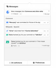
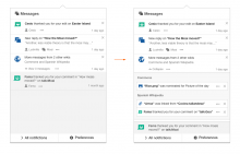
We propose to present notifications from other wikis as a bundle in the notifications panel. Check this prototype for a quick impression.

Panel - Cross-wiki.png (726×1 px, 96 KB)

  • Bundled. Notifications from other wikis are presented inside a bundle the user can expand to explore the individual notifications. This provides more weight to local notifications, allowing users to focus on the wiki at hand first. Advanced users interested in processing translations regardless of their origin or interested in more advanced queries will be able to make use of the notification page for that purpose in the future (T115316).
  • Organised per wiki. A single bundle is provided for all external notifications which is initially collapsed, but displays the notifications organised per wiki once it becomes expanded.
  • Shown after local notifications The group is presented at the bottom of the unread notifications, but the model can be easily adapted for the group to be chronologically ordered if we observe that the initial behaviour makes external notifications too buried down the list.

The Bundle and how it works

The bundle for cross-wiki notifications is similar to the general approach proposed for bundling (T114356), but it has some specific particularities since it is not grouping similar notifications but very different ones coming from different wikis. Details are given below about how it is presented and what can users do with the bundle:

  • General look. When collapsed, the bundle will look mostly like any other notification item. In order to communicate that it represents multiple elements, there is a subtle line at the bottom. When the bundle is expanded, it contains a list with the individual notifications it includes.
  • Icon. A globe icon is used to communicate that it include notifications from other places.
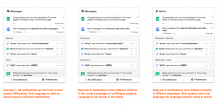
  • Text. The bundle label will anticipate the content of the bundle indicating the kind of notification (messages or alerts), surfacing one of the origins (e.g., Commons if the most recent notification is from there) and indicating if there are notifications from other origins. For example, assuming the user is on English Wikipedia, some possible labels could be: "More messages from Spanish", "More messages from Spanish and other languages", "More messages from Commons", "More messages from Commons and other wikis".
  • Actions
    • Expand/collapse. The bundle can be expanded and collapsed. There are two entry points that can be used to toggle between those states: clicking on the bundle item and an explicit expand/collapse action. The expand action ("view X messages") will show the number of the items the bundle contains.
    • Mark as read. When marking the bundle as read by clicking on the "X" icon, all the notifications that it includes will be marked as read and the bundle would disappear as a result.

List of notifications inside the bundle

When the cross-wiki notification bundle is expanded, it shows the unread notifications from other wikis. Some aspects to consider:

Grouping items
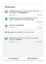
Notifications inside the bundle are grouped by project (first) and language (second) but the group labels only show what is relevant for the notifications in the group. This will make the descriptions more contextual, but we may want to start with a more generic approach showing always "project -language" initially and improve from there in further iterations.

Panel - Multi-project.png (790×1 px, 155 KB)

The labels indicating the wiki will be used as links that would link to the Notifications Page of the corresponding wiki.

Notification items.
Notification items inside a bundle are presented in a more compact way than regular notifications. this includes:

  • Showing a smaller icon.
  • Not exposing any additional action. If they have any secondary actions, those will be available through a "more" menu ("..." icon). If there are no additional actions, the "..." menu will not be displayed.
  • The icon, text, timestamp, action menu and close icon are presented in sequence forming a single row.
  • If the notification item represents also a kind of bundle, we are presenting it as a non-expandable item to avoid multiple expansion levels.

Only cross-wiki notifications
When there are no other unread notifications than those in the cross-wiki bundle, the cross-wiki bundle should be presented expanded by default.

Panel - Only external.png (671×547 px, 62 KB)

The alerts panel is an exception to this, where the cross-notification bundle will be presented collapsed (more details below).

One-item bundles.
Although for general bundles (those grouping very similar notifications) a single item bundle does not make much sense, for cross-wiki notifications we want to still provide some structure to distinguish local and external notifications, as well as to provide continuity when users keep discarding notifications from an expanded bundle.
For cross-wiki notifications bundles with just one item, the bundle will be shown with one item but the wiki label would be omitted for simplicity (since it is already present in the bundle item text).

Panel - One-item.png (726×526 px, 69 KB)

Empty bundles
Bundles represent a group of notifications. When there are no items left, there should be no bundle. Thus, if items are removed (e.g., marked as read) to the point the bundle becomes empty, the bundle should disappear.

Read status changes and propagation

Alerts
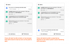
For notifications that become read automatically (e.g., "alerts"), we don't want to propagate that behaviour beyond the current wiki. With that purpose:

  • The cross-wiki notification bundle will be always be collapsed initially.
  • When users expand the bundle the notifications do not get marked as read automatically. Users need to mark them individually or mark as read the whole bundle.

As a result of the above, the cross-notification bundle will appear always as he first item in the alerts panel since the local notifications will become read as soon as the panel is opened. This may distract users from the recent local alerts. If that is the case, we can place the cross-notification bundle as a a floating element at the bottom of the panel (floating next to the "all notifications" and "settings" bar, not at the bottom of the list). In that way, users can notice the local alerts first while still being aware of alerts from other sites.

Panel - Cross-wiki alerts approach.png (726×1 px, 141 KB)

Messages

For notifications that are marked as read manually (i.e., "messages"), external notifications behave a usual: they became marked as read once the user clicks on them or the "X" icon.

  • The cross-wiki bundle has also a "X" button that allows to mark as read all external notifications.
  • It is still unclear whether the general "mark all as read" from the panel will act only on local notifications (providing more flexibility) or also with external notifications (in a strict interpretation of the action). We can start with the most conservative approach (marking only local notifications) since it provides more flexibility and iterate based on feedback.

Styling details

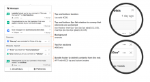
The annotated mockups below include information on different styling aspects such as color, borders and shadows:

Panel - Cross-wiki-details.png (570×1 px, 115 KB)

Panel - Cross-wiki-details-expanded.png (790×1 px, 196 KB)

Plan

Several tickets are created to support cross-wiki notifications:

Learn early:

Limit initial exposure:

Measure our achievements:

Adjust user control

Related

There is an RFC proposed for the support of cross-wiki notifications.
Related Objects

StatusSubtypeAssignedTask
Resolved Catrope
Resolved jmatazzoni
Resolved Catrope
Resolved Catrope
ResolvedNone
ResolvedNone
DeclinedSBisson
ResolvedNone
OpenNone
ResolvedNone
ResolvedNone
Resolvedmatthiasmullie
ResolvedMooeypoo
Resolvedmatthiasmullie
OpenFeatureNone
InvalidWikinaut
Resolved Catrope
Resolved Catrope
ResolvedPginer-WMF
Declinednshahquinn-wmf
Resolvedjcrespo
Resolvedmatthiasmullie
ResolvedMilimetric
DeclinedPginer-WMF
OpenNone
OpenNone
ResolvedSBisson
ResolvedSBisson
ResolvedSBisson
ResolvedMooeypoo
ResolvedMooeypoo
Resolved Catrope
ResolvedNone
ResolvedMooeypoo
DeclinedEBernhardson
ResolvedNone
ResolvedAmire80
ResolvedTrizek-WMF
Resolved Catrope
ResolvedTrizek-WMF
ResolvedTrizek-WMF
ResolvedTrizek-WMF
Resolved Catrope
Resolved Catrope
ResolvedSBisson
Resolvedmatthiasmullie
ResolvedMooeypoo
Resolved Catrope
ResolvedSBisson
Resolved Catrope
ResolvedMooeypoo
ResolvedTrizek-WMF
DuplicateTrizek-WMF
ResolvedPginer-WMF
ResolvedTrizek-WMF
Resolved Catrope
Resolvedmatthiasmullie
Resolved Catrope
Resolved Catrope
ResolvedLegoktm
ResolvedLegoktm
OpenNone

Event Timeline

There are a very large number of changes, so older changes are hidden. Show Older Changes

This seems nice. I wonder if we should always just show the full "$site - $lang" (or just $site if it's multilingual) though, rather than attempt to omit details where it'd be unambiguous.

I am more interested in crosswatch:
https://tools.wmflabs.org/crosswatch

But it seems to have been abandoned. It was improving rapidly, but lately suggestions have been ignored here:
*https://meta.wikimedia.org/wiki/Talk:Crosswatch

This notifications tool seems to be having similar problems in how to present the items. Grouped, chronological, and most important, scannability:
*https://www.google.com/search?q=scannability
*http://www.sitepoint.com/5-steps-scannable-lists - great article. The most important point in that article:

"So, for example, you might try to make all the list items fit on single lines, so that the eye can take in their initial words all at once."

Maybe someone can make all the list items fit on single lines on crosswatch too. By getting rid of the margins. At least provide an option for it.

This seems nice. I wonder if we should always just show the full "$site - $lang" (or just $site if it's multilingual) though, rather than attempt to omit details where it'd be unambiguous.

I think it is a valid point. My preference was on making it more contextual, based on the assumption that most users won't be involved in a high number of projects (or not getting frequent notifications from all of them). For example, for users participating on Wikipedia on several languages, they may perceive these notifications as notifications from different languages. In addition, the fact that we have language-specific projects and multilingual ones already adds some variability in how we label them (e.g., it does not make much sense to indicate "Commons - all languages").

Having said that, since this is expected to be exposed as a beta feature (T114237) we'll have a better idea on how these are use in practise (with real notifications based on real on-wiki activities). That would be very useful to identify any confusion with this, and adjust accordingly.

I am more interested in crosswatch:
https://tools.wmflabs.org/crosswatch

The notification panel is intended to provide a quick overview of the recent activity.
For advanced access to the different notifications (e.g., using filters to get all the notifications involving a given page or user), we plan to extend the notification page (T115316) which can be accessed from the "View all notifications" link in the notifications panel. This is still far in he roadmap (mockups are just illustrating early concepts, so don't take too literal) but it is intended to cover an area more comparable to crosswatch.
So we are really interesting on knowing about the usecases that you have experienced related to managing notifications (those that worked well with crosswatch and those that didn't). So feel free to provide any examples in T115316.

This notifications tool seems to be having similar problems in how to present the items.

Note that this specific task is for showing additional details about notifications from other wikis. The external notifications here are intended as a detail list to be expanded not as part of the main list. As I mentioned above, the notifications page can be useful to operate with all notifications regardless of their location at the same level.

@Mooeypoo, I added info in the ticket about colors, borders, shadows and other details:

Panel - Cross-wiki-details.png (570×1 px, 115 KB)

Panel - Cross-wiki-details-expanded.png (790×1 px, 196 KB)

Lat me know if any other detail is needed.

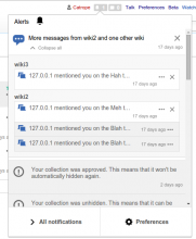
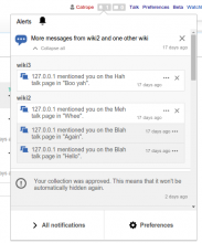
@Pginer-WMF: What should we do when the labels of foreign notifications are too long to fit on one line? In the current (unmerged) code, we truncate these labels to one line with an ellipsis, but that makes some notifications pretty uninformative:

cross-wiki-notifs-ellipsis.png (585×482 px, 52 KB)

If I remove the CSS rules that perform this truncation (white-space: nowrap; overflow: hidden; text-overflow: ellipsis;), it looks like this:

cross-wiki-notifs-no-ellipsis.png (585×489 px, 54 KB)

(Ignore the fact that unread foreign notifications are being shown, there's already a patch for that over at T119890.)

@Pginer-WMF: What should we do when the labels of foreign notifications are too long to fit on one line?

I'd not force truncation here. Some thoughts:

  • Notification text is expected to be already compact, and truncating it can result in missing relevant information.
  • We can increase the width of the panel a bit to reduce the chances of notifications to require multiple lines.
  • For cases where we want to surface user generated content we may want to do some truncation. For example, if we want to surface text from a user message instead of just announcing that you have a new message. But that is probably a case to consider separately since we are not supporting this in any notification type yet.

Questions came up about how many wikis should be shown in one cross-wiki bundle, and how many notifications should display for each wiki. Pau suggests the following as a starting point:

  • No limit on the number of wikis shown (i.e., show all wikis that have UNREAD notifications).
  • Apply the the same limit for each wiki as we use for the panel overall (i.e., 25) with the difference that we will show only UNREAD notifications.

One question, what happens in this cases:

  • At mediawiki, I disable Flow notifications.
  • At wiikidata, I enable Flow notifications

Now, if I open the cross-wiki bundle in mediawiki and wikidata, different things could happen,, either Flow notifications of the other Wiki are shown or the are not, depending of the notification settings of the Wiki you got the notification or the settings of the wiki you read the notification are applied. What would happen?

@MGChecker that is an interesting question. Our current thinking is the following:

  • Cross-wiki notifications act as a window that let you see whichever notifications you have in another wiki.
  • Notification settings allow you to adjust which notifications you receive in the current wiki.

In your example, you indicated that you are not interested in the Flow discussions about mediawiki issues. Thus, those are not visible from anywhere: You won't view them at mediawiki. You don't view them inside the cross-wiki bundle at wikidata or any other wiki.

Similarly, notifications related to Flow discussions about wikidata topics are visible from everywhere: the notification panel on Wikidata and the cross-wiki notification bundle on every other wiki (including mediawiki). Initially, since cross-wiki notifications will be exposed as a beta feature, you'll have to explicitly enable the feature in each wiki you want to view the cross-wiki notification bundle.

I think the above model meets the basic user expectations and it is a good starting point. It is totally possible that we identify that a greater degree of control is needed as we observe how the feature is being used in practice.

Really inetresting. I like this model really much, because it allows the user most possible control which notifications he wants to see. The only problem I see in this model that the overview about the settings in the different Wikis can get lost, but I think this is more a general problem of our current preferences.

On the use of the word “More” for the bundled message notification:

The message on the bundle at present is “More messages from Commons...”

I'd submit that the “More” here is extraneous and, in fact, confusing, since it's entirely possible that at times the ONLY messages will be from other wikis. e.g.,

pasted_file (671×547 px, 63 KB)

I propose the message simply be “Messages from Commons” or “Messages from Commons and other wikis” It's cleaner and more clear.

Also, a question: in this example, is Commons called out because it is a) the wiki on which messages were received first or, b) the wiki on which the most messages were received?

@Pginer-WMF, I wanted to clarify what you said on Dec 14, 2:41 AM, above (and copied below), just to make sure I've got it right: You're saying in grouped or bundled x-wiki messages, don't truncate (which I agree with). So, basically, in terms of the information that's in the V 2.0 Notifications Spreadsheet, we're saying use the entire Header text, but omit the Body text.

Also, as long as we're talking about how these should look, we're saying put all the secondary links into the "..." menu. Is that right?

I'd not force truncation here. Some thoughts:

  • Notification text is expected to be already compact, and truncating it can result in missing relevant information.
  • We can increase the width of the panel a bit to reduce the chances of notifications to require multiple lines.
  • For cases where we want to surface user generated content we may want to do some truncation. For example, if we want to surface text from a user message instead of just announcing that you have a new message. But that is probably a case to consider separately since we are not supporting this in any notification type yet.

(@Etonkovidova, making sure you saw this, since we were discussing the other day.)

On the use of the word “More” for the bundled message notification:

The message on the bundle at present is “More messages from Commons...”

I'd submit that the “More” here is extraneous and, in fact, confusing, since it's entirely possible that at times the ONLY messages will be from other wikis.

The idea was to use "More" only when there is more than one message. As illustrated in the "One-item bundle" section, the message in that case does not include the word "more" since there is only one item inside it. I think that "More" emphasises the idea that you will find additional items, marking the bundle item as an access point to those and not yet another notification. If we anticipate some issues with the word, we can consider removing it, but I have not seen any confusion related to it when we tested with users.

Also, a question: in this example, is Commons called out because it is a) the wiki on which messages were received first or, b) the wiki on which the most messages were received?

The idea is to show the one that has the most recent notification. That will be also the group on top that is shown when expanding the bundle.
This allows the following:

  • Keep some consistency with the chronologic order the whole panel follows.
  • Have an idea of what's new before opening the panel.

For example, if I notice that the cross-wiki bundle text changes from "More messages from Commons and other wikis" to "More messages from Spanish Wikipedia and other wikis", I know that something new happened in Spanish Wikipedia and that may inform my decision of checking the contents if I'm involved in more urgent activities there. When I expand the cross-wiki bundle, the notifications from Spanish Wikipedia will be shown first (with the recent one on top and possible other older unread notifications).

Also, as long as we're talking about how these should look, we're saying put all the secondary links into the "..." menu. Is that right?

Yes.
What some of the mockups are missing is the timestamp, which we are decided to include (although a more compact representation for timestamps could be useful in general, but that is a different story).

IIRC, we had a not that good feedback concerning the "..." menu. Or, at least, I've read comments concerning that menu, where people don't understand that is a menu.

Catrope claimed this task.
Passion4cars subscribed.
This comment was removed by Passion4cars.