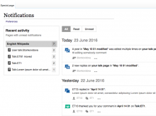
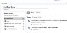
Page MenuHomePhabricator

List wikis and pages with unread notifications in the Notification Page left nav
Closed, ResolvedPublic

Description

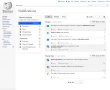
Currently the notification panel provides a way to view notifications from other wikis. However, when the user access the "all notifications" link, there is no information from other wikis.

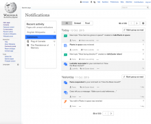
In order to surface this activity, we can provide a list of the wikis with unread notifications and the pages for which there are unread notifications (including always the current wiki).

This is intended to act as a Table of Contents, helping to easily access a subset of the information, but more importantly providing an overview on the topics that got more activity (and may require more attention) at a glance. As opposed to advance filtering or search, this does not require the user to know what to look for in advance, which facilitates discovery.

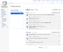
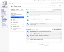
The mockup below illustrate the contents overview (on the left side):

notif-page-toc-usertalk-active-rev.png (1×1 px, 197 KB)

This prototype can be useful to illustrate how filters interact with each other (but several layout and copy changes have been made to the designs since, so don't rely on the prototype as a reference for that).

Design details

  • The list of wikis displays the current wiki on top (selected by default) and lists other wikis based on the number of unread notifications they have.
  • Only wikis with unread notifications are shown. The current wiki is the exception which is always shown even if there are no notifications there. In this case, the item is displayed in a lighter text:

notif-page-toc-local-empty-rev.png (1×1 px, 187 KB)

  • If there are no unread notifications in any wiki, the current wiki will still be shown:

notif-page-toc-local-empty-rev.png (1×1 px, 179 KB)

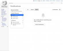
  • If there are notifications but none is displayed because of the current selection of filters, an empty state is shown with an action to reset the filters (showing "all" notifications for the current wiki) as the suggested next step:

notif-page-toc-empty-rev.png (1×1 px, 134 KB)

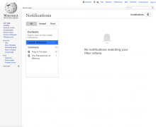
  • For the case where the local wiki has no notifications at all (which is a rare edge case), the "view all notifications" action won't be shown:

notif-page-toc-local-empty.png (1×1 px, 126 KB)

  • For each wiki listed, a list of the pages for which there are unread notifications is provided. The concept of "page" is broad and ignores the concept of namespace (presenting together the multiple dimensions of a topic, from content to talk). The items with more unread notifications are displayed on top.
  • From the list of pages, the user page (and user talk page) are represented with a user icon, and placed at the top of the list (unlike the other items which are ordered alphabetical).
  • Filter items are cropped based on the available width and hovering over them will show tooltips with the full title. If we find out there is not enough room for common cases we can consider items to wrap to more lines later.
Related Objects

Event Timeline

NOTE: a proposal has been made to simplify this feature by not listing in the left nav the individual pages within each wiki for which unread notifications are available. This proposal will be discussed at an upcoming team meeting and a decision should be made in the next week. In either case, the individual wikis for which unread messages are available would still be listed and filtering on a per-wiki basis would still be available.

I may not be able to attend the meeting, so I wanted to capture some of my thoughts in support for this:

  • The value of an overview. The purpose of listing the contents with activity is to provide an overview for the users about the areas that need attention so that they can get an idea at first sight as oppose to extract that information from a list of items in chronological order. This is part of what we are evaluating in the ongoing research T124416. Before making a decision about supporting an idea or not, we may want to identify if the idea brings the intended value based on the mentioned research.
  • Support for a more unified user talk page view. We've heard repeatedly from users that events in their user talk page are specially relevant (T132728). Presenting an aggregated view of notifications for all your talk pages seems to be technically challenging. However, having available the pages with activity under each wiki will allow users to check at first sight if they have pending items in their user talk pages from "English Wikipedia", "Spanish Wikipedia" and "Commons". What do we want them to do if we are not surfacing such info? The alternative seems to be checking every day each wiki and scan the list for user talk page related issues just in case.
  • Technology does not seem the constraint here. From previous discussions, it was not considered a specially difficult to implement aspect. The information needed does not seem very different from what we are already able to get for cross-wiki notification in the panel.
  • Complexity does not seem a big issue in practice. Given the volume of unread notifications, it does not seem we will be showing too many items to each user.

Given the above it is not clear to me the reasons for not listing individual pages with activity.

Support for a more unified user talk page view.

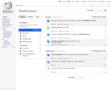
For clarity I illustrated how the user page (and user talk page) for each wiki can appear in a mockup below. I included also other ideas to emphasise it's access even more if we want to: use a distinctive icon and making appear at the top of the list (even if there is less pending activity there compared to other pages).

notif-page-toc-usertalk.png (1×1 px, 196 KB)

Regarding my NOTE from above:

NOTE: a proposal has been made to simplify this feature by not listing in the left nav the individual pages within each wiki for which unread notifications are available....

In the team meeting today we decided that listing individual pages is not overly burdensome. That feature is IN and Pau's design, below, is approved for Q4.

notif-page-toc-usertalk.png (1×1 px, 196 KB)

@Pginer-WMF, two questions come to mind about the items in the left nav:

  • Is there a limit to the number of pages we will display for each wiki? When we hit that limit, do we display scroll bars, a More link, what? (It's an edge case to be sure but bound to come up).
  • You state that pages in a list will be ordered by the number of unread items, most to least. For pages that have the same number, is the order alphabetic, by most recent, what do you recommend?
jmatazzoni renamed this task from Overview of cross-wiki activity per page on the Notification Page to List wikis and pages with unread notifications in the Notification Page left nav.Apr 18 2016, 11:08 PM

@Pginer-WMF, two questions come to mind about the items in the left nav:

  • Is there a limit to the number of pages we will display for each wiki? When we hit that limit, do we display scroll bars, a More link, what? (It's an edge case to be sure but bound to come up).

At an initial stage, I'd introduce no limits and just make scrolls appear when the left panel becomes too tall (this means a single scroll for the whole left panel, not one scroll per group of pages).

The following styling properties for the left panel should do the work:

min-height: 200px;
max-height: 70vh;
overflow-y: auto;

Later, based on the volume and distribution of pages shown (which we may want to add some instrumentation to mesure this) and how are those used; we can reevaluate the need for setting a threshold (e.g. if there are few pages with most notifications and a long tail of pages with 1 pending notification) and the possible ways to access the pages not shown.

  • You state that pages in a list will be ordered by the number of unread items, most to least. For pages that have the same number, is the order alphabetic, by most recent, what do you recommend?

One important consideration is to show the current wiki first regardless of the number of pending notifications. That is, from English Wikipedia, the "English Wikipedia" section will appear always at the top of the list even if it has no unread notifications or other wikis have more.

User (talk) pages are also presented on top of other pages in the list even if those have more unread items. However, user (talk) pages won't be shown if they have no unread items at all.

For the rest of the items, in case of items with the same number of unread notifications, using alphabetical order seems reasonable.

User (talk) pages are also presented on top of other pages in the list even if those have more unread items. However, user (talk) pages won't be shown if they have no unread items at all.

Another important remark is that the "pages" that appear in the left panel are expected to represent topics in a more general way, to avoid too much fragmentation in the filters. So notifications about the "Easter Island" article (e.g., edits reverted) and the "Easter Island" talk page (e.g., comment reply) should only result in a single "Easter Island" entry in the filters.

I can imagine some ways of supporting this (but others may surface alternatives):

  • Unify all namespaces (with some exceptions). One option is to ignore the namespace when creating the filter elements. This will result in a single "Paris" filter for the article about the french city, its corresponding talk page, the Paris category and it's talk page. However if the user happens to be named named "Paris", notifications about her own user and user talk page will also be captured in the same filter. Since user names are not likely to represent the same topic as their page counterparts with the same title in other namespaces, we may want to treat users as an exception to the above. This means to integrate both user and user talk page into a single filter but separate from the contents of the same title in other namespaces (using the avatar icon).
  • Unify only X and X_talk pairs. Instead of aiming for providing a filter for pages with the same title across all namespaces we can aim for integrating the pairs of namespaces that represent content and talk on that same topic. For example, articles in main namespace and their talk pages will result in a single filter item. Similarly, user pages and user talk pages will result in a single file item too. However, Paris city and its category will result in separate filters ("Paris" and "Category:Paris").

@Pginer-WMF , I have two comments/requests about this design:

notif-page-toc.png (1×1 px, 193 KB)

  1. I don't think the word "Contents" at the top of the left column is helpful. I think I know why it's there, but I don't think it provides users with any useful info.
  2. Meanwhile, I think there is an important piece of information missing from that left column generally: I strongly believe we need to clarify that the numbers are for "Unread" messages only.

Re. #2, in some ways, the entire column pertains only to unread messages. E.g., if you click the Read filter at top, the column does not update to show you the names of every page in the selected wiki about which you've ever received a notice. Nor, of course, do the numbers update.

So, at a minimum, I'd like to see a heading over the numbers column that says "Unread." There may be another solution. I was going to suggest calling the entire box "Unread Notifications," but I'm pretty sure that one can a) select a page in the left nav and then b) filter to see Read notifications for that page. So I suppose you can't label the whole nav that way...

Regarding item #1, I'm not sure we need a title for the box. But if I were going to include one, it would be about filtering....

@Pginer-WMF , I have two comments/requests about this design:

Those are valid concerns and this missmatch has caused confusion during our research sessions. So it's definitely worth solving.

I started exploring some ideas that I combine in some mockups below:

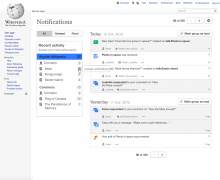
  • Rename the panel. Using a more general concept of activity (even if it is inferred from the number of pending topics) will cause less feeling of contradiction. The "recent activity" (or "active topics", or any other similar names) concept is relevant independently on your focus on pending (unread)/completed (read) items, and it connects with the main goal for this (e.g., identify if there has been a lot of activity in an area I'm interested in).
  • Make the numbers look closer to badges. Badges are associated with new activity, providing similar styling would help a bit communicating their purpose (more on this below).

notif-page-toc-usertalk-active.png (1×1 px, 197 KB)

  • Add a tooltip for further clarity. If additional clarity is needed, we can show a tooltip to clarify what the number means.

notif-page-toc-usertalk-active-tooltip.png (1×1 px, 199 KB)

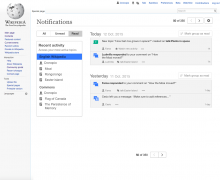
  • Don't show the numbers when the "Read" filter is active. When the reading filter is active, the active topics may be still of interest, but the exact number of pending items is less relevant. We can consider not showing the number to avoid confusions when the user selects the "read" filter (but keep them when "all" or "unread" filters are selected).

notif-page-toc-usertalk-active-read.png (1×1 px, 172 KB)

Thoughts?

In the second picture, the r of your is missing. Apart from that, I like the concept.

In the second picture, the r of your is missing. Apart from that, I like the concept.

Thanks for the feedback, and the good catch (I updated the image).

@Pginer-WMF , @Mooeypoo and myself had an IRL conversation about this and clarified a few things.

Pau wants the list of pages to really be a list of topics, so that notifications for [[Moai]] (e.g. thanks for edits, reverts of edits) and notifications for [[Talk:Moai]] (e.g. mentions, thanks for comments, new Flow topics) both show up under "Moai". I suggested that we think about this not as grouping titles together across all namespaces, but as pairing each subject page with its talk page. That way pages like [[User:Moai]], [[User talk:Moai]], [[Wikipedia:Moai]], [[Wikipedia talk:Moai]], etc. are not grouped under "Moai" but instead under "User:Moai" and "Wikipedia:Moai". (For a more realistic example, consider [[Village pump]], [[Talk:Village pump]] and [[Wikipedia:Village pump]]; we don't want to group the third with the other two.)

I suggested that this might be possible with a more elaborate query, and I had something like GROUP BY page_title in mind (or maybe GROUP BY page_namespace/2, page_title). However, that doesn't work because the Echo tables are on x1 and the page table is on s1-s7, so we can't do joins between them.

One way this could still be done in the backend is by retrieving the complete list of pages with unread notifications (i.e. dropping LIMIT 10 and ORDER BY count from the query), then querying the ns+title for each page ID, then on the PHP side group by subject+talk pairs, sort, and return the top 10. This sounds worse than what we currently do but I don't think it will be, especially since the current query already has to sort the entire list of pages by count on the DB side.

Change 292600 had a related patch set uploaded (by Mooeypoo):
[wip] Add a cross-wiki sidebar to the Special:Notifications page

https://gerrit.wikimedia.org/r/292600

Notifications not associated with any page make these counts not add up. I understand how it works, and that it's technically correct, but it's annoying. Or maybe it's just me?

Screen Shot 2016-06-14 at 10.17.59.png (614×1 px, 129 KB)

Notifications not associated with any page make these counts not add up. I understand how it works, and that it's technically correct, but it's annoying. Or maybe it's just me?

Screen Shot 2016-06-14 at 10.17.59.png (614×1 px, 129 KB)

In T137502#2376488 I proposed to consider those as part of the "user" filter (i.e., in the same group as those related to the user page). In that case, those should be reflected in the counter for such filter.

Note that the counts will potentially not add up anyway, because we only show the top 10 pages.

Note that the counts will potentially not add up anyway, because we only show the top 10 pages.

How will it work if you have more than 10 wikis with x-wiki notifications? Some will appear when you will have cleared a wiki? that may be perceived as the Δαναΐδες endless task, no?

Note that the counts will potentially not add up anyway, because we only show the top 10 pages.

How will it work if you have more than 10 wikis with x-wiki notifications? Some will appear when you will have cleared a wiki? that may be perceived as the Δαναΐδες endless task, no?

According to our data, the number of users with unread notifications from more than 10 wikis is relatively small.

Also, my understanding is that the limit of 10 in pages refers to the pages with unread notifications for each wiki. According to this study the percentage of users with more than 5 unread notifications is quite small for the analysed wikis (~0.5%). Considering that the pages associated with notification are expected to be equal or less than the number of notifications, this does not seem a big limitation to be worried about.

Note that the counts will potentially not add up anyway, because we only show the top 10 pages.

How will it work if you have more than 10 wikis with x-wiki notifications? Some will appear when you will have cleared a wiki? that may be perceived as the Δαναΐδες endless task, no?

I meant the top 10 pages for each wiki, not that we'd limit to 10 wikis. That said, limiting to some sensible number of wikis could be a good idea, but in practice people tend not to have unread notifications across unreasonable numbers of wikis.

Change 292600 merged by jenkins-bot:
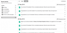
Add a cross-wiki sidebar to the Special:Notifications page

https://gerrit.wikimedia.org/r/292600

Is this incoming change will release Phillip into the wild?

(Translated version: will people see that new left bar after that release, or is it expecting an other development?)

Is this incoming change will release Phillip into the wild?

Yes. You can play with it at http://en.wikipedia.beta.wmflabs.org/wiki/Special:Notifications .

Note that this isn't quite complete: it doesn't yet combine subject pages and talk pages, list page-less notifications (see T137502: Display page-less notifications together with the user page), or use the correct icon and presentation for the user page / user talk page.

@Catrope: is the following a bug or an issue that will be resolved with T137502: Display page-less notifications together with the user page ?

  1. A new user has only page-less messages - e.g. email and Welcome notifications.
  2. Special:Notifications page will display 0 in counters. (The flyout counter is correct).

The screenshots below illustrate the above scenario.
A new user - ET91 - gets 'Welcome' from cawiki (the user account was created there) but the user's first login is to enwiki

Screen Shot 2016-06-22 at 3.21.40 PM.png (467×1 px, 170 KB)

Then somebody sends an email in enwiki to ET91, but ET91 still sees zeroes in the counters when visiting either enwiki and cawiki.

Screen Shot 2016-06-22 at 3.29.41 PM.png (502×1 px, 173 KB)

@Catrope: is the following a bug or an issue that will be resolved with T137502: Display page-less notifications together with the user page ?

It's a bug, not directly related to T137502 but kind of. So I ended up fixing it while implementing T137502 today: https://gerrit.wikimedia.org/r/#/c/295561

Double-checking with @Pginer-WMF for sign-off.

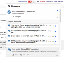
  1. Examples of a blue dot position

Screen Shot 2016-06-22 at 3.29.41 PM.png (502×1 px, 173 KB)

Screen Shot 2016-06-23 at 1.54.08 PM.png (526×584 px, 90 KB)

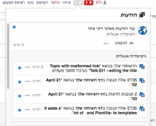
RTL example
Screen Shot 2016-06-22 at 11.44.53 AM.png (438×540 px, 62 KB)

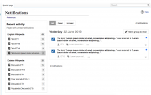
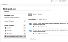
  1. The small grey square for the side panel counter (.mw-echo-ui-pageNotificationsOptionWidget-count) - how it looks. The contrast for the grey square background (#555) is ok?

Screen Shot 2016-06-22 at 1.10.08 PM.png (415×1 px, 79 KB)

Screen Shot 2016-06-23 at 11.31.03 AM.png (683×1 px, 124 KB)

Summary of what specs are missing - separate bugs may be filed.

  1. filed as T139646: Notification side panel: For current wiki with zero unread notifications the title should be greyed out

The current wiki [...] is always shown even if there are no notifications there. In this case, the item is displayed in a lighter text

The current wiki name with zero unread notifications is displayed in bold.

Screen Shot 2016-06-23 at 3.29.37 PM.png (534×853 px, 80 KB)

  1. - more severe issue. Filed as T139637: Users with only cross-wiki notifications see 'No notificaitons' on Special:Notifications page.

If there are no unread notifications in any wiki, the current wiki will still be shown.

In this case, 'No notificaitons' will be displayed on Special:Notifications

Screen Shot 2016-06-23 at 4.00.27 PM.png (327×1 px, 63 KB)

  1. Filed as T139642: Notification page side panel: sorting order of pages is incorrect .

From the list of pages, the user page (and user talk page) are represented with a user icon, and placed at the top of the list (unlike the other items which are ordered alphabetically).

First, the user icon is not displayed
Secondly, the user pages are not automatically placed at the top of the list.

In fact, the list of pages is not ordered alphabetically - the order is based on the number of unread messages.
Compare, first User talk:Etonkovidova is placed at the top (seems that the order is based on the # of messages, then on the last update)

Screen Shot 2016-06-23 at 4.09.36 PM.png (630×848 px, 95 KB)

Then, Talk:ET1 has added some messages - totaling 5 - and moved to the top.
Screen Shot 2016-06-23 at 4.10.28 PM.png (447×888 px, 71 KB)

  1. Filed as T139644: Notification side panel: Tooltips are not provided for truncated titles

Filter items are cropped based on the available width and hovering over them will show tooltips with the full title.

No tooltips are displayed.

@Etonkovidova captured good points to review. In addition to those, some comments on small details:

Blue dot alignment

The blue dot does not seem to be right-aligned with the timestamp at the bottom.
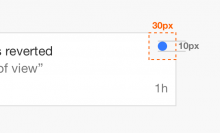
If we look at the distance to the edge of the notification, the blue dot is expected to be at 10px (or equivalent in EMs):

Slice 1.png (432×711 px, 18 KB)

The timestamp position should be affected also by the 10px wide space around the notification item:

notif-layout-spacing-reference.png (158×502 px, 18 KB)

However, it seems that the current distances are 1em for the notification right padding (computed to ~14px), and 0.7em for the margin around the blue dot (~9px). Causing the slight misalignment. Ideally those should be the same distance in both cases (even if they are not exactly 10px).

Stretched blue dot
Another detail I noted is that the blue dot for the first notification is not completely circular and looks a bit stretched instead. In the example taken from Elena, we can see that for two notifications with the same text the issue happens on the first one with no apparent reason:

Screen Shot 2016-06-23 at 11.31.03 AM.png (683×1 px, 124 KB)

Stretched blue dot
Another detail I noted is that the blue dot for the first notification is not completely circular and looks a bit stretched instead. In the example taken from Elena, we can see that for two notifications with the same text the issue happens on the first one with no apparent reason:

Screen Shot 2016-06-23 at 3.29.37 PM.png (534×853 px, 80 KB)

Wrong screenshot?

Wrong screenshot?

Indeed. I updated the comment with this one:

Screen Shot 2016-06-23 at 11.31.03 AM.png (683×1 px, 124 KB)

Thanks for catching this!

Stretched blue dot
Another detail I noted is that the blue dot for the first notification is not completely circular and looks a bit stretched instead. In the example taken from Elena, we can see that for two notifications with the same text the issue happens on the first one with no apparent reason:

Screen Shot 2016-06-23 at 11.31.03 AM.png (683×1 px, 124 KB)

I noticed this too. It happens only for the first dot on the special page, and IIRC also for the first dot below an expanded cross-wiki bundle in the popup. This is a rendering bug in Chrome (it doesn't happen in Firefox, and Chrome's own inspector believes the dot is round), probably to do with rounding (if we use 10px instead of 0.7em, it doesn't happen). The fact that it only happens for the first dot indicates it might be triggered by nearby margins or something.