Page MenuHomePhabricator

Rethink in-article navigation on mobile web [Prototype]
Closed, ResolvedPublic

Description

Overview

Story
As a reader, I want to be able to navigate through different sections of articles as quickly as possible, so that I can target the content I am most interested in.
Background
We investigated collapsing sections and came to the conclusion that collapsed sections are the optimal experience for users. We would like to explore combinations of collapsed sections with a table of contents.

to prototype
We will have a floating button dedicated to scroll to the top of the section and close the section. this button will be available while scrolling and will be tied to each section.

Flow -

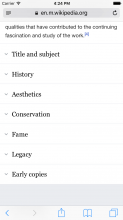
  1. user sees list of closed sections

closed.png (1×750 px, 87 KB)

  1. user taps on a section to open, a floating action button pops on bottom right

1open.png (1×750 px, 220 KB)

  1. user scrolls, the button stays in position. first time ux - show a tip saying what the button does

1open copy.png (1×750 px, 261 KB)

  1. user taps on the button, the page scrolls to the section header in view. and closes the section. no animation for closing section. but scroll to the section name might be preferable.
NOTE: this is a prototype and edge cases are not handled. only happy path to begin with

Prototypes

I'm working on prototyping a number of solutions to this problem/opportunity. The prototypes can be found here: https://in-article-navigation.firebaseapp.com/. They are meant to be used on mobile devices.

Related Objects

Event Timeline

ovasileva triaged this task as Medium priority.Nov 1 2016, 2:30 PM
Nirzar renamed this task from Rethink mobile web navigation to Rethink in-article navigation on mobile web.Nov 1 2016, 4:15 PM
Nirzar renamed this task from Rethink in-article navigation on mobile web to Rethink in-article navigation on mobile web [Prototype] .Nov 29 2016, 7:28 PM

I would like to say I very much would appreciate such a function :) It's quite hard for scrolling even with just a back-to-top, because then you have to scroll down to another section again. Something like this would make navigating easier: like subpages under https://meta.wikimedia.org/wiki/2016_Community_Wishlist_Survey, as an example. There were many proposals under many categories, and sometimes there were very long proposals, or a lot of votes on an proposal which makes scrolling take longer.

If and when this prototype is created, I would be happy to test it out! I appreciate the work people put in to make things like this :)

@SamanthaNguyen sounds good! i will share the updates here.

@Nirzar and @ovasileva are you still happy with the priority of this task?

Jdlrobson lowered the priority of this task from Medium to Low.May 20 2017, 4:15 PM
ovasileva raised the priority of this task from Low to Medium.May 21 2017, 8:56 AM