Page MenuHomePhabricator

Use display locking to allow browser's native "Find in page" function to work with collapsed sections
Closed, ResolvedPublic2 Estimated Story Points

Description

NOTE: This problem is solvable by display locking (https://developer.chrome.com/articles/hidden-until-found/)

Due to sections being collapsed by default on mobile, in way that the browser doesn't consider as part of its searchable document index, most text in articles cannot be found by users via the "Find in Page" functionality of web browsers.

I noticed this during my teams' most recent offsite in Boston when we were doing some performance-related user testing, where a user found this surprising on their phone.


Upstream:

QA steps

  • Make sure you have latest Chrome
  • Resize window to about 400px.
  • Load the Dog page
  • Make sure all sections appear collapsed
  • Using browser's find in page feature search for "aegyptius"
  • Expected: The search term should be found. Taxonomy section should be expanded

QA Results - Prod

ACStatusDetails
1T216789#8231013

Event Timeline

There are a very large number of changes, so older changes are hidden. Show Older Changes
alexhollender_WMF renamed this task from "Find in page" does include text in sections default to Browser's native "Find in page" function does include text in sections default .Feb 25 2019, 9:22 PM

If we can't expand sections by default I don't see this as being solveable. That's the trade off in my opinion. The only thing I can suggest is working with browser vendors to add a JavaScript event that is fired when find on page is invoked - at which point we could expand all the sections (although this also might not be great from a UX perspective. FWIW the workaround I use (and tell all my friends is to go to the bottom of the page, and scroll up, opening sections as you go... then using find on page.

Another alternative would be building and adding a find in page feature to the page actions menu.

In T216789#4982690, @alexhollender wrote:

@Jdlrobson I think this would be fantastic to fix. Speaking only from personal experience I also struggle with this, and have heard the same from friends. Expanding all sections by default is not going to work from a reading perspective [..]

I would agree as well. I think the collapsed sections play a crucial part today, in the user's ability to understand the structure of the document and navigate from a high level.

Having said that, I do think there's room for improvement or alternate ways to address this user need. Because while the collapsed make it work, it's not exactly ideal.

[..] the workaround I use (and tell all my friends) is to go to the bottom of the page, and scroll up, opening sections as you go... then using find on page.

Yeah, same here. I also experience the opposite version of this workflow, by the way - where you start from the top to re-collapse the sections; as the workaround for not having a table of contents. I quite often feel the need to get a high-level perspective, either because it's been a while since I started reading, or because I started somewhere in particular first but then want to read about something else, or because I got a permalink that opened and jumped into a particular section, etc.

Re-collapsing all sections is the current workaround I use to get back to something that resembles a table of contents, which works today, but isn't intuitive to everyone. I'm curious what the history is behind not having a table of contents. Perhaps something we could reconsider as part of these user stories.

I don't know how long ago it changed, but the approach the Wikipedia app on iOS uses currently for navigation and orientation seems quite pleasant. It looks very much like the overview MobileFrontend provides, except it provides both the expanded view and the section listing at the same time.

A few months ago our team was thinking about how to improve in-article navigation. At the time we weren't considering find-in-page as an aspect of in-article navigation, but interestingly during user testing it came up a lot, and I think it's fair to categorize it as a navigational tool. Some people scroll, some people search — they're different ways of accomplishing the same task.

I'm not sure of the history of not having a table of contents (I think it's just something we haven't gotten around to yet), however one of our prototypes, which you can check out here (click Group 3), did include a table of contents. Based on the usertesting, and from using it myself, I do think it adds notable complexity to the interface: having to tap a button in order to see a table of contents, rather than scrolling down a little bit, where the collapsed section headers double as a TOC. So we'd have to consider that tradeoff if we wanted to expand all sections by default for the purpose of being able to use find-in-page.

Krinkle updated the task description. (Show Details)
Krinkle moved this task from Backlog to Reported Upstream on the Upstream board.

@alexhollender I think introducing a more accessible table of contents would be great, and presumably unblocks the issue of collapsed sections. In terms of performance, I've not been able to find any downside with sections being expanded. To my knowledge it was solely a UX decision to have the collapsed sections effectively serve as table of contents.

@Krinkle If moving the ToC is a potential solution, then this is probably a parent task of T147717.

Ha, yeah. I was just looking at that earlier today.

My understanding is that the ScrollToTextFragment spec isn't going to solve this problem. It builds on top of the pre-existing DOM search also used by Find In Page.

If and when we don't hide the text and/or establish a means of telling the browser about additional text hidden in the document, presumably both of these features would be able to make use if it.

Orthogonal, but related to this proposed spec is the Find In Page API spec which would potentially give us a JavaScript event when "Find In Page" is used from we could open one section at a time as the search is going on (and possibly re-close behind us, depending on what we want for UX).

Also, depending on how the ScrollToTextFragment turns out, it might give us a way to target with CSS where the anchored text is and force the containing section to open. However that won't affect Find In Page.

I created a demo to explore the proposal of rendering all sections open by default, while providing a new table of contents mechanism: view demo here. Some tradeoffs worth considering:

  • any table of contents mechanism other than the current solution of rendering all sections collapsed by default will likely be less discoverable. Currently you arrive at the table of contents by default as soon as you scroll past the lead section. In the demo above (and in the iOS and Android apps) you are required to tap/swipe in order to reveal the table of contents. This is partially why we liked this solution after our user testing. The simplicity of the table of contents being the collapsed section headings is compelling.
    • conversely, on articles with long lead sections (often including tall infoboxes) (e.g. China) there is a lot of scrolling involved in order to reach the table of contents. In the demo above you're able to access the table of contents from (basically) the top of the page. So while it might be less discoverable it might be described as more accessible because you don't need to scroll a bunch to get to it.
  • something that came up in the 2016 research is that when long pages have all sections open they become unwieldy and overwhelming. This suggests that all sections being closed by default (and being expandable/collapsible) is beneficial beyond just serving as a stand-in table of contents mechanism. We would be loosing this benefit. We could imagine all sections being open by default while still retaining the expandable/collapsible functionality, however I think at that point it's sort've self-defeating.
    • conversely, this doesn't seem to be an issue on iOS and Android, plus this research suggests benefits of all sections being open.

Perhaps the difficult task now is to compare the drawbacks/tradeoffs listed above (if indeed we do view them that way) with the benefit of being able to search the entire page. CC @RHo @Pginer-WMF @Volker_E @cmadeo for additional design brainpower.

Apart from collapsed vs always expanded discussion, one immediately visible issue is a discoverability issue of the demo approach.
The article title and a symbol very similar to the hamburger icon is put in place of the hamburger icon and the Wikipedia logo. Where have we discussed a fixed header for mobile web? A fixed header with a changing section highlight would probably tame this.
@alexhollender Also I think it's very well worth to have this discussion, but it were better located (and deserves) a task on its own…

Hi @alexhollender - thanks for the detailed background for this task. Weighing up the pros and cons, it seems like having sections open in conjunction with a new ToC-like overview of sections/navigational shortcut is the path forward:
It is supported by this research indicating uncollapsed mobile web reading is conducive to longer reading and less time navigating
It is the model used by both the apps pretty well in terms longer average reading times and usage of the ToC controls, though of course it should be taken into account that it is an audience that tends to be more engaged.
The 2016 usability research is useful insofar as it gives clear user preference for uncollapsed sections when given that simple binary choice, but the result may be quite different if they were shown an option with expanded sections *and* a ToC or other quick overview/navigational mechanism (which is sort of indicated in tester comments wanting a sticky header, jump to top button, etc).
One scenario that wasn't tested in the above usability study was this ticket's use case, finding something specific in the article, where there is again benefit in having sections open.

Whilst I like new demo you've proposed as it is solving a lot of the problems presented, I agree with @Volker_E that the ToC icon may have discoverability issues as it is very similar to the menu icon and wordmark in the header. And more importantly than discoverability of the ToC is that this makes the nav drawer and search functionality in the menu header both less accessible and less discoverable if is not sticky (since the user needs to know they have to scroll all the way up to the top of the screen to see the mobile header again). It seems worthwhile re-exploring having the table of contents accessible elsewhere for this reason, which is why I also support moving these comments into a separate task and linking to this ticket as a something that may be resolved as a related issue.

Thanks for your comments @Volker_E @RHo. Your points on the shortcomings of the demo are noted, though just as an FYI it did perform well during our user research.

For the time being I want to clarify that until we design, test, and implement an alternative table of contents element with the (potentially) new requirement taken into consideration we should not move forward with making all sections expanded by default. The related task is here T151115, however during those explorations we weren't considering the need of expanding all sections by default. Cc @ovasileva for tracking this.

Sorry for being late to this conversation! Thank you @alexhollender for all of the context and research.

I'd echo @Volker_E and @RHo's concerns around accessing the header / overflow menu on the current demo: perhaps including a task in a usability test of this that asks users to navigate to a completely new page (eg. search) or utilize another overflow menu option might be helpful in determining if this is an issue in practice for users.

One other thought from the apps is that both apps currently collapse the infobox, which would also make navigating down to the first section much faster for articles with long infoboxes. That being said, it's not a perfect solution as often infoboxes include a lot of the information that users are looking for for common searches including the 'bar bets' category (trying to find Laila's research that showed common search types on apps but can only find some raw data that I don't have access to share).

Overall though, very excited for these new developments on the article view!

If we decide not to change the UI, I can confirm the issue with find in page will be fixed by the display locking spec being discussed in T230941.

I think if we want to discuss expanding all sections as an alternative proposal, this will likely come with some performance challenges that we'll need to think through so you'll want to sync in the performance team as part of the design phase. I recommend not using this task for that but to create a new one outlining the proposal (or using the unstalled T199157 or T147026).

Jdlrobson changed the task status from Stalled to Open.Feb 9 2022, 11:39 PM

I think this is relevant to desktop improvements if we decide to roll this out onto the new Vector too.

Moving to planned until we're able to set up a roadmap for adding collapsible sections for smaller viewports

I noticed that hidden=until-found from the display locking spec is now implemented in Chrome 102 https://developer.chrome.com/blog/hidden-until-found/

Jdlrobson renamed this task from Browser's native "Find in page" function does include text in sections default to Use display locking to allow browser's native "Find in page" function to work with collapsed sections.Jul 12 2022, 4:45 PM

Change 816351 had a related patch set uploaded (by Josepharhar; author: Josepharhar):

[mediawiki/extensions/MobileFrontend@master] Make sections expandable by find-in-page

https://gerrit.wikimedia.org/r/816351

Thanks for the patch! I've moved it into our sprint board to get eyes on it.
Olga: This is now mobile only as desktop won't be collapsing sections for the foreseeable future but should finally fix the "find in page" problem (when sections are collapsed) on Google Chrome.

Jdlrobson lowered the priority of this task from Medium to Low.Jul 26 2022, 9:50 AM

Would the performance team be interested in measuring this change in any way or code review?

I've reviewed the patch and I have no big concerns about doing this change - it does nothing in older browsers and find on this page works in modern Chrome. The change required is super simple. I think the only thing to do before merging this is to check in with the performance team if they have any concerns or requests for us to consider (e.g. performance metrics) before doing this work.

Hey @Jdlrobson thanks for addressing this task, it's much appreciated.
The performance team usually prioritizes Performance Reviews through the Performance Review intake process. Since this one doesn't require a full-fledged review, we encourage code owners to proceed in a self-service manner by reviewing our runbook for help on how to measure the impact of their features.

If you want we can provide assistance on that as well. And of course, if you run into concerning measurements, feel free to ping us.

Hi @larissagaulia to be clear, I don't need assistance, do not have any concerns and am not requesting a performance review.

I just wanted to be diligent here since this task was created by a performance team member. If you are happy for us to go ahead with this change without your involvement, that's fine, I just didn't want to assume. We do not plan to do any measurements here, but will monitor before/after the change.

I'll look to merge this sometime next week (probably Tuesday), so please let me know ASAP if there is any problem with that. Thanks!

Change 816351 merged by jenkins-bot:

[mediawiki/extensions/MobileFrontend@master] Make sections expandable by find-in-page

https://gerrit.wikimedia.org/r/816351

Thanks for merging the patch @Jdlrobson! When do you think I might see it on en.m.wikipedia.org?

Thanks for merging the patch @Jdlrobson! When do you think I might see it on en.m.wikipedia.org?

A week today: T314186

LGoto set the point value for this task to 2.Aug 29 2022, 5:38 PM
Edtadros subscribed.

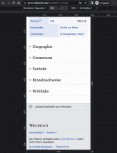
Test Result - Prod

Status: ✅ PASS
Environment: dewiki
OS: macOS Monterey
Browser: Chrome
Device: MBP
Emulated Device:NA

Test Artifact(s):

QA Steps

Make sure you have latest Chrome
Resize window to about 400px.
Goto https://de.m.wikipedia.org/wiki/Walluf_(Fluss)
Make sure all sections appear collapsed
Using browser's find in page feature search for text within a section.
✅ AC1: The section containing the searched text should be expanded.

Screen Recording 2022-09-12 at 7.20.54 PM.mov.gif (948×732 px, 260 KB)