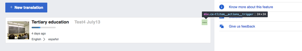
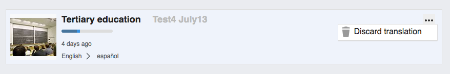
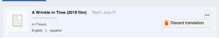
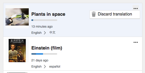
The list of in-progress translations in the dashboard allows users to discard them:
Currently the menu presents several issues that are especially problematic with small screens and touch devices:
- It should be possible to open the menu by clicking on the "..." icon. Currently the menu is opened on hover (which is good), but if a user clicks on the "..." icon the click event seems to propagate to the list element resulting in an unintended navigation.
- The active area is small and overlapping. Making the active area for the "..." menu to be bigger and reducing the overlap with the list item active area will reduce the chances of accidentally clicking in the wrong place.