Story: As an editor, I want to see if my input has been recognized
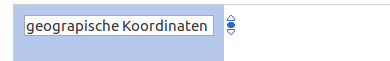
Example: A person is typing in the property to make this a "geocoordinate" property. However, the person makes a tippo and the system fails to communicate that there is a problem.
Severity: Hard to say, since we tried to help people along in the test to not have them stuck for too long, but I assume it is
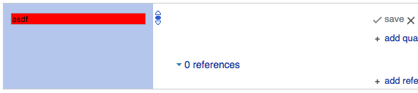
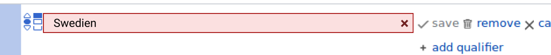
Not recognized:
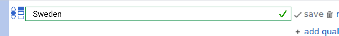
Recognized:
--> No difference
There is a not recognized warning
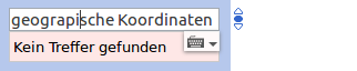
But as soon people tab or click out, it disappeares, which is relevant, since users who see that the interface does not behave as expected often click other elements in hope to resolve the problem, here particularly "save" (which is not activated due to the "malformed" input.
Proposed solution: Make recognized properties/values appear different than plain text input, e.g.
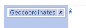
This has the nice effect, that we can establish semantics that, once learned can be used in other places, too.