Page MenuHomePhabricator

Apex theme: Too much vertical space between form fields (Special:Preferences/MonoBook)
Closed, ResolvedPublic1 Estimated Story Points

Assigned To
Authored By
Xaosflux
Dec 1 2017, 1:56 AM
Referenced Files
F22725125: image.png
Jun 27 2018, 2:20 PM
F22725109: image.png
Jun 27 2018, 2:20 PM
F17293315: abuseCapture.JPG
Apr 24 2018, 10:13 PM
F17268958: image.png
Apr 23 2018, 5:41 PM
F11147295: image.png
Dec 2 2017, 9:45 PM
F11147278: 20171202-preferwhitespacestillCapture.PNG
Dec 2 2017, 9:45 PM
F11147271: MW-prefs-20171201-b.PNG
Dec 2 2017, 9:38 PM
F11147269: MW-prefs-20171201-a.PNG
Dec 2 2017, 9:38 PM

Description

This task is now solely about this issue:

MW-prefs-20171201-a.PNG (799×1 px, 52 KB)

Original task:

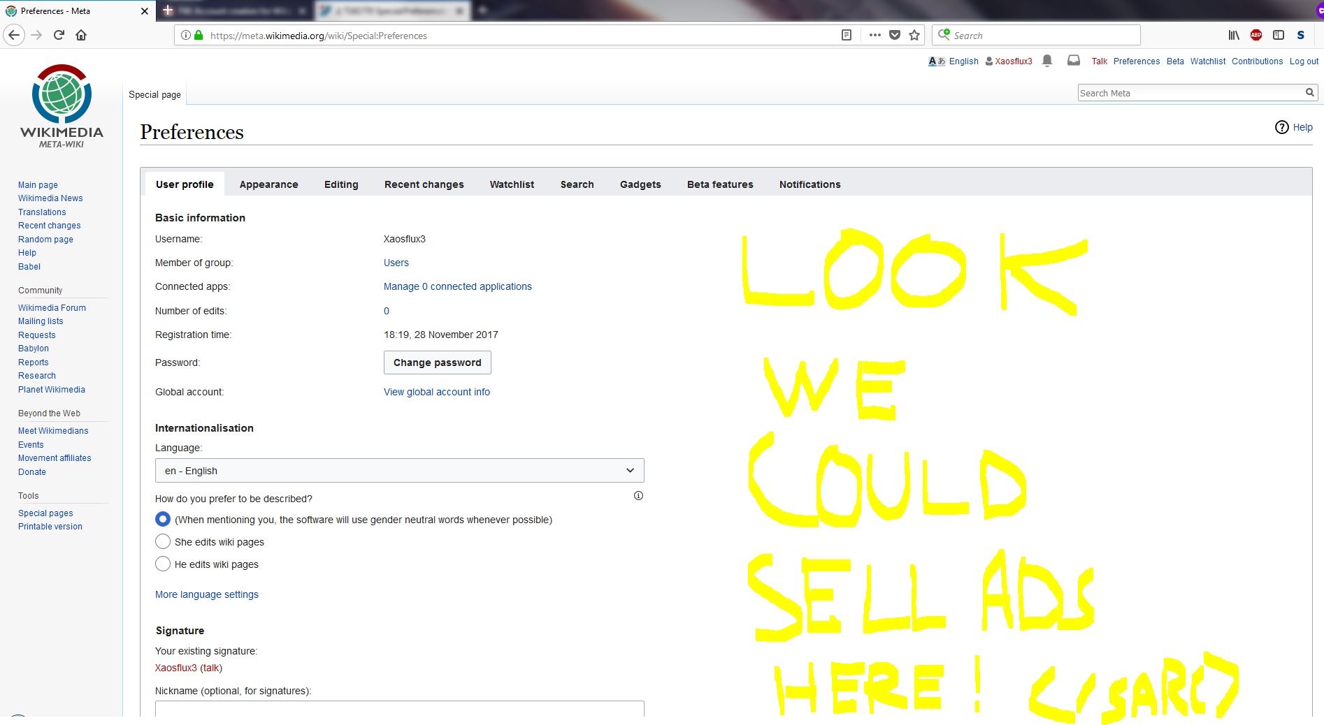
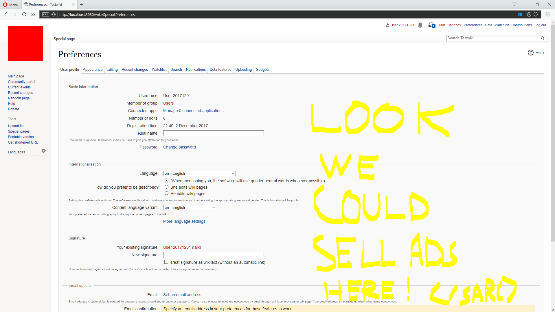
Special:Preferences layout in Monobook is hard to use with OOUI (and its Monobook theme Apex)

See screenshots:
https://commons.wikimedia.org/wiki/File:MW-prefs-20171201-a.PNG

https://commons.wikimedia.org/wiki/File:MW-prefs-20171201-b.PNG

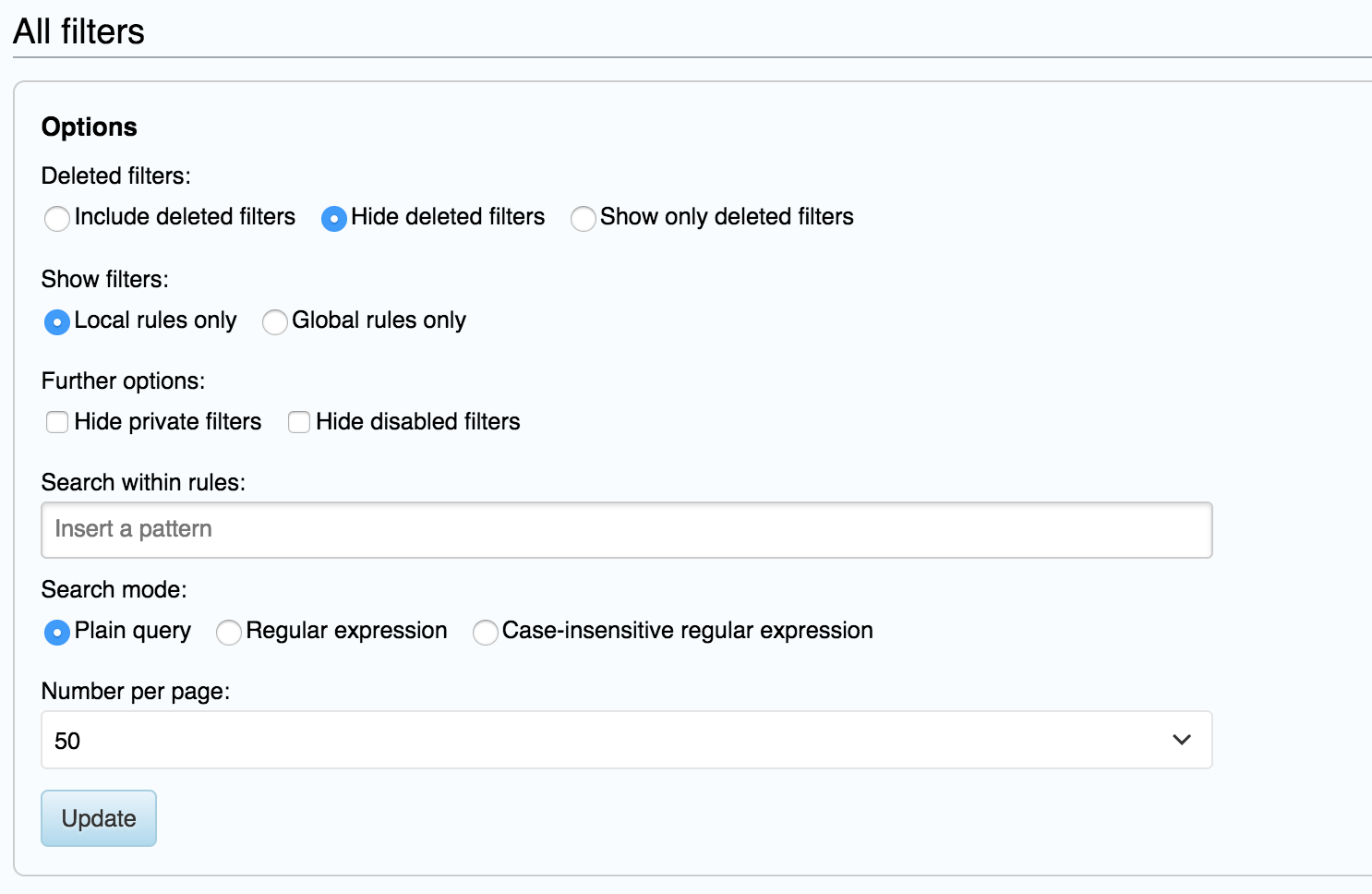
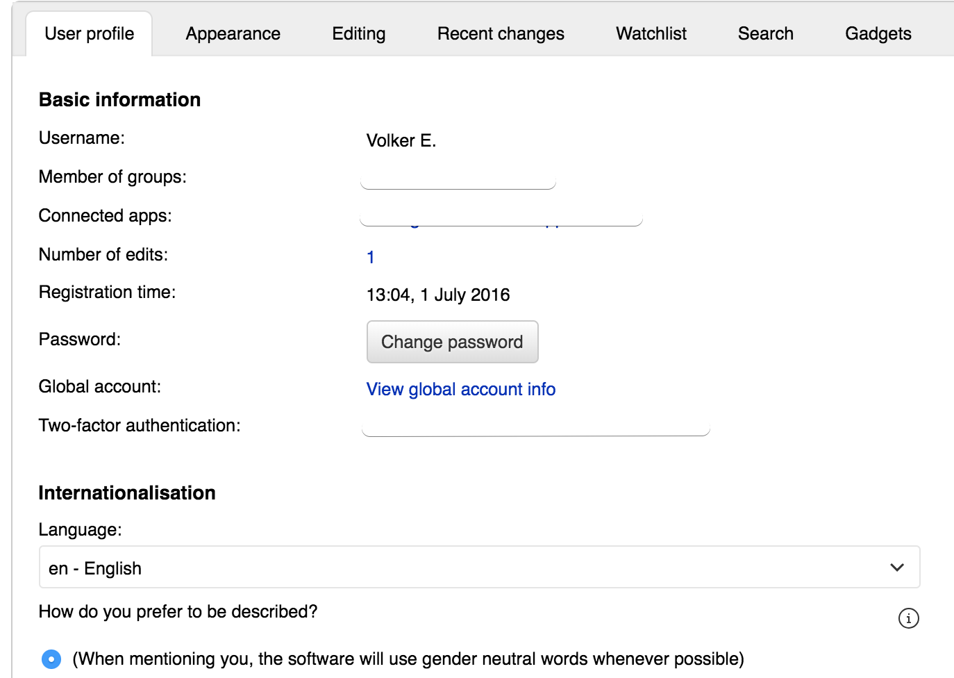
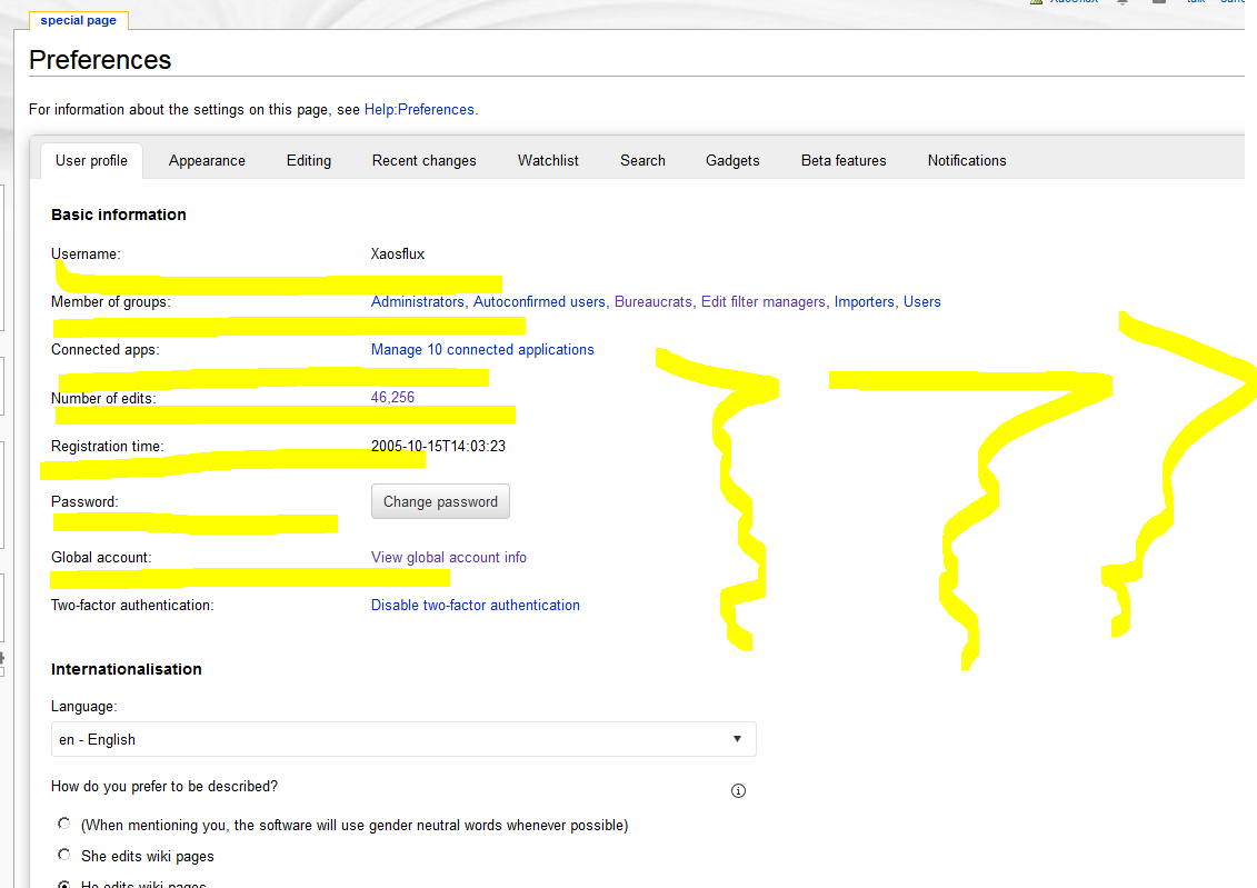
There is way too much whitespace, and it is wrapping the body of the page too narrow compared to the rest of the page. Two examples given.
The button layouts are also confusing, not being oddly located to the side of large text blocks, and the help is way in the bottom corner.

See also enwiki VPT discussion:
https://en.wikipedia.org/w/index.php?title=Wikipedia:Village_pump_(technical)&oldid=812986811#Preference_page_%22improvements%22_aren't_improvements

Event Timeline

Looks like most of all the issues are related to alignment and not respecting dynamic screen sizes (esp. for wide screens).

I agree with Xaosflux. What were you thinking? There was nothing wrong with the old page, and many thing that were right are now wrong. On the User profile tab, there were helpful boxes separating the sections. These boxes are now gone, and because of ludicrous amounts of white space within sections, it's hard for the user to see where the section breaks are. Prompts belong to the left of input fields, not above them. The check box next to Treat the above as wiki markup is badly placed and should be right next to those words, not several lines below them. And that's just the first tab. The other tabs are equally bad. What a disaster!

Change can be jarring, and we'll get used to most of it, but the lack of bounding boxes or lines of some sort around each section is clearly a UI bug that should be fixed.

On the "Editing" page (at least on en.WP), "right clicking" should be "right-clicking" and "double click" should be "double-click".

The little "i" with a circle icons are a pixel or two too high. They should align with the text that they explain. Also, their placement at the far right edge of the invisible box makes it unclear what they belong to.

The red "Restore all settings" text is unclear. It is not blue or purple, as a usable link should always be, and it's not inside a button, so it looks like some sort of explanatory text for the "Save" button, which does not make sense. Red links have a meaning on Wikipedia, and that meaning is not correct in this case. At the very least, it should be a button.

This is not a matter of getting used to something. This is a matter of replacing a good design with a poor design. Please stop arguing just revert it now.

Constant demands of "revert it now" are as unhelpful as they are short. This is clearly a change that is here to stay (OOjs-UI, that is), so your time would be better spent making recommendations on improving it, as you began to do on VPT.

[offtopic] In reply to T181770#3801783 by @Anomalocaris: Thanks for registering on Wikimedia Phabricator. Please read and understand the Phabricator Etiquette if you'd like to continue being active on Wikimedia Phabricator. Thanks for keeping Wikimedia Phabricator a respectful place.

Nihlus wrote, "Constant demands of 'revert it now' are as unhelpful as they are short. This is clearly a change that is here to stay (OOjs-UI, that is), so your time would be better spent making recommendations on improving it, as you began to do on VPT." OK, Here is my proposed list of improvements:
User Profile tab

  • To better separate sections, use boxes around each section, or have larger headings.
  • Reduce line spacing within sections.
  • Move user input to the right of, not below, instructions/descriptions.
  • Reduce width of pull-down menu, which now is almost 3 times the width of the longest option.
  • Align checkbox with top of description.
  • Reduce verbiage about signature field. One thing that is missing here is something like, "uncheck if blank".
  • Better, don't allow the use to save this page with a blank signature and the box unchecked.
  • Remove (i) buttons and display their now-hidden information.

Appearances tab

  • To better separate sections, use boxes around each section, or have larger headings.
  • Reduce line spacing within sections.
  • Move user input to the right of, not below, instructions/descriptions.
  • Reduce width of all 3 pull-down menus; each is many times wider than the widest option.
  • Reduce width of Time offset input field, which is 5 to 10 times wider than it should be.
  • Remove (i) button and display its now-hidden information.

Editing tab

  • To better separate sections, use boxes around each one, or have larger headings.
  • Reduce line spacing within sections.
  • Reduce width of "Edit area font style" pull-down menu; it is about 3 times wider than it should be.
  • Move "Edit area font style" pull-down menu to the right of, not below, its name.
  • Remove (i) button and display its now-hidden information.

Recent changes

  • To better separate sections, use boxes around each section, or have larger headings.
  • Reduce line spacing within sections.
  • Reduce width of "Days to show..." and "Number of edits" fields; they are 10 times wider than they should be.
  • Move "Days to show..." and "Number of edits" fields to the right of, not below, their names.
  • Remove the three (i) buttons and display their now-hidden information.
  • Pending changes section should be better grouped. Reducing line spacing between radio buttons while keeping the large line spacing between the group of radio buttons and the check box would help clarify the grouping.

Watchlist tab

  • To better separate sections, use boxes around each section, or have larger headings.
  • Reduce line spacing within sections.
  • Reduce width of "Days to show..." and "Maximum number of changes..." fields; they are more than 10 times wider than they should be.
  • Move "Days to show..." and "Maximum number of changes..." fields to the right of, not below, their names.
  • Remove the four (i) buttons and display their now-hidden information.
  • "Manage tokens" should be "Manage token", because there is only one token ... is there the possibility of multiple tokens for one user?

Search tab

  • No issues at this time.

Gadgets tab

  • To better separate sections, use boxes around each section, or have larger headings.
  • Reduce line spacing within sections.

Beta features tab

  • No issues at this time.

Notifications tab

  • To better separate sections, use boxes around each section, or have larger headings.
  • Reduce width of "Send me:" and "Email format" pull-down menus; they are 2 and maybe 8 times wider than they should be, respectively.
  • Move "Send me:" and "Email format" pull-down menus to the right of, not below, their names.
  • Move email address to the right of, not below, "Send to:"
Jdforrester-WMF renamed this task from Special:Preferences layout is hard to use after 20171201 rollout to Special:Preferences layout (with OOUI) is has quite a bit of excess whitespace in Monobook.Dec 1 2017, 11:03 PM

Looks like most of all the issues are related to alignment and not respecting dynamic screen sizes (esp. for wide screens).

Thanks for highlighting this. AFAICT the problem is principally around using the Monobook skin; we've adjust the whitespace significantly in Vector, which is the supported interface. Sorry that we didn't spot this beforehand. We'll get it fixed soon.

[Snip]

[Snip]

Thanks both for these lists, but could you put them on the parent general task (rather than this specific one), or create specific tasks as children of that one ("Edit Related Tasks..." > "Create Subtask") so they can be dealt with appropriately? Note that some of those points are already there, though.

All or most of these problems exist in the Vector skin as well, at least on en.WP.

Xaosflux renamed this task from Special:Preferences layout (with OOUI) is has quite a bit of excess whitespace in Monobook to Special:Preferences layout (with OOUI) is has quite a bit of excess whitespace.Dec 2 2017, 4:29 PM

@Jdforrester-WMF this is not limited to monobook or enwiki, I just created a new account - all defaults with private browsing and hopped over to meta.

Look at this screenshot: https://commons.wikimedia.org/wiki/File:20171202-preferwhitespacestillCapture.PNG

(I am copying the screenshots to Phabricator because Commons admins like to delete stuff)

@Jdforrester-WMF this is not limited to monobook or enwiki, I just created a new account - all defaults with private browsing and hopped over to meta.

Look at this screenshot: https://commons.wikimedia.org/wiki/File:20171202-preferwhitespacestillCapture.PNG

20171202-preferwhitespacestillCapture.PNG (1×1 px, 157 KB)

Among all other valid issues listed in this thread, this one is very much a non-issue. There was just as much empty space on the side in the old interface, because there's simply nothing we can put there:

image.png (1×1 px, 177 KB)

Xaosflux renamed this task from Special:Preferences layout (with OOUI) is has quite a bit of excess whitespace to Special:Preferences layout (with OOUI) has quite a bit of excess whitespace.Dec 2 2017, 10:43 PM

As far as "what else could go there" - look at examples in https://en.wikipedia.org/wiki/Special:Preferences#mw-prefsection-gadgets -- notice the section title elements make use of the page, but then there is an unnecessary maximum width in the body, causing line wrapping that should not be required at wide resolutions.

Jdforrester-WMF wrote, "AFAICT the problem is principally around using the Monobook skin; we've adjust the whitespace significantly in Vector, which is the supported interface. Sorry that we didn't spot this beforehand. We'll get it fixed soon."

  • Excuse me, on the Appearance tab, there are 6 skins to chose from. Nowhere does it say that any of the skins are less supported. The idea that only one of those skins is "the supported interface" is improper. All 6 skins must fully supported.
  • Yes, my preferred skin is MonoBook, and my detailed tab-by-tab list of issues was based on a review using MonoBook.
  • For skins other than MonoBook, these two issues on many tabs are not as bad as MonoBook, but not necessarily entirely OK:
    • To better separate sections, use boxes around each section, or have larger headings.
    • Reduce line spacing within sections.
  • For skins other than MonoBook, one issue under Recent changes is not as bad as MonoBook, but not necessarily entirely OK:
    • Pending changes section should be better grouped. Reducing line spacing between radio buttons while keeping the large line spacing between the group of radio buttons and the check box would help clarify the grouping.
  • However, for each tab that has issues at all, except Gadgets, I listed at least two other issues, ...
  • ... so, it is incorrect to say that the problem is principally around the Monobook skin.
  • For the 5 skins other than MonoBook, not counting the issues that not as bad as MonoBook, there are still 21 issues from my previous message.
  • This can't be solved by just tweaking the line spacing of MonoBook.
  • The December 2017 interface appears to have zero advantages, and definitely has many disadvantages, compared to the interface it replaced.
  • So, one possible workaround to consider, even if one is not supposed to say so, is ...
    • (whisper, whisper) the previous version of this interface could be restored. (/whisper, whisper)
  • In this and my previous message, I have endeavored to be keep my comments to the point and avoid ad hominem criticisms.

Jdforrester-WMF wrote, "AFAICT the problem is principally around using the Monobook skin; we've adjust the whitespace significantly in Vector, which is the supported interface. Sorry that we didn't spot this beforehand. We'll get it fixed soon."

  • Excuse me, on the Appearance tab, there are 6 skins to chose from. Nowhere does it say that any of the skins are less supported. The idea that only one of those skins is "the supported interface" is improper. All 6 skins must fully supported.

None of them are fully supported, except Vector and Monobook on desktop and Minerva on mobile. I announced this in April 2013: https://meta.wikimedia.org/wiki/Turning_off_outdated_skins There's a task to note this on the preferences page, but some people have pushed back on putting such a note in because "everyone already knows" this fact. I agree that it's very confusing.

  • Yes, my preferred skin is MonoBook, and my detailed tab-by-tab list of issues was based on a review using MonoBook.

OK. But this task specifically is about whitespace between items in the form. Your issues, most of which are valid, are off-topic for this task. The parent task, as I said before, is a better place to put them.

[Snip]

Jdforrester-WMF renamed this task from Special:Preferences layout (with OOUI) has quite a bit of excess whitespace to Special:Preferences layout (with OOUI) has quite a bit of excess whitespace in Monobook.Dec 4 2017, 4:52 PM
Jdforrester-WMF added a project: MonoBook.

OK. But this task specifically is about whitespace between items in the form. Your issues, most of which are valid, are off-topic for this task. The parent task, as I said before, is a better place to put them.

With all respect, when this task was created, the task summary, which was 100% accurate at the time, was "Special:Preferences layout is hard to use after 20171201 rollout". Under that heading, a number of volunteer QA testers submitted detailed reports of reproducible problems with the layout, along with suggestions on how to fix some of the problems.

After that careful, detailed volunteer work was performed and the results were provided to WMF staff, Jdforrester-WMF renamed this task from Special:Preferences layout is hard to use after 20171201 rollout to Special:Preferences layout (with OOUI) is has quite a bit of excess whitespace in Monobook.

I suggest that if WMF staff want to retroactively narrow the scope of this task, that they copy the detailed volunteer QA testing reports to a separate task.

Volker_E renamed this task from Special:Preferences layout (with OOUI) has quite a bit of excess whitespace in Monobook to MonoBook: Special:Preferences' whitespace usage in OOUI needs improvement.Dec 18 2017, 11:23 PM
Volker_E triaged this task as Medium priority.
Volker_E updated the task description. (Show Details)

Signature field now looks reasonable:

image.png (211×665 px, 36 KB)

(Including T192823 from OOUI)

I'm going to update this task to just be about the spacing between fields. Any other issues raised here should be filed as separate tasks.

Esanders renamed this task from MonoBook: Special:Preferences' whitespace usage in OOUI needs improvement to Special:Preferences: Too much vertical space between form fields in MonoBook.Apr 23 2018, 5:46 PM
Esanders updated the task description. (Show Details)
Esanders set the point value for this task to 1.

This problem is now appearing in Special:AbuseFilter as well. Possibly related to T132284

The abuse filter vertical space appears to be the same problem in monobook and vector, so it is just informational here.

Volker_E renamed this task from Special:Preferences: Too much vertical space between form fields in MonoBook to Apex theme: Too much vertical space between form fields (Special:Preferences/MonoBook).May 20 2018, 3:39 AM
Volker_E updated the task description. (Show Details)

Change 434121 had a related patch set uploaded (by VolkerE; owner: VolkerE):
[oojs/ui@master] Apex theme: Reduce accumulated white-space in form fields

https://gerrit.wikimedia.org/r/434121

Change 434121 merged by jenkins-bot:
[oojs/ui@master] Apex theme: Reduce accumulated white-space in form fields

https://gerrit.wikimedia.org/r/434121

Volker_E claimed this task.
Volker_E subscribed.

Recent Special:AbuseFilter with patch above (shows BetaCluster)

image.png (968×1 px, 120 KB)

Special:Preferences with OOUI flag set to 1

image.png (976×1 px, 130 KB)

Volker_E edited projects, added OOUI (OOUI-0.27.4); removed OOUI.