Page MenuHomePhabricator

Explore ways to communicate the Neutral Point of View concept
Open, Needs TriagePublic

Assigned To
None
Authored By
Pginer-WMF
Mar 23 2018, 1:47 PM
Referenced Files
F16918081: npov-video2.png
Apr 11 2018, 4:27 PM
F16918083: npov-video3.png
Apr 11 2018, 4:27 PM
F16918066: npov-intro-reviewed.png
Apr 11 2018, 4:27 PM
F16918079: npov-video.png
Apr 11 2018, 4:27 PM
F16631604: npov-intro-reviewed.png
Apr 3 2018, 4:26 PM
F16432559: npov-after-compact.png
Mar 29 2018, 3:00 PM
F16432513: npov-after.png
Mar 29 2018, 3:00 PM
F16000743: npov-intro-examples-result.png
Mar 23 2018, 2:17 PM
Tokens
"Baby Tequila" token, awarded by cmadeo."Love" token, awarded by Trizek-WMF.

Description

Introducing the concept on the first contribution

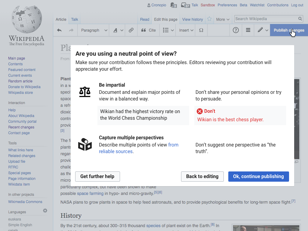
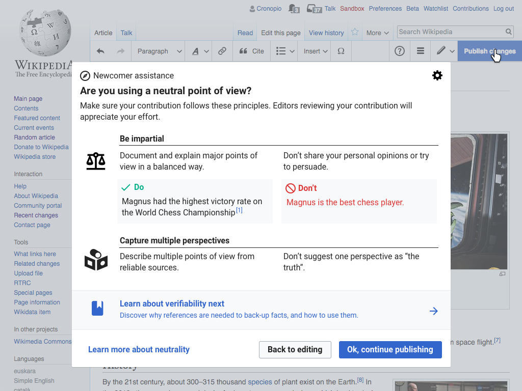
After the user makes the first edit of a significant size, we can introduce the Neutral Point of View concept (text based on the training library).

npov-intro-reviewed.png (768×1 px, 260 KB)

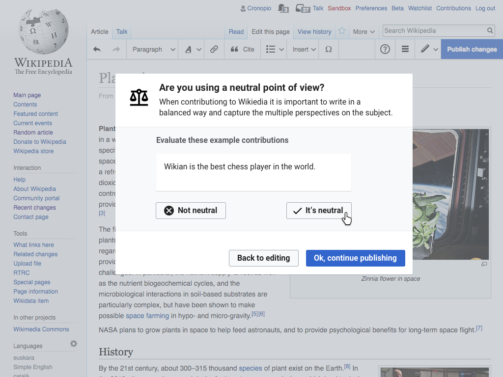
A variant based on evaluating examples

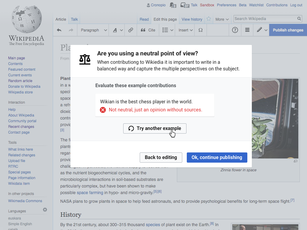
We can consider explaining the concepts more connected to specific examples. In the example below, an example edit is provided for the user to evaluate regarding the Neutral point of view. After the user makes a choice, the answer is provided with more detail on why the edit aligns with Neutral Point of View principle or not.

npov-intro-examples-initial.png (768×1 px, 296 KB)

npov-intro-examples-result.png (768×1 px, 301 KB)

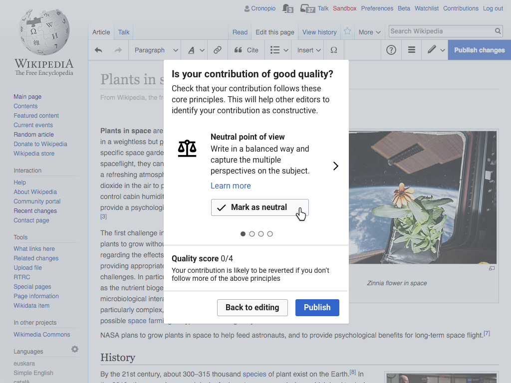
As part of a self-assessment for contribution quality

After the user makes one of their initial contributions, clicks on "publish" and no other specific lesson has been shown.

npov-self-assesment.png (768×1 px, 395 KB)

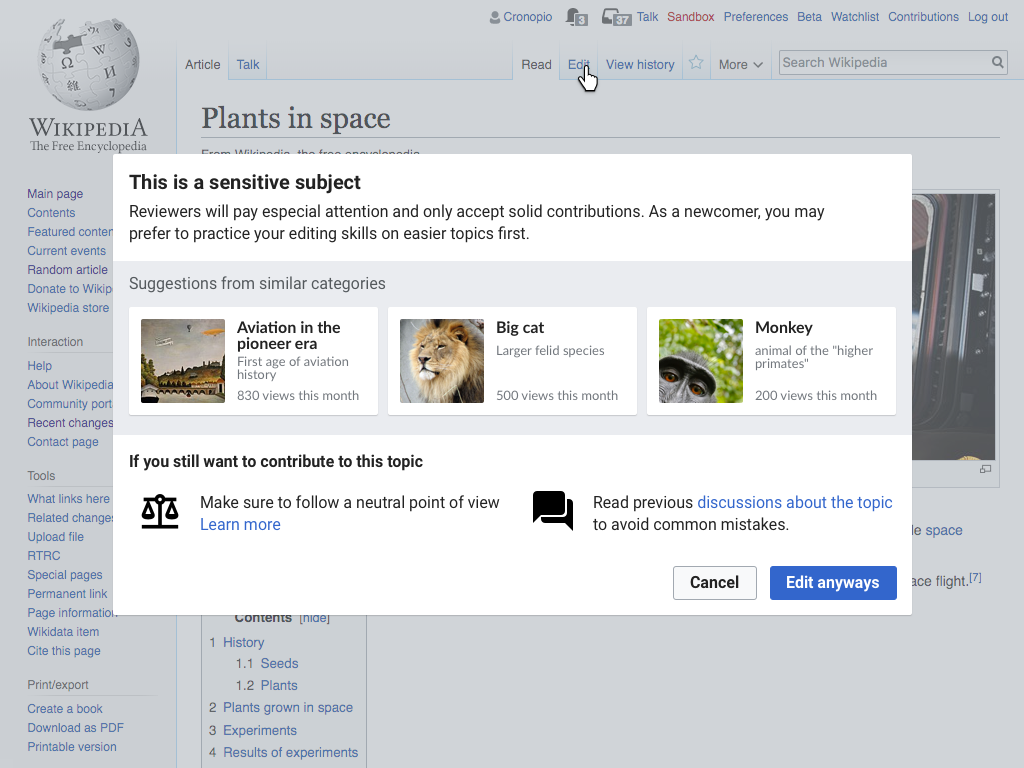
On problematic pages

When the user clicks on edit on an article that seems problematic because it is a high-traffic, featured or was marked by the community as such (using templates like Controversial topics, Pages under discretionary sanctions, Recent deaths, Semi-protected pages),

npov-controversial.png (768×1 px, 277 KB)

As a follow-up suggestion

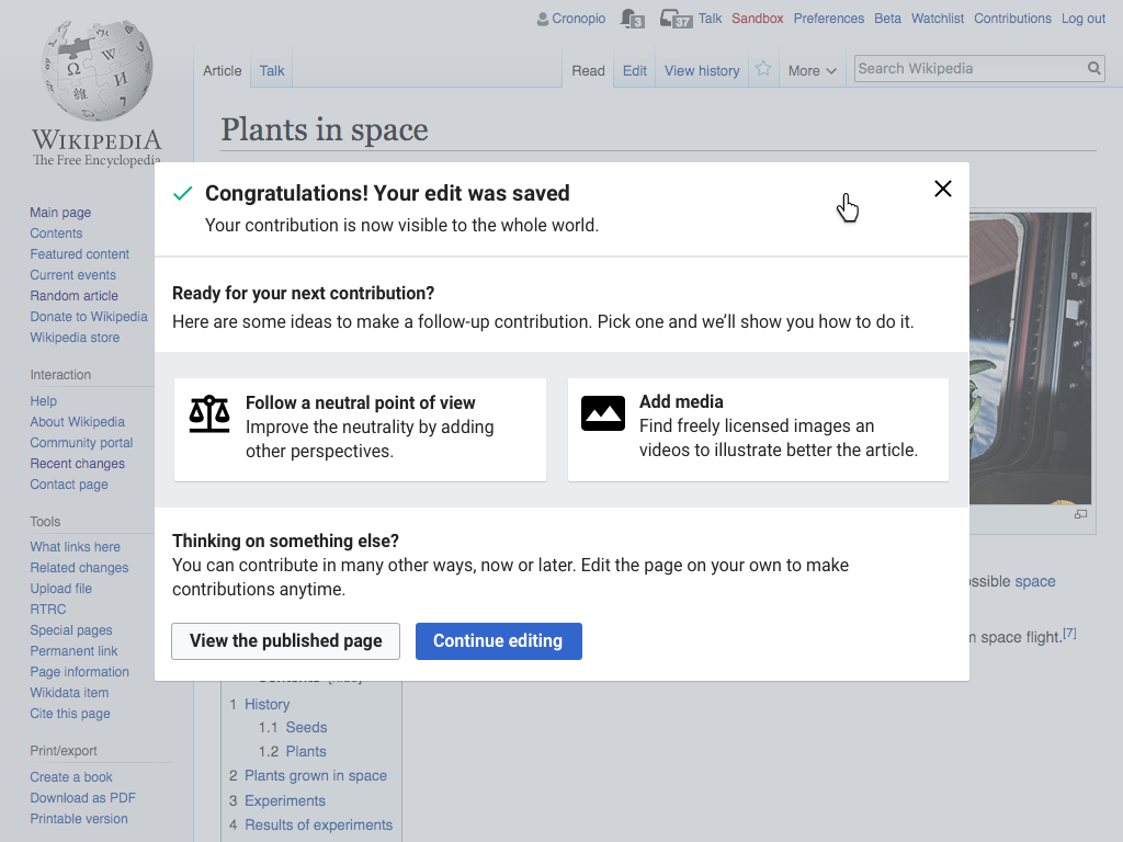
When the user completes publishing an edit and gets redirected to the reading view, improving the article neutrality (among other activities) can be proposed as a next step for the editor. That can help to discover new ways to contribute and learn about their associated key concepts. Once the user selects an option, te'd go back to editing with specific guidance for the task.

npov-after.png (768×1 px, 229 KB)

Alternatively, the ways to follow-up can be collapsed if we want to provide them in a less prominent way (initially, or for the later edits):

npov-after-compact.png (768×1 px, 383 KB)

As a multi-step animation

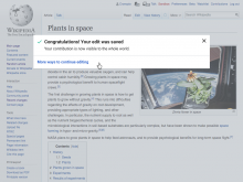
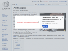
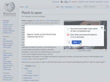
Showing an animated example to illustrate how an example edit can be problematic, and how to improve it to make it more neutral. The animation is shown next to key pieces of information to reinforce the learning.

The animation shown below is just an example to illustrate the idea and it needs more thinking, but ideally it should be specific enough for the user to understand what is going on (i.e., an example the user can relate to their future experience editing) but abstract enough to not be distracted by the specifics of the UI (i.e., not a screencast). this allows for a more easy localisation (e.g., using a Javascript animation library that gets content strings translated in the usual way our codebase does).

You can check this example to view the idea in motion.
npov-video.png (768×1 px, 279 KB)
npov-video2.png (768×1 px, 281 KB)
npov-video3.png (768×1 px, 275 KB)

Event Timeline

These mockups are really interesting Pau. Great work. I have very specific comments on each. But first, some overall comments that apply to all or multiple examples.

Overall Comments

  • We can, and should, usability test this in the near future: What we're talking about here is creating a set of tools and capabilities. Each offers a different mode of teaching. Which should we do first? Which gives the biggest bang for the buck. Which do users hate? I invited @dchen to this doc. And it feels to me like we have plenty to test just looking at which forms of teaching users prefer and learn most from
  • Header/branding: My first overall reaction is that the user needs to know "where is this coming from? What is it?" (And possibly, "how can I make this stop?") So my thought is that all of these windows would benefit from some type of header or other identification "branding" them, for lack of a better word, as part of "Newcomer assistance," or whatever we call this. Also, let's face it, there is a lot of messaging around the wikis that will not be as carefully thought out or as newbie-appropriate as these. We want newcomers to learn that this is a "brand" they can trust—and one designed for them and their needs.
  • What should we call this? The title for these help windows will need to tie them in with the Newcomer preference we have in mind. And the special icons or labels we want to use to replace the help icons. I'm thinking something like Newcomer Assistance or Newcomer Support. (I'm not at all sure, BTW, that this concept lends itself to an icon treatment, unless we plan to very prominently couple the icon with the title in most places and then use the icon alone only, say, as links on tools where the phrase will be too big.)
  • What actions/buttons do we want? This is a big decision and topic. We'd talked about a use case of someone who is, for whatever, reason, just too busy to read the screen, so wants to dismiss it but is open to seeing it again. For such a person, we might offer buttons along the lines of the following:
    • Got it—don't show again.
    • Busy now, show again later.
  • More about this choice--before or after publish: Here, the idea is complicated by the question of whether to put this screen up before or after publishing. Obviously, the above is not a viable option with the other buttons we're showing. I don't know how valuable the now/later thing is. What do you think? Independently, I do think we probably want to be careful about interrupting the publishing process—particularly in cases where we have no reason to think the user has done anything wrong. When we're just checking. So a) I think I'd probably make all of these post-publish. b) it might be interesting to see an example or two with the now/later concept, just to try it out.
  • "Further help" link: Two thoughts here. My first reaction was simply that it's not clear what the "Get further help" is going to do. So my idea was to make it more specific, a la "More about neutrality." The idea being that it would take you to the standard wall-of-text Help page But then I remembered the whole upsell idea. The upsell for Neutral point of view is “The importance of including citations.” Some topics have a few upsell options. What do you want to do about this? Easiest, I suppose, might be to make "Learn more" a menu that could offer multiple options? And when offering them, would we want to distinguish between our stuff and standard help pages? E.g.,:
  • Newcomer support: Citations are important!
  • Further reading: Neutrality
  • "Wikian": I imagine you were reaching for a non-culturally-specific name here but the name "Wikian" in your examples is confusing, since it made me think it was something about the wikis. Go with a generic name like Smith or López.

Introducing the concept on the first contribution

npov-intro.png (768×1 px, 235 KB)

  • Clarify the structure: I like the do/don't structure you seem to have going here, but the design doesn't follow through on it. I would emphasize it a bit more in the following ways: 1) you have a heading for the "yes" side, "Be impartial." Try adding one for the other side: "Don't persuade or debate" ; 2) you might make that even more clear by formatting as follows: Do: be impartial / Don't: persuade or debate
    • Since I've used the "persuade" word in the heading, just end the first admonition after "opinions."
  • Parallel icons: You're using an icon for "don't" but none for "do." Why not try a green check mark and a red "cancel" slashed-circle? (I don't think the "clear" is as standard as a "don't do this" symbol as the slashed circle--plus it looks clickable. )
  • Add a reference—a tiny point, but for your first example, add a superscripted numeral to show the user has included a citation.
  • Do we need the icons at left? While they add visual interest, I think it will be hard to iconize the many ideas we'll be expressing. And I'm not sure they earn the space they take. But your call.
  • wording: pls amplify second set a tiny bit If there's room, these are just some edits that would make me happy and add some persuasive info (to show we can do these lessons effectively with brevity).
    • (add to "Do" example) Try a "Some say....Others say" structure.
    • (add to "Don't" example) or offer your own analysis.
  • More friendly intro: I'm trying to imagine someone getting this notice. They might be thinking, did I do something wrong? Why did I get this? So what about something like this:
    • Thanks for your contribution! Here's a tip: edit reviewers will be checking to see whether what you wrote cites sources and is written in a neutral, factual way.
    • Alternatively, the "tip" part might be in the headline, like so: Friendly tip: Neutral point of view | Thanks for your contribution! Reviewers will now check to see if your writing has the right tone. Did you cite sources and write in a neutral, factual way?

A variant based on evaluating examples.

npov-intro-examples-initial.png (768×1 px, 296 KB)

npov-intro-examples-result.png (768×1 px, 301 KB)

  • All points in "Overall comments" above.
    • Though I'd agree that in a test, you would not offer the Learn more menu.
    • change "Wikian" name, pls.
    • If we don't interpose in the Publish process, then which actions, besides "try another example" ? Would you still want Dismiss-permanent and dismiss but show again?
    • Etc...
  • Interface: Should we add the "Try another example" button to this first screen? Some people might like to skip.....
  • Pedagogy: A positive example should really lead any sequence of test screens like this, to model right behavior. The Do's of Do's/Don'ts above.
  • Generalizableness: When would we see this testing-type screen? Would this be an alternative to "Introducing," above, or would it follow after it, as a qualifying quiz.
    • Pass the quiz, win the "right" to not see the lesson again?
      • An alternative to "Permanent dismiss" (see Overall Comments). Perhaps in combination with other tests (max 3?)?
    • Is this type of testing something we think is of general value? I.e., how many other concepts would benefit from such testing?

As part of a self-assessment for contribution quality

npov-self-assesment.png (768×1 px, 395 KB)

I really like the idea of a self-check checklist idea in principle. This would seem to be the most demanding of our formats, since it looks like you want the users to go through multiple topics. Here are some thoughts on how to sharpen this.

  • Add the "Newcomer Support" header (etc. as above), to let them know it's not someone coming down on them.
  • I'm trying to think of a headline that tells them more what's going on here (it's a "self-check," not some authority-imposed test) and puts the self-check in terms that are not good/bad but maybe more like "style"?. Something like this: Self-check: Did you follow Wikipedia style?
  • Since this would be one of our first interactions with them, I still think we should say thanks first. So the intro might say:
    • Thanks for your contribution! Reviewers will be more likely to approve it if you've followed these core principles:
  • Learn more: When I look at the quiz as it is here, the problem is the user has no choice. It's Mark as Neutral or...what? Meanwhile, Learn More is perhaps the thing we want a newbie to click the most. So I'm thinking this could be elevated so that the choice is "Learn more" vs. "Yes, it's neutral," at the same level presentation-wise. Pedagogically, I like the implied philosophy: either you're good or you need to learn.
  • One sentence of teaching copy is a little too abbreviated, there in the middle . Maybe add one more sentence, like "Don't share your personal opinions or try to persuade."

On problematic pages

npov-controversial.png (768×1 px, 277 KB)

  • No comments, really I like what you've done a lot with this one.
  • The recommended articles would presumably use the gap-finder technology? We need to look into that but offering suggestions is a lot better than just saying "no."
  • Wording suggestion: instead of "solid contributions" maybe something a bit more descriptive, like "...contributions that meet all requirements and follow proper style."

Ooooah! That's great! :D

Overall Comments

I would love to see all of that on mobile as well. (Reminds me a presentation about how people see NPOV in Francophone Africa, where it is a mark of respect to say that someone is awesome, or add titles to all names.And edits from a computer aren't common there.)

Introducing the concept on the first contribution

That's really clear. Have examples picked from somewhere and related to the topic would help to have an perfectly in-context help. Introduce Wikian as a chess layer is not related to plants in space and that may be a bit confusing. Examples are key here!

Structure is a but strange. I don't get why the constructive example is not branded (in green?) like the "bad" one is.

I would title that example as "Test: are you using...". It gives a clear clue to the user about what's going on. I would not go on a thank, while people don't always do thankable edits, and get machine-generated edits is not really frank. I prefer thanks to come from humans. :)

A variant based on evaluating examples

I don't get that one.

From a new editor POV, I've contributed to plants in space and now I'm asked to review something? And what are "sources"?

Have it as a training before editing when the user clicks edit would be great and would probably have more sense. That would be perceived as a small exercise. Then the title should be "Are you aware of using a neutral point of view?".

As part of a self-assessment for contribution quality

I don't get that one at all. Is the goal to check if your edit is neutral and more? If so, yes it is: I check the boxes and publish.
There is 4 things to check? I'll check all 4 to get my score increasing from 0/4 to 4/4 and pass the quality test.

Where that quality score comes from? That's ORES based like we have explored it earlier? If that score is based on that and the pop-up prompting people to improve their edit, there is some confusion here.

On problematic pages

I'm not for that one: it blocks the edit. Shy people who have a legitimity to edit can be definitely blocked by that.
How it it triggered? Experienced users can also use it to block edits.
My partner, seeing that mockup told me that's condescending for beginners and I agree with her: it would be better for newcomers to learn how to properly edit, more than being asked to move to the kindergarten playgound (that's how I've perceived that, sorry).

I prefer the first mockup, I'm not convinced about the others.

Rather than López or Smith, I would use actual people. Using the chess example:

«Magnus Carlsen won the World Chess Championship 2016.¹» vs «Magnus is the best chess player.»

This has the added benefit of reinforcing how we want that even for "obvious facts". Also, I included the WCC edition, as it is deemed to change.

I agree with jmatazzoni about the likely reaction of "how can I make this stop?". I disagree however that they will take it as a brand to trust and that it will work better than the already existing documentation, no matter the effort put on it. This UI will often lead to "pressing buttons until I can make it go, so I can add my vandalism, no matter what the box said". We already saw this happening with the UploadWizard, and it was already predicted there, too. ☹

We do need a name for this, though, if only so that people can name “that box that (sometimes) appeared when editing”.

I'm not sure about the video option that will require extra work to get that "video" element translated. Unless if there is a (light) script to do this, based on system messages.

I'm not sure about the video option that will require extra work to get that "video" element translated. Unless if there is a (light) script to do this, based on system messages.

More than a video I was thinking on more lightweight animations. Those could be implemented using some of the javascript libraries for animation, using text that can be translated the usual way. I updated the description to reflect this.

We want it to be possible to apply these approaches across any language. However, I think that the hardest challenge is to figure out what works for new editors to learn the key aspects of editing. So I'd consider trying even an approach based on video if it has potential, even if it requires an extra effort to make it scale.

Triaging as future: this is one of the options we are considering with Growth, but we need to finish the community consultations first and then decide if that ticket is one of the possible solutions we may implement.