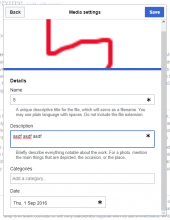
Splitting off from T185752.
Description
Details
| Subject | Repo | Branch | Lines +/- | |
|---|---|---|---|---|
| Update OOUI to v0.28.0 | mediawiki/core | master | +314 -321 | |
| FieldLayout inline help: Move help after field when align=top | oojs/ui | master | +24 -8 |
Event Timeline
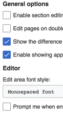
Another example:
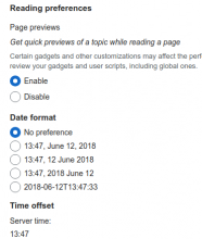
The enable/disable are closer to the next label in the form than their own label.
Change 439919 had a related patch set uploaded (by Esanders; owner: Esanders):
[oojs/ui@master] FieldLayout inline help: Move help after field when align=top
I agree with having an issue in F22145141, but that is more so a problem with the too small top margin of the PanelLayouts
Agreed - although even with some top margins on the headings, the fields are still way to far from their labels.
I agree with Ed, this seems like a good idea. The help text (whether shown in the popup or inline) is supposed to be an additional explanation, and in most cases users should not have to read it before they can fill in the field. It makes sense to put it underneath, to keep the main label and field closer together.
We need to find more examples before making that the default output of the library.
Both, @RHo & @alexhollender provided good feedback on the different use cases for above and below. Alex also shared, that we need to think about how error messages would play into either.
Our existing notices system, which we will want to replace with this (T197179), currently places the messages below the field.
Where does this assumption come from? Is this anywhere explained or did we follow this “unwritten” guideline ourselves throughout our projects?
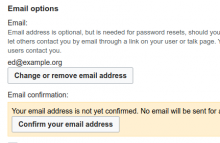
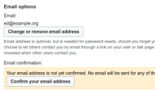
Looking at Special:Preferences we see three examples of help text in Internationalization, Signature, and Email options. In all of these, a person is able to fill out their preferences just by reading the label — "Email", "Signature", "How do you prefer to be described?". Reading the help text is not needed. No harm is done if they aren't read, and the results of changing a preference are exactly what a person might expect.
For those who need to know more about how this information is going to be used the extra text is helpful. Even for them its unlikely that they need to read it every time before they edit the field.
Hmm, it is a guideline I've always personally followed when deciding whether some text should be a label (always shown) or a tooltip (shown on hover/click). I don't actually know if it's generally accepted, perhaps I should have spoken less authoritatively :)
I found another case where we've already used additional labels underneath the field, in the cross-wiki upload dialog (in VE, Insert → Media → Upload):
(The CSS class for them is mw-foreignStructuredUploa-bookletLayout-small-notice, and yeah, that's a typo in it ;) )
The task for this was T116086, there is some discussion in it.
In an example to the contrary, the new design for UploadWizard (https://commons.wikimedia.beta.wmflabs.org/wiki/Special:UploadWizard) places additional labels above the field:
(Ignore the misplaced "Remove" button, I just submitted a patch to fix it.)
The task for this was T197924, I don't see any discussion there, but there might be some rationale in the private Zeplin project linked there, which I can't access.
Change 439919 merged by jenkins-bot:
[oojs/ui@master] FieldLayout inline help: Move help after field when align=top
Change 452872 had a related patch set uploaded (by VolkerE; owner: VolkerE):
[mediawiki/core@master] Update OOUI to v0.28.0
Repeating myself from patch set comment:
@RHo brought up at another design discussion, that Material design is positioning assistive text besides the label as positioned below. https://material.io/design/components/text-fields.html#anatomy
I'm still not fully convinced by this, but am ok to follow in order to move this forward. We should be outspoken and limiting when we're using and promoting such uses!
Update: I've changed the description in the demos to be verbose on optional, assistive character of inlined help (for now).
