Page MenuHomePhabricator

The input fields should not be focused when the field is removed
Closed, ResolvedPublic2 Estimated Story Points

Description

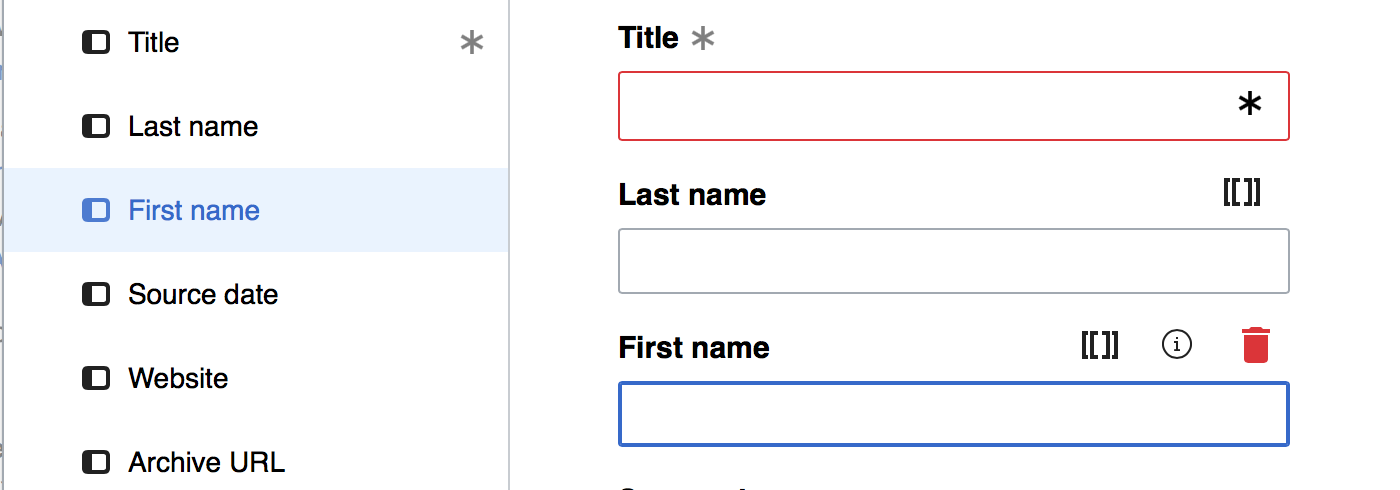
Clicking the field button when removing a field makes it focused which is not the desired behavior. Reproducible on my local and commtech wikis. Tested on Chrome and Safari.

image.png (130×432 px, 15 KB)

Expected behavior: The focus moves to the next input field and if there isn't a next input, it moves to "Add all fields" button.

Event Timeline

There are a very large number of changes, so older changes are hidden. Show Older Changes
Restricted Application added a subscriber: Aklapper. · View Herald Transcript

I'm confused; is the text input focused or the button? If it's the button, you just clicked it, it looks like the correct behavior? What should happen instead?

I'm confused; is the text input focused or the button? If it's the button, you just clicked it, it looks like the correct behavior? What should happen instead?

It's a button, yes, but it's not supposed to be focused with the blue box around it. See the mocks to get an idea.

That's ooui's focus feature for accessibility. I'd highly recommend against removing it... :/

We can explore putting the focus on another input instead if you think it makes sense? For example, maybe if you remove a parameter, the cursor should appear in the next parameter input?

The border itself is an accessibility focus feature. If the button is focused at all, it'll have a border...

We can explore putting the focus on another input instead if you think it makes sense? For example, maybe if you remove a parameter, the cursor should appear in the next parameter input?

Yes, let's place the focus on the next (or previous) parameter input instead of the button. That makes more sense.

VE actually does a nice thing here:

image.png (490×1 px, 57 KB)

It gives a blue background to the field that's currently in focus. We can also do something like this to allow users to relate parameters to inputs, if we want. That's beyond this ticket though.

Yeah, those aren't buttons, though, those are OptionWidgets.... They're not quite the UX of a "click to do an action" but more of a "I select this content to see" so the behavior is different, but we might be able to get something similar with volker's assistance.

In any case, pushing the focus to the next (or previous) input should be not-too-horrific; I believe VE has a method for that (findClosestSelectableInput or something weird like that) and we can use or duplicate that.

It also makes sense that on adding a field, the focus should be on the input of the added field, so the user can immediately start typing.

We do need to figure out what happens if there are no more fields; so, if I clicked the last field's "remove" button -- where would the focus go?

It also makes sense that on adding a field, the focus should be on the input of the added field, so the user can immediately start typing.

This happens right now too.

We do need to figure out what happens if there are no more fields; so, if I clicked the last field's "remove" button -- where would the focus go?

My feeling is it either goes to the previous field or is lost completely. We can also make it jump to Submit but I'm not sure that's the best idea. Thoughts?

I would definitely not lose it completely; I'm thinking of keyboard accessibility, and losing focus is not really helpful.

I think either going for the "add all fields" or the first "Add" field on the left; the fact it's focused is consisted with everywhere else we have OOUI.

I would definitely not lose it completely; I'm thinking of keyboard accessibility, and losing focus is not really helpful.

I think either going for the "add all fields" or the first "Add" field on the left; the fact it's focused is consisted with everywhere else we have OOUI.

I like the idea of moving the focus to "Add all fields". That's also going to logically be the next element in the panel.

Niharika set the point value for this task to 2.Jul 18 2018, 12:01 AM

@cmadeo It'd be great to have your thoughts on whether the behavior we decided on in the comments above seems sensible or if there's a better way to handle this which we overlooked. :)

@Niharika, moving focus to the next input field if available or the 'add all fields' button if there is no next input field seems reasonable to me!

Change 449394 had a related patch set uploaded (by Samwilson; owner: Samwilson):
[mediawiki/extensions/TemplateWizard@master] Focus next or previous field when removing a field

https://gerrit.wikimedia.org/r/449394

The above patch focuses the next field, or if there isn't one, the previous (including if that's a required, non-turn-offable parameter). Haven't done the "focus add/remove button" bit yet, because that's not been merged.

I did a review on Gerrit. No comments but I'm noting it here in case I messed something up. I'm dipping my toes in the water. :)

In moving the focus to the next or previous field from the one just removed, are we assuming that the current focus is in the removed field? Because if we're focussed elsewhere, it might feel a bit odd to be jumped down/up to some other field. We could also currently not be focussed anywhere, and so wouldn't expect a new focus.

@Mooeypoo raised the point on the above patch that OOUI has a findFocusable() method, which will find the first or last field in a set. That makes things simpler, but only if that's what we're wanting to do. I think we want more complexity though. :(

In moving the focus to the next or previous field from the one just removed, are we assuming that the current focus is in the removed field? Because if we're focussed elsewhere, it might feel a bit odd to be jumped down/up to some other field. We could also currently not be focussed anywhere, and so wouldn't expect a new focus.

From my testing, it seems like when the frameless button for a field is clicked to remove its input, it gets the focus. The problem is only with the frameless input buttons getting the focus. If the focus is nowhere or somewhere else, we can leave it be. If the focus is on the input button, we should move it to the next available input field or the 'add all parameters' button. Does that make sense?

In moving the focus to the next or previous field from the one just removed, are we assuming that the current focus is in the removed field? Because if we're focussed elsewhere, it might feel a bit odd to be jumped down/up to some other field. We could also currently not be focussed anywhere, and so wouldn't expect a new focus.

@Mooeypoo raised the point on the above patch that OOUI has a findFocusable() method, which will find the first or last field in a set. That makes things simpler, but only if that's what we're wanting to do. I think we want more complexity though. :(

I might be missing something, but why do we need more complexity? If we remove a field, the focus should go to either the next available field or the last field (I think last is just fine). Is the OOUI function not doing that? We can call findFocusable before we hide the field so it finds the closest focusable to that field...? Is that not working?

If OOUI doesn't provide the right answer, we can go with what we have, I just want to make sure we aren' tmissing something, since that method seems to be recursively going through containers with some tests and checks that validate focusability in multiple cases, etc... seems like it has potential of being stronger, but I am not 100% sure if it fits here.

Sorry, I've been confusing myself I think! :)

So:

  • If the removed-field or nothing is focussed, we move focus to the closest field to the removed-field.
  • If there's no closest field, we focus the add-remove-all button.
  • If anything else is focussed, we leave it be.

Sorry, I've been confusing myself I think! :)

So:

  • If the removed-field or nothing is focussed, we move focus to the closest field to the removed-field.
  • If there's no closest field, we focus the add-remove-all button.
  • If anything else is focussed, we leave it be.

By 'closest' if you mean the next-closest, then this seems about right. Let's consistently put the focus in the next available input field unless we run out of fields and then we move the focus to add/remove all button.

By 'closest' if you mean the next-closest

Yep, so either the next field below the just-removed one, or the one above it if it's the last in the list.

By 'closest' if you mean the next-closest

Yep, so either the next field below the just-removed one, or the one above it if it's the last in the list.

Let's move the focus to add/remove all button if it's last in the list, instead of the one above. Does that seem okay?

I like the idea of trying to move the user forward if possible. That's what I understand from what Niharika is saying.

Going backwards seems a bit odd to me.

I added a comment replying to @Samwilson's question in the patch which is probably bet to be posted here to:

 > The other thing I'm not sure about here is that we have to keep
 > track of where focus was *before* it came to the button. We can't
 > do this when we click the button, because by then focus has been
 > lost from where it was. Am I right in thinking we should keep track
 > (only for the parameter fields) of which is currently focused?

We can't do that. I am already not 100% happy about the reasoning to change the focus (because we don't like the accessibility styling) -- if our goal is to be helpful for the user, we should consider what is actually useful in terms of next focus.

Consider, too, that the people who are MOST affected by this are people who need the accessibility factor, who are heavy sighted or use keyboard navigation. We want to bring the focus to the place where it either makes sense, or where they'd expect it to be.

Most people expect that what they just clicked retains focus unless there's a reason. If we think the workflow is removing a field and then filling info in another, then let's re-focus on the closest field. But if the workflow is removing a field and then removing or adding another, let's consider leaving the focus where it is.

@Mooeypoo Thinking from the user's perspective, I think the current focus behavior makes the least sense. Here's an example of when a user will remove a field:

  • Alice is trying to add an identifier for her book citation.
  • The field names aren't obvious so she adds asin and then clicks the description tooltip to see what that field is for.
  • She realizes that that wasn't the field she wanted and clicks the asin field button to remove it.
  • The focus is on asin.

Since the user has just removed that field, giving it focus isn't giving the user any useful information.

Yeah, that's a good point.

I'm not saying the current behavior is good, I'm arguing that the complex behavior of where the focus goes next is something we need to be careful in choosing. Next field? First field? Last field? And whatever we choose, I think we need to be consistent.

I was mostly answering the question about whether we want to return the focus to where it was before clicking the button... I think that behavior has potential to be a lot more inconsistent and problematic.

Does the behavior I described in the comments above seem reasonable?

@Niharika it does seem reasonable, but I'm still not clear about what happens when the user had focus elsewhere altogether.

Is this a valid flow?—

  1. A user goes to the cite template, and adds title, year, isbn, first, last, and publisher (let's pretend they're in that order);
  2. Starts typing title and year (so now focus is on year);
  3. Realises they have an institutional author, so clicks to remove last and first (in preparation for adding author);
  4. Now they're focused on publisher.

I think the whole concept of focus can be made a lot more clear if you try to navigate without a mouse — it should be possible! At the moment, it's not (can't hit enter on the parameter buttons; I think that's a separate bug though). It makes it clear why focus stays on the last thing pressed (or goes to the thing that the last thing activated).

Anyway, I'm happy if we want the 'focus next field' behaviour... @Mooeypoo am I understanding that you reckon we should upstream this option as an extra parameter for OO.ui.findFocusable()? That sounds fine, but I'm also not really sure that it's super generalizable.... we're working with FieldLayouts, and findFocusable is a jQuery-level thing, so... well, anyway, I'll reply on the patch.


Hey, can't we just do:

.oo-ui-buttonElement-button:focus { border: 0; outline: 0 }

:-P

Let's move the focus to add/remove all button if it's last in the list, instead of the one above.

Sorry, I forgot to reply. Yes, this seems fine, although in my testing it does seem fine to focus the one above too (feels more in keeping with what happens when other fields are removed).

@Niharika it does seem reasonable, but I'm still not clear about what happens when the user had focus elsewhere altogether.

Is this a valid flow?—

  1. A user goes to the cite template, and adds title, year, isbn, first, last, and publisher (let's pretend they're in that order);
  2. Starts typing title and year (so now focus is on year);
  3. Realises they have an institutional author, so clicks to remove last and first (in preparation for adding author);
  4. Now they're focused on publisher.

Yep, I think that's fine.

I think the whole concept of focus can be made a lot more clear if you try to navigate without a mouse — it should be possible! At the moment, it's not (can't hit enter on the parameter buttons; I think that's a separate bug though). It makes it clear why focus stays on the last thing pressed (or goes to the thing that the last thing activated).

If we want to actually focus on the fields, I would do something like what VE does where it gives it a dark background and it doesn't look ugly. Not a part of this ticket definitely. I'm trying to understand what you mean by what happens when the user had focus elsewhere. The focus would be on the button when it gets clicked, wouldn't it? Can you give me an example to explain what you mean?

Hey, can't we just do:

.oo-ui-buttonElement-button:focus { border: 0; outline: 0 }

:-P

Honestly, I'd be happy with that. This ticket hasn't turned out to be the 2 pointer we thought it was.

We should not override accessibility design, as badly as we hate seeing them. ;)

I merged the patch, since it does what is described and ooui doesn't quite answer the problem. We should consider upstreaming this to ooui or updating/upgrading the current ooui method, but that's not urgent.

Moving to QA/Product review.

Change 449394 merged by jenkins-bot:
[mediawiki/extensions/TemplateWizard@master] Focus next or previous field when removing a field

https://gerrit.wikimedia.org/r/449394

If we want to actually focus on the fields, I would do something like what VE does where it gives it a dark background and it doesn't look ugly. Not a part of this ticket definitely. I'm trying to understand what you mean by what happens when the user had focus elsewhere. The focus would be on the button when it gets clicked, wouldn't it? Can you give me an example to explain what you mean?

Yes, by the time the button is clicked the focus is on the button. But if we then move it off elsewhere after that (i.e. to a field) then I guess I wondered if it'd make sense to send it back to where it came from. But I'm convinced; the next-field behaviour feels good in practice.

Hey, can't we just do:

.oo-ui-buttonElement-button:focus { border: 0; outline: 0 }

:-P

Honestly, I'd be happy with that. This ticket hasn't turned out to be the 2 pointer we thought it was.

I know... sorry! I feel like I've needlessly overcomplicated this. :-)

I know... sorry! I feel like I've needlessly overcomplicated this. :-)

Nah. I think we're running into one of the reasons why accessibility is so difficult. The idea of "let's move the focus" sounds easy and straight forward, but once you actually see the cases and edge cases, it turns to be quite elaborate. People are using our products with keyboard-only navigation, and we (in Wikipedia/Wikimedia projects in general) have good (but far from great) support, and one of the issues is tab index and focus shifts. It's hard to figure out what the best behaviors are. OOUI *tries* to make it simpler by having some of the behavior embedded in the widgets, but (as we see here) not all of it is possible out-of-the-box.

In short -- I think we underestimated this task for its elaborate UX-consideration. The implementation was probably a 2-pointer, it's the back-and-forth of what makes most sense for UX that took us more, and was, at least in my opinion, quite important to at least consider.

@Samwilson Not your fault at all, duh! I agree with everything Moriel said.

At least we all learnt a lot from this ticket and would (hopefully) keep accessibility more in mind when considering future feature designs. :)

hehe yeah. :) thanks.

And yes, keyboard-only navigation is actually a lot faster too sometimes, so it's worth building for it for everyone. (Not that I remember to test for it always of course...)

For all accessibility focus issues above, there's T172578: Investigate and consider keyboard-only focus for OOUI widgets.
I've started a WIP patch, but the technical hurdles are huge and more on a breaking change level. So this alternative might never make it into production. Evaluating at least.

Thanks @Volker_E.

I tested this on commtech wiki and the behavior seems inconsistent. The focus seems to jump seemingly randomly instead of going to the next available input. I made a video to show this -

(I wish Phabricator would allow video embedding)

Change 450289 had a related patch set uploaded (by Mooeypoo; owner: Mooeypoo):
[mediawiki/extensions/TemplateWizard@master] [proposed] Focus on last field when a field is removed

https://gerrit.wikimedia.org/r/450289

I am wondering if the OOUI method may still be better here. It might not give us 100% what we want, but since it's used in so many other places, I have a bit more confidence in its stability...

As I was checking it, I figured I'll submit a proposal patch. The patch removes all the complexity of trying to find where to put the focus (which, in my opinion, beyond being potentially an opening for bugs, is also potentially confusing and inconsistent for the user?) it puts the focus on the last available field in the list.

I wrapped this with "proposed" so that there's something to test and see if it's acceptable. If not, we can delve into the logic of the focus-finder code and se what we can do. I do think that the complexity here (of the UX-approach and of the code) has a potential of being unstable, but we can prove me wrong by fixing the specific bug @Niharika pointed to, and seeing if QA can find any more ;)

I'm totally in favour of making this simpler, and just focussing the last field (or maybe the first non-empty field, as we might do when adding all fields? T194436)

The bug is because it wasn't taking into account the required fields; will send a patch for this if we do want to keep that system.

But yeah, simpler and using core functionality seems nicer. (Although, personally, I'm still not sure there's a way to move the focus that doesn't feel a bit odd in at least some situations.)

I'd prefer moving the focus to the first empty field instead of the last field.

Another edge case to be aware of: When there are no inputs left (when the last inserted parameter is being removed), the focus should move to add/remove all button.

When T194436 is done, we'll have a method for focusing the top empty field.

Change 453896 had a related patch set uploaded (by Samwilson; owner: Samwilson):
[mediawiki/extensions/TemplateWizard@master] When removing a field, focus top-most empty field or the add-all button

https://gerrit.wikimedia.org/r/453896

Okay, simplified this to behave the same as when we click the add-all button. Ready for review: https://gerrit.wikimedia.org/r/453896

Change 450289 abandoned by Mooeypoo:
[proposed] Focus on last field when a field is removed

Reason:
Abandoning since that goes against product decision. We can retrieve if decisions change.

https://gerrit.wikimedia.org/r/450289

Where should the focus be when you just load the template? I'd think it should be consistent, and focus the first available field (or 'add all' if no field is visible) but right now it has no useful focus until you start adding fields.

I didn't think this is a blocker for the existing commit, so I'll merge it, but I think we should add a followup where on-loading-of-template the focus is placed consistently.

(There's also another issue where the button doesn't respond to "enter" event, which makes the focus annoyingly useless. It should be an issue in OOUI, though, but I'll explore and submit a bug where needed.)

Change 453896 merged by jenkins-bot:
[mediawiki/extensions/TemplateWizard@master] When removing a field, focus top-most empty field or the add-all button

https://gerrit.wikimedia.org/r/453896

The use of keyboard actions (once we're already on any button) is solved through this ticket T203287: TemplateWizard buttons (-/+ fields and 'add/remove all') do not activate on "enter"

Should we open a new ticket for where the focus needs to be on loading of templates, or do we consider it part of this task?

Change 458279 had a related patch set uploaded (by Mooeypoo; owner: Mooeypoo):
[mediawiki/extensions/TemplateWizard@master] Set initial focus on template load

https://gerrit.wikimedia.org/r/458279

I added the 'focus on load' to this ticket, since it was a quick fix. Requires review.

Change 458279 merged by jenkins-bot:
[mediawiki/extensions/TemplateWizard@master] Set initial focus on template load

https://gerrit.wikimedia.org/r/458279

I don't have enough time to read through all this, but note that jumping the focus elsewhere ALSO can be accessibility issue. Think of it like this: You have roadmap directions, you read one of the streets, and suddenly the entry after the street you just read changes to something else. That's confusing and will make you doubt about where you are.

Niharika moved this task from QA to Q1 2018-19 on the Community-Tech-Sprint board.

I don't have enough time to read through all this, but note that jumping the focus elsewhere ALSO can be accessibility issue. Think of it like this: You have roadmap directions, you read one of the streets, and suddenly the entry after the street you just read changes to something else. That's confusing and will make you doubt about where you are.

That's a good point. I did not look at it from this angle. Thanks for making me aware.

I feel at this point we should roll with what we have and come back and reiterate if we hear from our users that the current behavior doesn't make sense.

I learnt a lot from this ticket that about accessibility. Thanks all. :)