We have been using flexbox a lot. Where it's not avaiable - on iOS and Internet Explorer based devices, there are problems with rendering
- The header is unusable

- the caption is overlapping the text.
#2018101910000341 reports that image captions overlap with other article text when viewed on InternetExplorer (IE) 11 on Windows Phone 8.1:
(image and version details shared with permission)
IE
A reader in OTRS
iOS
the problem also impacts iOS
In mobile view (not the app), using an iPhone4s with iOS 9.3.5, image captions more than one line long overflow and overlap the following content. The same type of error was seen in all articles I visited on enwp, dewp and svwp.

This overflow was not seen using a cellular device with iOS 12.0.1 or Android versions 4.1.2 or 8.0.0.
Developer notes
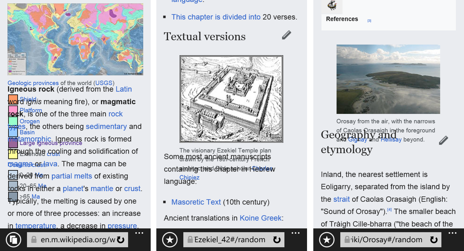
Visit https://en.m.wikipedia.org/wiki/Igneous_rock on IE11 Windows 10
Can be replicated on browser stack using iPhone+6S 9.0 (Safari) (there the issue is caused by flex: 1 0 100%; rule.)
Fixing overlapping thumbnails (and iOS bug)
IE11 has buggy support for display: flex.
Wrap the display: flex rules inside a feature query. https://caniuse.com/#search=feature%20queries (IE11 does not support feature queries). display: flex is not essential for these rules.
Hopefully this will also fix things for iOS. If not, spin out a new task
other possibilities
We should either drop support for these browsers in JavaScript or use feature queries to find a suitable fallback e.g. display table cell