Page MenuHomePhabricator

As an editor on the iOS app, I'd like to know that the introduction paragraph is presented differently in the editing view / preview than in the article view
Closed, ResolvedPublic

Assigned To
None
Authored By
cmadeo
Dec 19 2018, 5:27 PM
Referenced Files
F57523663: image.png
Sep 19 2024, 1:17 PM
F57523661: image_720.png
Sep 19 2024, 1:17 PM
F57505670: Saved.jpeg
Sep 13 2024, 2:49 PM
F57496598: 31D7B1F0-1B48-4D69-9702-F3C6AB7EAB13_1_102_o.jpeg
Sep 10 2024, 5:16 PM
F57496596: IMG_8159.PNG
Sep 10 2024, 5:16 PM
F57496609: CleanShot 2024-09-10 at 17.52.06@2x copy.png
Sep 10 2024, 5:16 PM
F57496593: CleanShot 2024-09-10 at 17.52.06@2x copy.png
Sep 10 2024, 5:16 PM
F55880728: image.png
Jun 25 2024, 9:34 PM

Description

Why are we doing this?

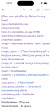
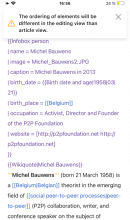
Article introduction sections are presented differently on the app then they are on web. This means that the order of elements in the editing view and preview do not reflect the article view on the iOS app. Some users have noted that this can be confusing or disorienting and we do not currently explain to users that the ordering will not be the same in the app article view as in the app editing view.

User story

As an editor on the iOS app, I'd like to know that the introduction paragraph is presented differently in the editing view / preview than in the article view

Proposal

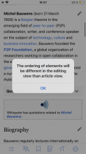
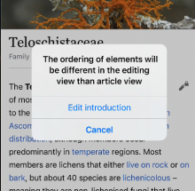
The first time that an editor taps on the edit pencil on the introduction section, show a dialogue that explains that the ordering of elements will be different in the editing view.
Event Timeline

Hello @cmadeo, Hope you are good!. I worked a bit on task. Do we want like, when use click on the Edit introduction button, we show alert for first time and then we don't show?

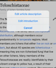
I want to confirm the point and the steps where we want to show an alert. For now if user click on Edit introduction button, second pop up will show and if user says yes edit popup won't show again otherwise with press of cancel button user won't be able to go in edit screen, popup will show again whenever user comes back. I have attached photo below. Please let me know.

1st step:

image.png (502×414 px, 229 KB)

2nd step:

image.png (441×450 px, 263 KB)

if user says yes, then shows edit page:

image.png (689×318 px, 174 KB)

Tsevener subscribed.

@cmadeo I kicked off a design review build (Experimental #111) for this one to help with feedback. Thanks!

Hi @Rajparad, great to see that this ticket was picked up, thank you!

This solution makes sense and looks good. I was curious, since we have a wider range of components nowadays that could showcase the message at this stage of the editing flow, could we use something that is a little less disruptive?

I have 2 other propositions for the design and the team can decide wether they want to go forth with the solution above or the ones below.

  1. Have the message appear via a toast (top of page) after the contributor chooses to edit (this will appear after the edit notices). This way it doesn't interrupt the workflow and would not be using the alert component since it is recommended by the HIG to 'Avoid using an alert merely to provide information.' This is my preferred solution.
Toast.png (667×395 px, 79 KB)
  1. Keep using the alert but have one button that says 'OK' instead of the 'Edit introduction' or 'Cancel' since the message is more informative rather than actionable.
Alert.png (667×375 px, 71 KB)

cc @Tsevener

This is how it displays to me in Experimental build #111:

image.png (2×1 px, 1 MB)

I prefer Olga's solution #2, as it looks more informational.

Also, it appears that the ordering is not always different, could we update the copy to reflect that?: The ordering of elements may be different in the editing view than the article different. Would you like to proceed?

What do you think @Rajparad?

@HNordeenWMF agh sorry, I have not created a new experimental build with @Rajparad 's latest work. Will do that shortly. Can you re-review after that?

@HNordeenWMF Please check version 7.5.2 (note older version number) Experimental build #125.

Thanks @Tsevener ! Ah great I see it matches Olga's suggested design 1 :)

Two requested changes:

  1. Ensure the notice only shows if someone has chosen to "Edit Introduction" from the first edit button, or "Edit Source" from the overflow menu. Currently I see the notice when I start editing a section, and I understand that the difference in ordering should not be an issue with section edits.
  2. The notice disappeared very quickly and I didn't have time to read all of it - is that our normal length for this type of alerts? or could it be extended?

@HNordeenWMF

Ensure the notice only shows if someone has chosen to "Edit Introduction" from the first edit button, or "Edit Source" from the overflow menu. Currently I see the notice when I start editing a section, and I understand that the difference in ordering should not be an issue with section edits.

👍

The notice disappeared very quickly and I didn't have time to read all of it - is that our normal length for this type of alerts? or could it be extended?

Generally they are 2 seconds, but we can customize it depending on the alert. We'll try bumping it to 5 seconds. I'll make a new build for review when these changes are in.

Tsevener added a subscriber: scblr.

@scblr @HNordeenWMF Latest work on this is in Experimental build 7.5.9 (158). Let me know if it looks good to y'all and you are ready for it to be merged into the next release.

@Tsevener I tried this in 7.5.9 (158) on iOS 18 Beta multiple times, but it didn’t show, see this recording. Am I missing something? Thanks!

@scblr ah sorry about that - we actually have it skipping the error message if an edit notice appears, to prevent message overload. Try on an article without an edit notice, or you can turn off the toggle on the edit notice modal and edit the article again.

Thanks, @Tsevener – seeing it now!

The orange-on-white fails contrast tests.

CleanShot 2024-09-10 at 17.52.06@2x copy.png (1×748 px, 613 KB)

I suggest going with Olga’s designs:

Toast.png (667×395 px, 79 KB)


In general, I’m slightly confused about when to use which "toast" type. Are all three technically different?

CleanShot 2024-09-10 at 17.52.06@2x copy.png (1×748 px, 613 KB)
IMG_8159.PNG (2×1 px, 867 KB)
31D7B1F0-1B48-4D69-9702-F3C6AB7EAB13_1_102_o.jpeg (2×1 px, 387 KB)

We should likely work on consolidating these soon @HNordeenWMF.

The orange-on-white fails contrast tests.

This is how that toasts system displays all of its warning messages, you see this style in other toasts:

Saved.jpeg (2×1 px, 832 KB)

So if we update it here we should audit and update it everywhere, to avoid one-off style differences.

In general, I’m slightly confused about when to use which "toast" type. Are all three technically different?

The first and third screenshots go through one toasts system, the second screenshot is a different toasts system. Both have been in the app for many years.

We should likely work on consolidating these soon.

@scblr We have had a task in our backlog for a while to rewrite our toasts system (T350398). This would likely be a L or XL task. We have been adding minor tweaks to the old toasts components during feature development, and have had to push back on any major adjustments here due to time and risk.

Thanks for all the info @Tsevener. In general: I feel like toasts/snackbars are not very native to the platform. But yeah, let's decide which of the three we’re moving forward with without any rewriting, so we’re at least consistent from now on. I added it to our agenda for our 1:1 tomorrow!

@scblr @Tsevener did you discuss this in your meeting?

Because this task uses the existing warning messages designs, I think this should move forward, and @scblr could you please file a task to fix the contrast issue for these warning messages throughout the app?

@HNordeenWMF @Tsevener

Because this task uses the existing warning messages designs, I think this should move forward,

Sounds good to me.

Did you discuss this in your meeting?

Yes we discussed this. but we are more focused on components as we currently use three different toasts in the app. After a comparative review, we found out that toasts are not a thing on iOS (it’s an Android pattern and they’re called snackbars).

Moving forward, we should either decide to:

1) Avoid using toasts. Use a large content viewer (see examples below), and update the older toast variants using a large content viewer.

image_720.png (720×332 px, 180 KB)
image.png (720×332 px, 112 KB)
Apple MusicApple Books

2) Or create a unified toast component based on the three different variants that we currently have.

Could you please file a task to fix the contrast issue for these warning messages throughout the app?

We can resolve the contrast issue effectively by addressing this thoughtfully (see suggestion 1 or 2). How about we set aside some time to optimize this component from both a design and engineering perspective?

Ok - @Tsevener this task can move forward as-is.

@scblr we discussed this in our 1:1, I'll create a phab task for optimizing this component from a design & engineering perspective.