Review description
👉 Visual changes to review description | T217173 on Zeplin
- Review screen shows article in target language
- Review screen shows more article text
- Tick is emphasized in blue (#36c)
| • Charlotte | |
| Feb 26 2019, 6:43 PM |
| F28476871: Screenshot_1553643296.png | |
| Mar 26 2019, 11:36 PM |
| F28463692: Screenshot_20190325-131857.png | |
| Mar 25 2019, 12:24 PM |
| F28287795: Screenshot_20190226-122921.jpg | |
| Feb 27 2019, 6:29 PM |
| F28287800: eaf-08.png | |
| Feb 27 2019, 6:29 PM |
| F28287844: eaf-09.png | |
| Feb 27 2019, 6:29 PM |
👉 Visual changes to review description | T217173 on Zeplin
| Status | Subtype | Assigned | Task | ||
|---|---|---|---|---|---|
| Resolved | scblr | T215630 [EPIC] Suggested edits V1 (design improvements) | |||
| Resolved | cooltey | T217173 Visual changes to review description |
Great work @cooltey.
Question: Is your implementation only related to the “Add descriptions“ flow? I was not able to review this screen within the “Translate descriptions“ flow since tapping a card in “Translate descriptions“ currently takes me to the “Add descriptions“ flow (version 2.7.273-alpha-2019-03-22). Thanks for clarifying.
Here are the things to improve in the current version:
01 Review screen is currently scrollable which is not optimal, check out this video on my Pixel 3 that shows the current state. I also assume that the legal copy needs to be fully visible at all times in this view. Can we either:
02 Article content line-height is currently set to 32px (line-height: 2em;), which is a bit much. Please adjust it to 28px (line-height: 1.75em;).
03 Please remove the underlines from links in the legal copy (text-decoration: none;).
04 RTL: If the phone’s system language is set to English and the primary language in the app is set to Arabic, the article’s content should be right aligned (CCing @Amire80 in case his seeing this, could you confirm?) Thanks!
Thanks and sorry for all the CSS syntax ;)
[1] from T217170:
Show more of article text based on the users screen height. The more content from the article, the better (more context for users).
Hi @schoenbaechler
Question: Is your implementation only related to the “Add descriptions“ flow? I was not able to review this screen within the “Translate descriptions“ flow since tapping a card in “Translate descriptions“ currently takes me to the “Add descriptions“ flow (version 2.7.273-alpha-2019-03-22). Thanks for clarifying.
Not sure why that happened. The review screen with new designs was implemented to both flows.
make the legal copy always stick to the bottom (position: fixed; bottom: 0;) and only scroll the article’s content itself?
Will follow this part.
make the legal copy always stick to the bottom (position: fixed; bottom: 0;) and only scroll the article’s content itself?
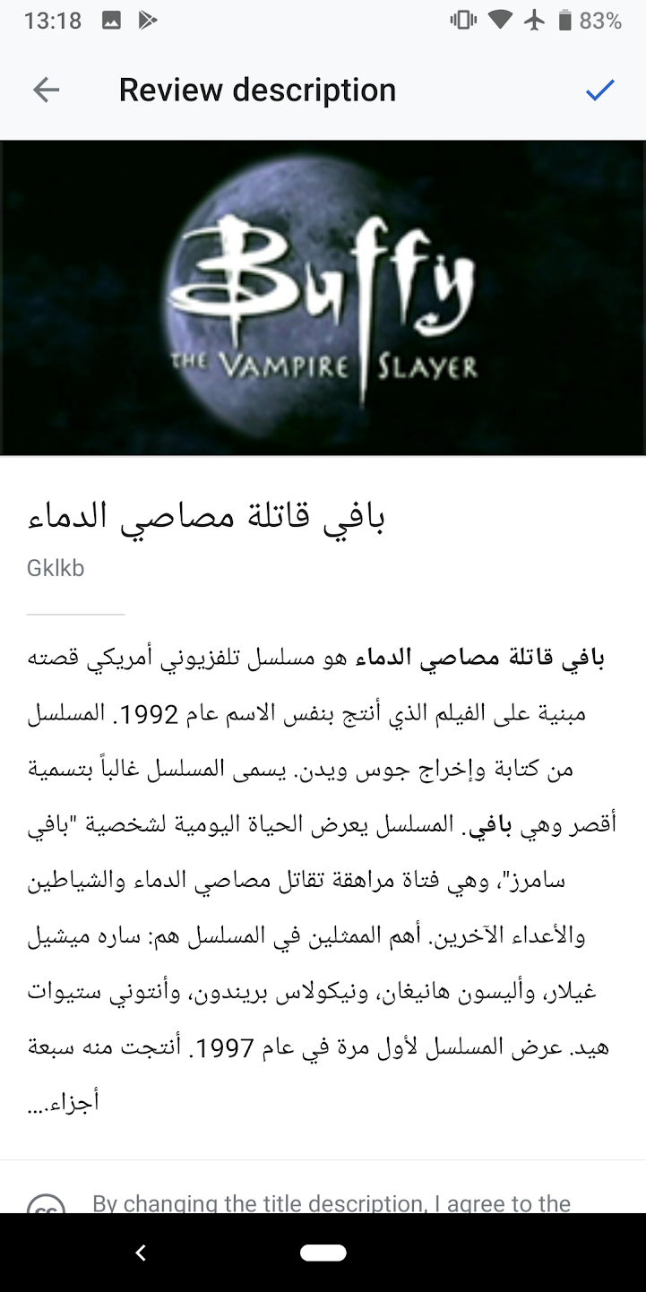
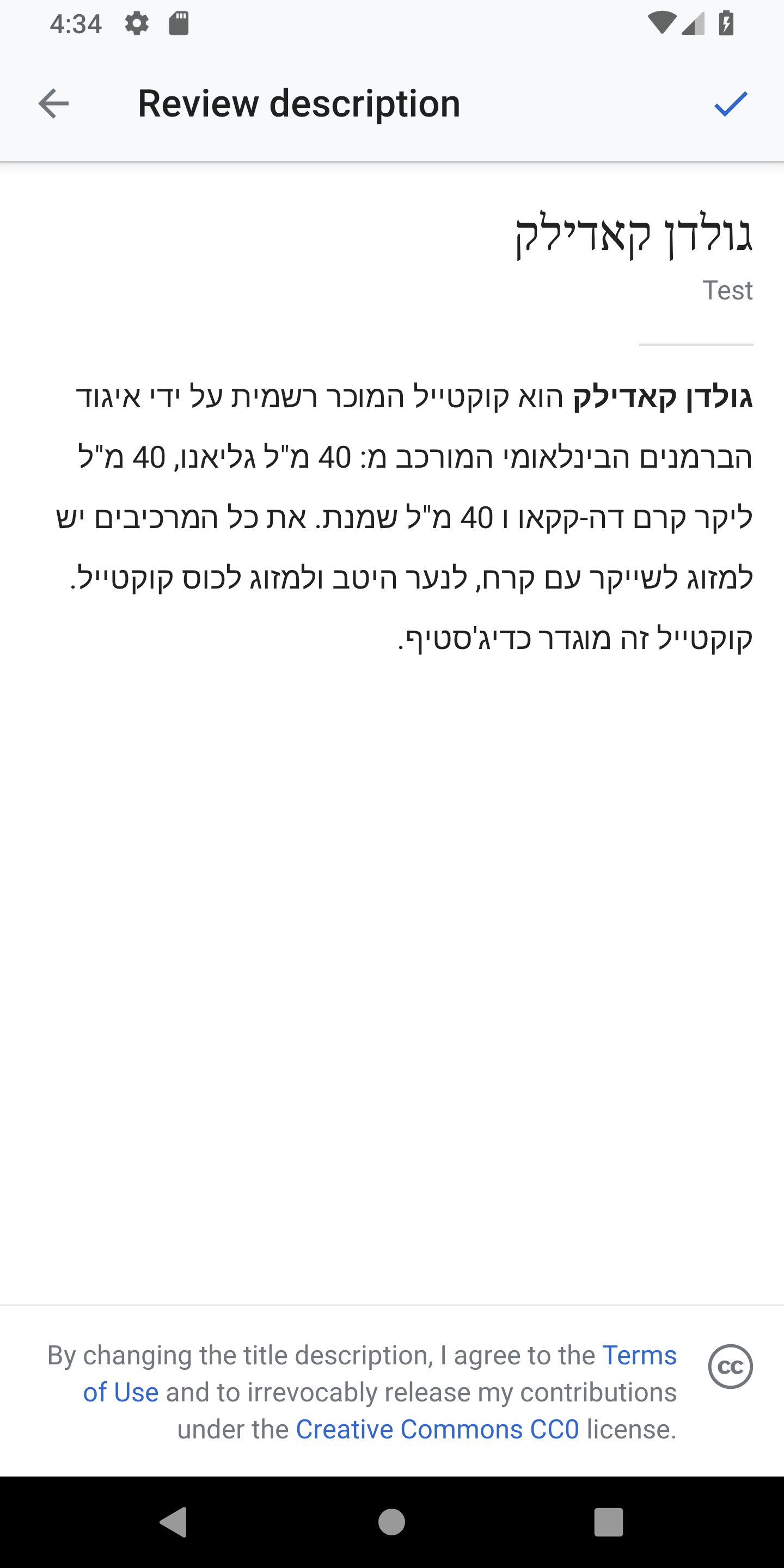
Will let the view adjusts its text direction after got the RTL or LTR text like the following screenshot.
After our sidebar discussion on Slack, this looks good @cooltey! Thanks and moving it to QA signoff.