Page MenuHomePhabricator

[EPIC] Suggested edits V1 (design improvements)
Closed, ResolvedPublic

Assigned To
Authored By
scblr
Feb 8 2019, 4:40 PM
Referenced Files
F28554787: Screenshot_1554161412.png
Apr 1 2019, 11:34 PM
F28554796: Screenshot_1554161117.png
Apr 1 2019, 11:34 PM
F28295788: eaf-09.png
Feb 27 2019, 6:22 PM
F28295792: eaf-17.png
Feb 27 2019, 6:22 PM
F28295785: eaf-16.png
Feb 27 2019, 6:22 PM
F28295778: eaf-13.png
Feb 27 2019, 6:17 PM
F28295776: eaf-17.png
Feb 27 2019, 6:17 PM
F28289632: eaf-01.png
Feb 26 2019, 5:15 PM

Description

The following design suggestions base on @dchen’s research slide deck. To better understand the changes in the course of the redesign, the screens below show a before/after state and contain written details about the changes.

👉 Oh, and there’s a flow chart. Check out it out here to grasp context more quickly.


Copy changes

Please check out the copy master doc for all strings used in the designs. I made adjustments to the copy and simplified language wherever possible. I’ll try to keep it in sync with the designs but please use the sheet as a source of truth since designs can outdate quickly. Some of the major changes include:

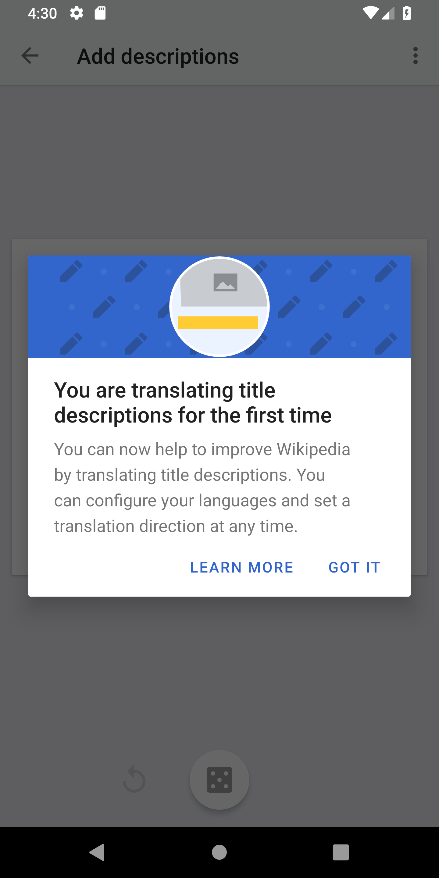
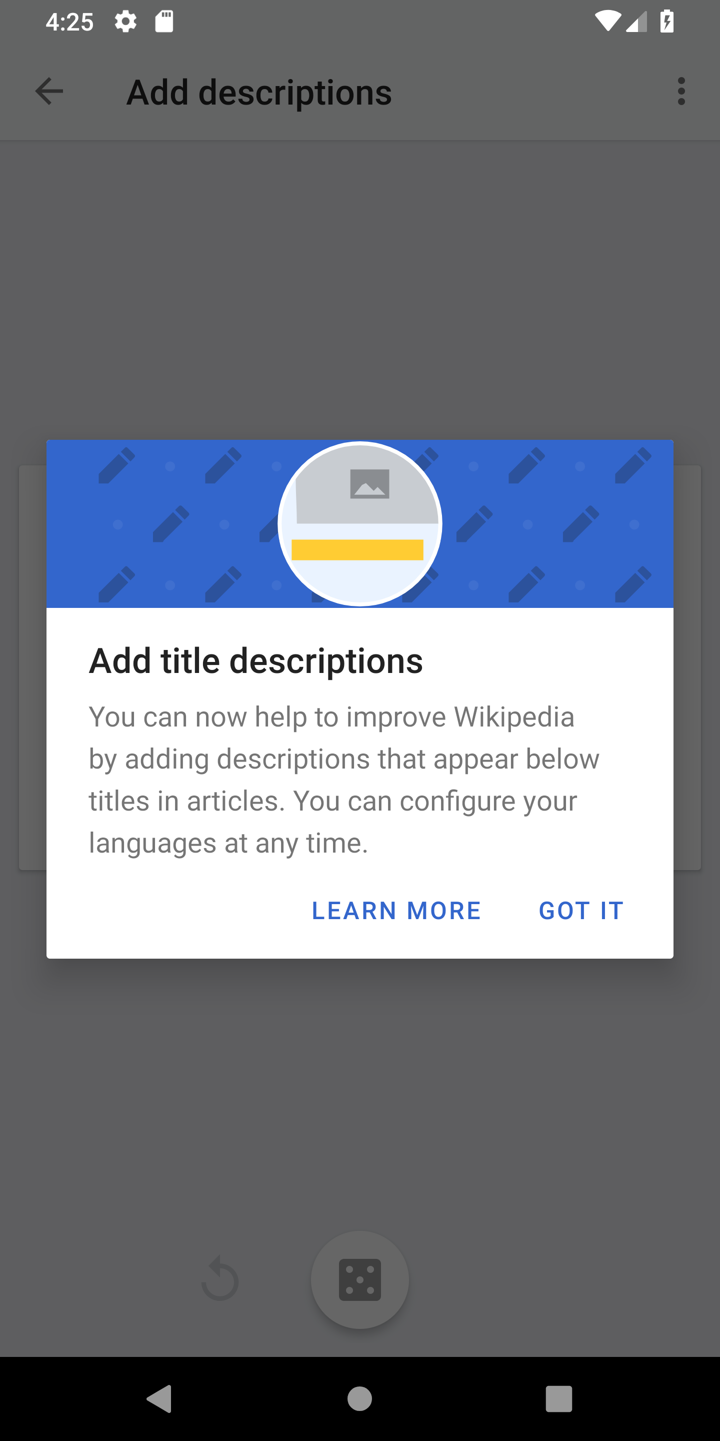
Add/translate title description -> Add/translate description
The term “title description“ is confusing for people who don’t have 15 years of edit experience on Wikipedia and with Wikidata. We want to make editing as accessible as possible and reach people that haven’t edited before. Let’s talk about adding and translating descriptions. We can still provide details about the history of the term “title descriptions“ in the “Help/Support“ area.


Todos

  • My contributions
  • Move screens to Zeplin
  • Promotion/Dialog/Notification concept
  • Merge “My contributions“ tasks
  • Review overflow menu
  • Design example screens for RTL treatment (T217170#5015719)
  • Create MediaWiki help page for suggested edits (T217562)

Related Objects

Event Timeline

scblr updated the task description. (Show Details)

Hopefully there aren't too many repeats I didn't notice in this list below.

Review screen:

  • feedback indicates users find this step useful/essential, however it is not registering well/consistently. more visual indication to distinguish from previous screen, and perhaps some elements of review and final screens can be merged

Final screen:

  • user feedback generally supports removing this step. suggestions include a setting to disable, showing for only the first # edits, removing entirely and showing a 'description added/edit published' notification/message that goes away after a few seconds, notification/message could include a link to the article with the new description etc.

Workflows:

  • most specific items have been covered, but macro level, there is a lot of task list workflow intertwining with the 'rest of the app' which causes general confusion and sometimes conflation.. which then results in different types of confusion, leading to users wanting task list workflow features integrated into the 'rest of the app' (i.e. seeing add desc button workflow from add description link in article screen // if going to article card from translation workflow, wants to see source title description after tapping on add desc link on destination language article, the latter of which doesn't make any sense)
  • RTL/LTR 'hot mess' (per user... and per me) bears repeating here. one exp user said translate workflow was avoided bc of cognitive load of the screen
  • option to visually distinguish articles added to/interacted with vs skipped, user indicates sometimes can change mind later, but then can't remember which was which (esp if tapping back to return to the card screen)
    • related; on the card carousel, after going 3 forward or back, cards change from what they were previously
    • related; would like way to view articles interacted with but not necessarily opened
  • blurb/snippet; clearer indication of tappability is mentioned previously, but for the translation workflow, there is the added complication of source title desc box --> destination language article. per feedback this needs a visual indicator of some kind.
    • additionally, copy-pasting is a big thing among users. if there is any way we can show visually that the preview is copy-pastable, that would be marginally helpful.
  • some users suggest making the card the whole screen with more content viewable; going directly to workflow (with snippet) screen or option to longpress and select view article or to directly to workflow
  • image of card itself not tappable
  • source description gets truncated if too long; perhaps they can be scrollable within card and within blurb/snippet
  • disable add desc button when the card is not loaded yet, because it takes users to add desc for main page

Navigation:

  • limited ToC feedback. some negative, some neutral. some quotes from users:
    • 'Scroll seems dependent on section size, not article length. Didn’t use it to navigate, mostly to see the sections'
    • 'Want to collapse sections like in mobile web.' did not like using ToC
    • 'Didn’t tap on anything, but noticed heading was highlighted and moved with scroll. Wasn’t bothersome’
  • almost every user experienced the W back v phone back issue, so bears repeating here
  • from tabs screen; press Wback, last/bottom tab is not removed. if press phone back, the tab is removed. fun with (in)consistency!

Contributions:

  • most users want to see contributions listed in main menu or in main menu within username, and to see it on the task list where it says 'in-app contributions'. for some users there seems to be some conflation of the task list with the app in general, with some users saying contributions should only be shown in the task list (??)

Visual elements:

  • translate button on app remains confusing to some; see in other languages or translate?
  • a few users felt the explore feed was a lot and was confusing. one user even saw sections like 'in the news' and 'on this day' repeatedly, for the same day. i'm not sure if this is supposed to happen, but even i was confused when the user showed me this.
  • the icon/blue lining on task list screen was either clear to users as a level/progress indicator or totally unclear at all.
  • a couple users had negative feedback about the continue reading box on explore feed. general feedback about tabs is, why isn't it always in the same place, top right corner?
  • dark/black modes; do not show visual 'highlight' indicator when finger-hovering on snippet/blurb, and show white text on white highlight on translate article card
  • customization card/pop-up on feed; card portion not tappable (which is also the case for the article cards in the workflows!). image 'random and meaningless'. customization options not immediately clear.
  • cards sometimes partially hidden when screen is smaller

Other:

  • user wanted to be notified of past edited articles missing descriptions
  • a few users wanted to know how these articles were chosen, and some further wanted options to select topics/categories, whether for interest or for more efficient add/translate sessions
  • the input boxes on the workflows capitalize the first letter regardless of input; the 'rule' is that that should only be the case if first word is proper noun i believe
  • some users did not like that opening articles while doing these tasks added to the tabs count
  • wants app to 'remember the last session'; instead of reverting to default lang, keep the language last selected for add desc, or source/destination langs for translate
  • related; tapping home button on phone --> app explore feed. but if recent apps screen --> app (last screen seen)
  • app not reliable on slow/intermittent internet // blurb/snippet didn't load sometimes
  • help screen has no guidelines regarding translations
  • source description editing to be included in workflow
    • related possible bug: source description sometimes different from what is shown on article
  • integration of machine translated title descriptions, more efficient
  • one user feels that when tapping new tab, wants to see explore screen instead of featured article page (more consistent with his experience with new tabs, not sure if there is a standard for this)
  • links in preview cards; not tappable currently. if made tappable, suggests preview card changes to the most recently tapped link
  • tabs move based on when last accessed; some users suggest tab location kept stationary
  • possible bug, couldn't edit subsections in hindi (not sure what this is exactly)
  • one user mentioned that the 'task list' translation in main menu is strange in swedish (i personally can't confirm)
  • translating labels as a task possibility
  • app generally makes standard templates invisible leading to links to our own projects kept unseen (infobox), but directing users to ext links
  • some articles have 'edit title description' as a dropdown option on the edit button after adding, however, some articles only allow normal editing and nothing about the title description; unclear why this is.

Update:

Here are the design focus areas for this week, based on @dchen’s notes (thanks!) and our previous findings. Work’s in progress...

CC: @Charlotte


Edit Action Feed overview: Layout and copy improvements:

  • Clearly define and design different states (locked, unlocked, set multiple languages)
  • Simplify/reduce interface complexity, indicate clearly that top part (“My contributions“) is a tap target

Card feed UI (Add/Translate): Improve clarity and unify:

  • Make card tappable (and increase the its affordance)
  • Treat buttons at the bottom as secondary actions (“Skip“ and “Read article“)
  • Rethink/Define display of languages in “Translate title descriptions“. Use a real article example and not dummy data
  • Deemphasize “Swap language“ icon in “Translate title descriptions“, user expectation is to see the current article in a different language
  • Showcase RTL/LTR combination of languages
  • Store/keep previous language selection when translating title descriptions

Add/Translate title description screen UI:

  • Simplify/rethink current designs
  • Focus on input field when taken to this screen to make the process faster
  • Translate title descriptions:
    • Consider a read article in user’s app language option?
    • Indicate better in which language that users are going to translate
      • Consider displaying the language switch dropdown. This would make it more clear to users in which language space they’re currently working. Daisy by email: “(...) some users said, just stick the words from / to on there!“
      • Use a placeholder that says “Title description in German“ or “Titelbeschreibung in Deutsch“
      • Use a placeholder that says “Title description in German“ or “Titelbeschreibung in Deutsch“
      • Bigger font-size for the description that should be translated. It’s currently too small.
  • Do we need to show the legal text at all times when adding/translating title descriptions?
  • To not interrupt the editing flow: “Back“ button after tapping “Read article“ should lead users back to previous screen and not to the explore feed
  • Blurb/snippet; clearer indication of tapability is mentioned previously, but for the translation workflow, there is the added complication of source title desc box --> destination language article. per feedback this needs a visual indicator of some kind.
  • Additionally, copy-pasting is a big thing among users. if there is any way we can show visually that the preview is copy-pastable, that would be marginally helpful.

Add/translate title description: Review and Published UI:

  • Improve review screen, e.g.with more visual indication to distinguish from previous screen, and perhaps some elements of review and final screens can be merged.
  • After the 3rd edit, the “Description published“ dialog (T178544) should be shown as a “Toast“ rather than full screen overlay, especially when users do batch editing.

Other:

  • Define notification concept
  • Unclear term “title description“, explore:
    • Revise/improve copy, be more concise/clear in UI and dialogs
    • Provide examples of the “norm“ of how title descriptions are written, either with a dialog or with an additional “Help“ link/button within “Add/translate title descriptions“.
  • Review timing of the dialogs. E.g. would it make more sense to show a dialog in edit mode?
  • Create/improve/review My contributions
    1. Add/Translate title descriptions | Step 01
  • Familiar interface from article page, addresses confusion in usability testing
  • Consistency of icon paired with improved copy
  • Call to action in destination language
  • Tapping the card leads users to translation interface
  • “Add description“ button now “Read article“ button
  • De-emphasized swap icon, since user expectation is to see the current article in another language (and this is not the case)
  • Add and translate title descriptions have similar interface (Skip / Read article)
  • Onboarding message describes that cards can be tapped directly

Previous task description below


“Add/translate title descriptions“ flow

  • “Translate title description“ main view (changes will likely affect “Add title descriptions“ designs too).
    • Daisy by email: “(...) generally, the entire 'home page' of translate is not clear enough to users. it was often difficult for users to quickly grasp the from and to language, and while the highlight was clear for some, it was very confusing for others (and the fact that the rest of the card was in a different language).“ To explore:
    • Consider hierarchy/weight of elements
    • Should we lead users toward the “Add/translate title description“ action (blue button?)
    • Within “Translate title descriptions, the label of the main action should say: “Translate description“ instead of “Add description“
    • “Add title description“ text snippet at the top is tappable. There’s no indicator that the snippet is tappable. This needs to be improved.
    • The current “Add title description“ UI copy “From“ is unclear. Better: “Language“ (T214523 and Daisy by email: //“some users indicate that the from (label) is vague.“
    • Only display the language dropdown in the “Add title description“ UI when users have set multiple languages (T164606). In other words: hide it when users have set one language in the app.
  • “Translate title description“ first step (changes will likely affect “Add title descriptions“ designs too):
    • Ideally, tapping a card in both adding and translating title descriptions should lead users to the “Add title descriptions“ screen. However, we should include a less prominent “Read article“ action that still lets users navigate to the article, and back to the “Add/translate title descriptions“ view. Currently it takes them back to the “Explore“ feed. (T164606, T207334)
    • Indicate better in which language that users are going to translate, ideas:
      • Daisy by email: “(...) also on the add translation screen, some users thought that name of the target language should be clearly indicated above the input field.“
      • Consider displaying the language switch dropdown. This would make it more clear to users in which language space they’re currently working. Daisy by email: “(...) some users said, just stick the words from / to on there!“
      • Use a placeholder that says “Title description in German“ or “Titelbeschreibung in Deutsch“
      • Bigger font-size for the description that should be translated. It’s currently too small.
    • Active input field to make the process even faster
  • Do we need to show the legal text at all times when adding/translating title descriptions?
  • After the 3rd edit, the “Description published“ dialog (T178544) should be shown as displayed as a “Toast“ rather than full screen overlay, especially when users do batch editing.
  • Store/keep previous language selection when translating title descriptions (T214787)
  • Do we need a review translation screen at all? (T214789 and Daisy by email: “(...) some users mention it is odd that there are so many confirmation taps needed to move through the workflow.“)
  • Users are unclear about what verified edits are exactly. Provide an explanation somewhere in the interface (T207332, T164606, T207334)
  • Create/design RTL example mocks for “Adding/translating title descriptions (T214788 and Daisy by email: “RTL considerations need to be kept in mind here. there are many potential combinations of different origin/target languages that may be RTL and/or LTR, and then what the user's phone display language is, etc.“)
  • Do we need to provide examples of title descriptions or elaborate on what they are used for exactly? (T209539, T164606, T207334). Ideas to explore:
    • Daisy by email: “some users who were unfamiliar with title descriptions and/or were unclear on the terminology itself had some issues understanding how to formulate one in the style of the 'norm'.“
    • Showing an additional dialog/hint in the “Add title descriptions“ screen
    • Provide examples of the “norm“ of how title descriptions are written, either with a dialog or with an additional “Help“ link/button within “Add/translate title descriptions“.
    • Are dialogs in regards to adding title descriptions clear enough? Review them. Also review timing of the dialogs. E.g. would it make more sense to show a dialog in edit mode?

Notifications (T207333)

  • What about echo notifications (bell icon in the app bar)?
  • Review initial purpose of edit action feed notifications
  • Reminder notification after 1 week (value up for discussion) in case the unlock message was overseen.

My contributions

  • Create/improve/review “My contributions“ screens and behavior
  • Make it clearer in the edit action feed main view that “My contributions“ is tappable, currently there’s no affordance

Future

  • Introduce translate title descriptions in article view?
scblr renamed this task from Edit action feed V1 exploration list (work in progress) to [EPIC] Design improvements for editor tasks.Feb 26 2019, 11:53 AM
scblr updated the task description. (Show Details)
scblr renamed this task from [EPIC] Design improvements for editor tasks to [EPIC] Design improvements for suggested edits.Mar 14 2019, 11:04 AM
scblr updated the task description. (Show Details)

Hi @schoenbaechler, I just found the texts in both onboarding dialogs need to be updated, should we still need these dialogs?

The logic exists in current build that they will show up on the first time when users enter the Add description/Translate description.

(Please ignore the background of the screen, just want to let you see the dialog)

Screenshot_1554161412.png (2×1 px, 164 KB)

Screenshot_1554161117.png (2×1 px, 153 KB)

Hi @cooltey, thanks for checking back. The dialogs you are referring to have been removed from the concept to not overwhelm users with a flood of dialogs. More infos in T217369:

The two types of dialogs/notifications that will be displayed are:

  • 'You unlocked the “Add descriptions“ editor task', after the 3rd (not reverted) contribution
  • 'You unlocked the “Translate descriptions“ editor task', after the 50th (not reverted) contribution
scblr renamed this task from [EPIC] Design improvements for suggested edits to [EPIC] Suggested edits V1 design improvements.Feb 11 2020, 12:44 PM
scblr renamed this task from [EPIC] Suggested edits V1 design improvements to [EPIC] Suggested edits V1 (design improvements).Feb 11 2020, 12:54 PM