Page MenuHomePhabricator

As a user who enjoys adding descriptions, I can easily find other suitable articles to add descriptions to
Closed, ResolvedPublic5 Estimated Story Points

Description

Why are we doing this?

Now that this feature has been successfully rolled out across most languages and sees a significant amount of usage, we should start addressing the problem that users who like adding new descriptions can soon find themselves without easily findable opportunities to add more of them. (This could also be a reason why the usage rate of the feature appears to have slowly but steadily declined after the initial three-language rollout at the end of March.)

We could include, say, three articles lacking description on the "done" screen, drawn from https://www.wikidata.org/wiki/Special:EntitiesWithoutDescription , and ideally restricted to articles highly related to the one that the user just added a description to.

Separately (for returning users), we could include a version of https://www.wikidata.org/wiki/Special:EntitiesWithoutDescription somewhere else in the interface.

User story

When I have proven myself as an editor of good standing, I want to be shown more articles requiring descriptions, so that I can grow my contributions to Wikipedia.

Mocks

Portrait
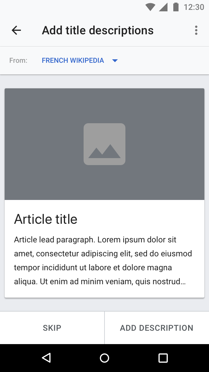
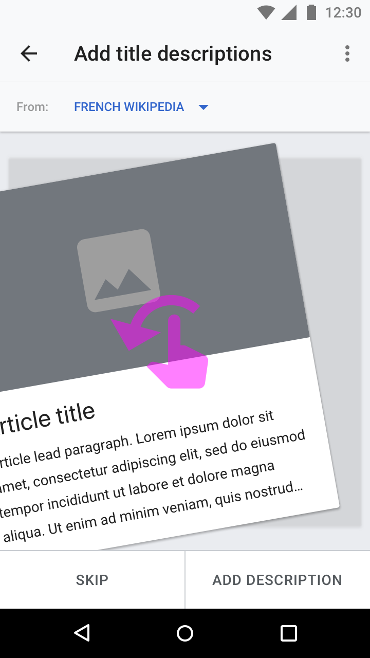
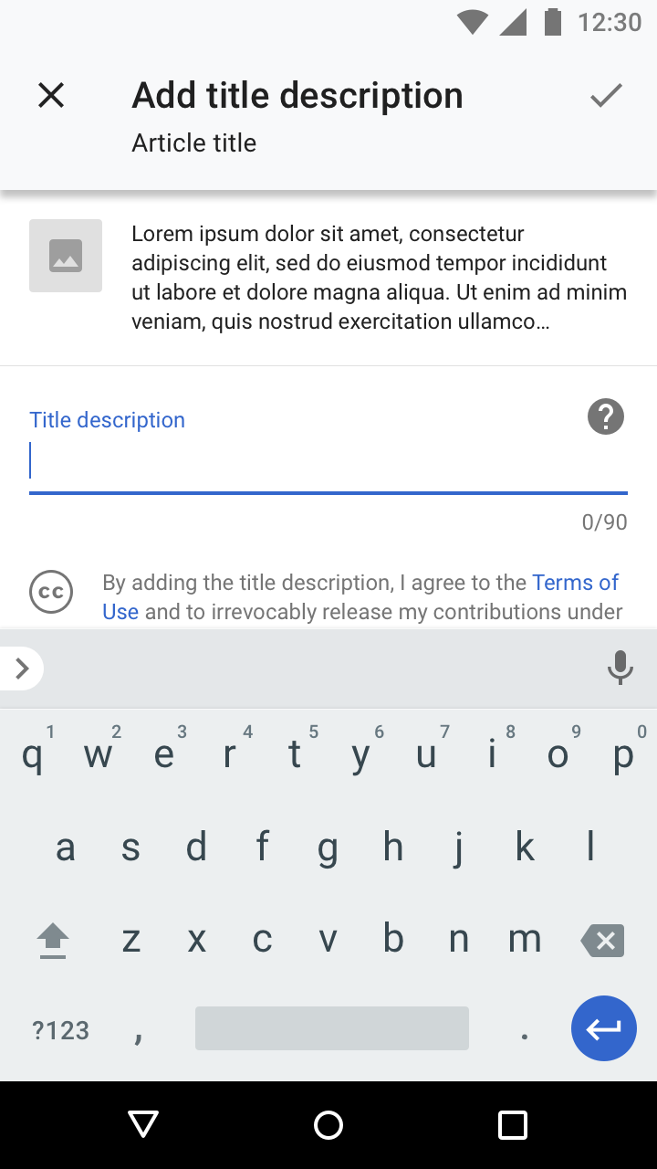
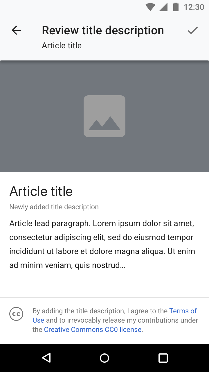
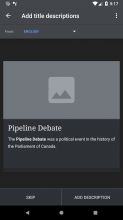
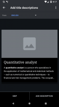
Adding title descriptions feedSkipping an itemTitle description editing UIReview of editFeed overflow menu
ALT 103b Adding title descriptions task list.png (1×720 px, 77 KB)
Dismiss item.png (1×720 px, 128 KB)
104a Add title description.png (1×720 px, 106 KB)
ALT 105a Confirm description.png (1×720 px, 95 KB)
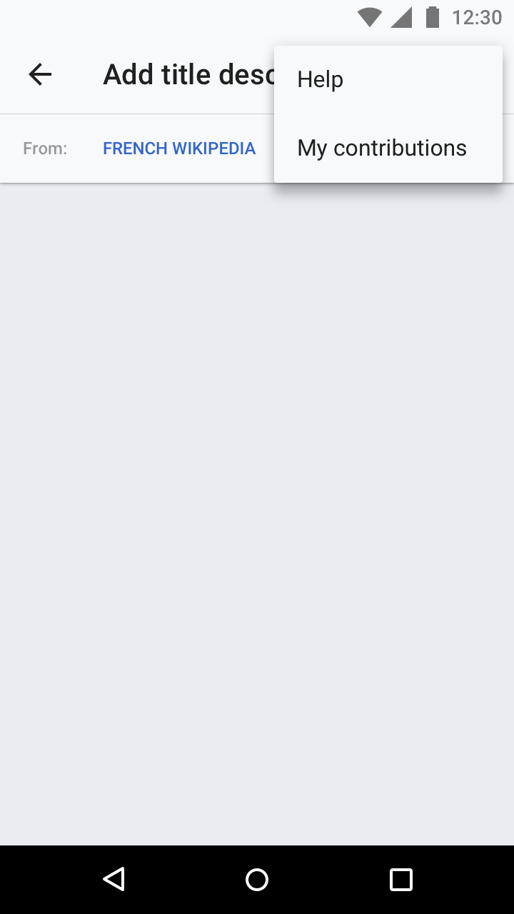
105b Task list overflow.png (1×720 px, 45 KB)
Related task: T164606Related task: T164606Related task: T164606Related task: T164606Related task: T164606
Landscape
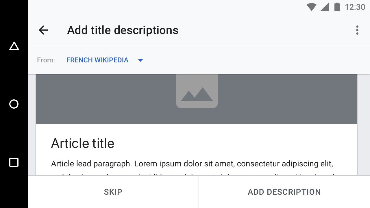
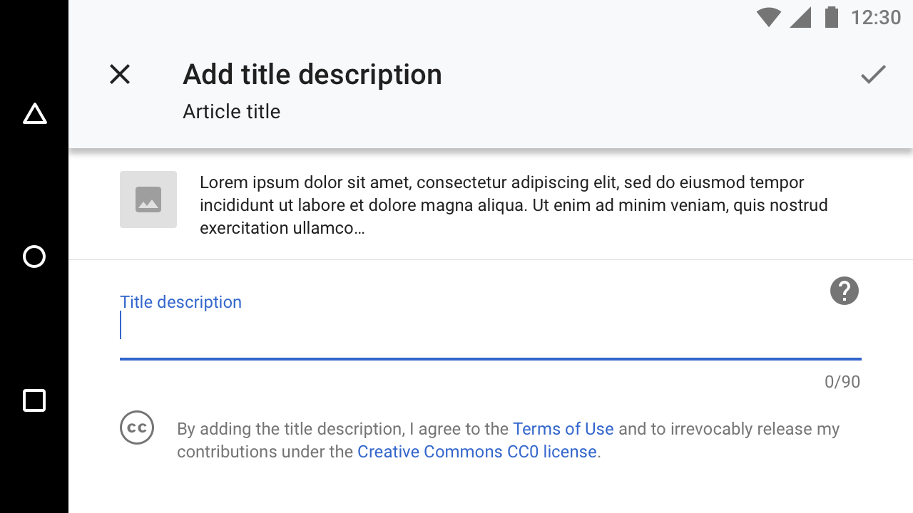
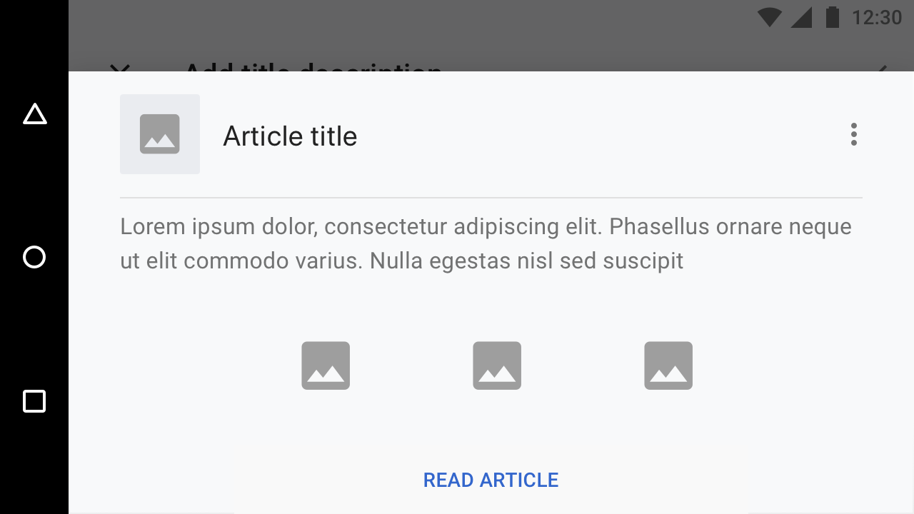
Adding title descriptions feedTitle description editing UIArticle previewReview of edit
LANDSCAPE 2 Adding title descriptions task list.png (720×1 px, 60 KB)
LANDSCAPE 104a Add title description.png (720×1 px, 82 KB)
LANDSCAPE 104b Read more about article.png (720×1 px, 59 KB)
LANDSCAPE ALT 105a Confirm description.png (720×1 px, 61 KB)
Zeplin: https://zpl.io/bPXLyrlZeplin: https://zpl.io/a75KpKKZeplin: https://zpl.io/aXwGyGPZeplin: https://zpl.io/2ZjP3PX

Event Timeline

Subtasks for:
Onboarding screen
Task menu
Title descriptions screen
Adding thumbnail and blurb to current wikidata description editing workflow

Questions for @cmadeo
Where does the "learn more" link in the onboarding take you to?
Please remove the image from the dialog so we don't have make a custom one
Can you confirm that the language wiki dropdown menu will only contain languages the user has set, and that we will not show the dropdown if they only have one set?
On the "Review" screen can we have a save mechanism that's a little weightier? People are not going to find the small checkmark I think.

Where does the "learn more" link in the onboarding take you to?

Tapping on 'Learn more' should open the same 'Title description help' screen that is linked too from the title description editing screen.

Please remove the image from the dialog so we don't have make a custom one

I mentioned this on a comment in T207333, do you think it'd be possible to build out this custom dialog?

Can you confirm that the language wiki dropdown menu will only contain languages the user has set, and that we will not show the dropdown if they only have one set?

Confirmed, the drop down should only show on the translate title description task and only contain languages that the user has set.

On the "Review" screen can we have a save mechanism that's a little weightier? People are not going to find the small checkmark I think.

@Charlotte do you think we could change the title of the screen to 'Review' and then have the save mechanism be either 'Publish' or 'Save'? I'm not sure of how many characters are usually included in these buttons (my apologies)

There is almost certainly not going to be enough room in the bar to do this in all languages - the German "Speichern", for example, is unlikely to fit. Why not have a button like is shown on the feed? Because the terms of use the user is agreeing to are at the bottom of the screen, would it perhaps make a bit more sense to have the action of agreeing a little closer to the thing they're agreeing to?

@Charlotte would it be possible to do usability testing with the action button as a checkmark in the upper right? I'm a little concerned about having the back navigation elements (back and next) on different areas of the UI.

@cmadeo - Sure, though remember that because Android has hardware (or in some cases software) back buttons, this is not as much of a concern as it would be on iOS for example.

Change 478375 had a related patch set uploaded (by Cooltey; owner: Cooltey):
[apps/android/wikipedia@master] [WIP] Add "adding title descriptions feed"

https://gerrit.wikimedia.org/r/478375

Hi @cmadeo, @schoenbaechler, @Charlotte

Have a question about the Title description editing UI and Review of edit screens.

Should we also need to apply the UI changes and review step mentioned to the general add/edit title description screens?

(for example, read an article that does not have title description and click on the Edit title description to enter the screen)

Thanks for bringing this up @cooltey. I'm actually a bit stuck about what the answer should be and would love input from @schoenbaechler and @Charlotte.

On one end, it seems like it would be a good idea to reduce the number of interfaces to maintain, but on the other the user has more context when they are editing from the article (therefore the UI could be a little more paired down). I can definitely see some benefits to including more context (eg. the new design) in the normal description editing though, so my vote would be to update both editors to be the same (the new version). I am not sure that we really need to review in the article view though as the user will see the article immediately after submitting and can take action to change it if they made a mistake.

FWIW, I agree about not needing the review screen for the title description when the user has entered the edit title description screen from the context of reading an article. The reason for the extra detail and review step is that users entering from the Edit action queue have no context of what the article is and move to the next title description after completing this action.

Thanks for the update, @cmadeo

Have a question about the Article preview screen. Since the card view in Adding title descriptions feed is clickable and able to read the article, should I keep the card view clickable?

And in our current bottom sheet dialog, we have the overflow menu with the options shows below, should we also need the same options to be implemented into the Article preview screen's overflow menu?

Screenshot_1544823545.png (1×1 px, 260 KB)

This comment was removed by cmadeo.

@cooltey thanks for jumping on a call to help me understand this better! Yes, let's keep the card style as it is currently implemented and include the overflow only if it doesn't cause too much trouble during implementation. Thank you!

Hi @cmadeo and cc @schoenbaechler

Do we have to set a different "default image background color"?

The "default image background color" is base30 #72777d for all the four themes, which you can see on the following screenshots.

For your reference: https://www.mediawiki.org/wiki/Wikimedia_Apps/Android_theme_guidelines

Screenshot_1545067039.png (1×1 px, 78 KB)
Light theme
Screenshot_1545068457.png (1×1 px, 100 KB)
Sepia theme
Screenshot_1545067062.png (1×1 px, 87 KB)
Dark theme
Screenshot_1545067076.png (1×1 px, 108 KB)
Black theme

Change 478375 merged by jenkins-bot:
[apps/android/wikipedia@master] Add "adding title descriptions feed"

https://gerrit.wikimedia.org/r/478375

@cooltey I think that this is okay to keep as is, thanks for checking

Moving this back to the “Needs Design/Design doing“ column since there will be modifications to the flow/screens based on feedback from usability testing.

This is a legacy task for “Editor tasks“ prototype. All changes will be addressed in T215630. Moving this to “Ready for signoff“.