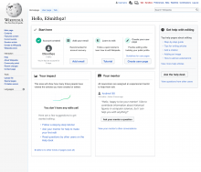
While working on the mobile version of the Newcomer homepage, we noticed how modules affordance could be increased by adding icons right next to the module's title.
Each icon would reflect the main purpose of the module, and will help users grasp the modules' features when having a quick overview look at the Homepage.
We propose to add the same design treatment to the desktop version of the Homepage.
