Page MenuHomePhabricator

VE saving dialog title is illegible for some languages
Closed, ResolvedPublic

Description

VE saving dialog has at the top 3 information: two buttons and an informative title.

Capture d’écran_2019-07-12_11-27-17.png (72×677 px, 11 KB)

If you have a language that has more characters than English, the title is squeezed. A recent OOui change (T226045) has increased the padding of the buttons, making the title less easier to read. TBH, it was not either visible before that change.

Capture d’écran_2019-07-12_11-20-55.png (105×528 px, 15 KB)

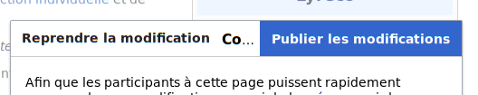
And, it is almost not possible to see the moving stripes when saving is ongoing:

Capture d’écran_2019-07-12_11-21-07.png (92×547 px, 12 KB)

Event Timeline

This was previously already filed as T212811, but Schnark for some reason closed it as a duplicate. One solution I mentioned here was just making the form a bit wider.

matmarex subscribed.

My proposed change https://gerrit.wikimedia.org/r/c/mediawiki/extensions/VisualEditor/+/520004 (related to T225021) will change the "Resume editing" button (top-left) to a 'close' icon image.png (20×20 px, 209 B), which should improve this.

In general, I don't think making the dialog wider is a good solution, because the same problem is likely to affect the mobile version, and we can't make the device wider. We should be aiming to make dialog title bars fit in 320px (the width of 4-inch iPhone SE, probably the smallest phone you can buy these days).


The save dialog on mobile already uses an icon, and a different shorter label message (just "Publish"), which fits comfortably in most languages, e.g. here's French:

E443F3C4-D20C-4A77-8214-A57EEFB15FEA.png (1×640 px, 105 KB)

There are still some cases where it doesn't, e.g. here's Georgian. I think here we should just encourage the translators to take some liberty with the dialog title message to make it shorter, e.g. change "Save your changes" to just "Save" (in fact, the French message looks like this was done there).

9F1B49FF-7218-4057-83B5-5C6FDCFAA56E.png (1×640 px, 131 KB)

Change 520004 had a related patch set uploaded (by Bartosz Dziewoński; owner: Bartosz Dziewoński):
[mediawiki/extensions/VisualEditor@master] MWSaveDialog: Use close flag for close actions, move 'back' button

https://gerrit.wikimedia.org/r/520004

I think here we should just encourage the translators to take some liberty with the dialog title message to make it shorter

It has always been the case that translators are meant to aim for brevity and the right sense over perfect accuracy. I don't speak even a smattering of enough languages to know if that's how translators are undertaking their work, however.

Translate extension mostly facilitates batch translations, and it’s not like everyone knows 100% where each message is going to end up showing (or this is shown to them), so most people probably go for a translation that makes most sense to them rather than the one that fits most in a specific interface.

Change 520004 merged by jenkins-bot:
[mediawiki/extensions/VisualEditor@master] MWSaveDialog: Use close flag for close actions, move 'back' button

https://gerrit.wikimedia.org/r/520004

My proposed change https://gerrit.wikimedia.org/r/c/mediawiki/extensions/VisualEditor/+/520004 (related to T225021) will change the "Resume editing" button (top-left) to a 'close' icon image.png (20×20 px, 209 B), which should improve this.

👍

Change "Save your changes" to just "Save" (in fact, the French message looks like this was done there).

In all cases, the translation is supposed to be accurately matching the source for interface consistency. In some cases, shortening can have a legal impact. IIRC, it was the case there. (But I may be wrong.)

I think here we should just encourage the translators to take some liberty with the dialog title message to make it shorter

It has always been the case that translators are meant to aim for brevity and the right sense over perfect accuracy. I don't speak even a smattering of enough languages to know if that's how translators are undertaking their work, however.

+1. In our case, the shortest option was chosen. Translations are not supposed to be the adjustment variable for the interface.


Adding user notice, since it is a change impacting two editors (assuming that the wikitext one is impacted too).

Adding user notice, since it is a change impacting two editors (assuming that the wikitext one is impacted too).

Only the 2017 wikitext editor (not sure if that's what you meant), nothing will change for the old wikitext editor or the mobile one.


I'll remove the tag, since the change was already announced in https://meta.wikimedia.org/wiki/Tech/News/2019/28:

The design of MediaWiki's software windows will change for desktop users. Layout will be simpler, buttons will be bolder and clearer, and close buttons will be just icons. This is like the mobile design. This will affect ContentTranslation, VisualEditor, TemplateWizard, and other tools. T226045

…we were just late with applying the change to this particular dialog. Sorry!

ppelberg claimed this task.