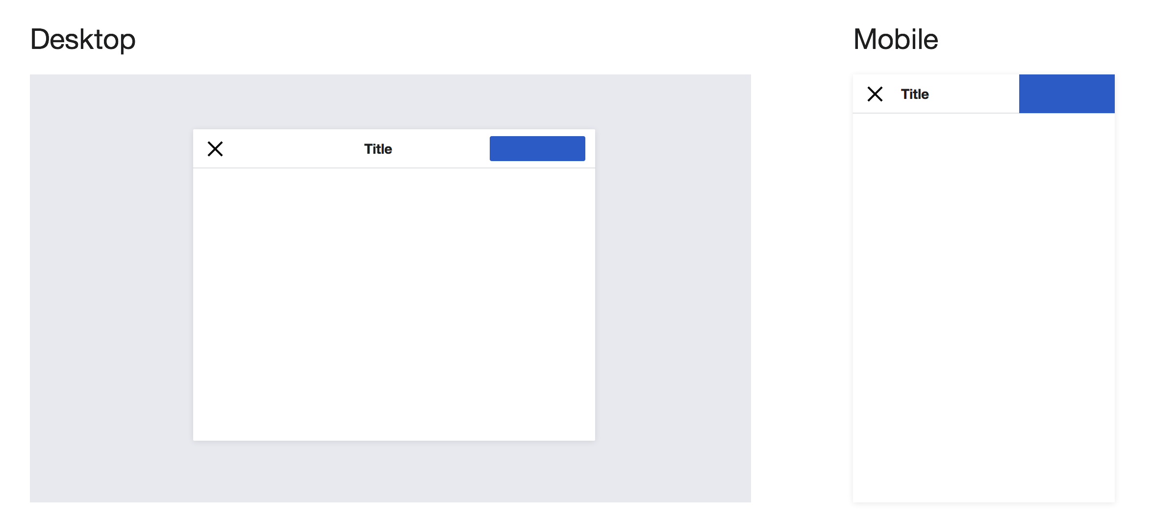
The top actions in dialogs are very verbose and in the case of the “Cancel” action it seems out of proportion in contrast to its function.
The title dialog receives less visual importance while the user's interest is more on the primary action and/or the dialog title.
| Current | Proposed |
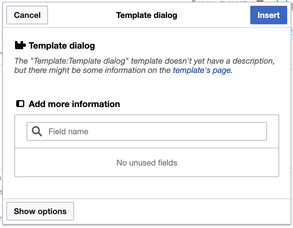 | 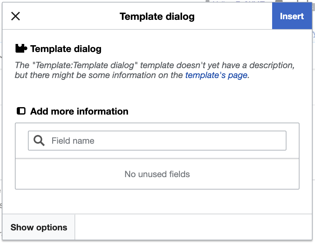 |
| TemplateDialog VE | |
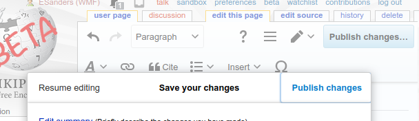
Current mobile appearance (as of v0.32.1):
Proposals
- Converge mobile and desktop appearance…
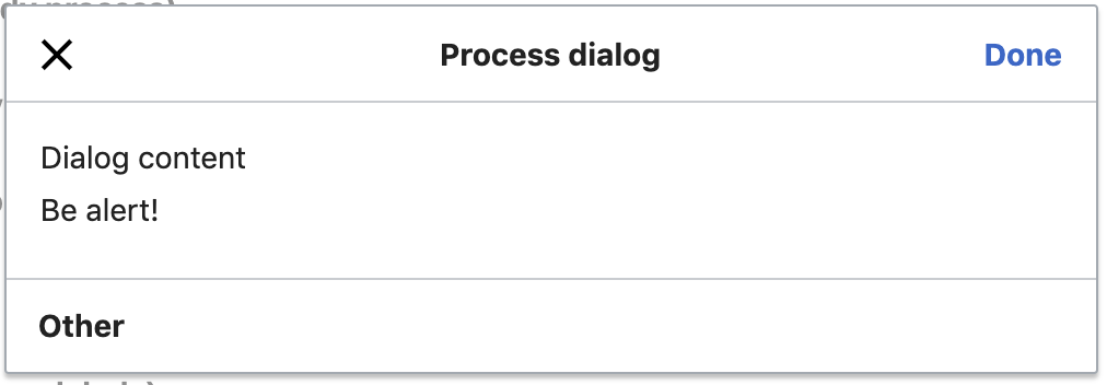
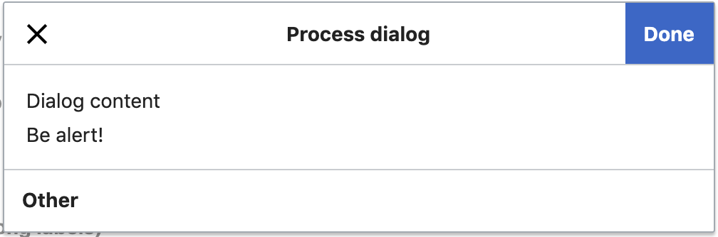
- “Cancel” default action in process dialog to change using 'close' (“x”) icon instead
- Primary buttons should have same primary button appearance everywhere (Accent50 background, Base100 text color)
- Evaluate increasing font-size of title slightly
- Make buttons full height similar to a toolbar appearance
- Bottom (other) action buttons should receive button interaction treatment, hover, active etc.
- Mobile: Left align title
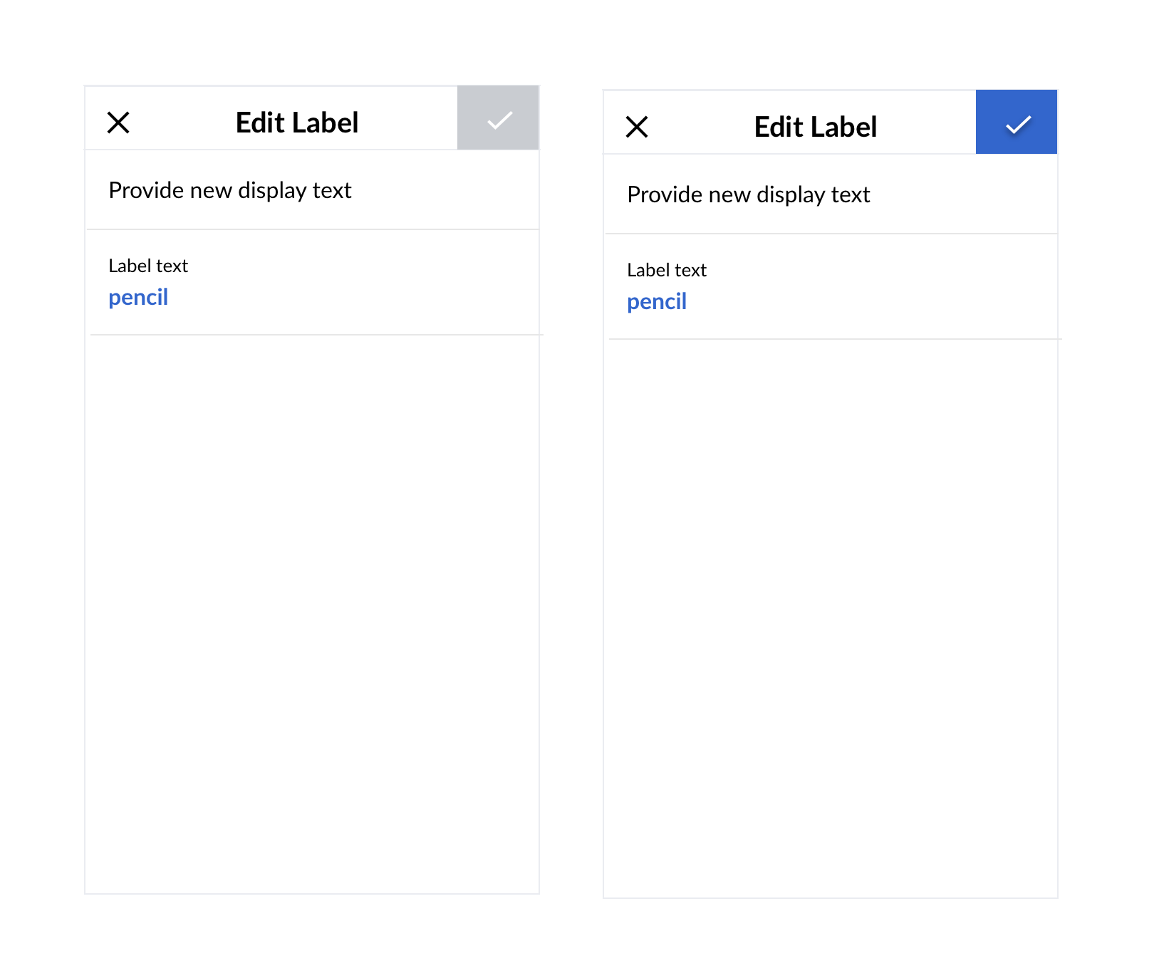
Proposed ProcessDialog (medium) from demos:
Improvements by proposal
- “x” is one of the most common window GUI elements and also used in other contexts. There's no reason to be overly verbose for such simple, secondary action. This would also increase focus on other, primary action and help with the reading direction sequence to improve user guidance
- Making the primary action full height would improve consistency between toolbars and dialog title bars, which latter were derived from former
Related tasks
…where the current behavior is challenged (or should be challenged)