Description
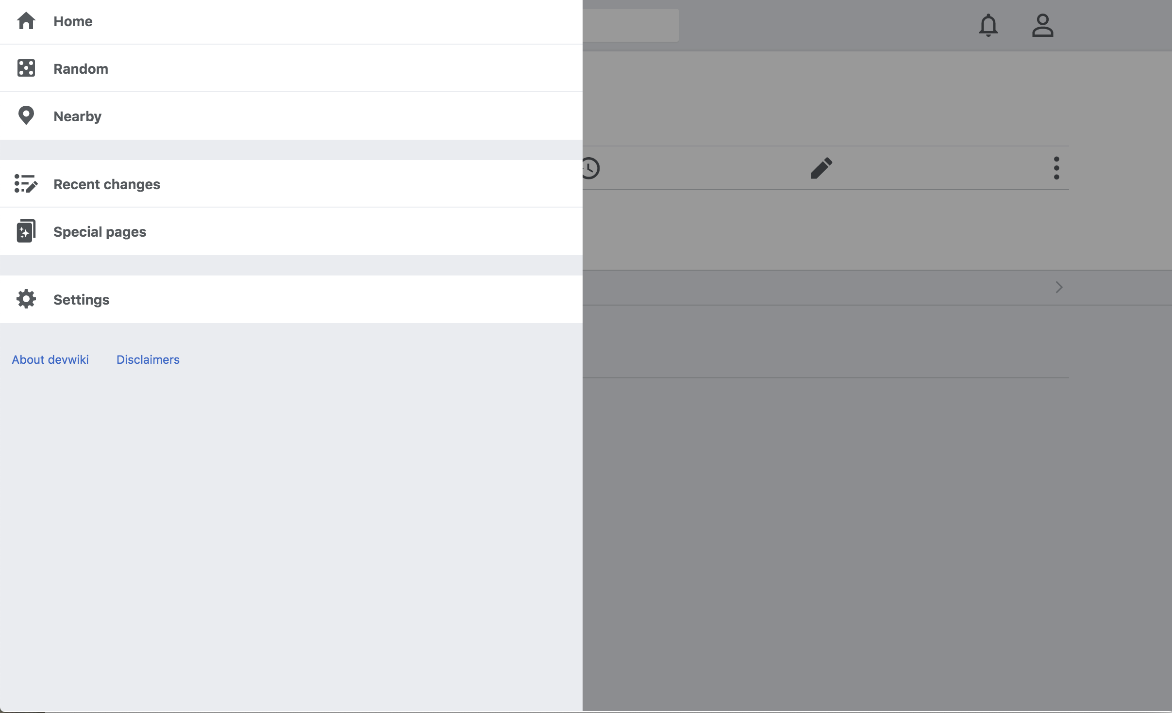
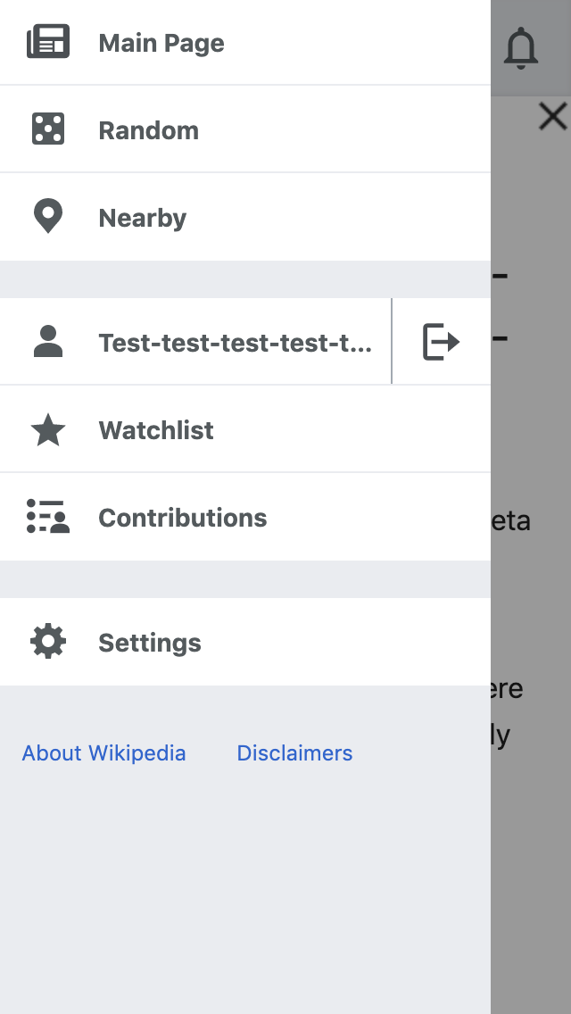
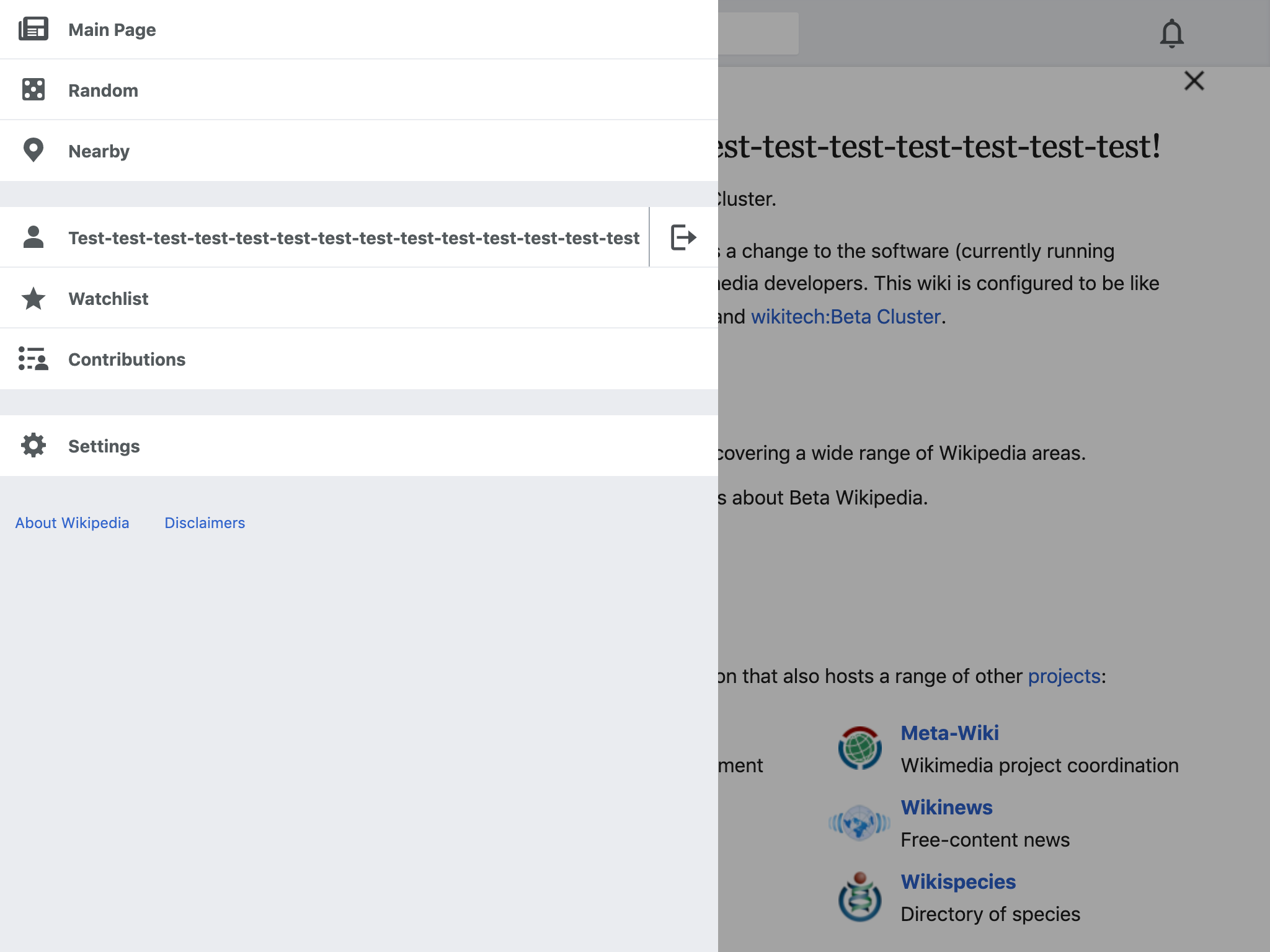
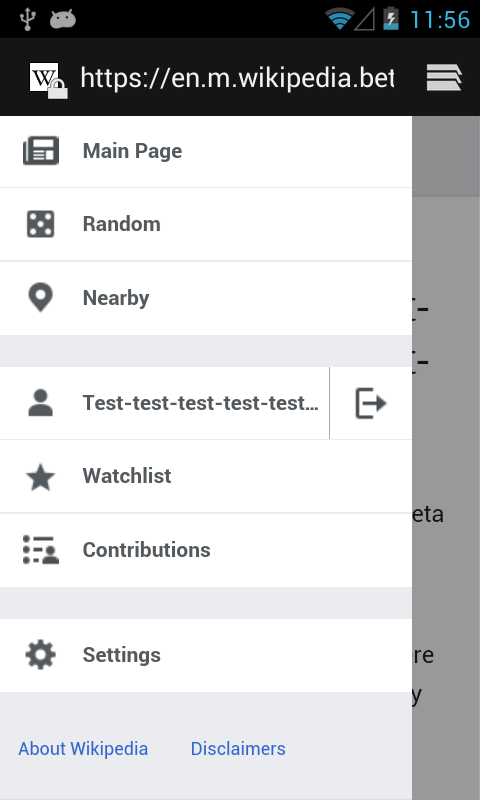
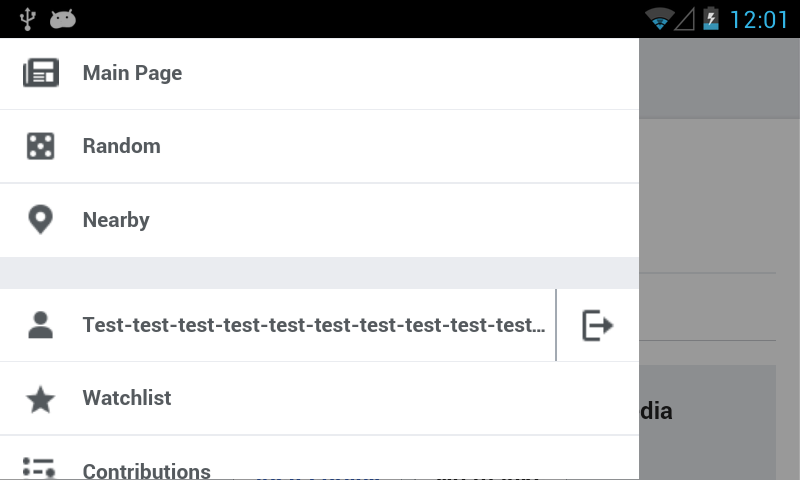
The main menu does not act like a drawer. It is not opened. Instead, the content is re-positioned around the drawer. This makes the drawer feel foundational, as if the website was literally built on top of the menu, not the other way around.
This task posits that the content is what's most important and should carry the most weight. The menus, drawers, and dialogs should be lightweight peripheral views that glide over the top and invite dismissal, not heavyweight hitters that shove or shift the content out of the way to show secondary information and require beckoning the content back into view instead of drawer dismissal. Animating drawers in and out over the content is far less distracting than animating the content and primary focus in and out.

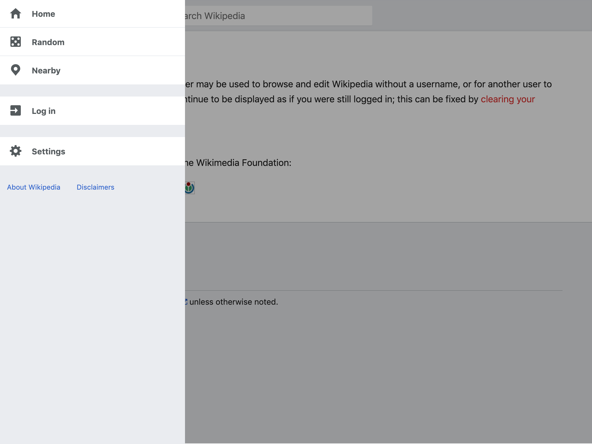
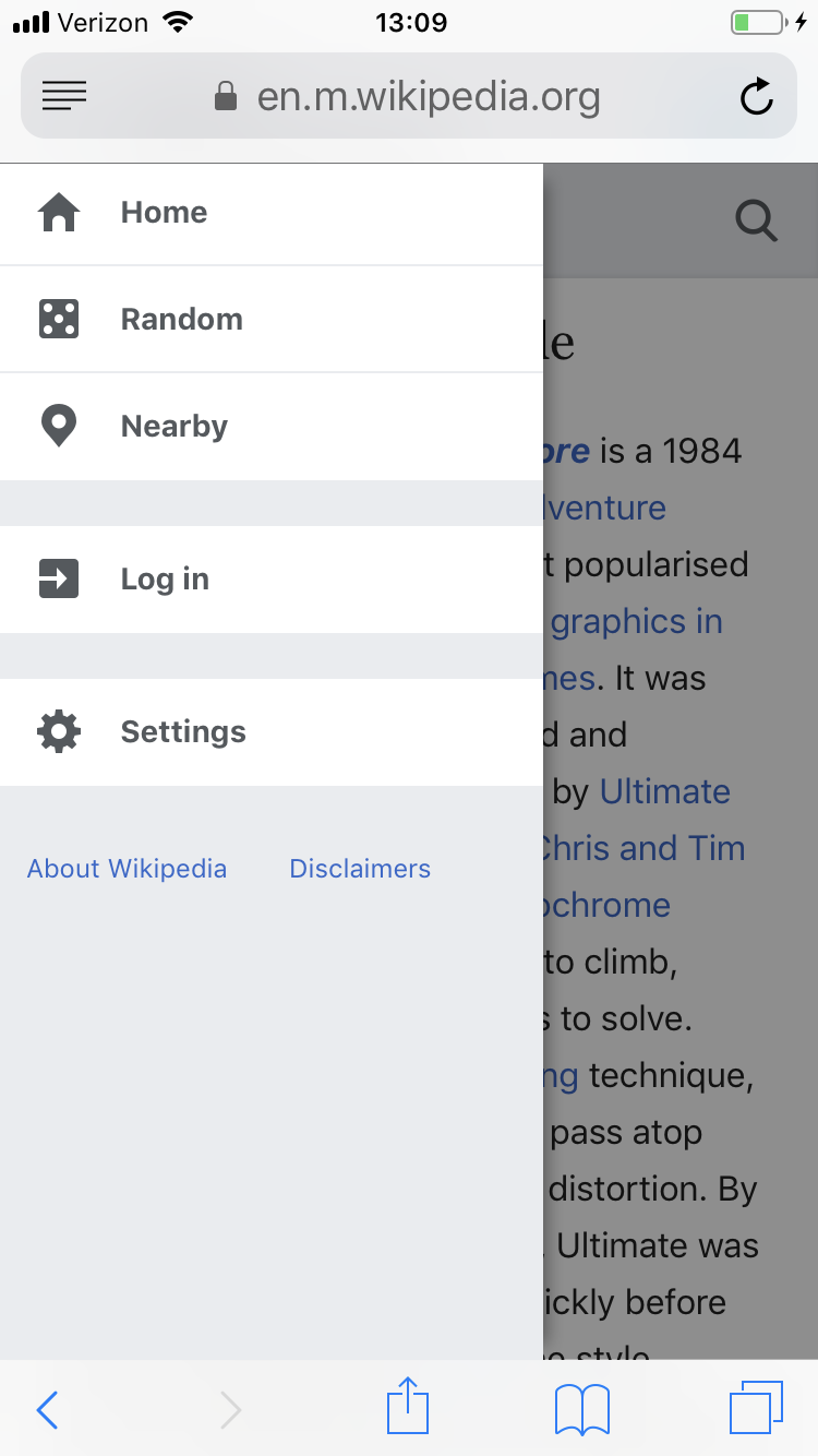
A lightweight drawer feels much more appropriate. E.g:

Designs
Developer Notes
If we don't support the swiping action mentioned in the above section and given that the .primary-navigation-enabled class is toggled on the body element when the hamburger menu is toggled, it should theoretically be possible to make this change only with CSS.
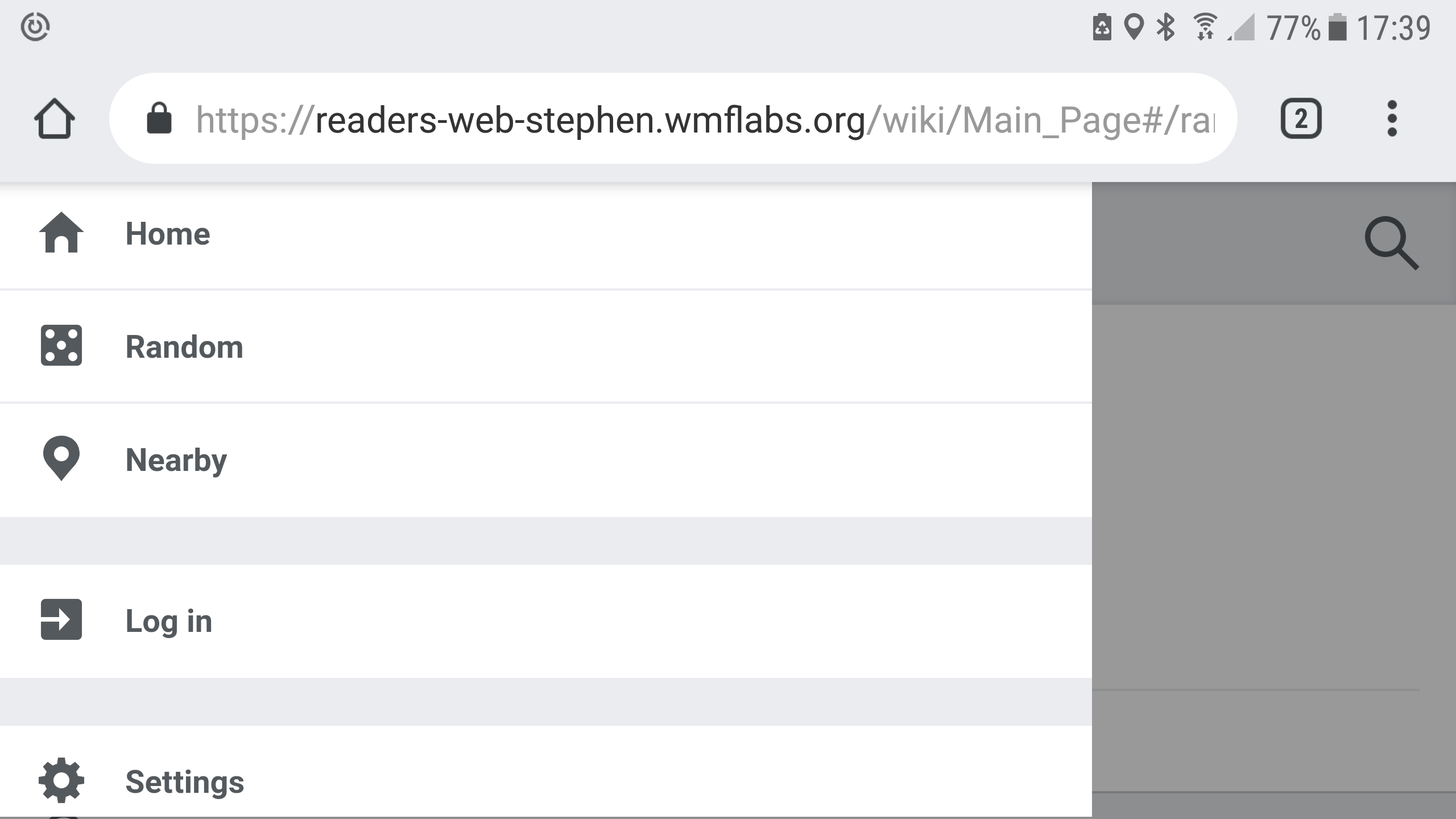
For mobile, the main menu is currently set to a relative width using a percentage
.animations #mw-mf-page-left {
    width: 75%;
}
It appears that doing a transform with a translate percentage i.e. transform: translate(75%,0); is compositor thread unfriendly and will cause the animation to stay on the main thread (at least in chrome) and this can cause unnecessary jank. When animating the main menu, it might be worth using vw units instead i.e. transform: translate(75vw, 0);.Consider using a feature query with a fallback for the browsers that don't support vw) as vw units appear to be compositor thread friendly [1].
Acceptance Criteria
- Main menu slides over content instead of pushing content off the page
- Try to make the menu animation stay on the compositor thread using compositor thread friendly properties. See https://developers.google.com/web/fundamentals/performance/rendering/stick-to-compositor-only-properties-and-manage-layer-count for more info. This shouldn't block sign off per https://phabricator.wikimedia.org/T206354#5432542
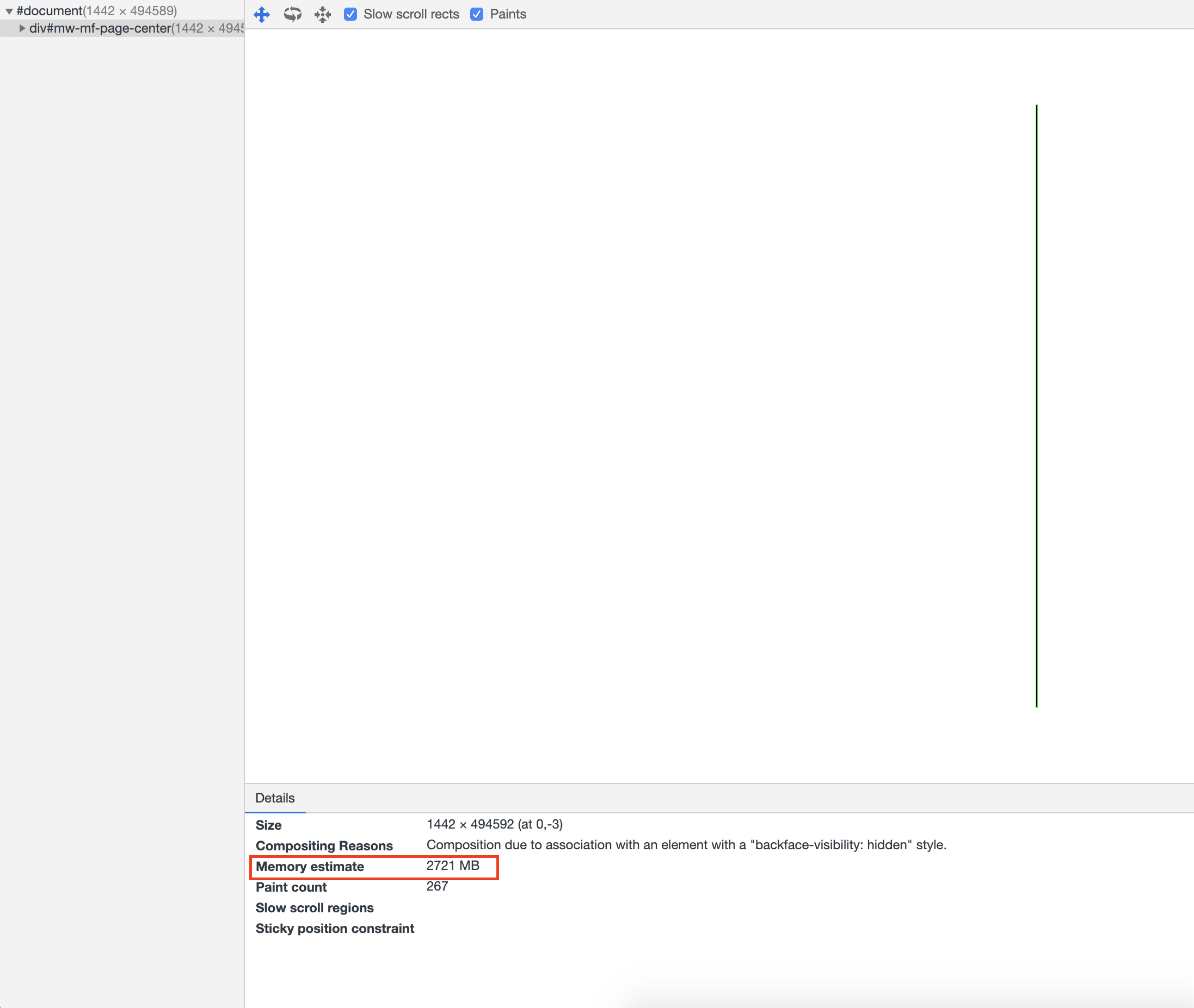
- Remove the -webkit-backface-visibility: hidden; CSS property on the .mw-mf-page-center element. This promotes the element to a new composite layer and uses memory [2]. By implementing this ticket, this rule should become unnecessary as the element should no longer animate.
- All of the .mw-mf-page-center CSS properties used to animate the element should be removed as this element should no longer animate.
[1] https://stackoverflow.com/questions/50409008/css-transform-transition-using-%C2%B4px%C2%B4-more-smooth-performant-than-percentage
[2] https://phabricator.wikimedia.org/T206354#5209466