Page MenuHomePhabricator

Test the location of Reply tool's input mode tabs
Closed, ResolvedPublic

Description

For this test to be run, T257280 must first be resolved.


This task is about conducting a usability test with people who are new to using Wikipedia talk pages to understand whether making the input mode tabs – source and visual – less prominent will lead them to notice them less and subsequently, be less confused by them.

Background

This task is an outcome of the most recent usability test we ran with people new to using Wikipedia talk pages (T246190) wherein we learned some people were confused by what the two modes meant and how they relate to each other.

What we are trying to learn

  • In which variant do people have an easier time accessing the visual mode's text formatting tools?
  • Does one variant lead people to become more or less distracted by the text input mode switching tabs

Variants to test

VariantInput mode shown by default*Visual mode tool locationTesting environment
AsourceRighthttps://en.wikipedia.beta.wmflabs.org/
BvisualRighthttps://en.wikipedia.beta.wmflabs.org/
CsourceLeftPatch demo
DvisualLeftPatch demo

* The text input mode – source vs. visual – test participants will see by default will be influenced by the account they are using to take the test, as was done in T246190

Test protocol

@iamjessklein to write.

Done

  • Testing protocol is written
  • Test is run
  • Findings are summarized

Related Objects

Event Timeline

Notes from the conversation @iamjessklein and I had today:

  • We defined what we are trying to learn from this test:
    • "In which variant do people have an easier time accessing the visual mode's text formatting tools?"
    • "Does one variant lead people to become more or less distracted by the text input mode switching tabs?"

...the task description's "What we are trying to learn" section has been updated to include the above.

Notes from the conversation @Esanders, @iamjessklein and I had today:

  • Variants A and C (text formatting tools being on the RIGHT side of the text input area) will be tested on PatchDemo
  • Variants B and D (text formatting tools being on the LEFT side of the text input area) will be tested on https://en.wikipedia.beta.wmflabs.org/
  • The text input mode – source vs. visual – people will see by default will be influenced by the account they are using to take the test

...the task description has been updated to include the above.

I updated the script. I:

  • added a step before the user replies to "Make sure that you are in the Reply editor’s visual tab."
  • added a question as part of the post-survey written response to follow up on that: "After you switched to (or confirmed that you were in) the visual tab of the reply editor, how did it feel to navigate around the page to write your response?"

@ppelberg @Esanders - please confirm that you are content with the language that I provided. You can see it in the context of the full script in this password-protected google doc.

I still need to make a few different test accounts for both tests.

@Esanders - can you provide the link for the patch demo on this ticket? Additionally, can you confirm that I can make test accounts on that server the same way?

I just started making the test accounts on beta and there are a few issues:

  1. I don't see the reply tool on the user talk page (no auto-signing or reply buttons etc.)
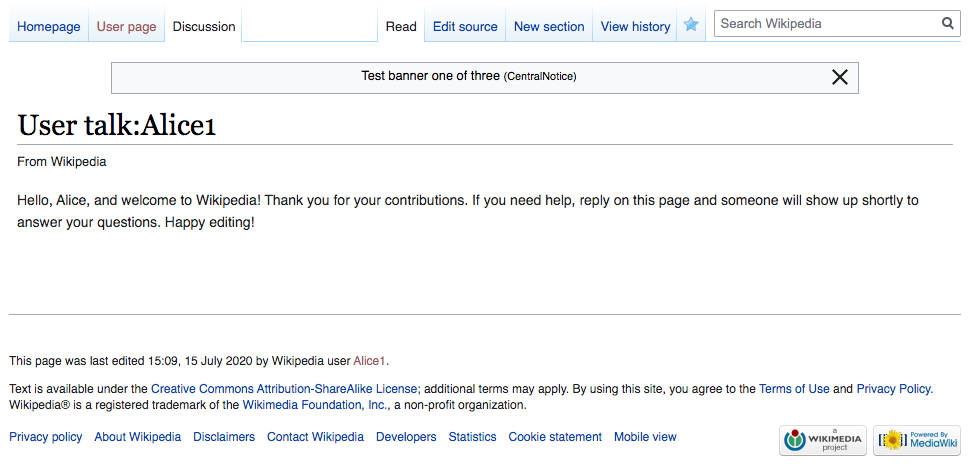
  2. It appears that some of the Growth team work is displayed here, so there are additional tabs (user homepage) and potentially other workflows that could appear to the user that I'm not aware of.

@Esanders: Can you take a look ?

Screen Shot 2020-07-15 at 11.09.42 AM.png (476Γ—980 px, 97 KB)

Actually #1 is not an issue (I just didn't realized that you still needed to sign initial comments manually).

  1. I don't think there's much we can do about this, it being a shared server. We can use the prototype server but I'd to no get it back up to date.

After discussing it with @ppelberg, we aren't going to make the copy changes to the test. We realized that we actually want to see if switching tabs is an obvious and expected step for junior contributors who are in source mode by default. So the protocol is good.

We still need to confirm why the Growth team's work is affecting the beta accounts. <--- @ppelberg @Esanders

@ppelberg : can you put a draft of the message that you will be posting on mediawiki to senior contributors here for documentation?

We still need to confirm why the Growth team's work is affecting the beta accounts. <--- @ppelberg @Esanders

I've asked the Growth Team whether there is a way for us to disable the Help panel so as to minimize the likelihood test participants become distracted by it. I'll report back what I find.

With the above said, I do not thinktheir answer should block us from starting the test.

For the test accounts:

beta:

  • make 6 new accounts (5 user and 1 who is supposed to be the Senior contributor writing to them)
  • for each account, adjust the preferences to make sure that newcomer homepage and the banner are disabled, as well as the help dialog
  • for each account make a user page
  • for all the junior contributors, make the discussion page
  • set the default editor

patch:

  • make 6 new accounts (5 user and 1 who is supposed to be the Senior contributor writing to them)
  • for each account make a user page
  • for all the junior contributors, make the discussion page
  • set the default editor

@ppelberg : can you put a draft of the message that you will be posting on mediawiki to senior contributors here for documentation?

@iamjessklein is it okay if we do what is being asked above in this ticket T257888?

...I agree documenting the outcomes of what we learn from Senior Contributors will be valuable and I think it will be easier to reference those learnings if we gather them in a ticket of their own.

@ppelberg I'm fine if it's not in this ticket, but it should be in a phabricator task.

Update: for beta, I:

  • made 6 new accounts (5 user and 1 who is supposed to be the Senior contributor writing to them)
  • for each account, adjusted the preferences to make sure that newcomer homepage and the banner are disabled, as well as the help dialog
  • for each account made a user page
  • for all the junior contributors, made the discussion page
  • set the default editor (AS SOURCE)

I will move on to setting up the first round of tests which will tackle: Variant D, source mode, left aligned toolbar.

Update: The first variant (a) is running on usertesting.com

Update:

  • Variant a is complete.
  • The second variant (b) is running on usertesting.com

I will log all the results on here at once so it's not overwhelming to see them come in piece meal.

I updated the description to include the correct variant definitions.

High level findings

General Usability
βœ… The majority of testers successfully completed all tasks with both versions of the tool.
βœ… Testers displayed unequivocally more ease in the visual mode

Pain Points
❌Several testers who were defaulted to Source mode got lost in the interface, and a few did not complete the tasks successfully.
❌Testers were confused by the taxonomy in the interface
❌The majority of testers stated that the page did not appear as they would have expected it to, stating they were anticipating more of a β€œmessage board,” or β€œemail” format.
❌Several testers completed the tasks using Edit Source and were confused by there being both Edit Source and Reply functionality

Notes
✏️The majority of testers expected to receive an email notification and on-wiki notification if someone were to reply to them.
✏️Testers who were defaulted to Visual mode were able to complete all tasks significantly faster than those who were defaulted to source mode. (On average 2x faster)
✏️Many testers perceive the left hand and top level navigations as part of the tool

Quotes

- On The mode tabs:

  • "When I click in the reply link, I didn't understand why there was two different tabs (visual and source).
  • "The way messages are displayed is really confusing, and I don't get the point of the source/visual text creation thinggie"

- On The Look and Feel :

  • "There is more functionality here than in my email"
  • "This resembles a low grade email inbox. It is very intuitive."
  • "It's a little old school, and it's not clear with some of the names and mentioning them what exactly that does, but it wasn't hard to do."
  • "i did not realize it would be indented. i guess it makes sense. id be curious if the next message goes back to where alice indented or under [my message]. so if it's like a running conversation like an email (but the email usually has lines on the side)."
  • "i guess if it was going to automatically append my username I'd expect a line break, which is more typical of an email model."
  • "I wish the format of the messages looked different and didn't look like one long message"
  • "It felt it was a bit dated. The term "User talk" is by far the most alien aspect of the site to me, it's not something I've seen or heard with other sites and services."
  • "I felt I had to scan the page a lot for what i needed, as different elements didn't really stand out. It wasn'tt really obvious that i was looking at a message from someone - it wasn't really immediately clear it was an inbox"

- On Understanding the Experience :

  • "I still don't agree with the formatting of this message page, but I see that it's a direct message page and that I have commented on it."
  • "I thought i was replying to this user but apparently im writing on a random board."
  • "i'm surprised it posted - i thought it would need to go through moderation."

- A positive quote from a truly Junior Wikimedian :

  • "for a few months i was editing a lot. the only way to talk to people was to edit the page. so this reply is new to me. This is more in line with what I'd expect. The other one was a lot harder to understand, for sure."

Near Term Recommendations

  1. Go with V2.1 - because it’s usable by junior and senior and on multiple sizes
  2. Swap location of β€œvisual” and β€œsource” tabs so visual is read first

Future Considerations

  1. Evaluate taxonomy holistically with a taxonomy audit T259266
  2. Visually distinguish: discussion from user page, discussions from one another, user talk pages/user info, and/or integrate page β€œwrapper” from the content within the discussion section T259263
  3. Consider if user talk pages should be treated differently than article talk pages T259261

Thank you for putting these together, @iamjessklein. A resulting question for you and then some follow-on comments for our future selves to remember.

  1. Go with V2.1 - because it’s usable by junior and senior and on multiple sizes
  2. Swap location of β€œvisual” and β€œsource” tabs so visual is read first

I've represented the above in the implementation ticket's (T257280) task description.

Notes
✏️Testers who were defaulted to Visual mode were able to complete all tasks significantly faster than those who were defaulted to source mode. (On average 2x faster)

Interesting. This is further evidence that we may need re-consider how the tool is currently implemented [i] in the context of en.wikipedia, es.wikipedia, he.wikipedia and fr.wikitionary where Junior Contributors will see the tool's source mode when clicking [ reply ] for the first time. Here is the task where this thinking will happen: T259392.

In the nearer term, it will be interesting to learn how "comment completion rates" vary based on what input mode people are shown by default. See metric #1 in the T247139's task description.

Quotes

- On The mode tabs:

  • "When I click in the reply link, I didn't understand why there was two different tabs (visual and source).
  • "...I don't get the point of the source/visual text creation thinggie"

Question:

  • @iamjessklein do you recall what variation of the Reply Tool each of these people was shown? I am curious to know where the source and visual mode tabs were located in the versions of the Reply Tool these people used.

- On The Look and Feel :

  • "I wish the format of the messages looked different and didn't look like one long message"
  • "I felt I had to scan the page a lot for what i needed, as different elements didn't really stand out. It wasn'tt really obvious that i was looking at a message from someone - it wasn't really immediately clear it was an inbox"

I've added the quotes above to the task description of the ticket where we will be thinking about visual enhancements: T249579.


i. T250523

It showed up in both versions of the tool consistently. The moment of the test where these comments were made was when we asked the user to take a look at the tool and describe it - so it might not have been an immediate reaction but at first glance the language on the tabs was confusing to a junior contributor. This should be incorporated in the thinking that we do around T259266.