Page MenuHomePhabricator

WikimediaUI: Icons for bold and italics beyond English defaults not aligned to icon guidelines
Closed, ResolvedPublic

Description

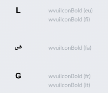
Current icon set features several language specific bold and italics icons that are not aligned to icon guidelines.

image.png (1×1 px, 143 KB)

Goal

Align to guidelines with attributes like

  • use of sans-serif font
  • 2 dp thick stroke

Resources

  • Here you can find the deprecated SVG icons (icons that we need to redesign in this task)

Acceptance criteria (or Done)

  • Design Style Guide
    • Design new icons with Sans-Serif
    • Align all icons to pixel grid
    • Export icons to SVG
    • Add icons to our icon system library Figma file and publish it
  • Codex
  • OOUI (0.43.0)

Icons to update on OOUI and Codex

  • Here you can download the new SVG icons to updated on OOUI and Codex.
Event Timeline

Volker_E updated the task description. (Show Details)
bmartinezcalvo changed the task status from Open to In Progress.EditedJan 5 2022, 10:45 AM

Hi all,

I have been working in two new proposals to unify all the Bold and Italic icons in all languages.

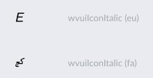
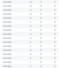
The first problem I found in the current icons was that it seems that they were built with different typographies, and it was the reason why they were not unified visually. In these two images you can view how the characters has different styles in each idiom.

Captura de pantalla 2022-01-05 a las 11.35.58.png (998×1 px, 233 KB)
Captura de pantalla 2022-01-05 a las 11.36.08.png (840×1 px, 212 KB)

For this reason I decided to use one only font to all Bold and Italic icons in all languages. I have created this two proposals:

  • Option A: icons made with Noto Sans font (available in more than 300 languages, so we have available all the characters we need).
  • Option B: icons made with Inter font (Inter font is not available for Arabic, Georgian and Armenian characters, so if we decide to use this fond we should use another font for the Arabic, Georgian and Armenian characters, so our icons would not be well unified as in the option A).

New icons (Noto Sans and Inter fonts).png (2×2 px, 221 KB)

You can view the design proposals in this Figma file where I have left some notes.

@KieranMcCann it could be great if you can review this task as you are the Visual Designer in our PatternLab.

I send you the Figma file with all versions, feel free to add your own versions or feedbacks there. Also, assign yourself the task if you feel necessary.
https://www.figma.com/file/wmY698HOCwGamNXzdtQ952/Bold-and-Italic-icons---T298211?node-id=328%3A1228

@bmartinezcalvo brought up a valuable input in this conversation off-thread in Slack. After pointing out that we were using 'Lato' whenever possible as our default Style Guide choice, she shared, that Lato in contrast to 'Noto Sans' or 'Inter' doesn't provide a number of glyphs.

With a different font choice we have to

  • decide if we accept 'Inter' typefaces as only icon specific choices and add this clarification to our icon guidelines
    • decide if we publish specific typeface choices necessary for languages not covered

Note that we're currently recommending Noto in cases of extended language support needs:

We recommend […] Lato, when available in your language. As well as the Noto font family for extended language support.

I'd personally lean towards using 'Noto Sans'.

Also, for languages where we don't have a clear improvement, we should continue with the current choices (working solution in production accepted by language community wins over icon consistency with unclear recognition).

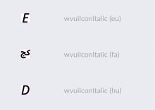
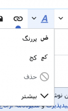
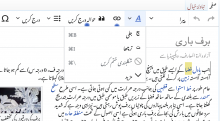
Lastly, current italics (ur) is also not italics:

image.png (272×1 px, 28 KB)

@Volker_E

  1. I would always use Noto Sans for text icons (B, I, ?, etc.) because Noto Sans is the font with more available characters and let us build a more unified icon system. Even if our typography is Lato, I think it don't mind if we use Noto Sans only to create icons because they are going to be icons, not text. So my proposal here is to use Noto Sans always for our icons (and update the rest of icons with text if we need it), not only for extended language support needs.
  1. About the Italic characters, Italic is not available for Arabic, Armenian and Georgian fonts (I think the reason is that these languages don't use Italic) so if we want to make our Arabic characters italic, we should force them using a design tool to skew them.

Captura de pantalla 2022-01-10 a las 19.22.07.png (948×1 px, 221 KB)
Captura de pantalla 2022-01-10 a las 19.23.13.png (508×604 px, 188 KB)

@bmartinezcalvo

  1. Let's continue with using Noto Sans then 👍🏻, it's in alignment with our guidelines and provides us in most scripts with the needed letters.
  2. We should not skew letters if the script doesn't support them. It's similar to the problem of skewed letters in Chinese, Japanese or Korean scripts, where false italics is possibly negatively impacting readability. Let's leave questionable character optimizations out of scope until we would have gotten native speaker clarity.

For completion, Farsi's own sans-serif choice currently:

image.png (486×300 px, 23 KB)

Change 753172 had a related patch set uploaded (by VolkerE; author: VolkerE):

[oojs/ui@master] icons: Align specific language 'bold*' and 'italic*' icons to guidelines

https://gerrit.wikimedia.org/r/753172

Change 753174 had a related patch set uploaded (by VolkerE; author: VolkerE):

[design/codex@main] icons: Align non-default 'bold*' and 'italic*' language icons to guidelines

https://gerrit.wikimedia.org/r/753174

Change 753172 merged by jenkins-bot:

[oojs/ui@master] icons: Align specific language 'bold*' and 'italic*' icons to guidelines

https://gerrit.wikimedia.org/r/753172

@Volker_E as we decided to move forward with the Noto Sans proposal, I have convert all text to outlines to create the icons and also I have reviewed them to align all their points and straight lines on full pixel grid.

I send you the zip. with all icons and if you verify that they are all ok, I will add them in our icon system Figma file.

Also, I link here the Figma file where I have worked all the proposals and versions.

cc: @iamjessklein

Change 753557 had a related patch set uploaded (by Jforrester; author: Jforrester):

[mediawiki/core@master] Update OOUI to v0.43.0

https://gerrit.wikimedia.org/r/753557

Change 753557 merged by jenkins-bot:

[mediawiki/core@master] Update OOUI to v0.43.0

https://gerrit.wikimedia.org/r/753557

Hi @Volker_E I assign you the task because I have finished all the icons design and I have published them in our icon library, so the only step left is to update the icons in OOUI and Codex.

I have created this other task to review and update the rest of our icons with text applying them Noto Sans https://phabricator.wikimedia.org/T299381

Change 753174 merged by jenkins-bot:

[design/codex@main] icons: Align non-default 'bold*' and 'italic*' language icons to guidelines

https://gerrit.wikimedia.org/r/753174

Change 758045 had a related patch set uploaded (by VolkerE; author: VolkerE):

[oojs/ui@master] icons: Further optimize 'bold*' and 'italic*' icons and update 'bold-f'

https://gerrit.wikimedia.org/r/758045

Change 758045 merged by jenkins-bot:

[oojs/ui@master] icons: Further optimize 'bold*' and 'italic*' icons and update 'bold-f'

https://gerrit.wikimedia.org/r/758045

Change 761653 had a related patch set uploaded (by Jforrester; author: Jforrester):

[mediawiki/core@master] Update OOUI to v0.43.1

https://gerrit.wikimedia.org/r/761653

Change 761653 merged by jenkins-bot:

[mediawiki/core@master] Update OOUI to v0.43.1

https://gerrit.wikimedia.org/r/761653

Volker_E updated the task description. (Show Details)