Page MenuHomePhabricator

Minerva mobile: non-ASCII char in section heading cause bigger margin
Closed, ResolvedPublicBUG REPORT

Description

List of steps to reproduce (step by step, including full links if applicable):

What happens?:
A header that contains at least one letter from outside of the basic ASCII set is inset to the right by 8px. This makes the page look very inconsistent.

What should have happened instead?:
The margin between chevron icon and the header text should be the same, no matter what text was provided.

Software version (if not a Wikimedia wiki), browser information, screenshots, other information, etc.:
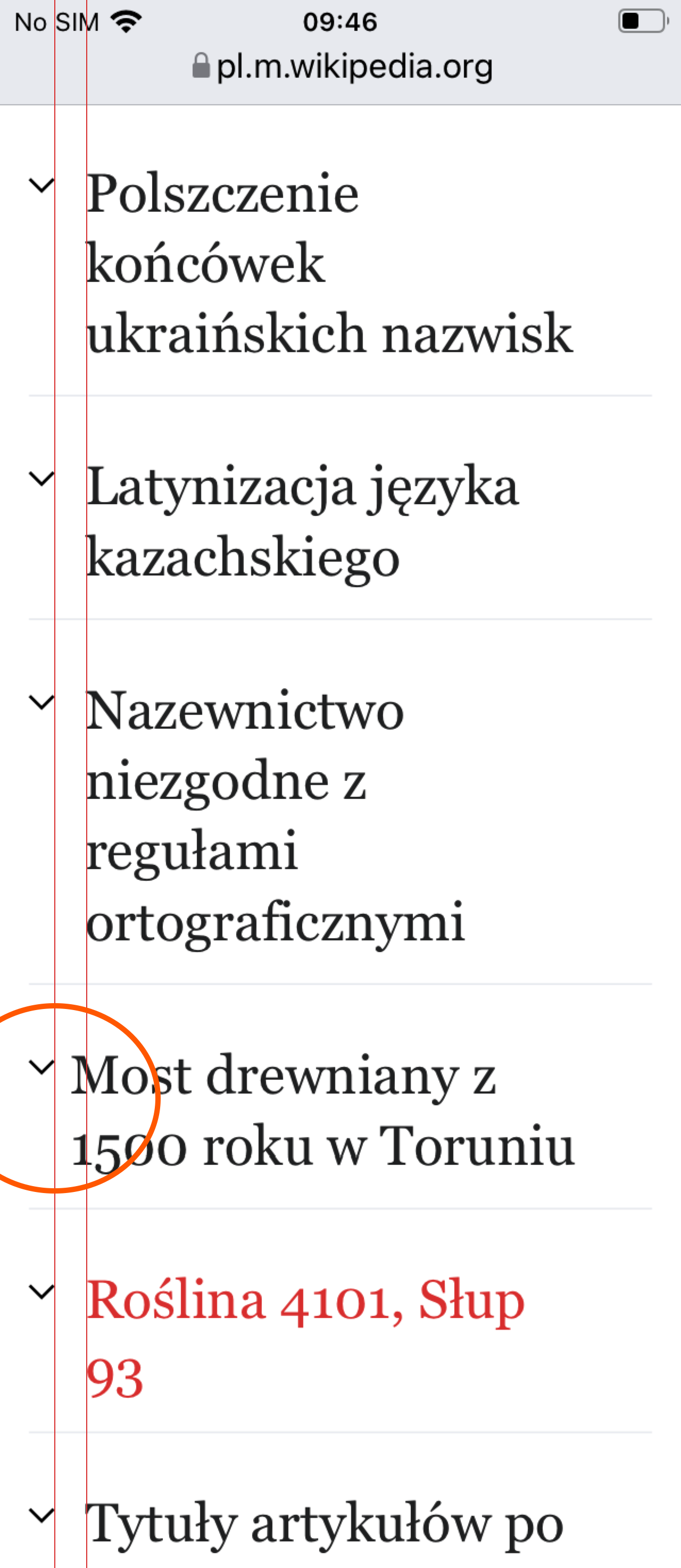
image.png (2×1 px, 528 KB)

Event Timeline

Jdlrobson added subscribers: Esanders, Jdlrobson.

@Esanders I haven't looked into this but wondered if your changes to section headings may be related or if this is a pre-existing issue.

Non-ascii characters triggers trigger an empty span which contains the ID with URL encoding. This span triggers the .mw-ui-icon + span rule in Minerva which adds 8px margin. That rule does seem overlay generic and we've had to adjust for it in quite a few places. It was only added a year ago (T292452) so this might be a good time to make it more specific.

Change 787878 had a related patch set uploaded (by Esanders; author: Esanders):

[mediawiki/core@master] MWUI: Don't add post-icon margin to empty spans

https://gerrit.wikimedia.org/r/787878

Change 787878 merged by jenkins-bot:

[mediawiki/core@master] MWUI: Don't add post-icon margin to empty spans

https://gerrit.wikimedia.org/r/787878

This above uses a :not( :empty ) selector to fix this case in the task, but it would be preferable if the labels required an specific class to get the left margin.

@Esanders can editing team please QA this one, as we don't have bandwidth to look at this one right now.

to clarify the issue, here is what I'm seeing on mobile:

image.png (2×1 px, 528 KB)

@Msz2001 the screenshot in the description is confusing to me because the blue line isn't straight. can you confirm if the issue you're describing is the title "Most drewniany z 1500 roku w Toruniu" being closer to the arrows than the other headings?

@Jdlrobson in either case the urgency here doesn't seem very high to me

@alexhollender_WMF Yes, the issue is that the title "Most drewniany..." is closer to the arrows. Sorry for drawing the line not exactly vertical.

(I think your "before" and "after" labels are reversed :) )

(I think your "before" and "after" labels are reversed :) )

Fixed. Thanks for pointing it out.

ppelberg claimed this task.