Page MenuHomePhabricator

Growth team product KPIs: Add number of questions sent to mentors to Grafana dashboard
Closed, ResolvedPublic

Description

As a Wikimedian,
I want to understand how newcomers are engaging with the Mentorship feature,
Because then I can better understand the impact of this feature

Description

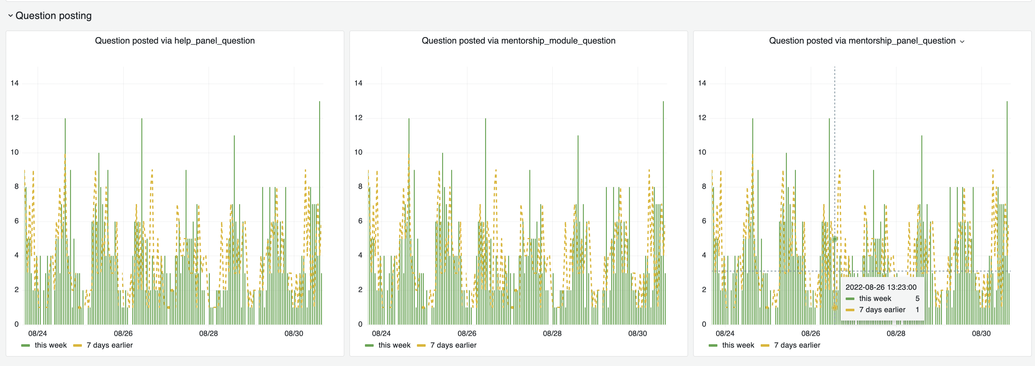
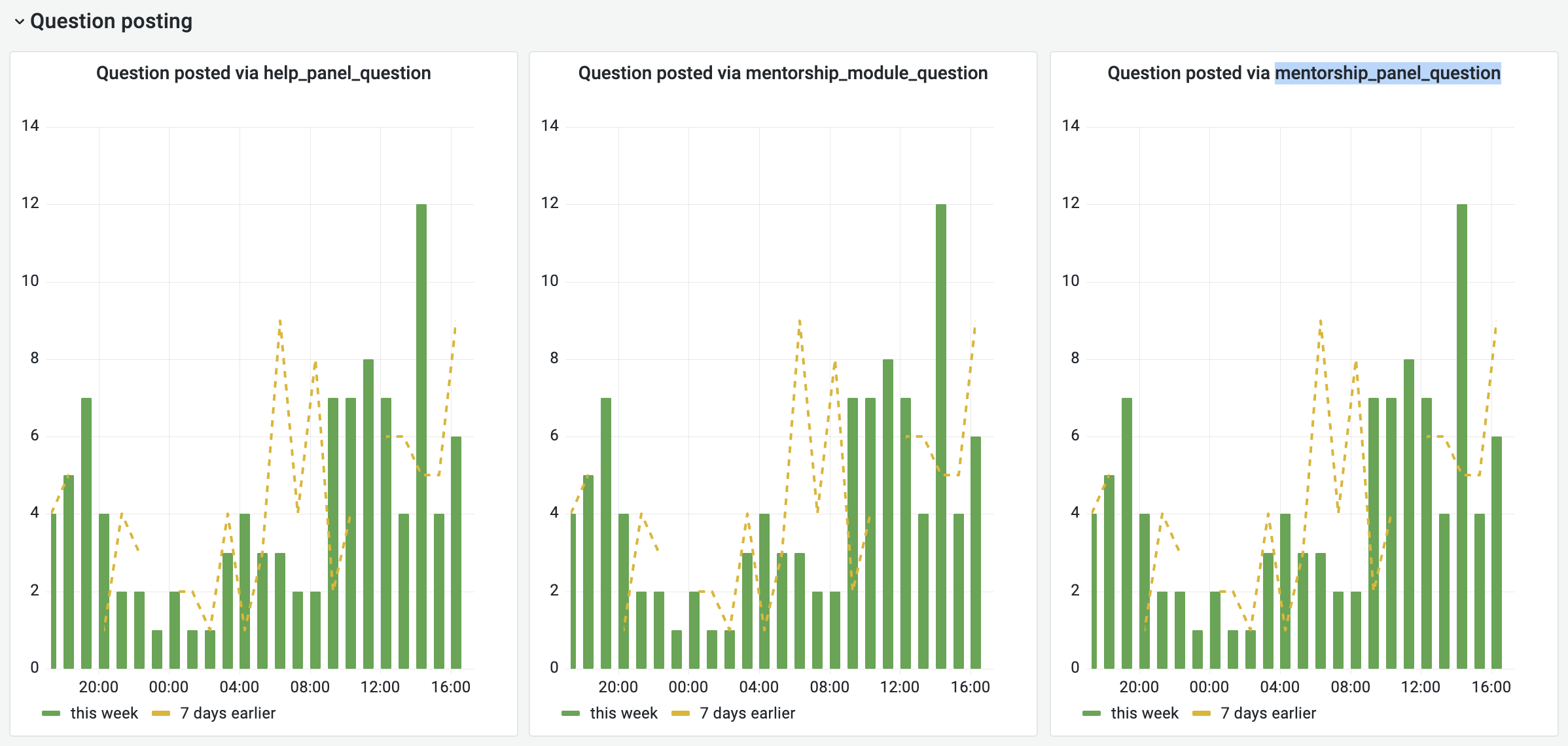
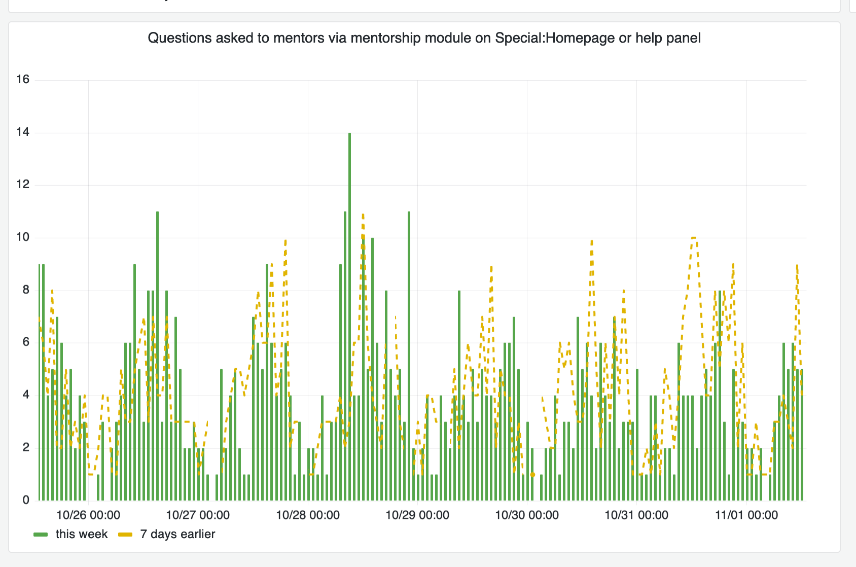
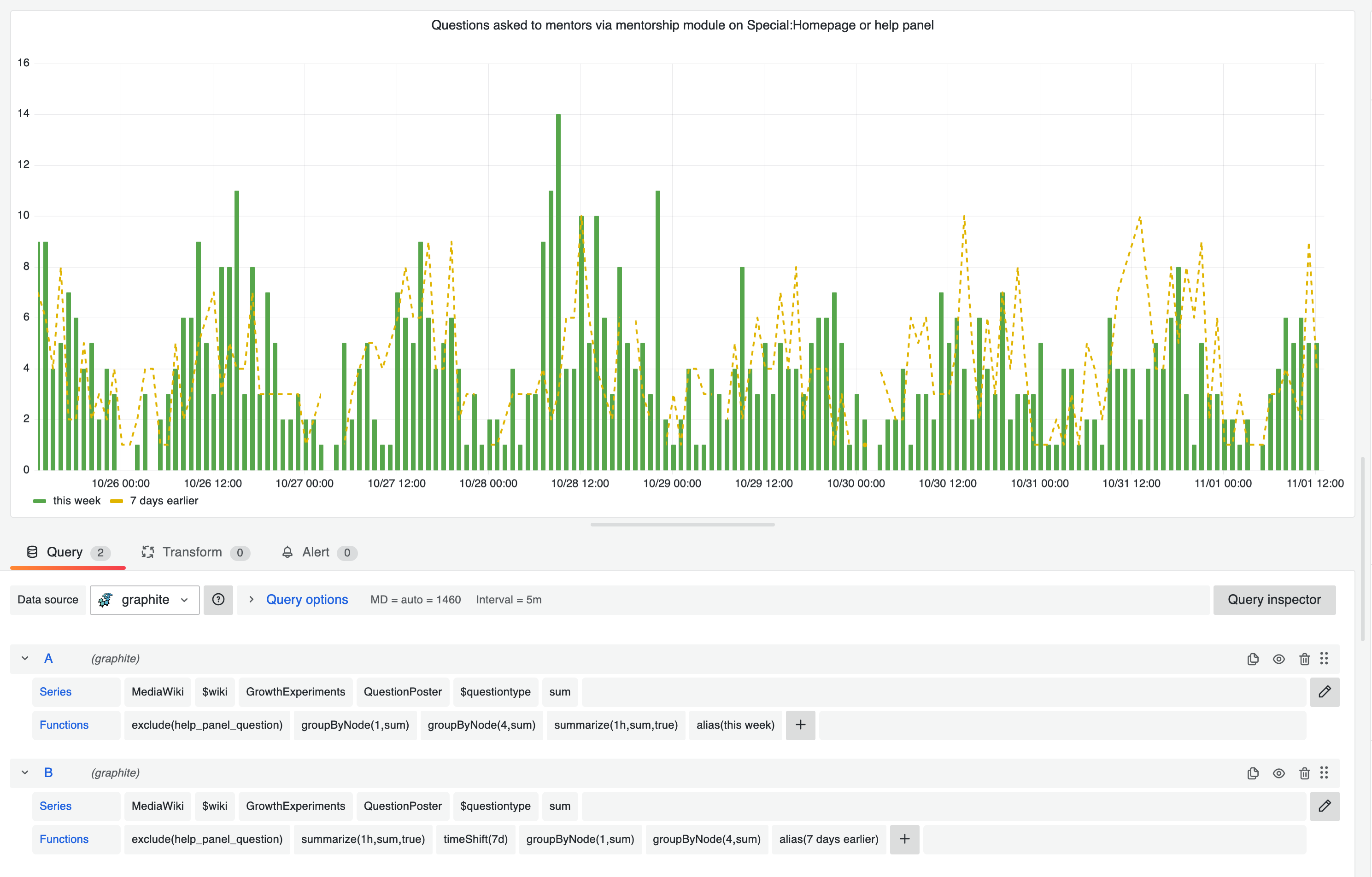
Communities want to know how many questions are sent to Mentors or to the Help Desk.

We added the code to track this in T286366 , so we can now add this to Growth team product KPIs.

Acceptance Criteria

Given I view the Growth team product KPIs,
Then I can see how many questions are asked via the Mentor feature
And filter by wiki and date range

Completion checklist

Functionality

  • The patches have been code reviewed and merged
  • The task passes its acceptance criteria

Engineering

  • There are existing and passing unit/integration tests
  • Tests for every involved patch should pass
  • Coverage for every involved project should have improved or stayed the same

Design & QA

  • If the task is UX/Design related: it must be reviewed and approved by the UX/Design team
  • Must be reviewed and approved by Quality Assurance.

Documentation

  • Related and updated documentation done where necessary

Event Timeline

KStoller-WMF renamed this task from Growth team product KPIs: Add number of questions sent to mentors to Graphana dashboard to Growth team product KPIs: Add number of questions sent to mentors to Grafana dashboard.Aug 22 2022, 3:34 PM

@kostajh Thanks for working on this!

Screen Shot 2022-08-30 at 10.37.58 AM.png (1×2 px, 215 KB)

  1. The visualization looks great, but I'm confused as to why all three graphs are the same.
  2. Could we name that section "Mentee Questions" or "Questions to Mentors" or something that adds more clarity than Question posting?
  3. Sorry if this is obvious, but I'm unsure where mentorship_panel_question data is coming from. Does this relate to how some Help panel questions go to Mentors, but some go to the Help Desk depending on Community Configuration?
  4. I appreciate having these three graphs, and I think it's helpful to better understand feature usage, but I'm wondering if the first graph should be a total of ALL questions sent to Mentors. I think that's a stat communities might want to quickly reference.

@Urbanecm_WMF - feel free to chime in here if you have any other suggestions for how we can make these graphs more useful to Mentors and communities as a whole. Thanks!

@kostajh Thanks for working on this!

Screen Shot 2022-08-30 at 10.37.58 AM.png (1×2 px, 215 KB)

  1. The visualization looks great, but I'm confused as to why all three graphs are the same.

Oops, I messed something up. Fixed!

  1. Could we name that section "Mentee Questions" or "Questions to Mentors" or something that adds more clarity than Question posting?

Sure, renamed.

  1. Sorry if this is obvious, but I'm unsure where mentorship_panel_question data is coming from. Does this relate to how some Help panel questions go to Mentors, but some go to the Help Desk depending on Community Configuration?

It's not obvious! I added a description to the panel (the "i" icon), but in short: help panel question means mentorship is not enabled, and the help panel posts to a help desk; mentorship panel means the question was asked from the help panel, and the question went to their mentor; mentorship module means that the question was asked from Special:Homepage

  1. I appreciate having these three graphs, and I think it's helpful to better understand feature usage, but I'm wondering if the first graph should be a total of ALL questions sent to Mentors. I think that's a stat communities might want to quickly reference.

I think that is possible, but involves some trickery with Grafana that I don't know how to do offhand. After seeing the updated graphs, please let me know if you think we should make this change and I'll look into it.

@kostajh Thanks for working on this!

Screen Shot 2022-08-30 at 10.37.58 AM.png (1×2 px, 215 KB)

  1. The visualization looks great, but I'm confused as to why all three graphs are the same.
  2. Could we name that section "Mentee Questions" or "Questions to Mentors" or something that adds more clarity than Question posting?
  3. Sorry if this is obvious, but I'm unsure where mentorship_panel_question data is coming from. Does this relate to how some Help panel questions go to Mentors, but some go to the Help Desk depending on Community Configuration?
  4. I appreciate having these three graphs, and I think it's helpful to better understand feature usage, but I'm wondering if the first graph should be a total of ALL questions sent to Mentors. I think that's a stat communities might want to quickly reference.

@Urbanecm_WMF - feel free to chime in here if you have any other suggestions for how we can make these graphs more useful to Mentors and communities as a whole. Thanks!

Thanks for the ping! The graphs look good to me in general.

However, I'm not sure whether communities would know how to interpret the charts. For example, it's not really clear to me whether the charts represent "questions per week" (as "this week" in the legend would suggest), or whether the unit is different. Based on the displayed data, it looks to be hourly, but can that be clarified, please?

Also, this set of tasks reminds me of one of our lingering tasks, T249987. I might be wrong, but it looks like the KPI tasks are collaborating towards resolving that task. If that's right understanding, perhaps he tasks should be grouped?

Etonkovidova subscribed.

However, I'm not sure whether communities would know how to interpret the charts. For example, it's not really clear to me whether the charts represent "questions per week" (as "this week" in the legend would suggest), or whether the unit is different. Based on the displayed data, it looks to be hourly, but can that be clarified, please?

Yes, it seems that it's posted hourly. I also agree with earlier suggestions by @KStoller-WMF that it's be good to have an aggregate (a sum) of questions for a specified period of time. Especially, for longer time intervals (even for 7 days), it's difficult to figure out how many questions were asked.

Also, this set of tasks reminds me of one of our lingering tasks, T249987. I might be wrong, but it looks like the KPI tasks are collaborating towards resolving that task. If that's right understanding, perhaps he tasks should be grouped?

I added this task as a subtask to T249987.

I also agree with earlier suggestions by @KStoller-WMF that it's be good to have an aggregate (a sum) of questions for a specified period of time. Especially, for longer time intervals (even for 7 days), it's difficult to figure out how many questions were asked.

@kostajh Having some sort of aggregate would make these graphs even more helpful. It would be great to quickly be able to say how many questions were asked of mentors over a certain period of time.

That being said, if that sounds like a lot of work, I'm happy to open a new task with that request, and we can consider this one complete.

@KStoller-WMF - I realized that I forgot to ask another question: the task specs have Documentation section. Should these stats be documented with the goal that communities would easily refer/discover it for explanation/clarification etc?

@KStoller-WMF - I realized that I forgot to ask another question: the task specs have Documentation section. Should these stats be documented with the goal that communities would easily refer/discover it for explanation/clarification etc?

Great point! The KPI dashboard has been included in our weekly update, and will also be mentioned in the upcoming newsletter, but I think it makes sense to have them more easily accessed from main Growth pages. @Trizek-WMF do you think we should include Growth KPIs on https://www.mediawiki.org/wiki/Growth ? Elsewhere?

Moving to Ready for Development for addressing/evaluating the following:

  1. I appreciate having these three graphs, and I think it's helpful to better understand feature usage, but I'm wondering if the first graph should be a total of ALL questions sent to Mentors. I think that's a stat communities might want to quickly reference.

I think that is possible, but involves some trickery with Grafana that I don't know how to do offhand. After seeing the updated graphs, please let me know if you think we should make this change and I'll look into it.

@kostajh I was looking at grafana docs and I'm also not seeing an obvious way to provide a Total or even Average metric attached to a Time series visualization.

Should I close this task (since the initial acceptance criteria is met) and instead add a separate task to add a few specific Stat panel visualizations?

OK, I think I got it here:

image.png (1×1 px, 180 KB)

I added an "exclude" filter for help_panel_question:

image.png (1×2 px, 431 KB)

Does that look about right @KStoller-WMF?

@kostajh - looks great, thank you!

The other aspect that I think communities want, is to be able to quickly see <#> questions were asked of Mentors during <time period>. Essentially to look at that second graph and also see a sum of all the columns.

But I'm not sure if that is even possible in Grafana's time series visualization. So I'm happy to consider this task resolved this task (since the initial acceptance criteria is met).